Logo Design For Som-Num

Muhammad Faizan
Logo Designer
Adobe Illustrator
Adobe Photoshop
SOM-NUM
Main Logo
About the Company
Som-Num is an up-and-coming startup based in Seattle that develops smart mattresses, called "Som-Num" (from the Latin word somnum, meaning sleep). Their business is still very young as they have just finished the Kickstarter campaign for their Bluetooth-enabled mattress.
Logo Mockup
Main Objective
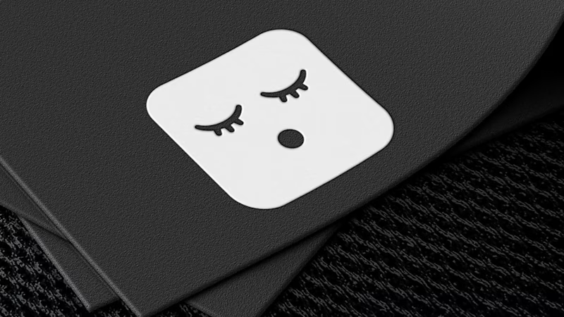
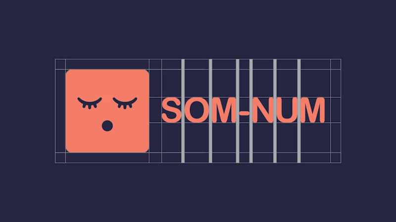
They wanted to have a simple, easily recognizable icon for their logo. Their logo should be able to be easily embroidered on the mattresses, so they didn't want any complex designs. They are already developing an app to go with it so the logo should also work on smaller screens and in an app store. They wanted their icon to appear fun and not too serious.
Brand Keywords
Fun
Soft
Sleepy
Logo Detailed
My approach to solving the client's problem
STEP:1 KNOWING THE AUDIENCE AND THE COMPETITORS
First of all, I had to see the demographics of the brand's target audience and analyze the competitors that how their logo and branding was done and what common do they have with each other.
STEP:2 WHAT MESSAGE DO WE WANT TO CONVEY?
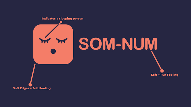
Analyzing the brief, I came up with a concept that, first of all, gives a soft feeling, and is supported by a great pictorial mark that defines clearly that the brand cares about their customer's sleep and well being.
STEP:3 CHOOSING THE RIGHT COLORS
Since the brand is related to sleep, I chose the colours that were a bit gloomy and weren't too bright so that even the colours could tell a lot about the brand.
More indepth details of the logo
Pattern
Usage
App Icon
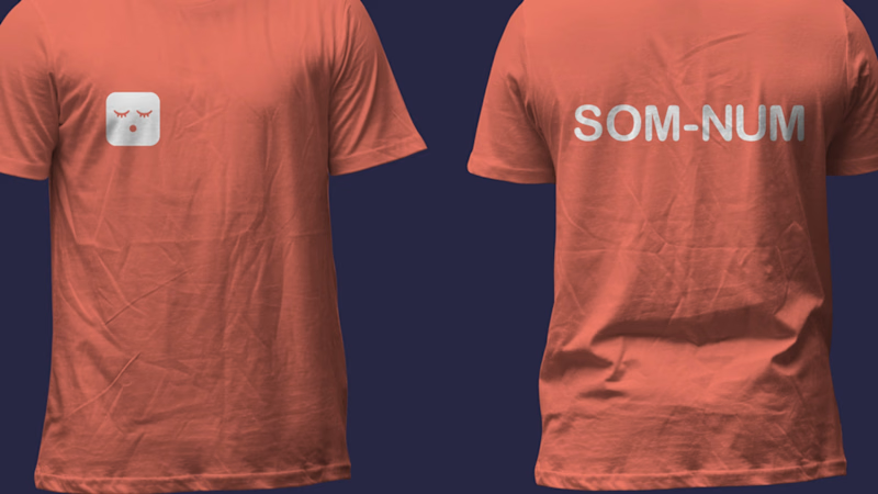
Tshirt Design
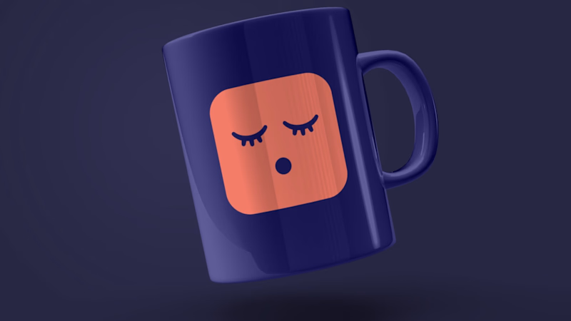
Cup Design
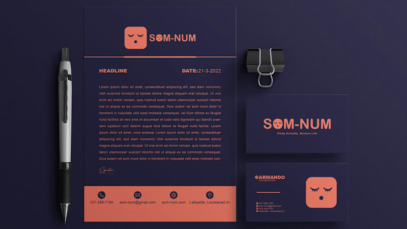
Letterhead & Business Card


