
This bold and eye-catching label design for Flux’s Kombucha was created to draw immediate attention and effectively communicate the product’s identity to a broad audience. The label’s unique shape and triangle sections guide the viewer’s focus to the word “kombucha” first, ensuring that the beverage type is clearly recognised, with the brand name as a secondary focus. This strategic hierarchy helps associate the Flux brand with kombucha for consumers who may be unfamiliar with the drink.

Custom Vector graphics for the label design
The design incorporates premium production elements, including a die-cut shape and spot UV embellishments, adding visual and tactile interest. Practical considerations, such as space for nutritional information and barcodes, were seamlessly integrated into the layout, ensuring both aesthetic appeal and compliance with packaging requirements. This thoughtful design balances functionality with a visually striking presentation, capturing the spirit of the Flux brand.
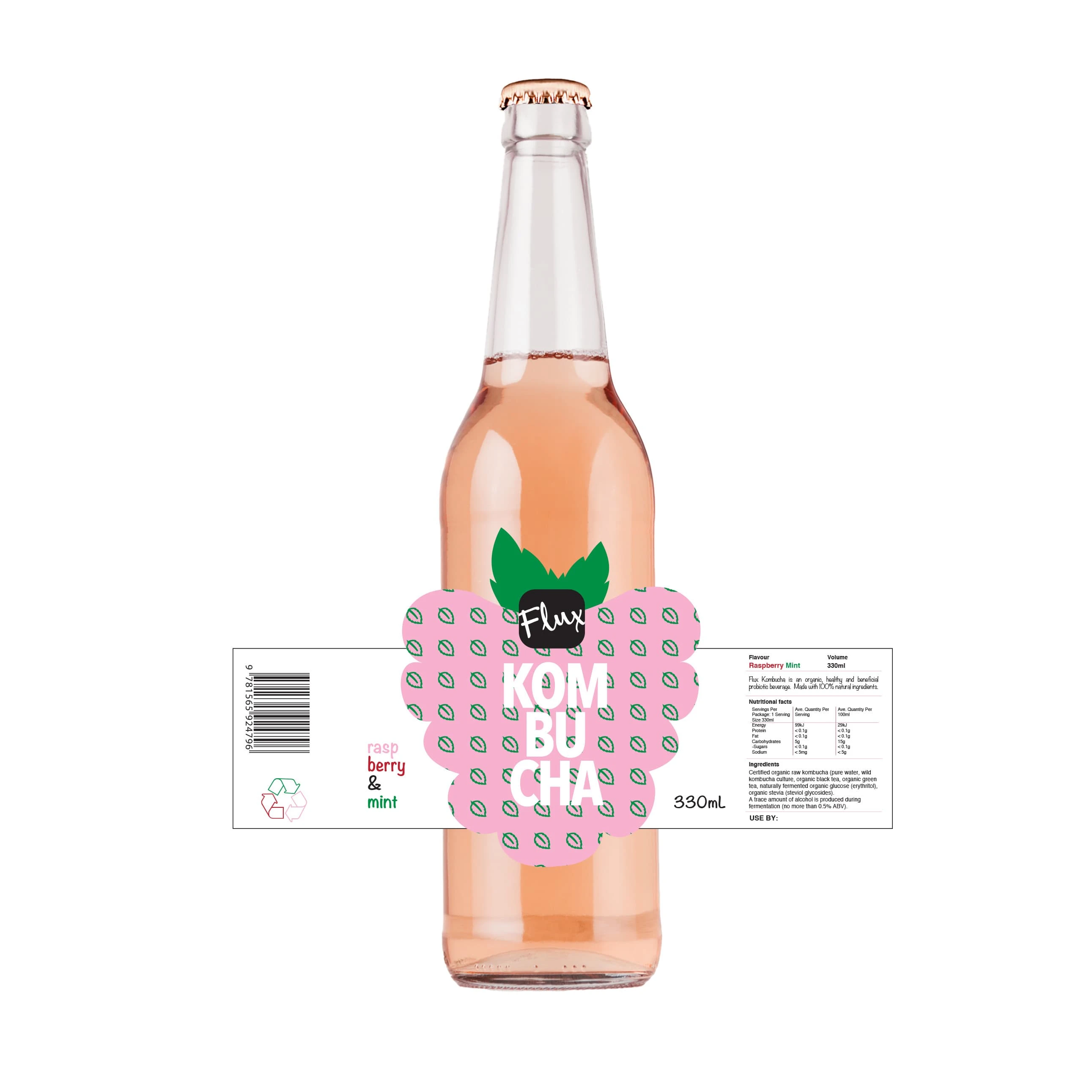
Final label design
0 likes · 6 views · Dec 16, 2024
This bold and eye-catching label design for Flux’s Kombucha was created to draw immediate attention utilising die cut and spot UV elements
