Summer in Argyle | Graphic Design

Sam Cordell
Graphic Designer
Illustrator
Print Designer
Adobe Illustrator


Adobe Photoshop

Audible

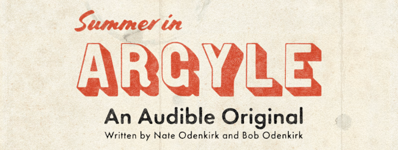
I was commissioned by Audible to design a map to accompany the release of Summer in Argyle, an Audible original comedy series.
My goal from the start was to try and capture the rich, playful character of classic mid-century maps and add a slightly contemporary feel while tailoring the piece to complement existing marketing material. I worked closely alongside the show's writers, Nate Odenkirk and Bob Odenkirk, to make informed design decisions and fill the map with humor, ensuring it would give listeners a deeper look into the world of Summer in Argyle.
Historical Research
The first conversation with the client began with a bit about the fictional town of Argyle; where it is, who lives there, how many people live there, etcetera. Through this conversation and my subsequent time spent listening to a pre-release version of the entire series, I formed a picture in my mind of this strange, wonderful town and couldn't wait to get to work.
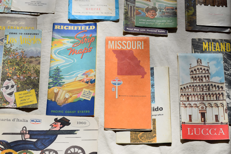
A selection of my favorite maps found as reference for Summer in Argyle.
I rummaged through dusty bins in the backs of antique stores to find appropriate reference material to begin my design process. I collected more than 15 printed maps, supplemented with scanned pieces from online archives to understand this style as best I could.
Setting the tone
I began with designing the cover of the fold out map. Although it was separate from the main map, it allowed for the style and texture of the project as a whole to be established before getting too deep into the design of the map itself.
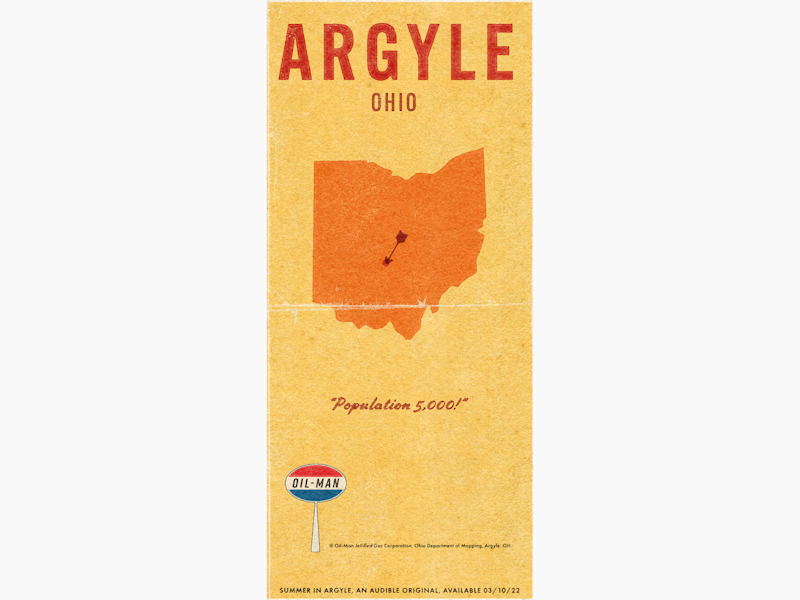
After vetting a few cover options and potential design directions, we settled on the version shown above and I forged ahead in finding the look for the interior of the map.
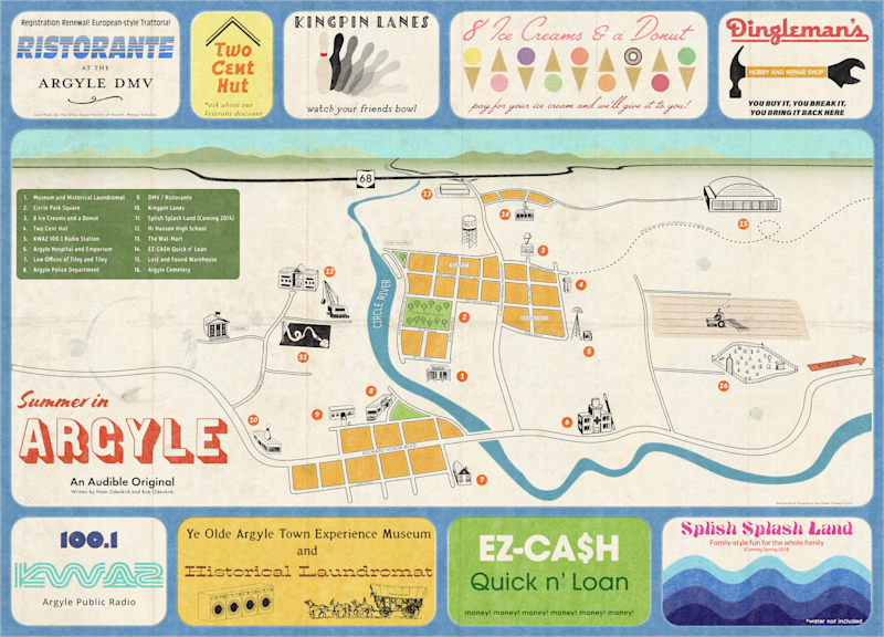
Shown above is my first suggestion feel of the main map. A slight perspective view along with period-appropriate colors, type, and mildew made for a convincing map and a style that immedately matched what the client and myself were searching for.
Foray into urban planning
I travelled, albeit virtually through Google Maps, between dozens of sub-5000 person towns across the Midwest to establish the scale and rough street layout of the city. From there, I placed each local business, river, bridge, street, and highway, and worked on connecting it all in a way that would fit the style of my references and the story of the show.
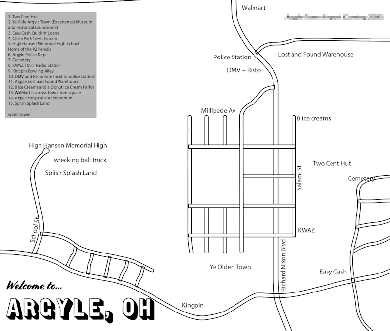
Early outline of Argyle, featuring some still-classified information in the top-right-hand corner :)
I listened to the entire show multiple more times and took note of each shop, street name, and spatial relationship mentioned and started to note potential places that would be highlighted on the map. The writing team gave this process direction and much content, bringing up their favorite portions of the show and populating the town with countless funny street names.
Expanding the scope
At multiple points in my design process, I made the decision to widen the scope of the project to better realize the vision of the client. The most acute example came from incorporating my personal favorite part of the show, which are radio ads for fictitious local businesses that open each episode of Summer in Argyle.
Nearly every reference map incorporated advertisements in a unique way. I decided to bring this key part of the show into this map, making the advertisements fit the tone of the project and further highlighting what I found one of the funniest parts of the series.
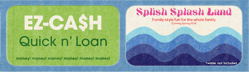
Two of my personal favorite ads. View all nine ads below surrounding the final map!
This addition brought a new level of visual character and variety to the piece as a whole, and was effective in incorporating the tone and humor of the show into the map without breaking stride from the period reference material. After the ads were complete, it was time to texture the map and bring it to life.
Before: Vector draft in Illustrator | After: Textured print advertisement in Photoshop
Illustration and texture
Illustration is another key aspect of mid-century maps that the writers and myself agreed had to be a major part of this project.
I began by making rough pencil sketches and finished with a large set of simple vector line drawings to accompany each marked location on the map, adding dozens of opportunities for more humor and moments from the show to be put on the map. There are many small details hidden in the illustrations for those looking closer than most!
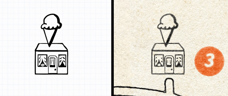
Before: Vector illustration in Concepts | After: Textured illustration in Photoshop
As the content was now set, the texturing process began to make the map tactile and authentic. Digital and analog solutions were combined to give the map the grit, grime, and creases it needed.
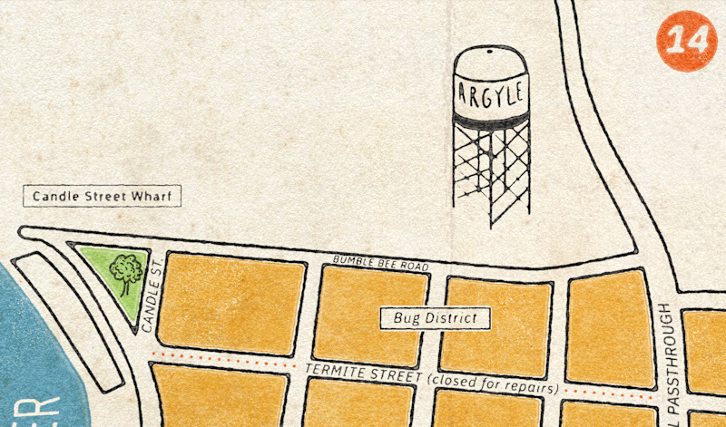
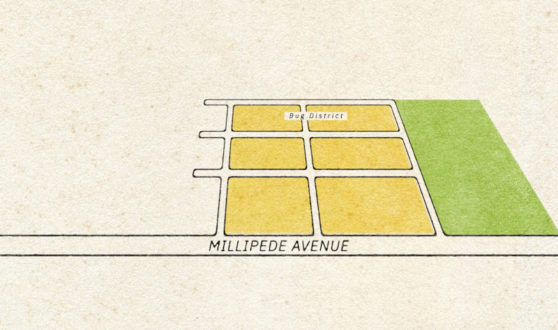
Detail of Argyle's Bug District. Note the texturing on type, roads, illustrations, and legend numbering.
When I thought it was filthy enough, I brought it to the writing team and they said they needed it dirtier! Coffee stains and all. These final, collaborative design decisions brought it to the finish line and made it mesh perfectly with the tone of the show.
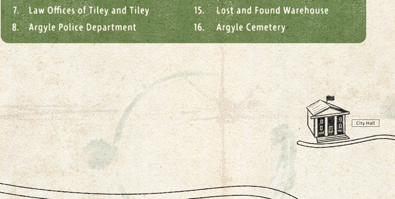
City Hall alongside a major stain and crease in the 'paper'.
Final Map
Shown below is the final map. I was pleased that the final product captured so many of my favorite parts of mid-century print design as well as realized the vision of the creators of Summer in Argyle.

While I played such a small part, I hope that my addition to the program brought joy to those who worked so hard to make the show what it is as well as to those listeners who desire to dive a bit deeper into the world of Argyle.
Thank you for taking the time to look at my design process. If any aspect of this project resonated with you, I would love to work on a project together!
2022