Kate Von Biel Coaching

Kate Riley
Brand Designer
Graphic Designer
Adobe Illustrator
Adobe Photoshop
Figma
It was really exciting to work with Kate on her new business as a personal and career coach. Talking through her plans and passions was inspiring. Kate is committed to helping people achieve their goals, so it was up to me to help her present this message in a way that represented her and appealed to her audience.
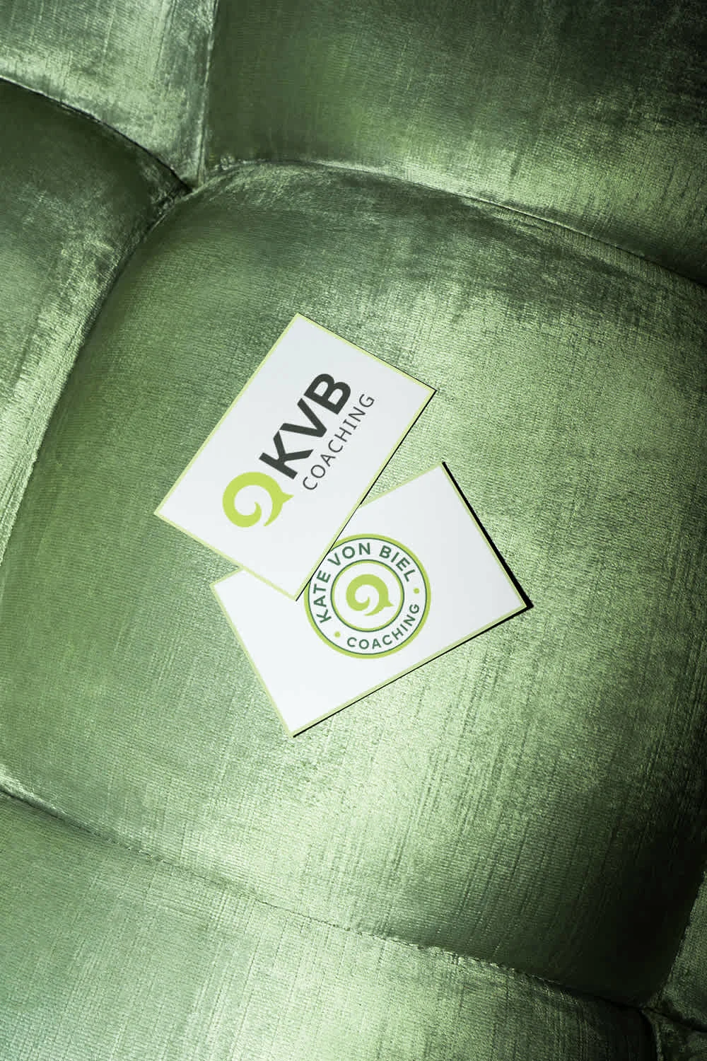
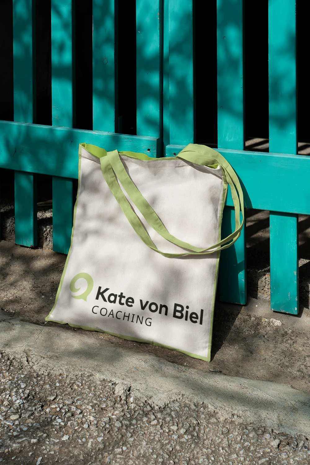
Kate needed guidance on how to proceed with her branding and website. She wanted people to know she was approachable and friendly, but also an authority and qualified life coach. We created a visual identity that was reassuring, warm and inviting but also simple, easy to understand and no nonsense. We presented this using a colour palette of growth and harmony, contrasting with an eye catching raspberry colour signifying energy and vitality. Kate was also keen to use a koru for her logo, the epitome of growth and development. Although it was a common logo mark, we morphed it into a speech bubble, representing the supportive conversation Kate has with her clients.


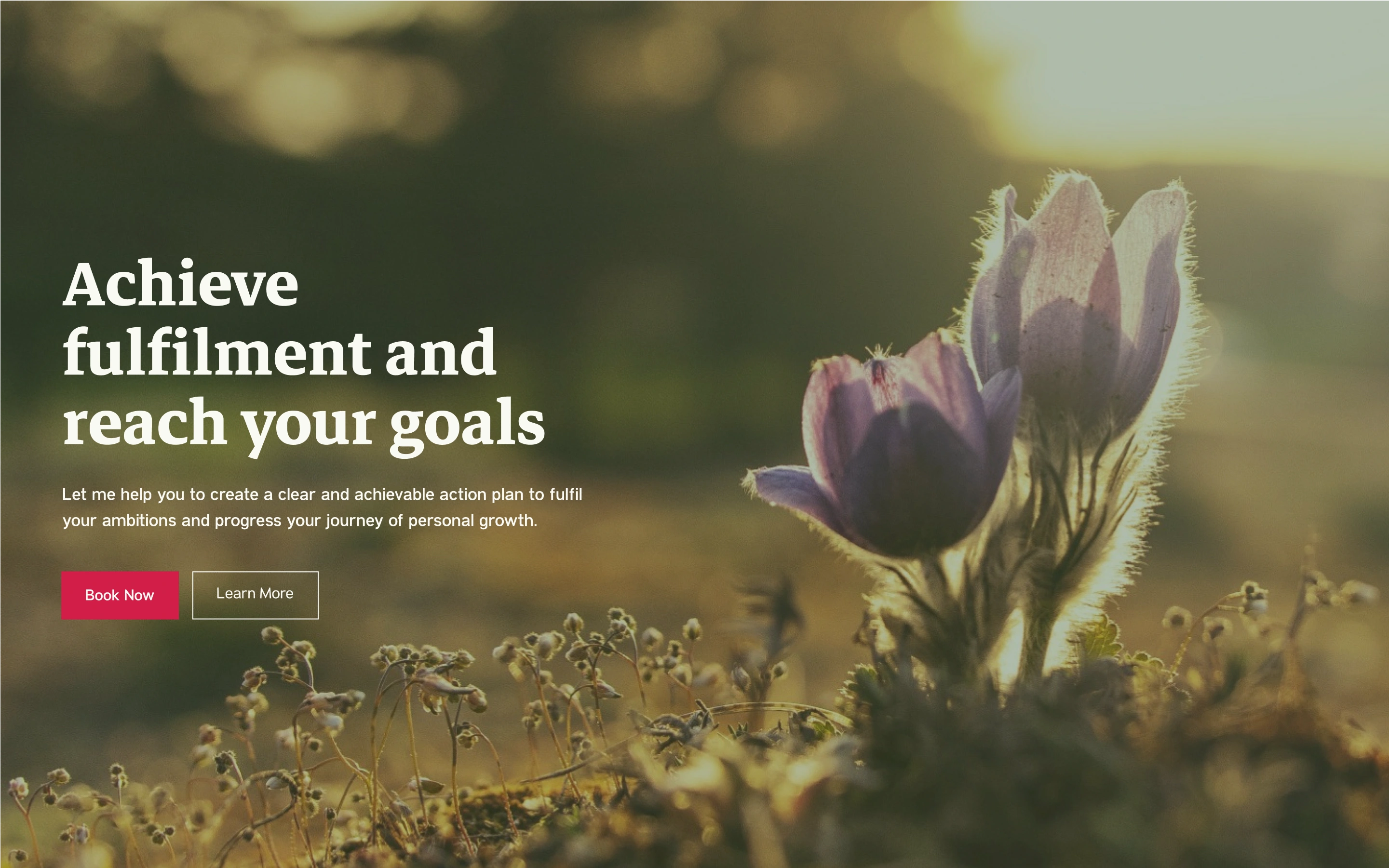
A preview of the hero from Kate's home page


