BOLD — Creative Agency Portfolio & Landing Page

Salman Halari


📌 Project Overview
BOLD is a premium landing page designed for a creative agency looking to stand out with a strong, minimal, and modern dark-themed visual identity. The objective was to create a bold digital footprint that showcases the agency's services (product design, app design, web design) and creative work with extreme clarity and high visual impact.
🎨 Design Strategy (Figma)
High-Contrast Aesthetics: Used high-contrast, bold typography and sleek card layouts set against a dark background to convey high-end, premium quality.
Structure: Designed an engaging flow starting with a strong "Mission Statement" section, followed by a highly-structured "Services" grid.
💻 Development (Framer)
Developed the Figma design into a fully interactive, responsive live website using Framer.
Optimized the layout, font scaling, and responsiveness so the site looks stunning on both large monitors and mobile screens.
Live URL: https://theboldportfolio.framer.website/
🗺️ Site Architecture & Pages
To build a complete digital ecosystem for the agency, the project was mapped into 5 core pages, keeping user navigation intuitive and conversion rates high:
Home: The main landing page showcasing the bold brand mission, prominent services grid, and key testimonials./work: A dedicated catalog displaying the agency’s complete creative portfolio and active case studies./articles: A clean, structured directory designed for publishing design insights and industry blogs./contact: An optimized onboarding page with a clear form for potential clients to submit inquiries./thank-you: A polished post-submission feedback page to confirm receipt and guide users back into the site.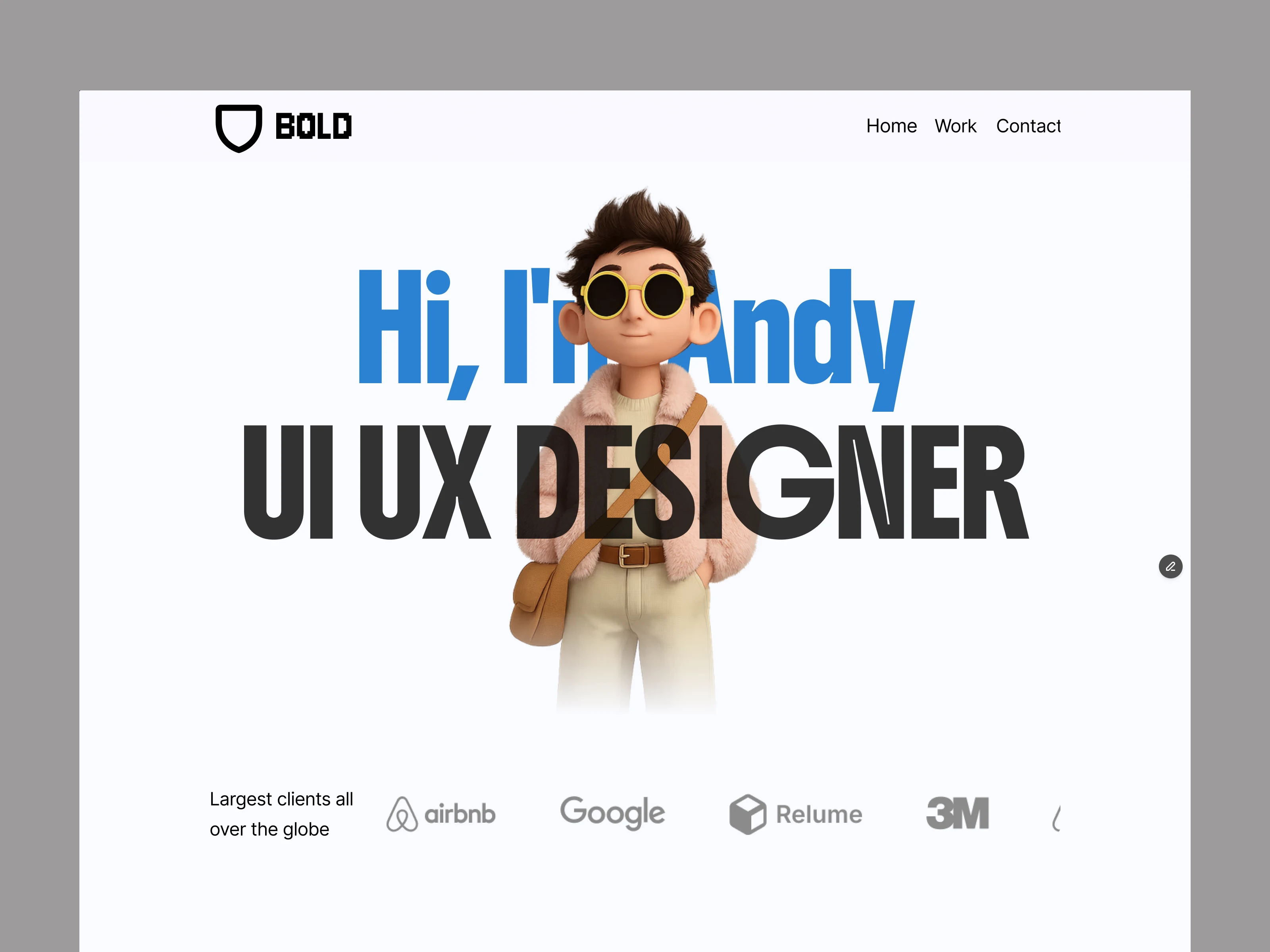
☀️ Light Mode Theme Exploration
Alongside the primary dark aesthetic, I explored a clean, high-contrast Light Mode version. The focus was to maintain the brand's bold typographic weight and identity while ensuring optimal readability, seamless color inversion, and a fresh visual alternative for diverse user preferences.
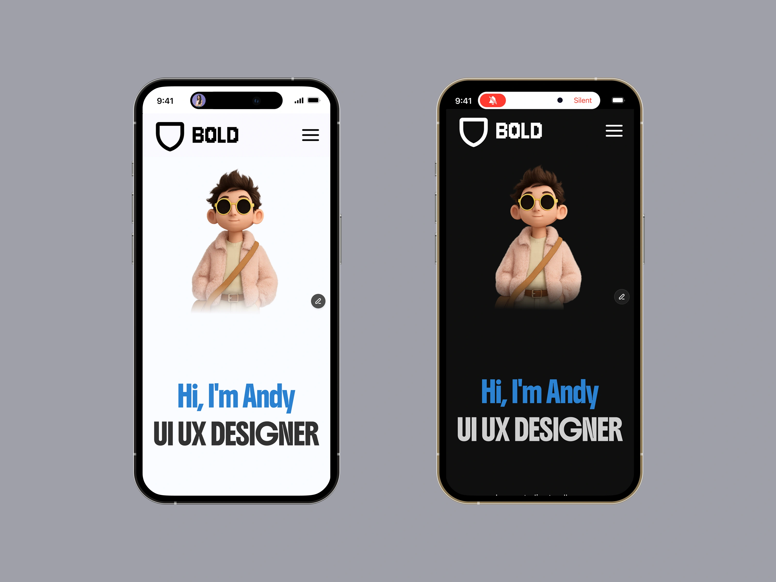
📱 Seamless Mobile Responsiveness
Great design must look flawless on every screen size. I meticulously optimized both the Dark and Light modes of BOLD for mobile devices. By focusing on fluid typography, carefully proportioned spacing, and finger-friendly interactive touch targets, the mobile layout maintains the same high-impact, premium feel as the desktop experience.
Adaptive Layouts : Grid systems and flexbox containers adjust dynamically to fit all modern smartphone viewports.
Consistent Identity : Iconography, font weights, and the customized 3D character remain perfectly scaled and aligned on smaller screens.
Like this project
Posted Jul 14, 2026
Premium agency portfolio landing page designed in Figma and developed in Framer. Features a modern dark theme, clean layouts, and smooth responsiveness.
Likes
0
Views
15