YouTube: Creating an Autoplay List Feature
YouTube: Creating an Autoplay List Feature

Overview
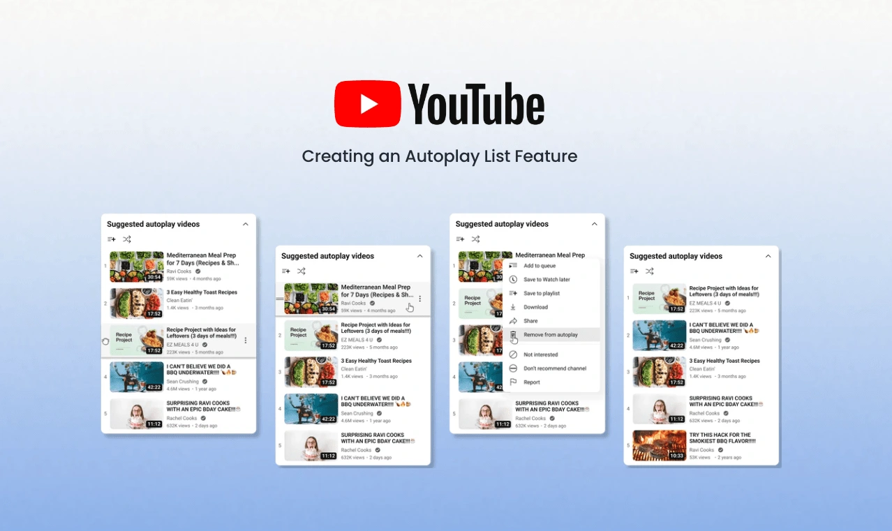
The autoplay list is a new feature for YouTube that shows the user a visualization of the list of videos that YouTube plays when autoplay (an existing feature) is turned on. The feature enables users to customize their video queue by rearranging, adding or removing videos.
Background
With 2.68 billion active users, YouTube is an extremely popular website. Over half of all internet users visit the site each month due to its gradual and thoughtful innovations.
Problem
YouTube's ability to evolve without feeling unfamiliar keeps it relevant. I aim to understand users and find opportunities for new features.
Role:
Product Design Lead (UX/UI)
UX Researcher
Timeline:
80 hours (4 weeks)
Tools:
Figma, Zoom, Otter AI, Useberry, Canva
Goal
Create a seamless, user-enhancing YouTube feature that complements the existing UI and addresses user pain points, with thorough testing for usability and user benefit validation.
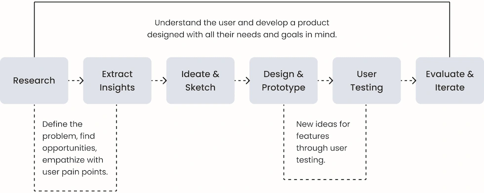
Design Process
Research
YouTube Market Research Discoveries
62% of internet users in the U.S. that use YouTube daily.
1 billion hours worth of videos are viewed by users daily.
53.9% of users are men, and 46.1% are women.
YouTube is the fastest growing video sharing website in the world and is the second-most popular search engine after Google.
While YouTube's algorithm is useful, it can also have negative impacts (validated in the user interviews).
With such a wide variety of videos, it can be difficult for a user to know which video is good quality.
A big issue for users is that there is no content quality regulations.
The majority of users are 25-34 years old.
Analyzing the Competitors
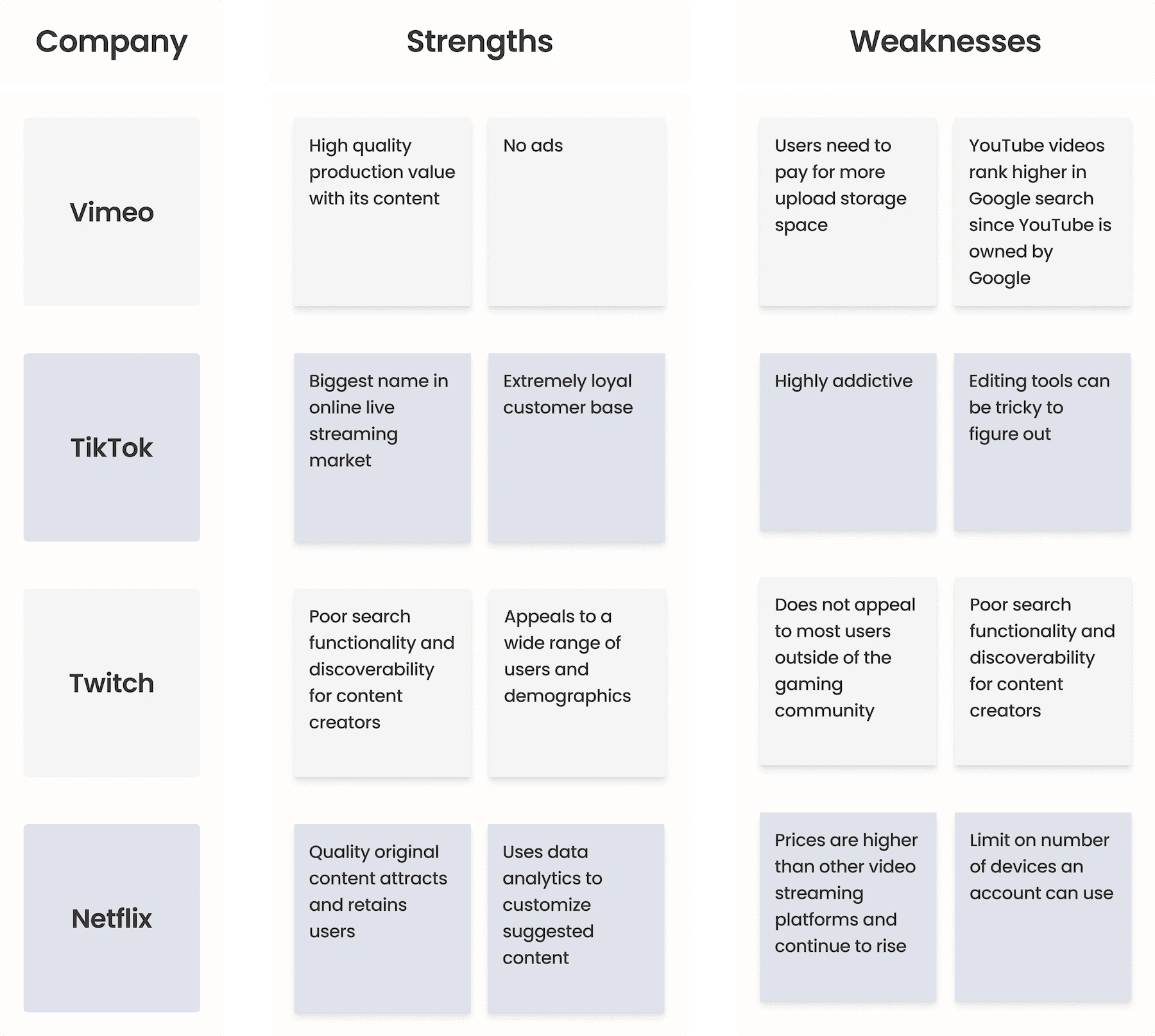
Vimeo, unlike YouTube, focuses on professionals, offering a clean interface and charging creators for storage, without ads.
Netflix competes with YouTube as a video streaming platform, while YouTube offers YouTube TV for movies and shows.
YouTube competes with Twitch by featuring a 'gaming' section with both live and uploaded content.
TikTok is YouTube's main competitor, with both offering short-form content like YouTube's 'Shorts'.
Key Discoveries from User Interviews
All of the participants said they have YouTube on while they work.
Users report finding the algorithm helpful, particularly in suggesting content.
Many individuals frequently utilize YouTube as a search engine to find tutorials and resolve work-related issues.
Users heavily rely on the algorithm's recommendations as much as they rely on searching for content.
The most commonly used feature is the comments, most participants enjoy reading the comments finding them either useful or entertaining.
Participants expressed frustration with being suggested content they have no interest, heavily dislike, or are morally opposed to.
Other popular features are playlists and playback speed options, as users find them useful when a content creator speaks too slowly.
Several participants ended up learning, networking, or discovering skills through YouTube that led them to their getting hired for their dream jobs.
Extract Insights
"YouTube is a life-saver, it has made learning, sharing, and exploring an endless journey."
Nas Daily
Since YouTube is such a popular and widely used platform, the bulk of my insights for this project came from the user interviews. As every participant interviewed uses YouTube while working, I knew that common thread would be prioritized throughout the ideation phase.
Affinity Mapping for User Research Synthesis
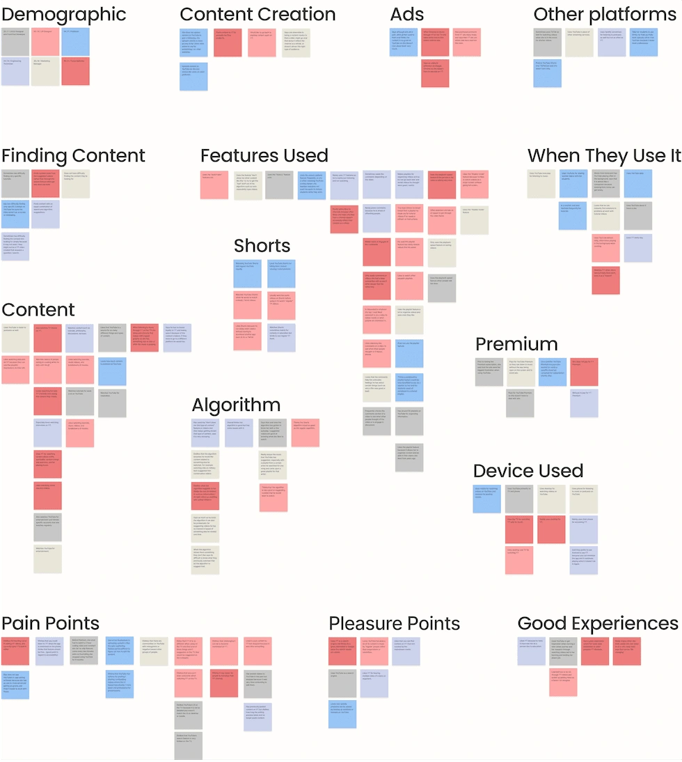
Defining User Goals & Needs
Insight: Users want to be able to customize and have more control over their watching experience.
leads to…
Possible solution: Implementing efficient user feedback mechanisms can increase happiness and trust.
User Needs
Users want algorithm-suggested content to accurately reflect the types of videos they want to see.
When playing YouTube in the background, users should be supported while multi-tasking.
It is crucial to prioritize quality and trustworthy content discovery.
Pain Points
As users are annoyed with ads, it's important the feature is seamlessly integrated with no extra steps.
Although the algorithm satisfies most users, it could be improved to reduce suggestions for undesirable content.
YouTube's UI on TVs is strongly disliked due to its inconsistency with the experience on other devices.
Ideate
Point of View
I watch a lot of videos and find the options overwhelming, there are so many videos I want to watch and I'm not sure which ones to prioritize.
How Might We…?
How might we enhance the multitasking capabilites for YouTube users?
Although users utilize and enjoy the algorithm-suggested videos, they expressed frustration with the lack of customization and control over what algorithm videos appear. Despite wanting more customization and control, the playlist feature is underutilized by users.
Due to user needs and pain points, the discoveries showed an importance on giving users more control and customization with the algorithm-suggested videos. Additionally, the feature should not require users to navigate away from whatever video they are watching.
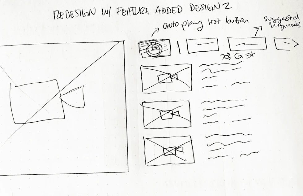
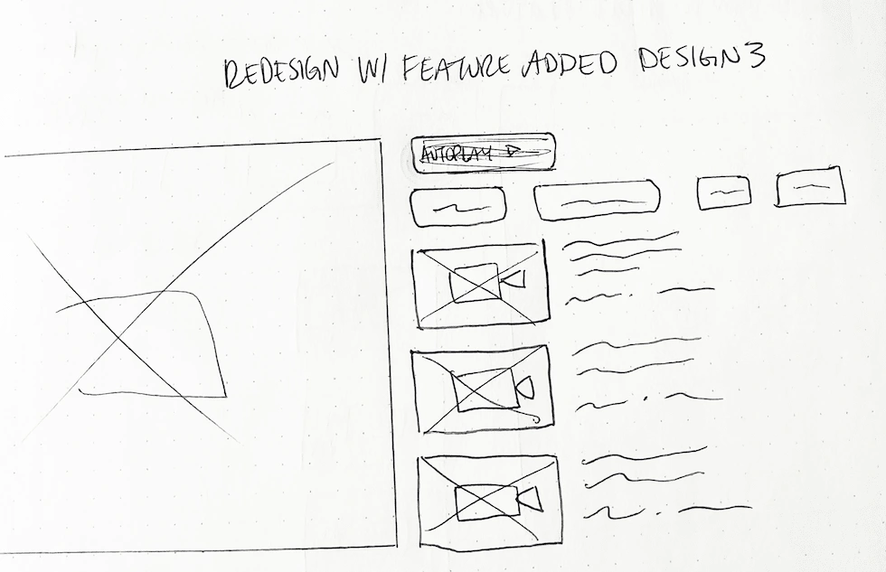
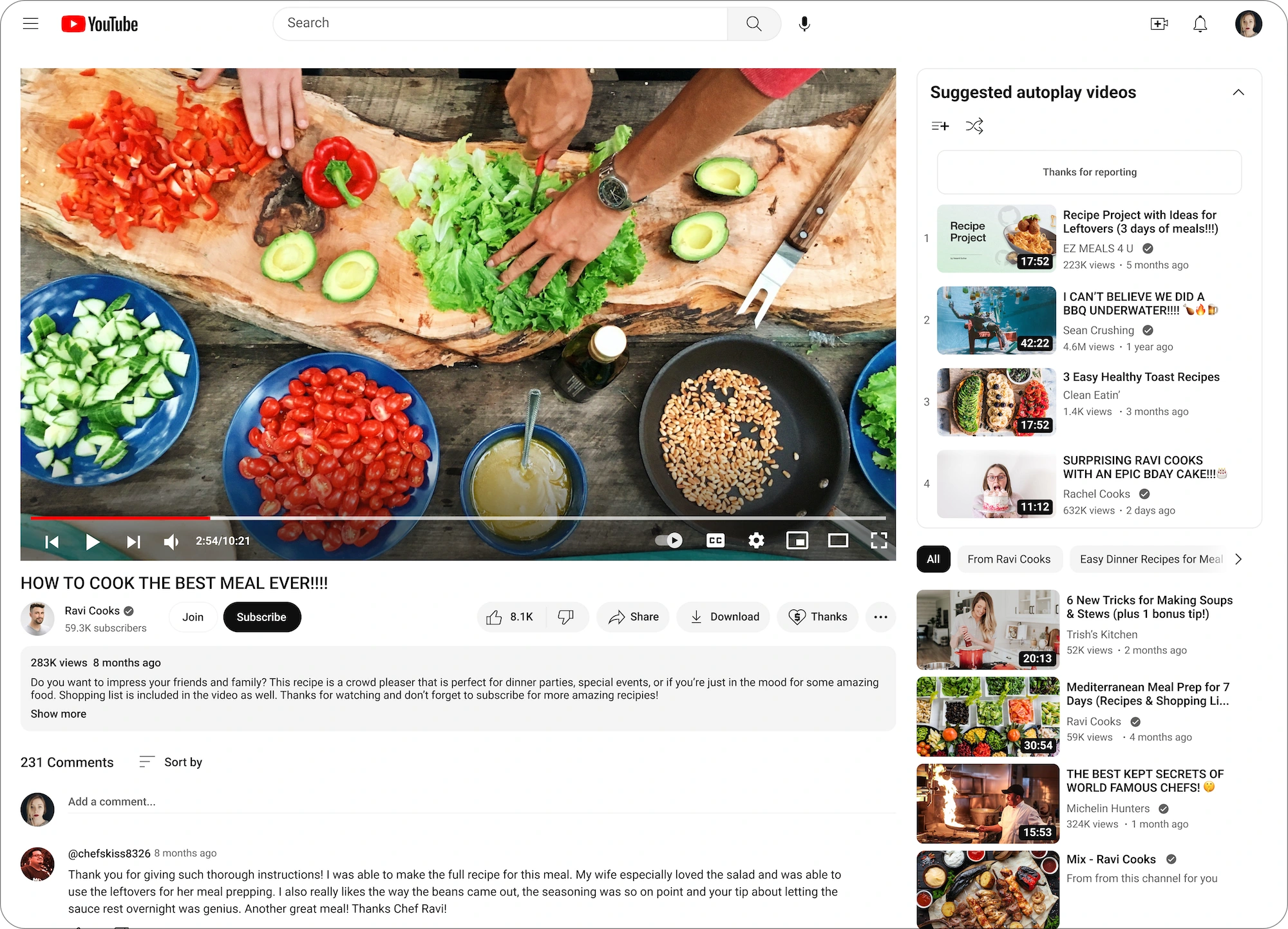
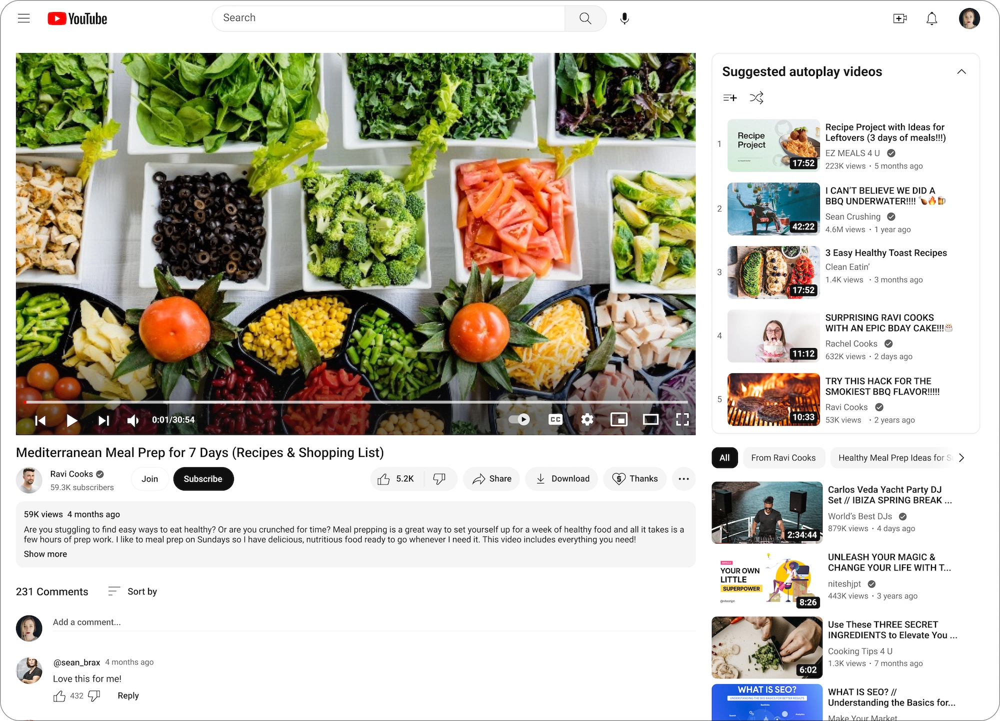
Defining the Feature: YouTube's existing autoplay feature only shows the user the next video. I want to create a feature that allows users to see a list of upcoming autoplay videos with the ability to adjust, remove, or rearrange them.
This will save users time and prevent interruptions during their viewing sessions.
Key Feature Functions to Include
A button which appears when autoplay is turned on and expands the video list.
A list display of the videos that will play next with autoplay.
Include existing UI for videos in the autoplay list such as functions like “add to playlist”, “not interested”, etc.
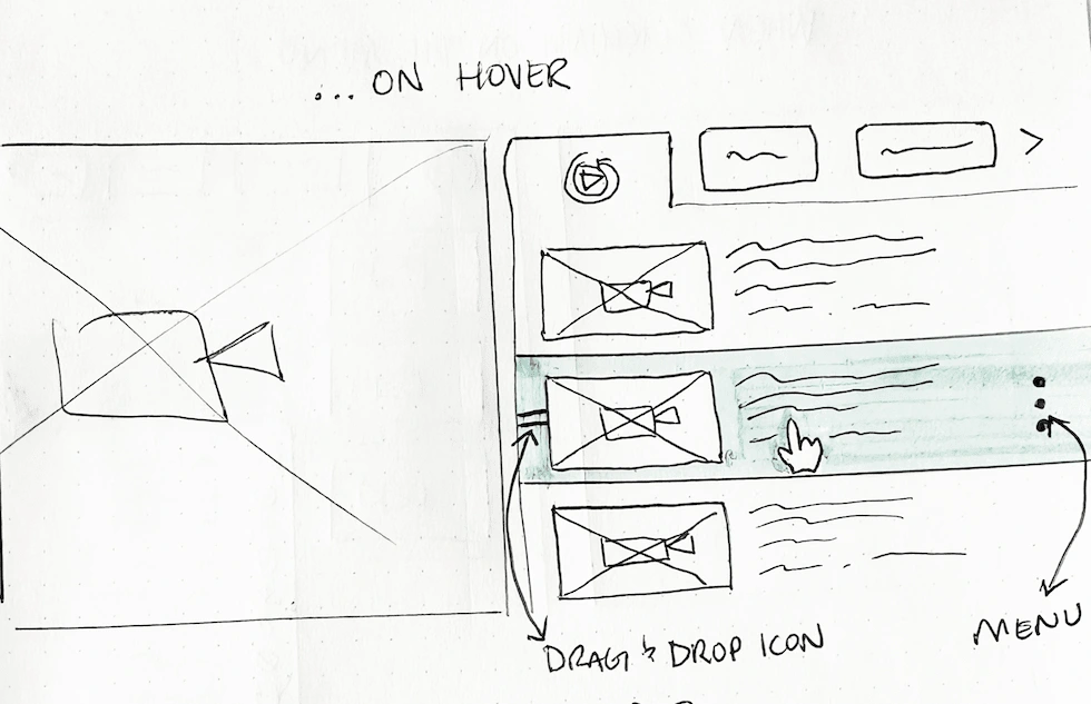
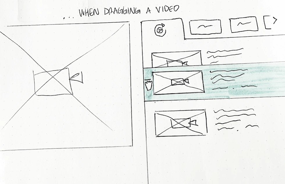
Drag and drop capabilities to rearrange the autoplay video list order.
Auto-replace removed videos to maintain the number of videos in the list.
Design & Prototype
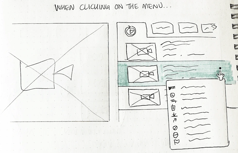
Low Fidelity Wireframe Sketches
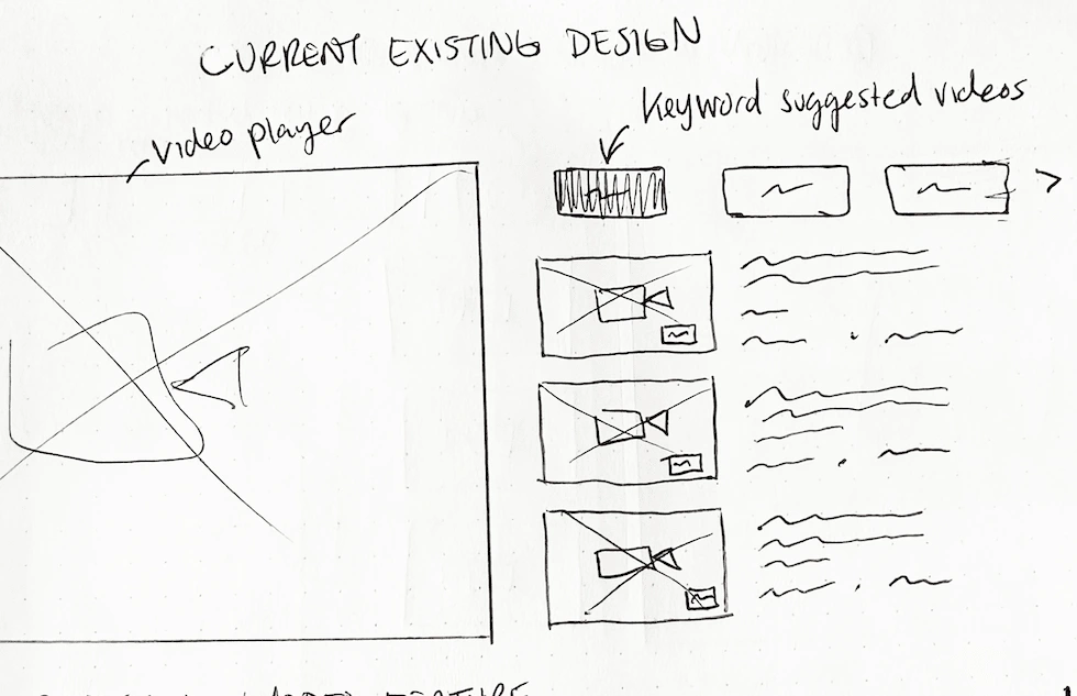
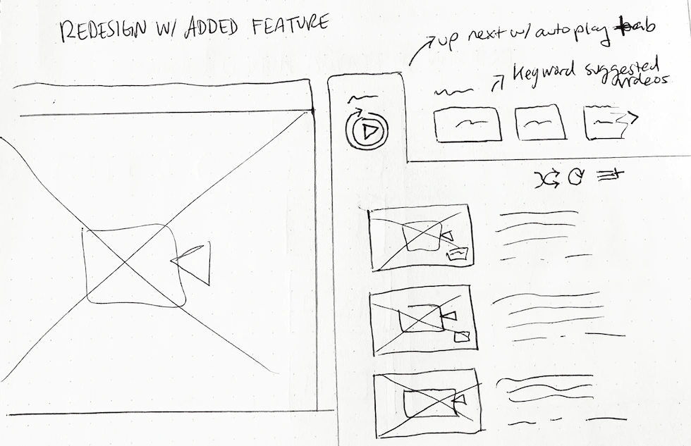
An Additional Insight
After creating low-fidelity wireframes in Figma and referencing YouTube's UI components, I noticed an overlooked feature: YouTube's existing queue feature (shown in the photos). This feature lets users add suggested videos to a priority queue, followed by algorithm-suggested videos once the queue is complete.
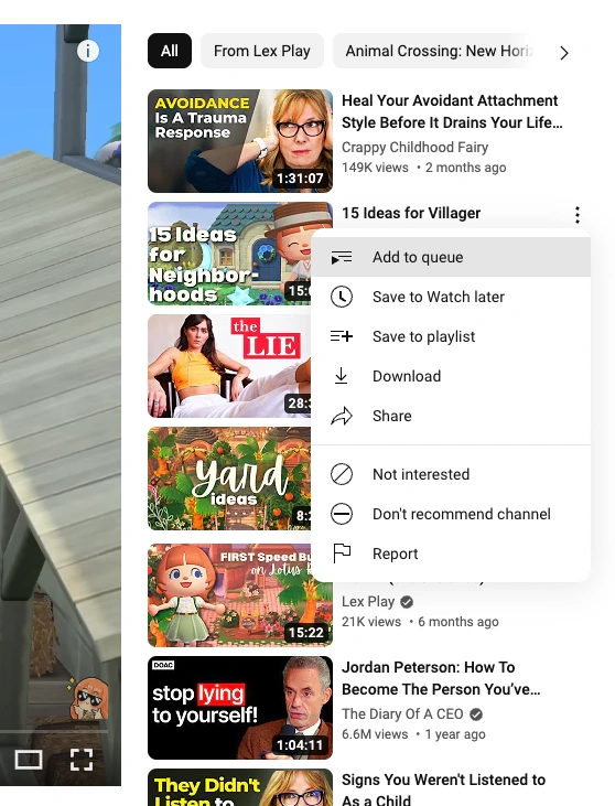
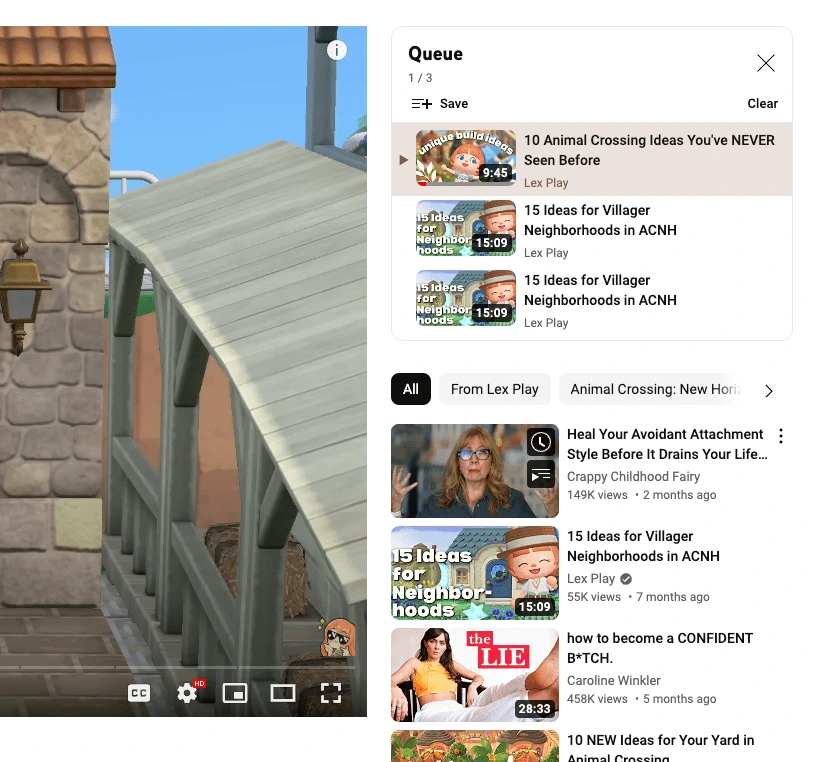
I reached out to the users I previously interviewed. Despite being daily YouTube users, no one was aware that this feature existed.
Due to time constraints, I decided to proceed with this project. Although I had concerns that the feature I designed was similar to the existing queue feature, I was able to validate its use for the following reasons:
Autoplay can bring attention to the queue feature and promote interaction with overlooked components.
The autoplay feature fulfills a user need for customization in the watching experience which was validated in the research.
The autoplay list is algorithm-generated while the queue is user-generated.
Users prefer algorithmic content to building their own queue.
Replicating & Integrating YouTube's Design Library
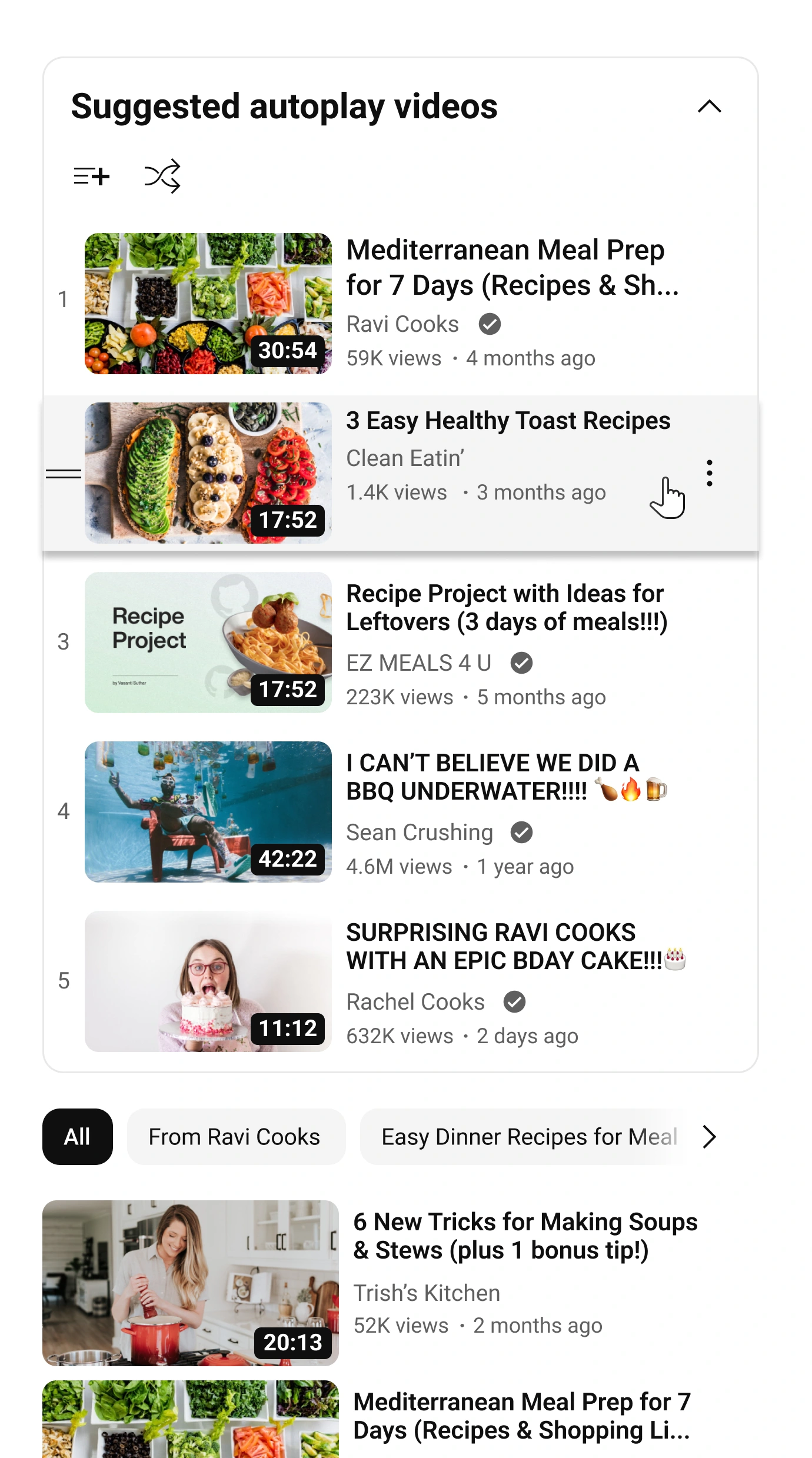
YouTube's existing UI was used as the foundation for new components in the autoplay list. Typography, colors, buttons, etc. were copied from the website, while to-scale screenshots ensured consistency in sizing for icons and menus.
Functions and micro-interactions were designed to work exactly like other features, ensuring seamless integration with the existing UI and easy navigation for users.
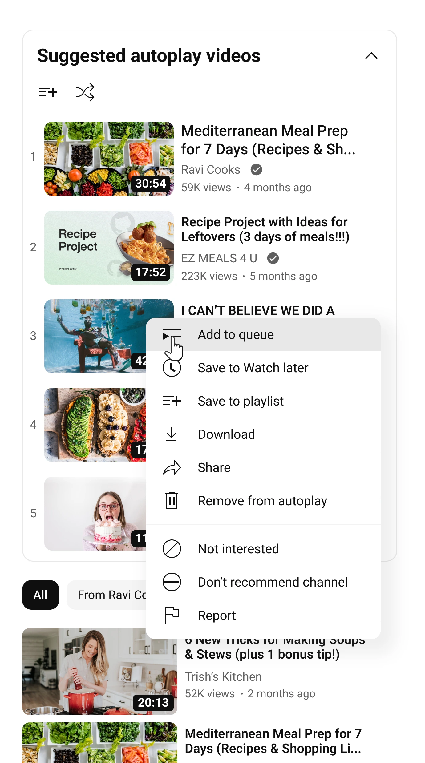
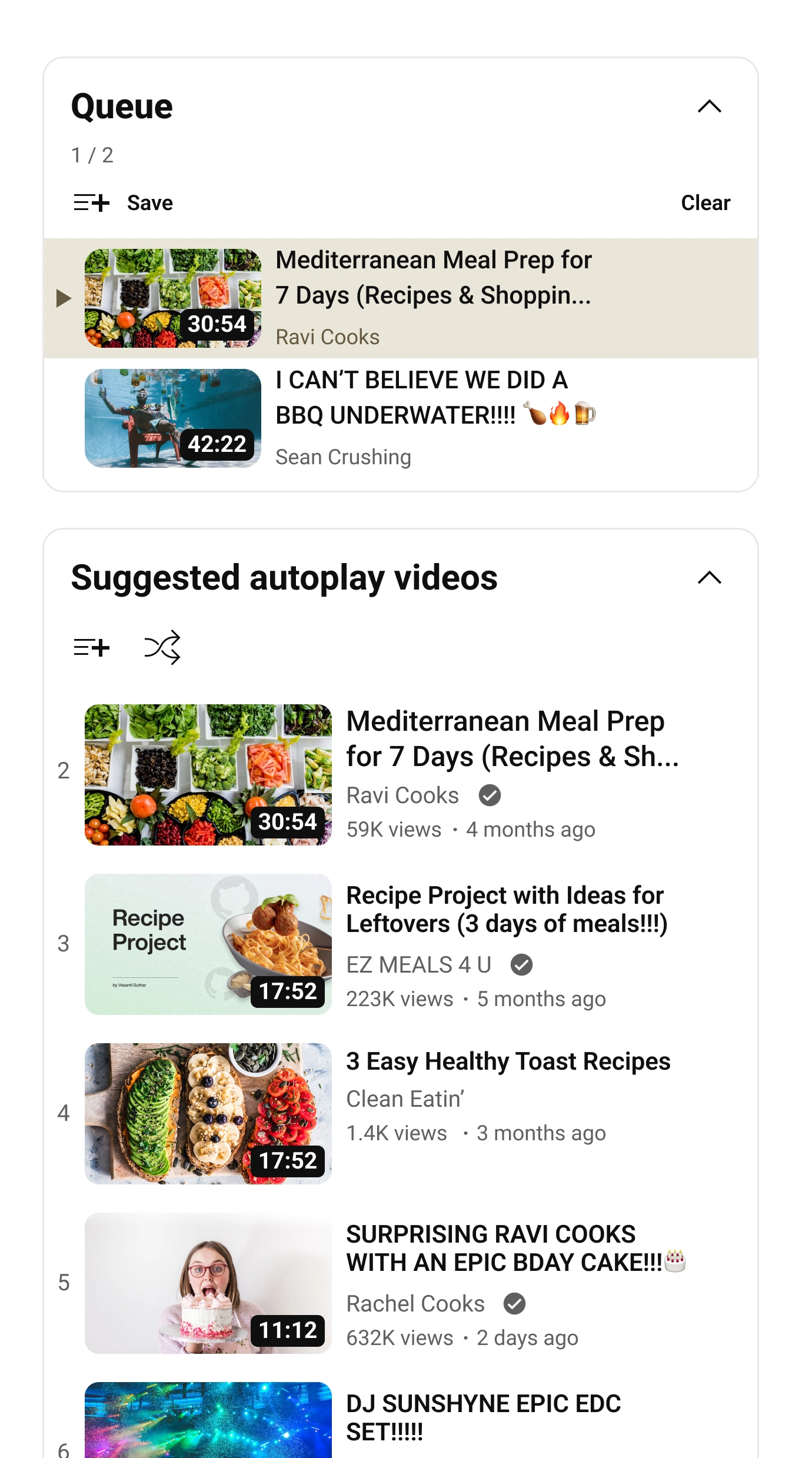
High Fidelity Wireframes
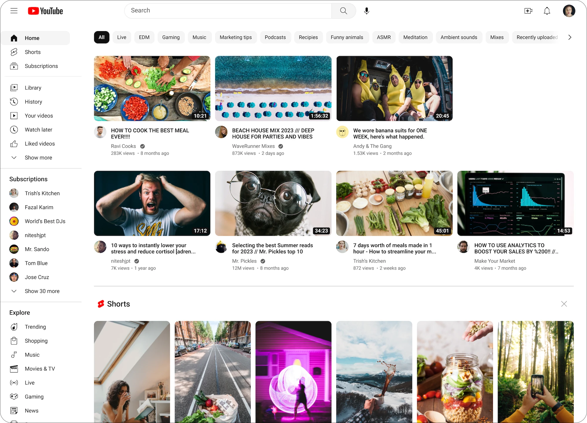
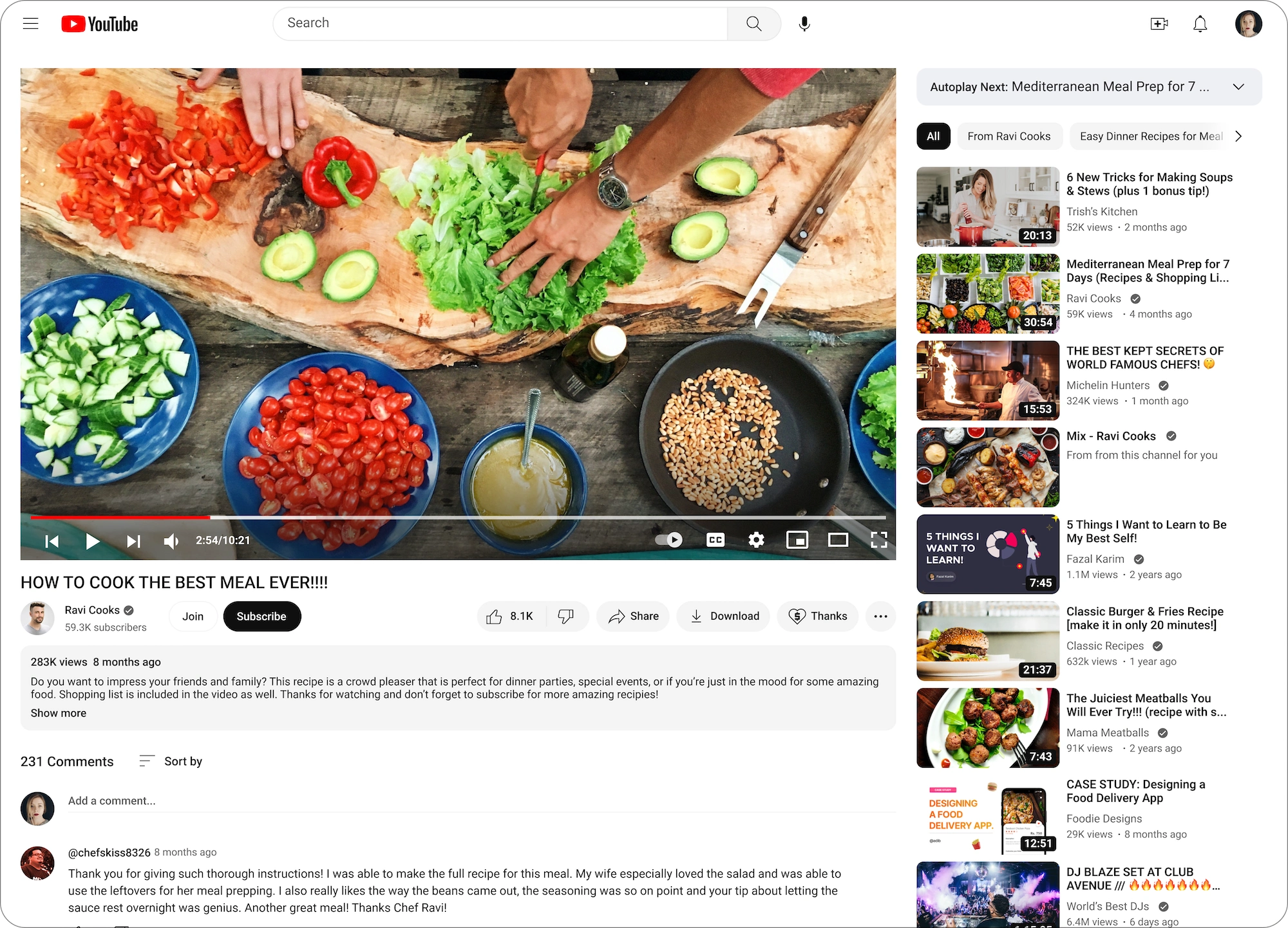
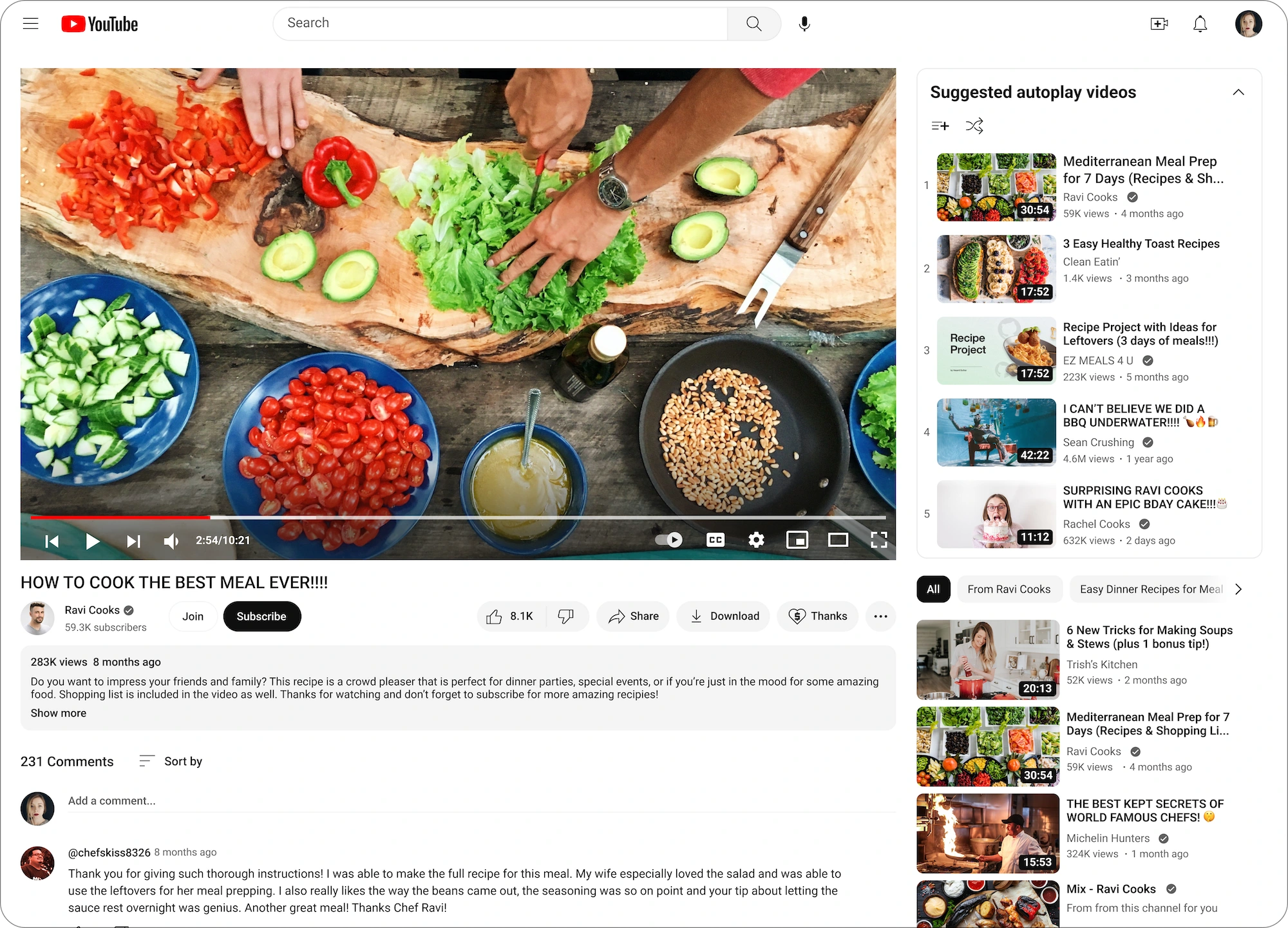

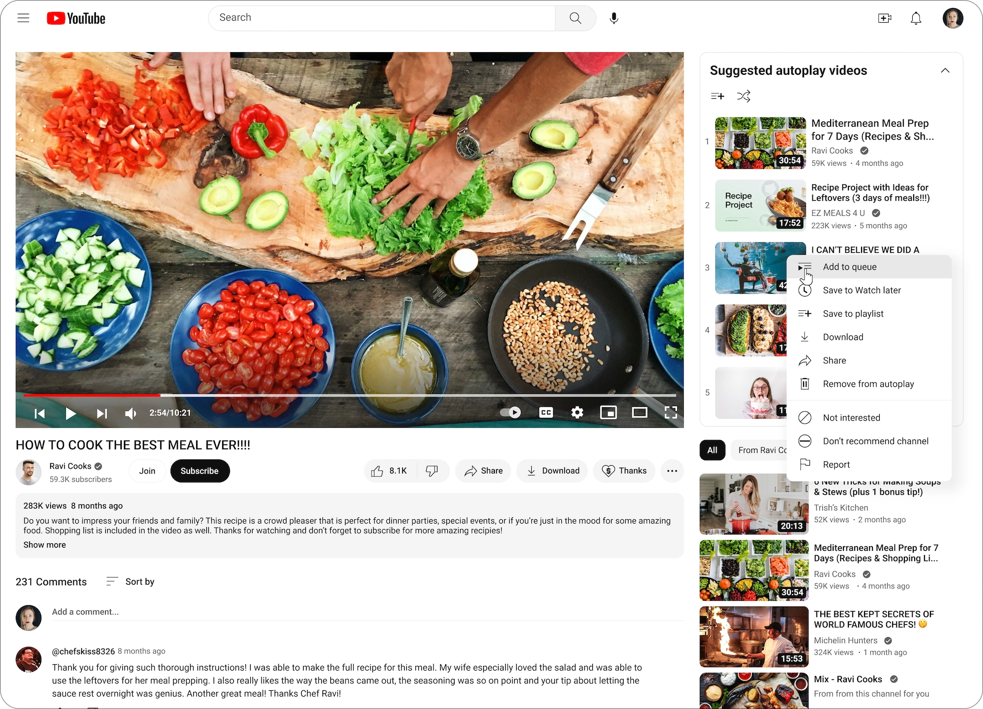
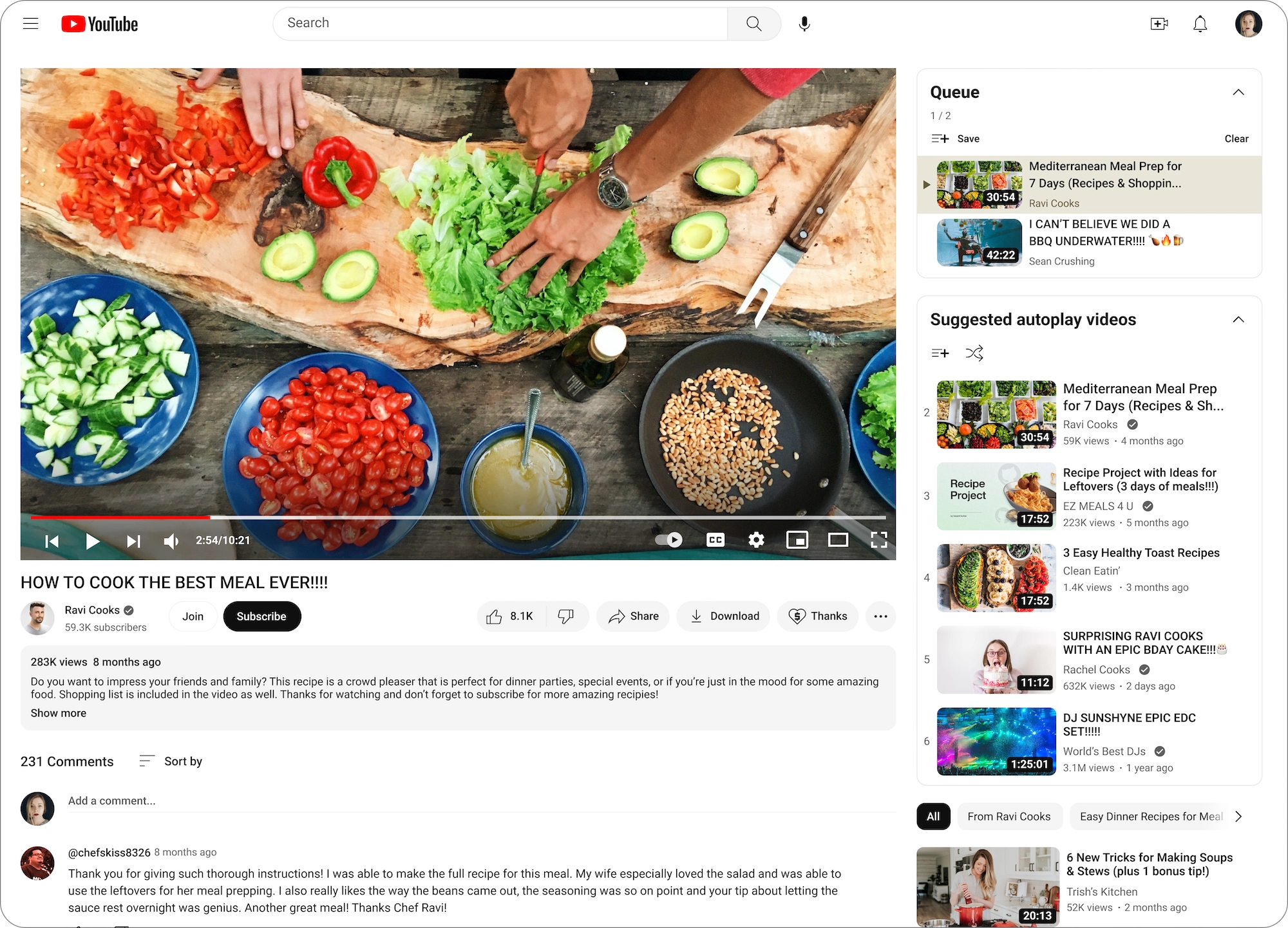
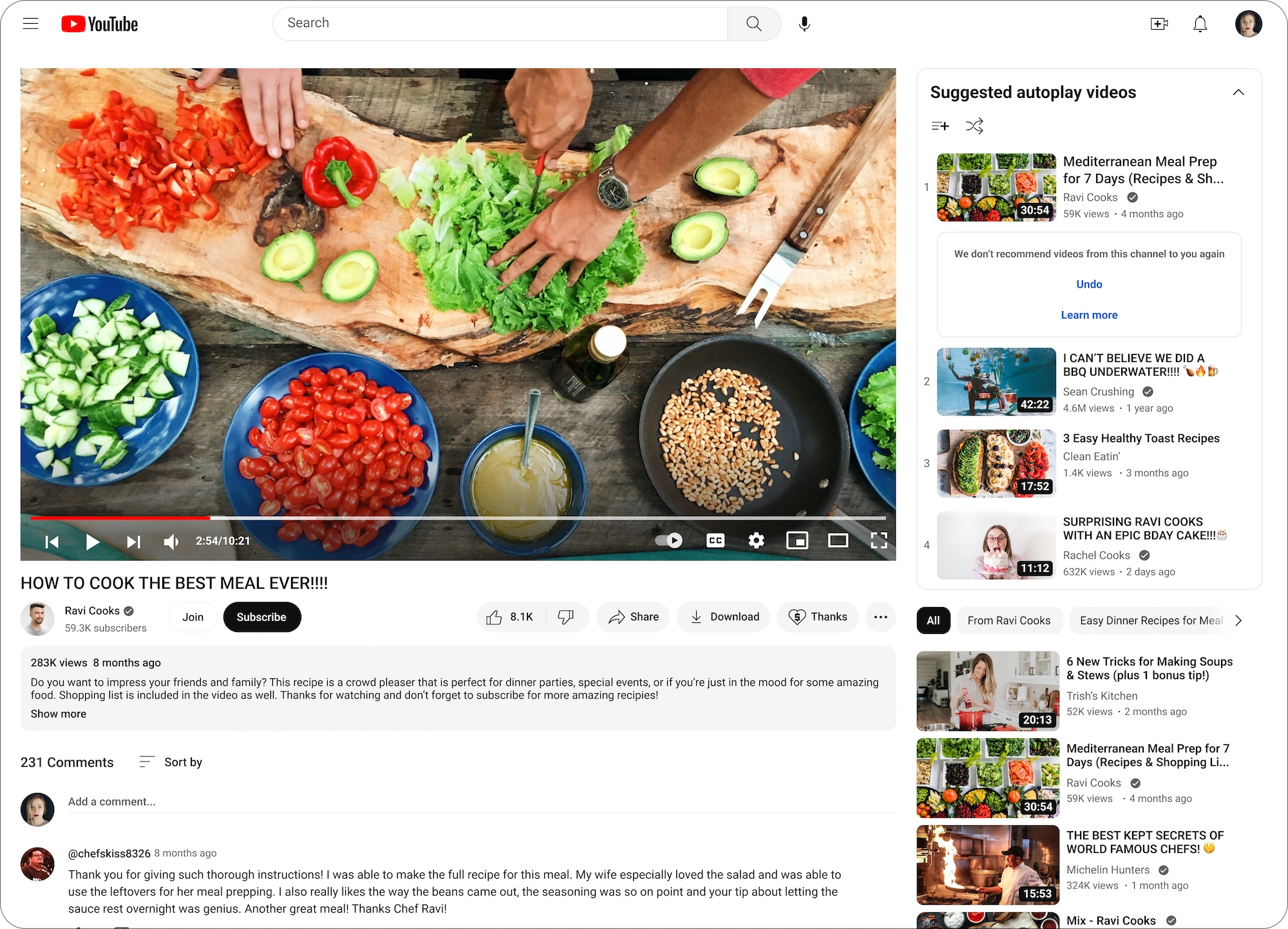

Prototype
Of all the projects in my portfolio, this one is arguably the most complex in regard to prototyping. The bulk of the prototyping involved programing the various features available in the video menu list. Each video needed its own menu with corresponding components in order to maintain accurate interactions. Due to time constraints I was unable to program every possible option.

User Testing
Overview
13 testers unmoderated virtually in Useberry
Age ranged from 25 - 57
7 men and 6 women
92% are daily YouTube users
4 tasks: Turning on the autplay list and using its various functions.
Success Metrics
Users can complete the tasks within set time.
The user does not encounter any blocks while completing tasks.
Overall the user finds the tasks and product to be easy and enjoyable.
Rating scale questions have an overall favorable rating of 80% or higher.
84.75%: The total average of testers who rated the tasks as "very easy"
43.35 seconds: Average time for task completion, all tasks done within set metrics
70%: Strongly disagreed that the system was unnecessarily complex
Insights & Feedback

Despite receiving some neutral ratings on the numerical scale, user feedback regarding challenges, usability, and preferences for individual tasks was generally positive. This suggested there were no significant design of functional issues with the prototype.
After reviewing the test results, I conducted further inquiries with testers to identify any potential areas for improvement. Here are the key findings related to user's challenges:
Autoplay Unawareness
The Issue
It's understandable that some users didn't realize that there is an autoplay feature currently available in YouTube.
Analysis & Troubleshooting
This is an issue with YouTube's existing UI, not the feature itself.
Changing the autoplay button size may disrupt overall UI consistency.
Autoplay shouldn't have heirachy over other elements (e.g. closed captioning, settings, full screen) as they're equally important.
A hover label was implemented in the prototype to inform users about the autoplay status before clicking on it.

"On the current YouYube platform the autoplay feature is new to me. So trying to locate the button was difficult at first" - User Feedback
"If I wasn’t a frequent YouTuber, I might not know the feature exists, but overall a really great execution!" - User Feedback
"I’m not super familiar with the Youtube buttons so finding the autoplay button was tricky at first." - User Feedback
The Impact of Figma Limitations
The Issue
Due to Figma limitations, certain functions in the prototype couldn't be fully realized, impacting the testing of the proof of concept.
Analysis & Troubleshooting
Multiple click triggers were unnecessary for proof of concept as they were for functions in YouTube's existing features. However, the inability to program multi-click triggered led to limited function utilization.
I couldn't program videos to follow the mouse precisely during dragging like YouTube's UI.
Drag functionality was improved by adding a drag icon on hover and triggering video order positions on drag. Time constraints limited complete programming of drag options.
The prototype interactions necessary for proof of concept exceed MVP requirements.
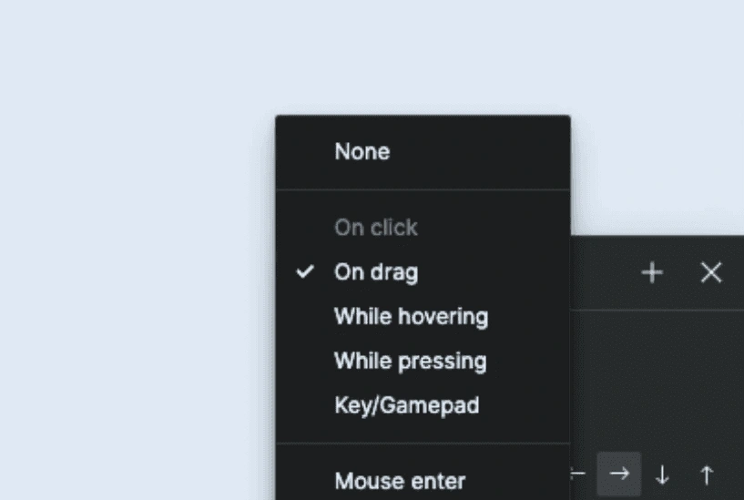
"The only qualm was with the dragging feature. I know the drag feature on YouTube site isn’t as finicky." - User Feedback
“Very easy to use and keeps the videos in the order that I like.” - User Feedback
“Easily integrated into the YouTube platform and the UI. All the patterns are expected and it was intuitive to know what to do.” - User Feedback
Complex Testing Process
The Issue
The prototype requires precise and complex steps to function as intended, impacting usability ratings due to its intricate nature.
Analysis & Troubleshooting
Tasks must be completed in a specific order due to the prototype's complexity.
Testers struggled with testing steps, impacting learning and complexity ratings.
I prioritized maximal interaction options over simplifying the prototype in order to emulate a realistic experience.
The original wireframes included 10 videos, but I reduced it to 5 to simplify.

“No issues. Just needed to review the instructions carefully.” - User Feedback
“I liked the organization and ease of use once I understood the pathway.” - User Feedback
"Overall, it functioned as expected and everything worked great! Your instructions were very clear." - User Feedback
Minor Accessibility Issues
The Issue
Testing encountered accessibility challenges with text size and language comprehension among non-native speakers, but these were due to testing conditions, not prototype design.
Analysis & Troubleshooting
Although I used the largest possible testing viewport, the prototype could not be tested at 100% scale which made the text appear smaller.
The prototype was designed to scale with YouTube, and all font sizes were copied exactly. Therefore, the issue was with the testing viewport rather than the prototype design.
Due to language barriers, some non-native English speaking testers were confused by the testing instructions.
ESL testers had no issues with functionality after understanding how the feature works.
“Some of the text is a bit small because I can't view it full screen like if I was using YouTube in real life.” - User Feedback
"I only had problems with the terminology but that is just me." - User Feedback
“Once I figured out the pathway it was easy.” - User Feedback
Evaluating & Iterating
Careful Consideration to Not Iterate
Based on user feedback, there was no need for additional iterations as the prototype worked as expected. Issues that arose during testing were not due to the prototype or design, but rather complications in the testing process.
As I could not discover any changes to make validated by user testing or feedback, it did not feel appropriate to iterate the prototype.
My mentor and UX peers confirmed that the prototype worked as expected, and while they recommended further exploration of the feature in the future, no specific issues required attention.
Final Product
Final Thoughts
The MVP prototype for the autoplay list feature on YouTube yielded positive results and valuable insights. With a success rate of 90% across all tasks, testers found the feature to be user-friendly, intuitive, and easy to navigate.
Despite some challenges, no major issues with the prototype's design or functionality were identified. That being said, the project still provided some great insights into user experience.

Key User Discoveries:
YouTube is a key component in the work of users not just as a tool but also for background noise, and even for dream job discovery.
Users value options that allow them to customize and personalize their experience.
Users heavily rely on algorithms to discover content and feel a strong emotional connection to them.
Despite holding the algorithm in high regard, users get upset when the algorithm doesn’t get it right, which further validates their need for customization.
Design Takeaways:
In the design process, it's crucial to consider Figma's limitations as they can significantly impact user experience.
Testing and flows should be designed with instructions that are as minimal and simple as possible, so as to not overshadow the user experience of an MVP.
Accessibility needs to be considered and prioritized not just in the prototype design, but in the testing experience as well.
Thank you for checking out this case study!
Market Research Sources
YouTube: Press Page
Global Media Insight: YouTube User Statistics in 2023
Brandwatch: 54 Fascinating and Incredible YouTube Statistics
Demand Sage: YouTube Statistics - Insights and Infographics (2023)
Pew Research Center: Social Media Fact Sheet.
Hootsuite: How the YouTube Algorithm Works in 2021: The Definitive Guide.
Google: How Video Empowers People to Take Action.
The Social Shepherd: 23 Essential YouTube Statistics You Need to Know in 2023
Statistica: YouTube’s Advertising Revenues as Percentages of Google’s Global Revenues from 2017 - 2022
Fortune: YouTube has paid out $30 billion to creators as the competition for online content intensifies.
Like this project
Posted Aug 12, 2024
Made with Framer
Likes
0
Views
9

