Landmark Lookout Lodge - Arizona

Kartik Joshi
SEO Specialist
UX Designer
Web Developer
Figma
Google Analytics
WordPress
As a freelancer, I worked on a project to improve the Landmark Lookout Lodge website, the lodge had been recently sold to a new owner who wanted to have a more digital approach. This site provides information and serves several important purposes aimed at attracting and engaging potential guests, enhancing their understanding of the property, and facilitating the booking process. My objective was to enhance the overall user experience and improve the user interface.
🎉 Goal of the project: Create a website that would enable offline and online visitors of the lodge to trust them and convert them into leads or possible clients
To achieve this, I conducted a thorough analysis, added a mobile responsive experience, upgraded the interactive components, and improved the content classification.
TABLE OF CONTENT
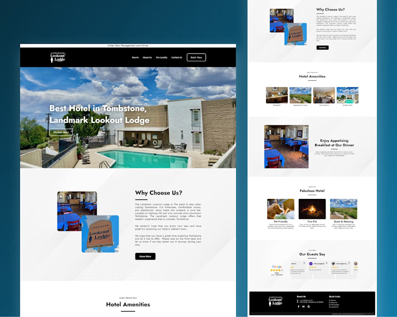
Home page of the redesigned website
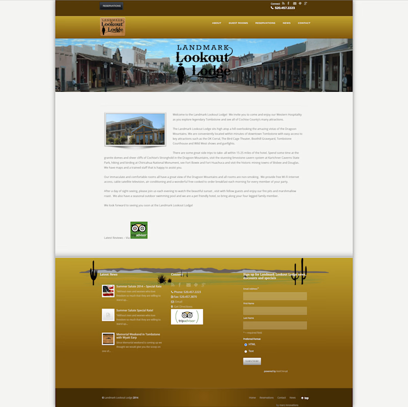
👎Problems Previous version of the website
⭕ Not mobile and tablet responsive
⭕ Lengthy checkout process (low conversion rate)
⭕ Lack of user engagement (Confusing User Interface [UI])
⭕ Lack of audience-friendly interface (Difficult to locate products/services)
⭕ Technical glitches: Bugs, crashes, slow loading times, and other technical problems
⭕ Lack of personalization: Generic content that doesn't cater to individual user preferences
✅ Audience-friendly Interface:
Clear and concise navigation: Use simple, easy-to-understand labels to book the hotel and look at the amenities and other freebies.
Google Reviews Sections: Established a more information-detailed website and displayed trust for the audience.
Optimize Information Architecture: I reorganized how information is categorized and presented on the website.
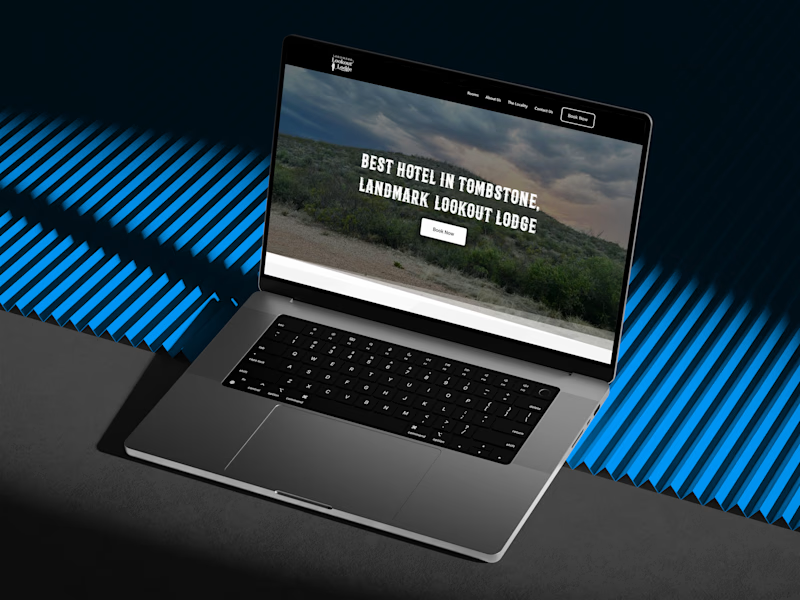
User Interface of the home page
✅ Precise and Attractive UI:
Visual hierarchy: Use design principles like brand colors, and spacing to guide users' attention towards important information and calls to action.
Relative elements: Images and videos of all the festivals, events, and parades held in Tombstone.
UI simplification: Prioritized user goals and made key functionalities easily accessible.
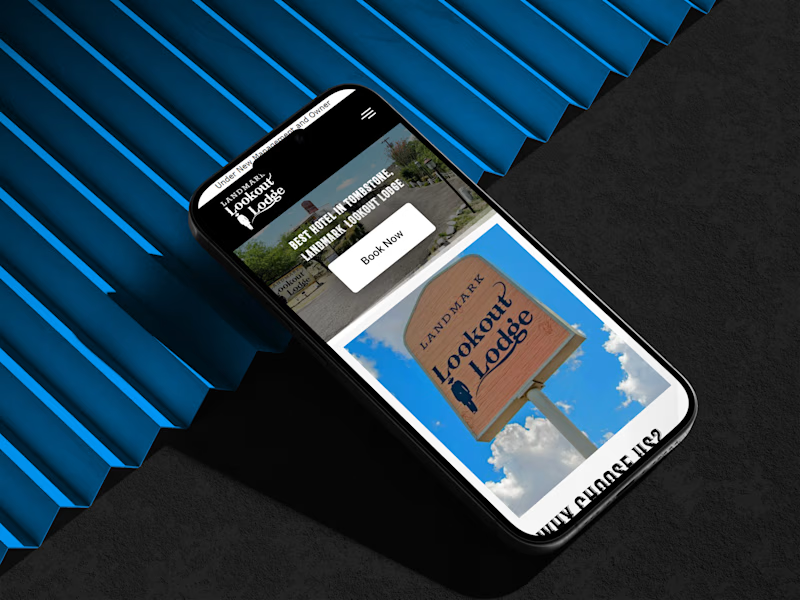
Mobile version of the website
✅ Mobile and Tablet Responsive:
Responsive design: Implement responsive web design (RWD) principles to ensure the website or app automatically adjusts its layout and functionality to display optimally on various screen sizes (desktops, mobiles, tablets).
Touch-friendly elements: The buttons, menus, and other interactive elements are large enough and spaced appropriately for easy touch interaction on multiple devices.
Testing on multiple devices: Thoroughly tested the website or app across different devices and operating systems to ensure a seamless user experience on all platforms.
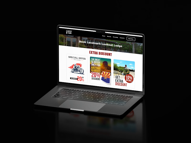
landing page in action
✒️ UI Design
The brand had no proper identity, but the logo was already printed in the lodge's location, so the clients didn't want to change it. I designed the page using a light theme to ensure proper visibility and readability for the reader. After establishing the UI guidelines and having a website that highlighted the lodge's key benefits while making the website more attractive.
Design decisions that improved the UI:
Responsive Layout: The readers would often leave after looking at the PC version of the website on mobile and tablets as the letters, icons, and images would be tiny.
Consistent interaction patterns: Users have to interact with multiple elements, The previous version had multiple different ways throughout the interface, which created a learning curve and reduced overall usability. So I made sure elements such as buttons fonts, and colors were even.
Neat and minimalist(client's request) aesthetics: The previous website had excessive use of different colors, fonts, and cluttered visuals that created a visually distracting experience. So the new version had a more professional, minimalistic, and neat UI that allowed the user to easily navigate throughout the website and reduce the bounce rate
🧑💻UX Design
The previous version of the website had limited and inaccurate content about the lodge, the location, and the locality. There was a higher bounce rate on their landing page. Users would often leave before even looking at the details as the UI made them feel unsure about the legitimacy of the website.
Increased Conversion Rate: Users would click on the click now button which would have directed them to booking software. However, adding an extra page with attractive offers and Google reviews, removed the blockage in the conversion funnel.
Lesser Bounce Rate: After designing a more attractive UI the landing page of the website also was upgraded and featured content that helped the users contact the lodge.
✅ New Booking Process:
Straightforward CTA: In the previous version of the website the users couldn't identify the website. Showed discounted rates and more in the
Streamline booking process: I reduced the number of steps required to complete the checkout process to 5. I also considered guest checkout options for the users for users who didn't want to receive our newsletters.
Clear and concise checkout page: I ensured the checkout page was free of clutter and distractions. Highlighted key information like the total, taxes, and other policies.
📈 SEO
Clear value proposition: The website communicates what Mandovi Cruises offers (boat cruises in Goa) and its unique selling points (unbeatable priced, reliable, professional, safe, and award-winning).
Call to action: The website includes clear calls to action, such as "Book Now" buttons, which make it easy for users to book a cruise.
Sitemap: Sitemaps Allow Users to easily navigate to the important pages of the website. They are structured listings intended for web crawlers such as search engines.
Upranking: The website began appearing on top of search results when looking for cruises, boats, and more in Goa.
🚚 Final Website Delivery
The final website effectively communicates the company's offerings, simplifies user interaction, and allows users to trust the website. The website aligns with the end goal of the client to advertise and grow their online presence. Now with their new mobile-friendly design they can reach a larger audience and reduce the bounce rate on their website by a big gap.
Overall the client loved the website and did see growth in their website traffic which increase their conversion rate on their website.
📈 Impact and Outcomes
The new website played a crucial role in educating users about their services and enhancing brand familiarity.
The SEO served the cruise booking platform to increase brand awareness
Significantly improved user understanding of the brand's offerings and online presence.
Increase in sales via an increase in trust and decrease in friction points in the conversion funnel.


