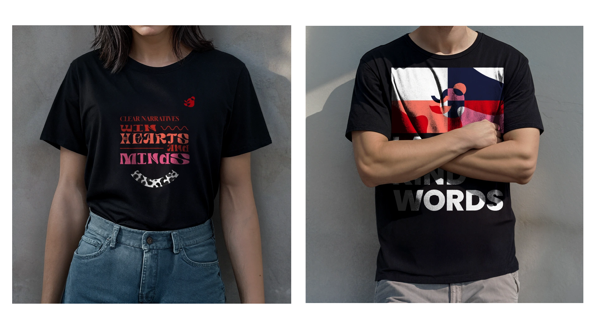
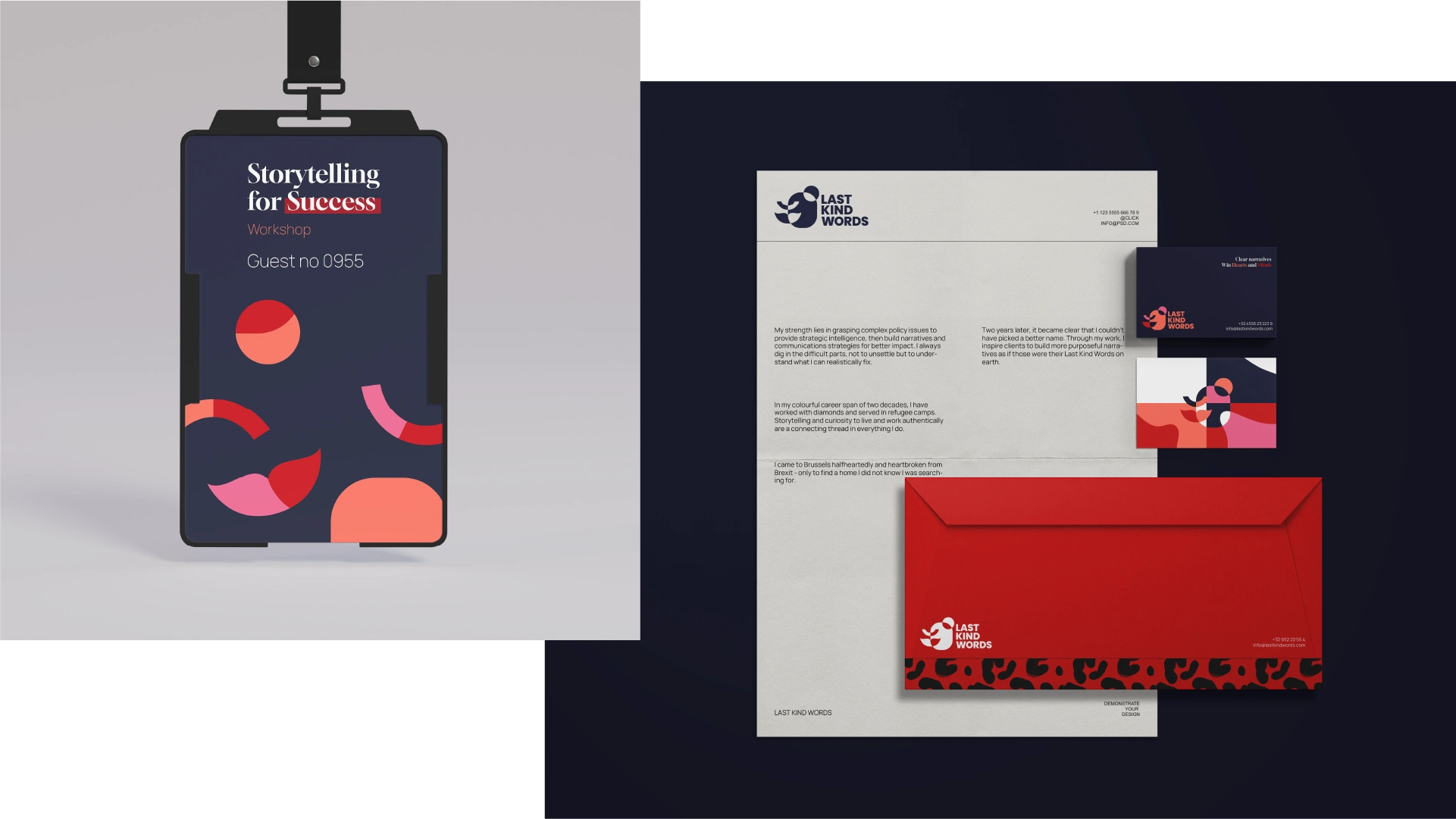
Visual Identity Development for Last Kind Words
Last Kind Words is a brand born from a deep connection to the blues, inspired by the haunting song by Geeshie Willie. For Jeta, the founder, she knew deep down that her love for blues and her expertise in strategic work were always destined to blend, creating something truly unique. Jeta's approach to both work and life mirrors the rawness and strength found in the women of blues—a spirit that, at first glance, might seem out of place in the polished EU Bubble. But as one gets to know her, they soon realize just how much they need someone like her.

When we collaborated on developing her brand, Jeta took charge of the strategy while I focused on the visual identity. Having the privilege of knowing her well, we spent countless hours discussing fashion, maximalism, art, and our place and mission in the world.
Last Kind Words is versatile, capable of being whatever it needs to be in any context, yet it remains consistently anchored in rawness and truth. It defies the visual norm seen in the Brussels consultancy world, embodying a dynamic and authentic spirit that’s as powerful as the blues that inspired it.


Like this project
Posted Nov 17, 2025
Developed a unique visual identity for Last Kind Words — a brand that defies the visual norm seen in the Brussels consultancy world and crafts its own space.
Likes
0
Views
0
Timeline
Dec 18, 2023 - Mar 4, 2024


