Parkquility Mobile Application User Experience Design
Brief
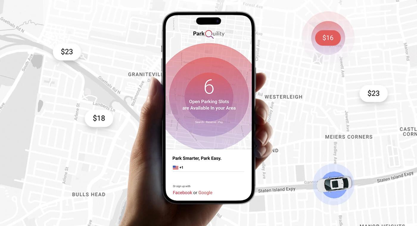
Finding a suitable parking spot in any crowded city is exceptionally difficult, time-consuming, and frustrating. A smart parking application can help drivers save time and frustration by showing them the real-time availability of parking spots, as well as the location and cost of nearby parking garages and lots. This can help drivers avoid the frustration of driving around looking for a parking spot, or of overpaying for a spot they find.
The Great Parking Problem
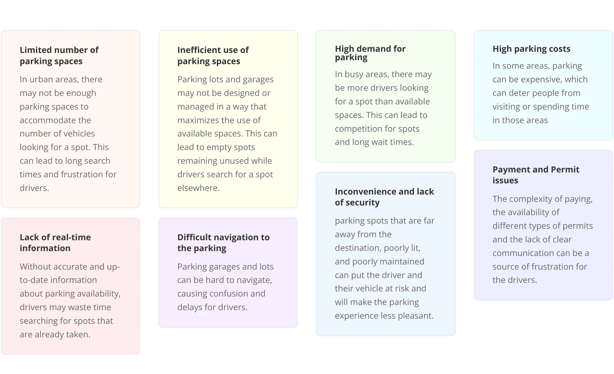
Finding a good parking spot is extremely difficult in urban areas, especially in busy or densely populated areas. This problem can be caused by several factors, such as a lack of available parking spaces, poorly designed parking lots, and inefficient parking management systems.

User Interviews
n order to design a user-friendly smart parking system, I have conducted in-person user interviews to gather insights into the needs, behaviours, and pain points of drivers who use urban parking facilities.
By observing users in real-world parking situations and having in-depth conversations with them, I was able to gain a detailed understanding of their context, motivations, and problems. This information was crucial in identifying key areas for improvement and in developing a smart parking system that addresses the specific needs of the users. In-person interviews also provided the opportunity to observe users’ verbal and nonverbal cues, which provided additional information and insights.
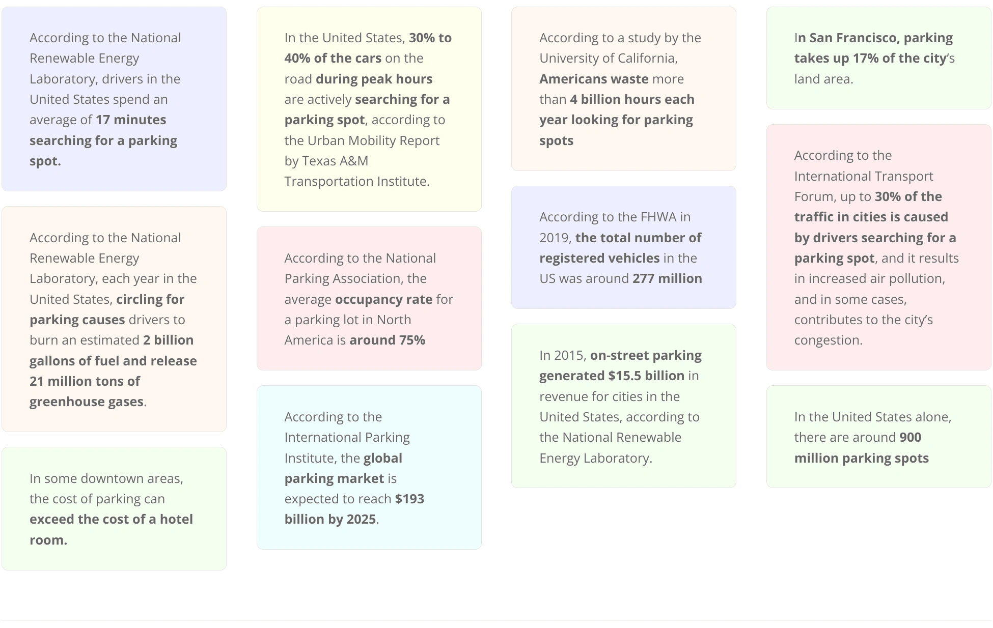
Some of the significant pain points are illustrated below
Statistical Findings
User Journey Map
After I had some sense of what the central problems and desires were, I decided to probe into our users’ minds by mapping out a potential customer journey. This allowed me to further understand how users interact with the parking solution (at different stages like pre-parking, during parking, post parking) to identify areas that may be causing friction and prioritize what needs to be improved. It allows for creating a more seamless and user-centred experience, by addressing the pain points, at each stage of the customer journey.
Motivation
The driver may have an urgent need to park their vehicle, such as commuting to work or running errands, and this might be a key touchpoint for their motivation to find a parking spot.
Need to park their vehicle.
The urgency to find a parking spot.
Type of parking spot needed (street parking, garage, covered, etc.)
Awareness
The driver may be aware of different parking options, such as street parking or parking garages, and may use their phone, or a map, or ask for recommendations from friends or family to make a decision. These options can be touch points for the awareness stage.
Available parking options in the area.
Use of phone, map or recommendations from others to find parking options.
Cost, location, security and the ability to reserve a spot.
Searching for a Parking Spot
The driver may search for a parking spot by driving around the area or by using a mobile app. This stage can be a key touchpoint for the driver as they may encounter problems such as difficulty finding a spot or navigating to the spot.
Navigation to the parking spot.
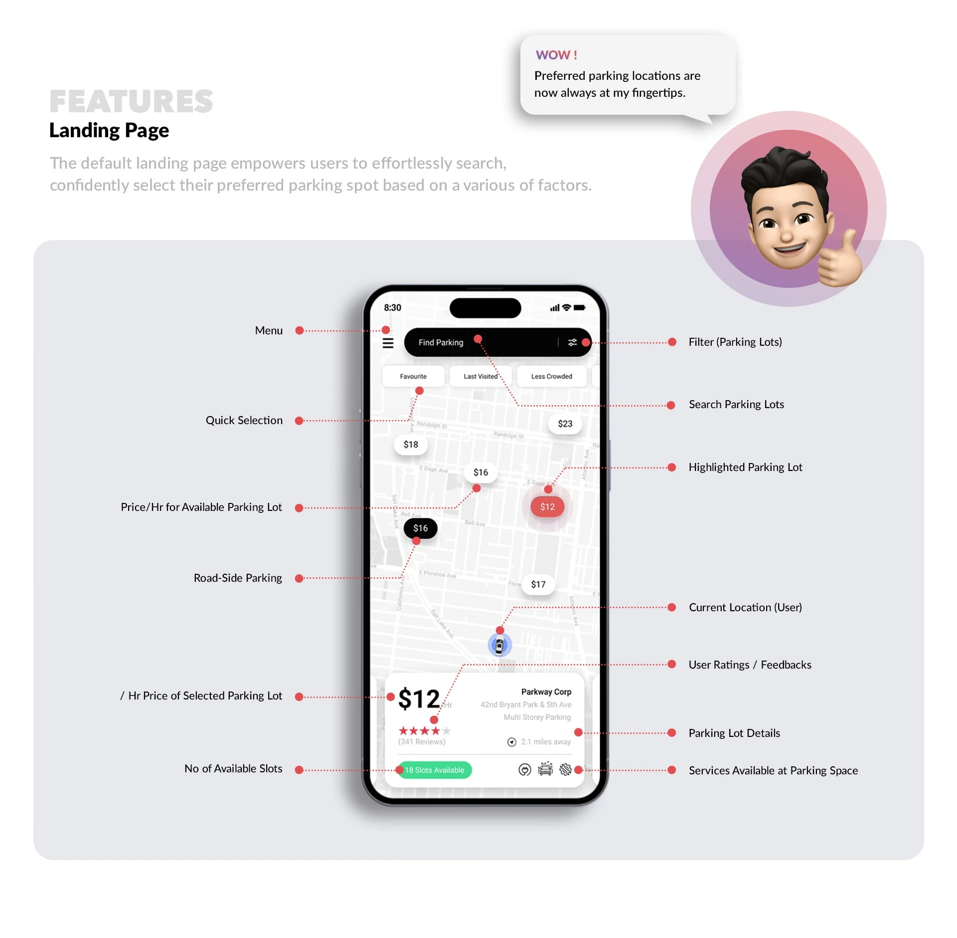
Finding availability and prices of parking spots.
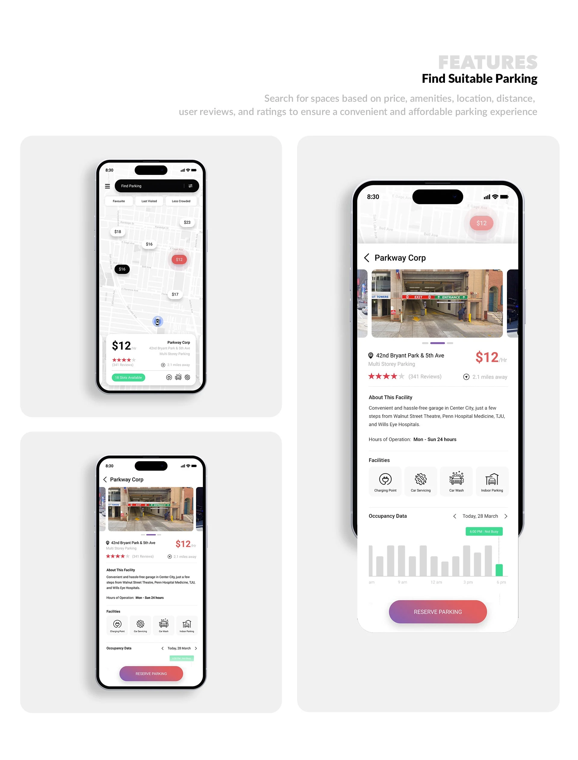
Comparing different parking facilities.
Real-time information on parking spot availability.
Decision Making
The driver may evaluate the available parking options and decide on a spot that meets their needs. Cost, location, security, and the ability to reserve a spot can be touch points for the driver in the decision-making stage.
Cost and location of the parking spot
Safety and security of the parking spot
Ability to reserve a parking spot
Solution
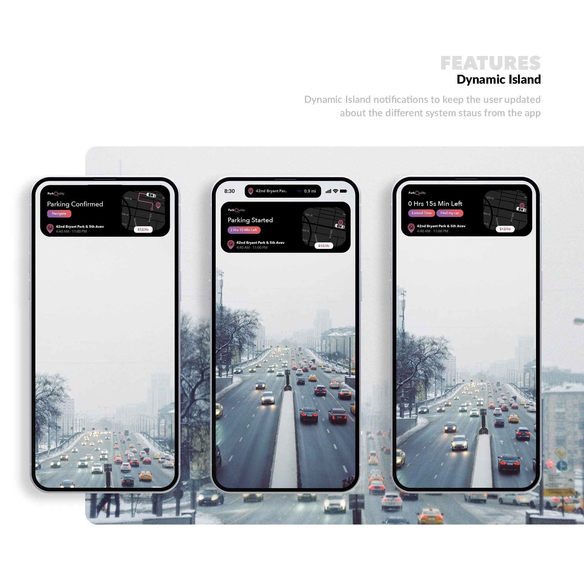
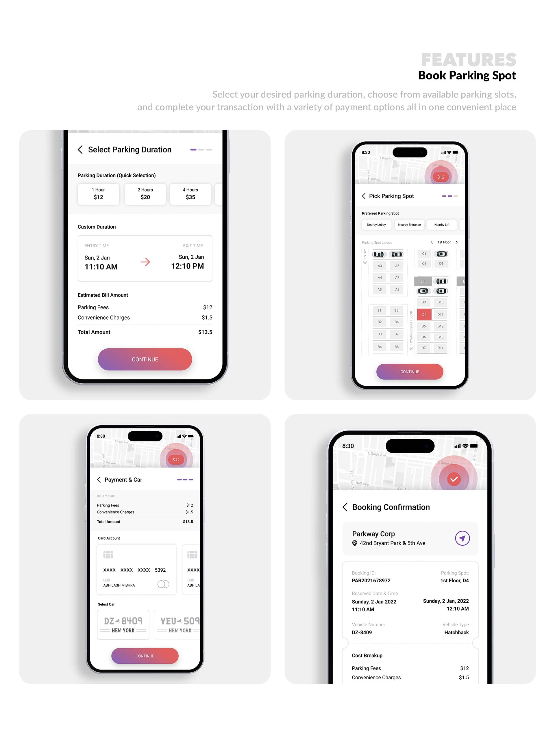
The driver finds and selects a parking spot and may use a mobile app to reserve or pay for the spot. This stage can be a key touchpoint for the driver as they may encounter problems such as difficulty reserving a spot or understanding the payment process.
Reserve and pay for a parking spot.
Processes for reserving and paying for a parking spot.
Navigation to the parking spot.
Confirmation of reservation or payment.
Solved
After parking their vehicle, the driver continues with their day’s activities. They may be satisfied with their parking experience or may encounter problems, such as difficulty finding their car later or high costs.
Finding the car later
Overall satisfaction with the parking experience
Evaluation
The driver evaluates their parking experience and can provide feedback or rate the spot or leave a review, this stage can be a touchpoint as well.
Feedback, rating, and review of the parking spot
Referral to others
The Problem & Solution
With a clear understanding of our target user, it was time to analyze the data and develop a well-defined problem statement and solution that addresses the gaps in the current parking Experience.
The solution in question?
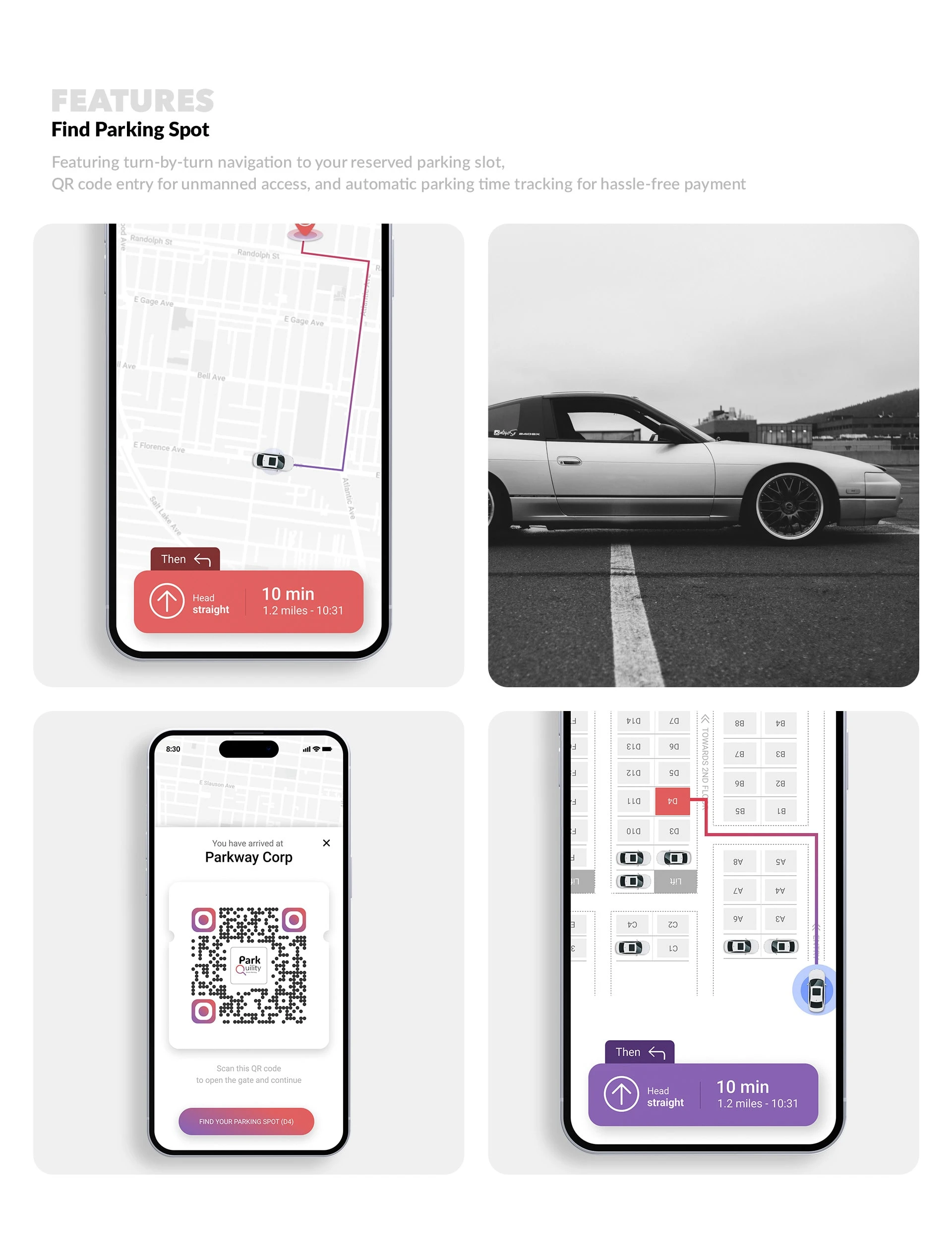
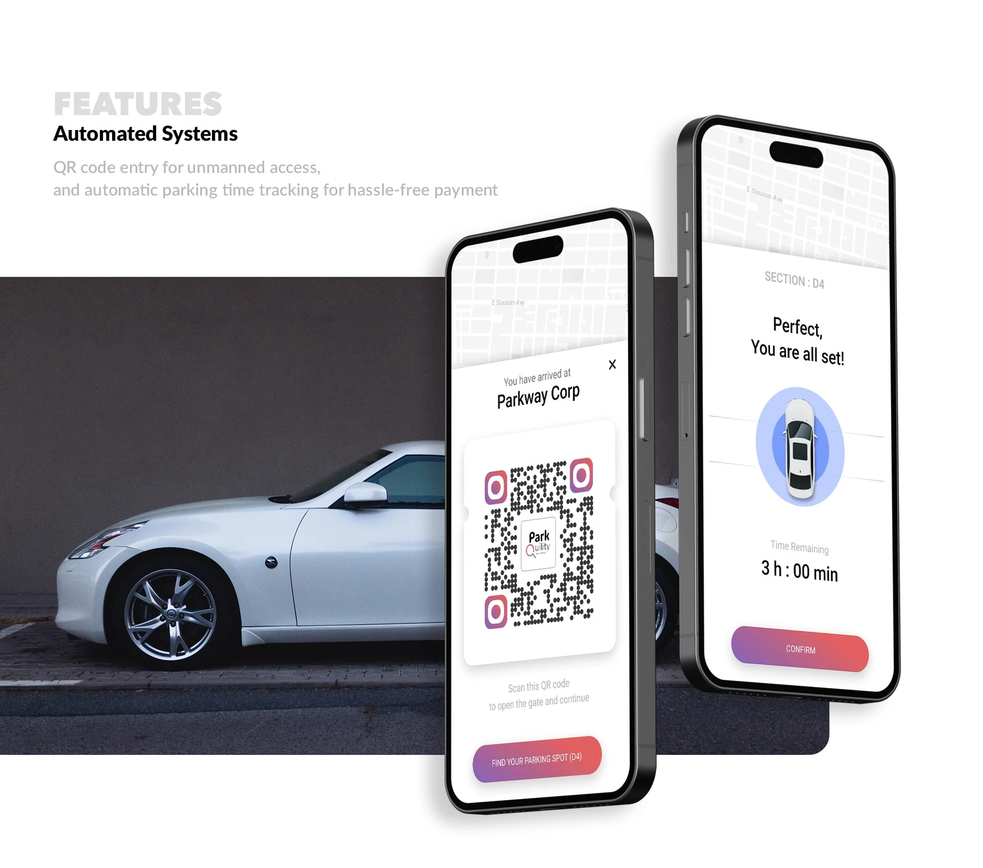
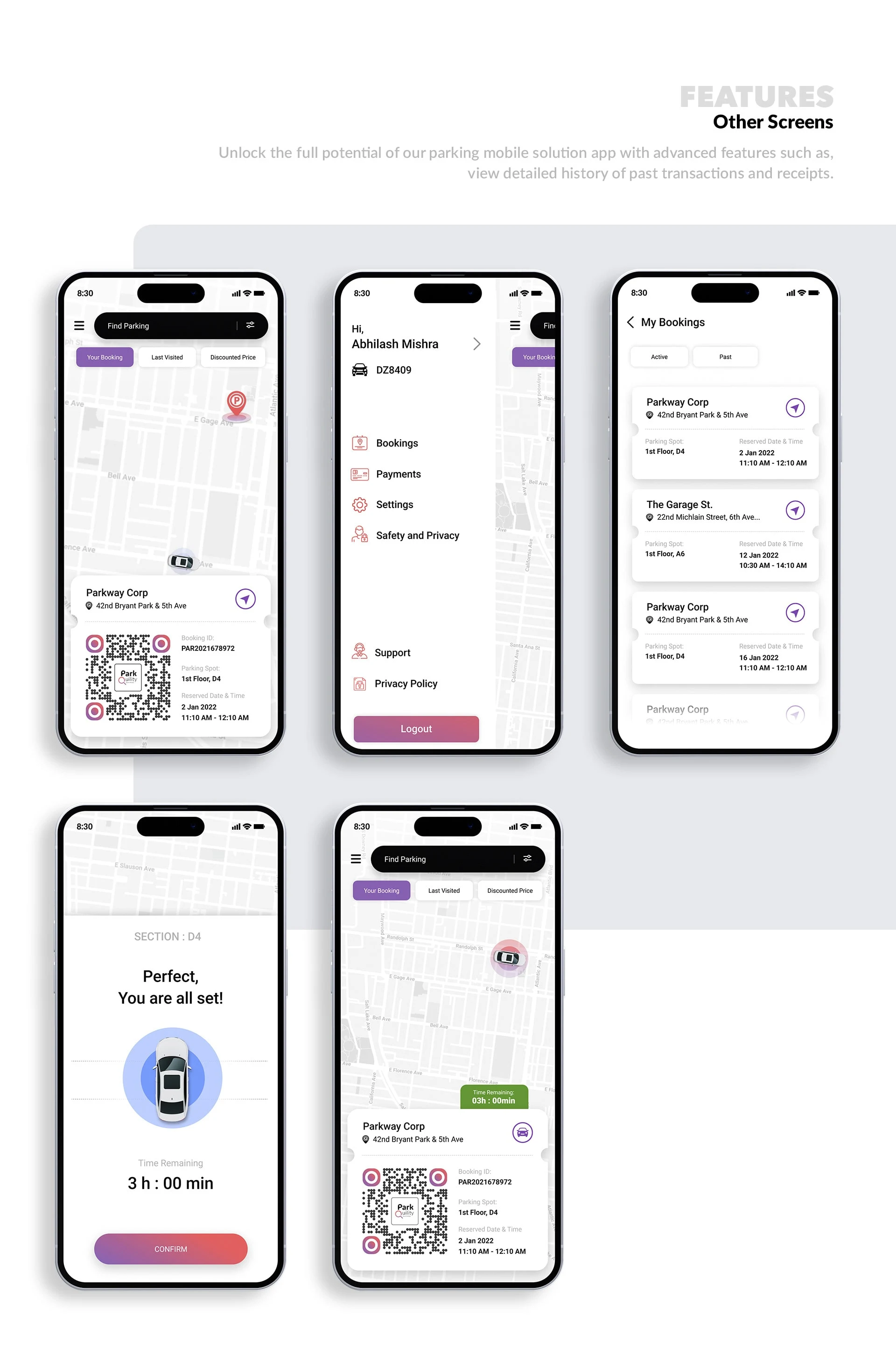
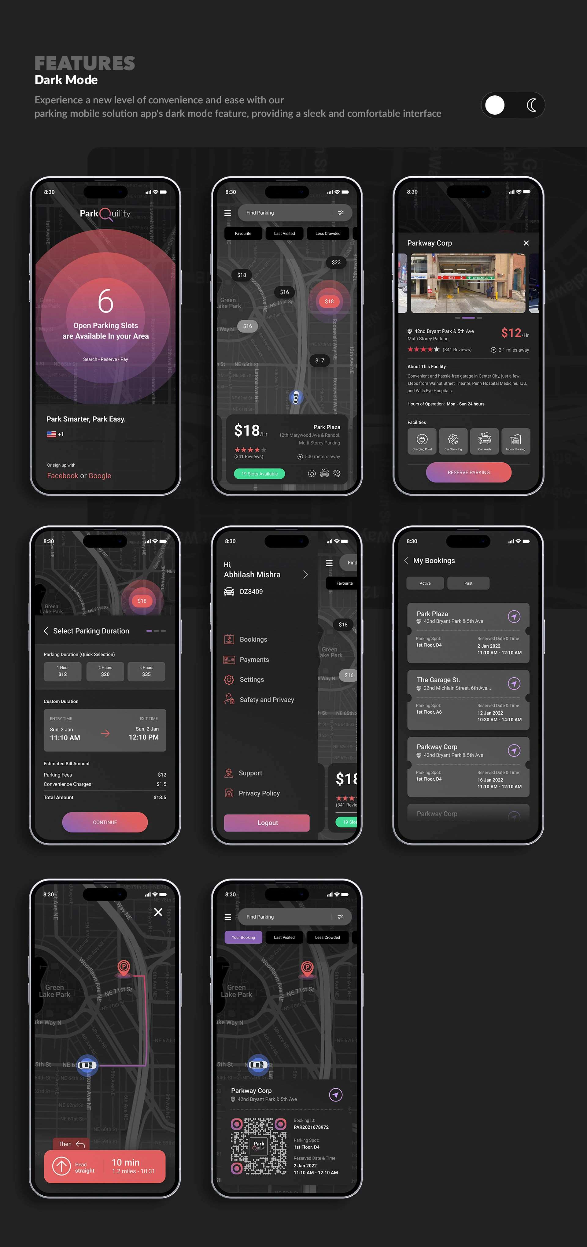
A smart parking system designed to eliminate the hassle and frustration of finding and booking a parking spot at a preferred parking spot (based on location, review/feedback from users) in advance with a user-friendly online booking system. The solution should also offer a range of options for short and long-term parking, Integrated navigation assistance so that drivers can easily find their way to the spot, easy payment options, On-demand booking and real-time parking data so that drivers can find open spots quickly, park hassle-free, all without the need of human intervention.
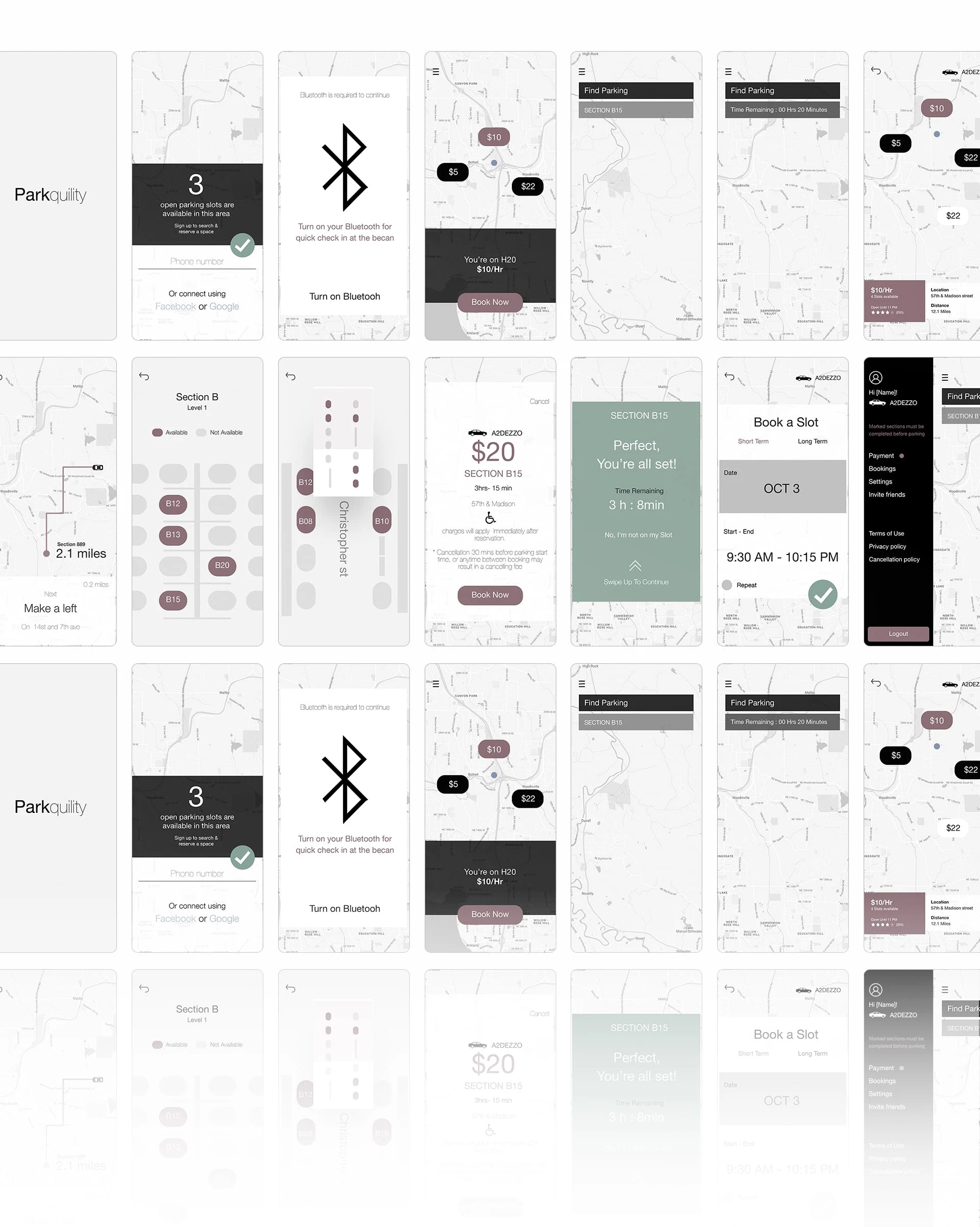
Mid-Fidelity Wireframes
Created a mid-fidelity wireframe to test user flows and gather feedback on usability and overall design before moving forward with UI design/development. This allowed us to identify and address any potential issues or pain points early on, ensuring that the final product would be as user-friendly and efficient as possible. Additionally, by testing the prototype with a diverse group of users, I was able to gather valuable insights and make informed design decisions that would ultimately benefit all users.
The wireframes also served as a visual representation of the desired end product, allowing for better communication and collaboration with the development team.
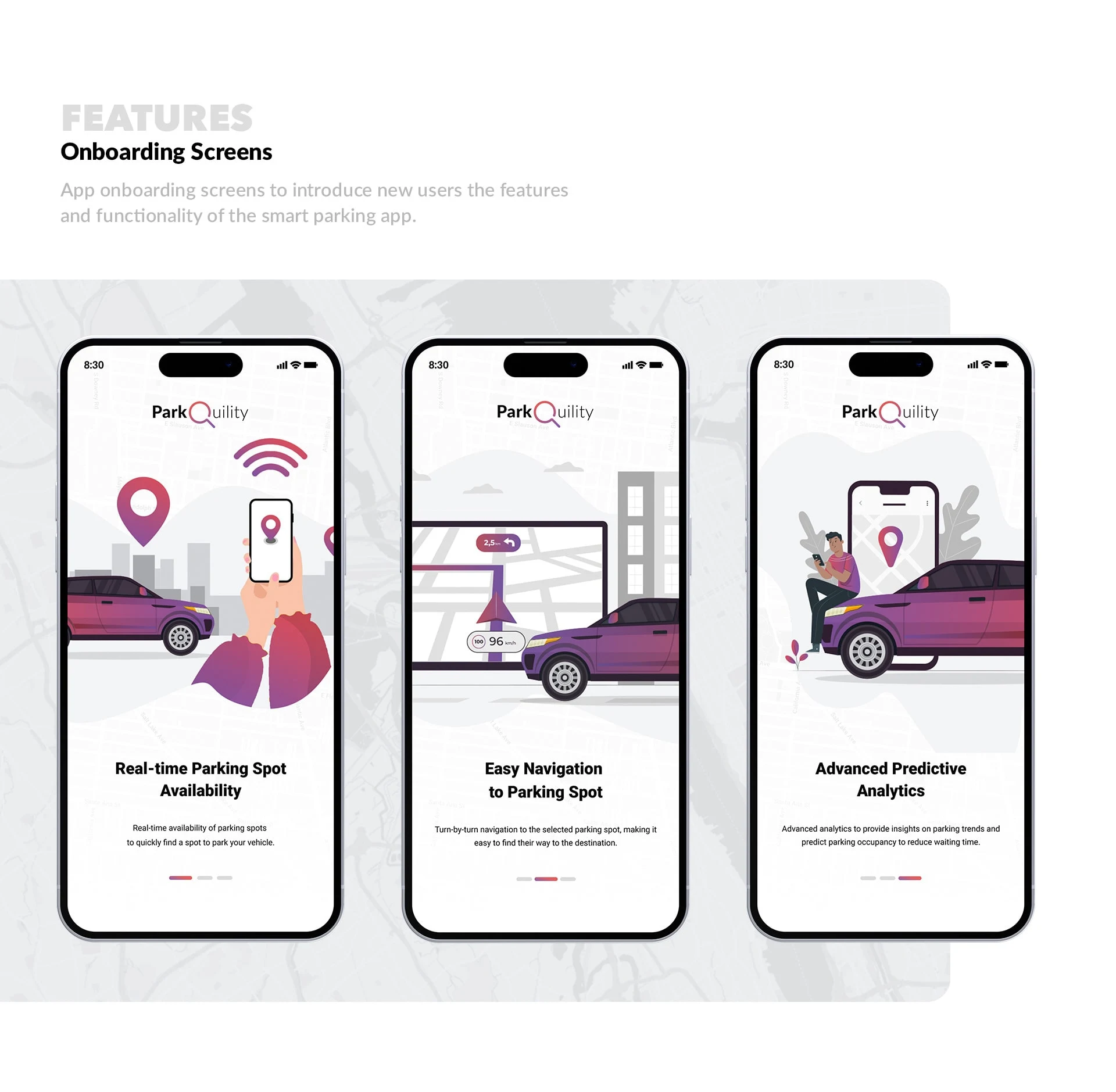
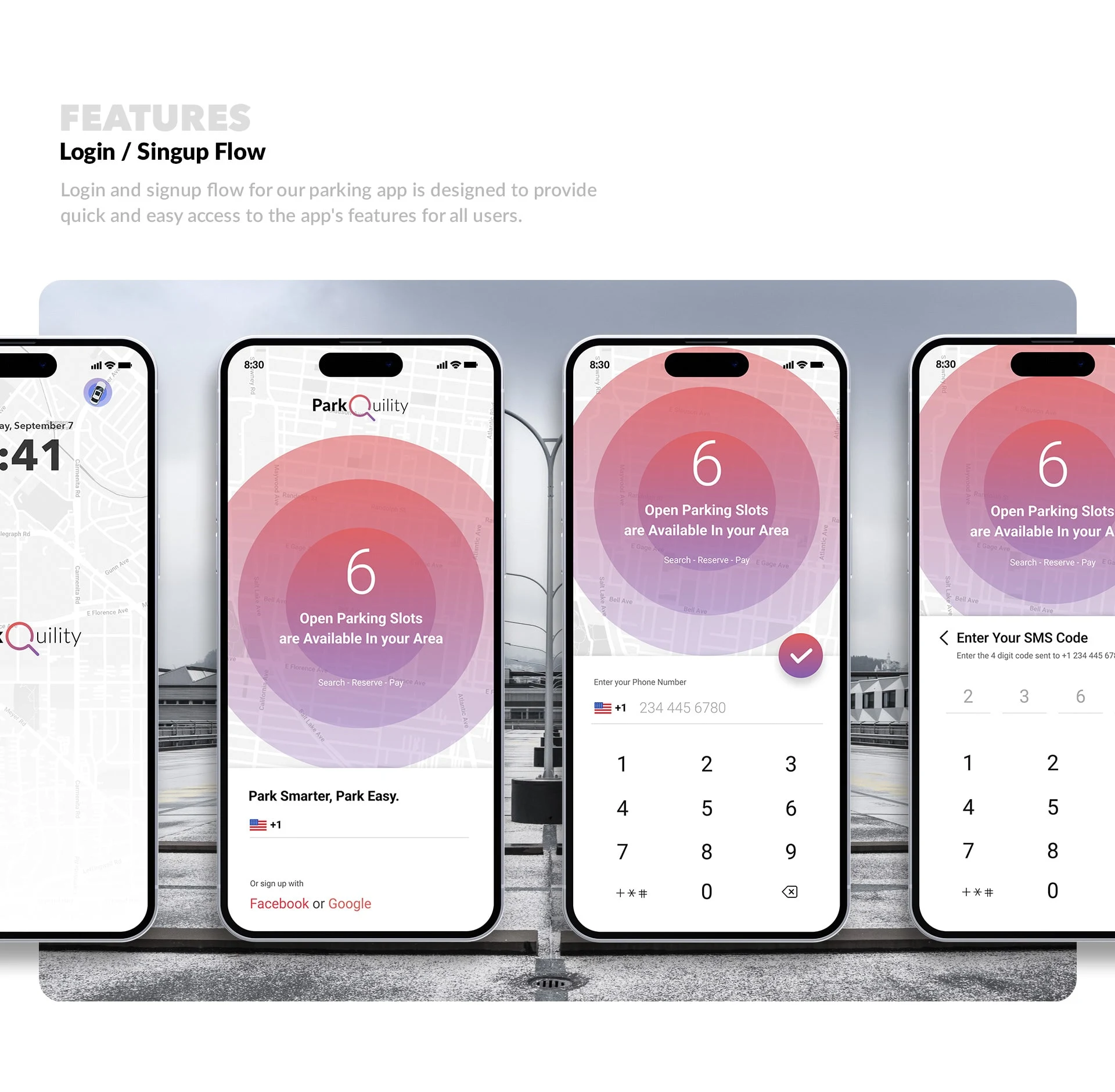
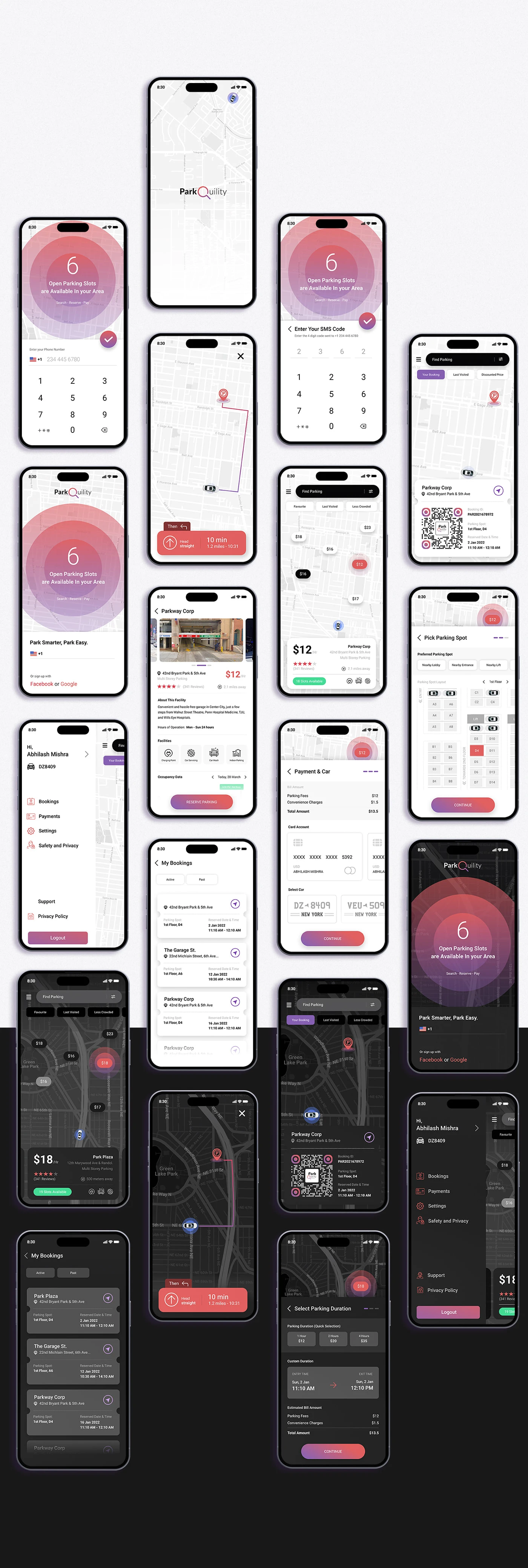
UI Design of Pages / Elements
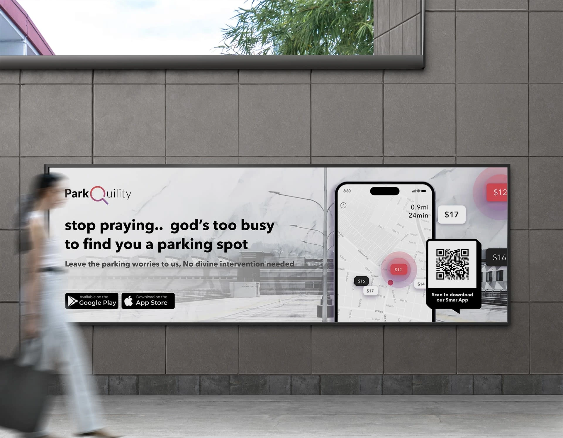
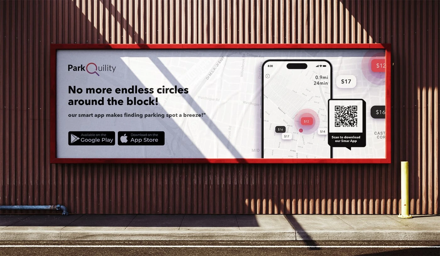
Outdoor Advertisements Sample
Like this project
Posted Feb 4, 2023
A smart parking system designed to eliminate the hassle and frustration of finding and booking a parking spot at a preferred parking spot (based on location, re
