Bull Run Kitchen and Bath - Complete Website Redesign
Live URL: Figma Design
Project Overview: Bull Run Kitchen and Bath required a comprehensive website redesign to enhance their online presence and improve user interaction. The project involved reimagining the entire site with a focus on modern UI/UX principles and adding new functionalities to better serve their clientele. The redesign aimed to create an intuitive, visually appealing platform that showcases their services and portfolio while ensuring an exceptional user experience.
Design Process:
Initial Assessment: Analyzed the existing website to identify areas for improvement, focusing on outdated design elements and user experience issues.
UI/UX Overhaul: Developed a new design framework in Figma, prioritizing user-centric design with streamlined navigation, clean layouts, and visually engaging elements.
Functionality Enhancement: Introduced new features and functionalities to improve the website’s interactivity, including a more robust portfolio display and enhanced contact options.
Client Collaboration: Worked closely with Bull Run Kitchen and Bath to ensure the redesign aligned with their brand vision and business goals.
Key Features:
Modern Aesthetic: A fresh, contemporary design that reflects Bull Run Kitchen and Bath’s commitment to quality and innovation.
Enhanced Portfolio Section: A dynamic portfolio with high-resolution images and detailed project descriptions, allowing potential clients to explore past projects in depth.
Improved User Experience: Streamlined navigation and clear calls to action make it easy for users to find information and engage with the brand.
Responsive & Functional: Ensured the website is fully responsive, with added functionality to enhance user interaction across devices.
Visual Highlights:
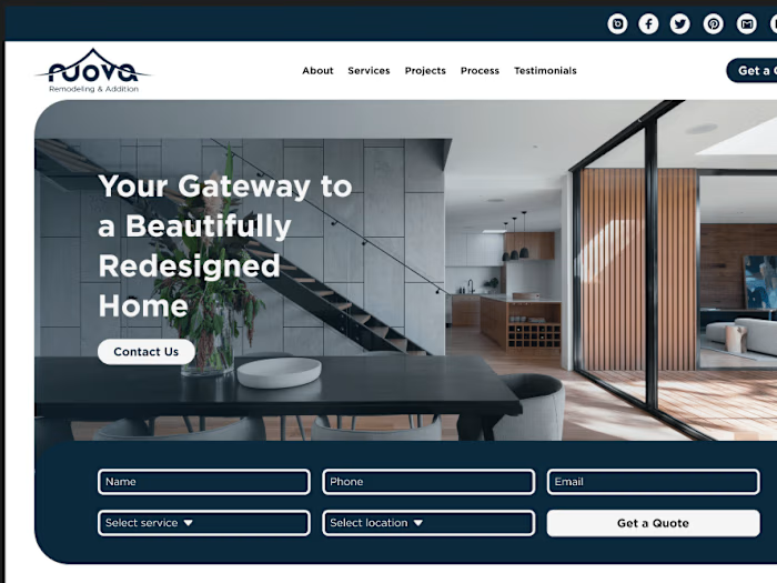
Homepage: A visually striking hero section featuring high-quality images of recent projects, with overlays highlighting key services.
Portfolio Section: A grid or masonry layout showcasing a variety of projects, with hover effects to reveal additional details or a lightbox for full-screen views.
Services Section: Use of icons or custom graphics to represent different services, making the content more engaging and easier to understand.
Contact Page: A user-friendly contact form with a relevant background image or design element that aligns with the brand’s aesthetic.
Result: The redesigned website positions Bull Run Kitchen and Bath as a leader in their industry, offering a modern, user-friendly platform that effectively showcases their work and makes it easy for potential clients to connect.
Like this project
Posted Sep 2, 2024
Bull Run Kitchen and Bath required a comprehensive website redesign to enhance their online presence and improve user interaction.
Likes
0
Views
9


