Luxury Makeup Brand Shopify Storefront Design
Mustafa Tugrul Firat
Lumière was born from a simple belief: that beauty should feel like an experience, not a transaction. The client had been building her makeup brand for years — carefully selecting formulas, refining her packaging, cultivating a community of customers who trusted her. What she didn't have yet was a digital home that matched the level of care she put into everything else.
The Challenge
She came to me with two non-negotiables. First, the design had to feel luxurious and playful at the same time — not the cold, minimal aesthetic that dominates premium beauty, but something warmer, more human, more her. Second, every pixel had to be buildable in Shopify. She wasn't looking for a concept. She was looking for something she could hand to a developer and go live with.
That tension — between editorial beauty and commercial function — became the creative engine for the entire project.
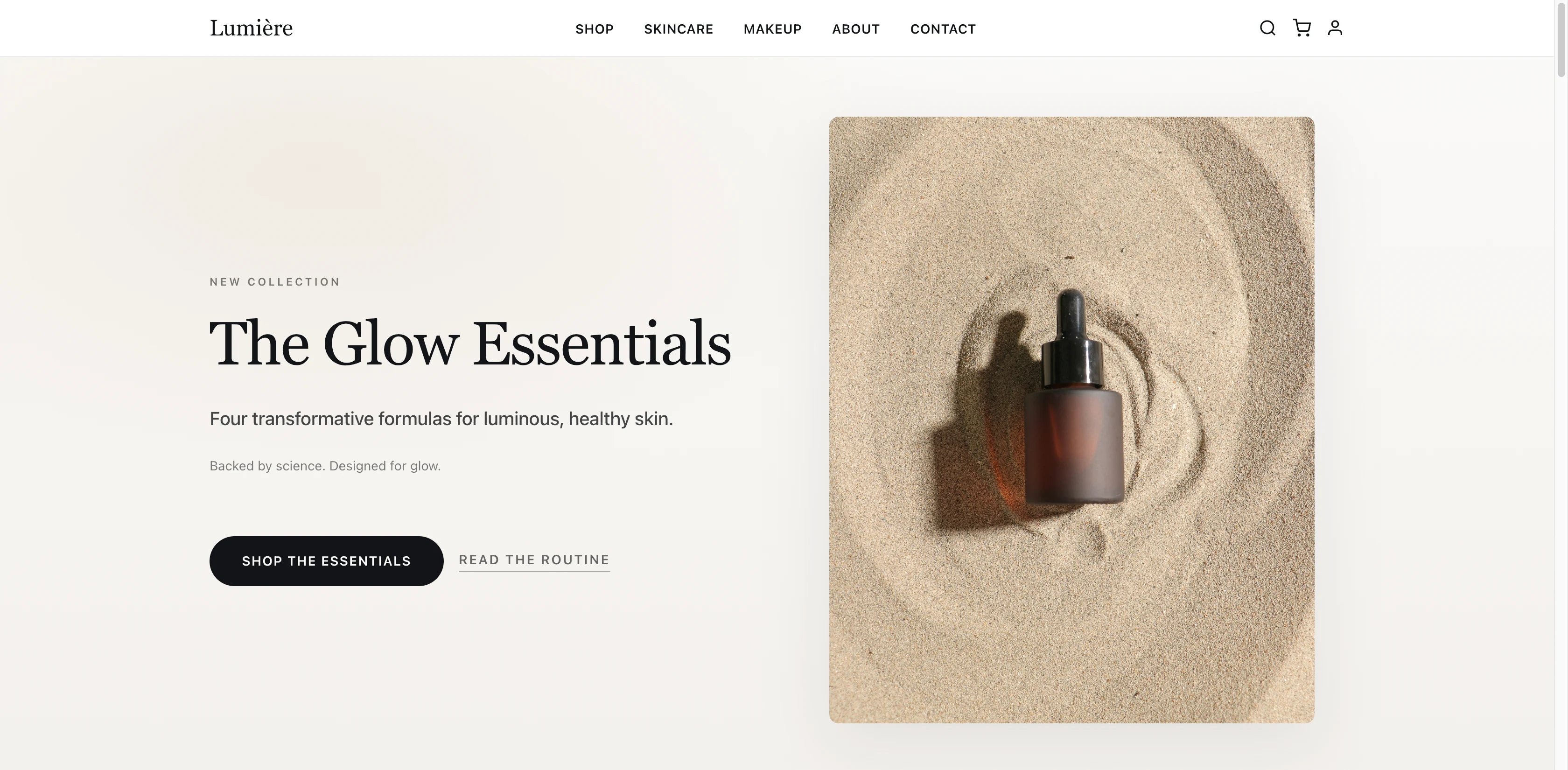
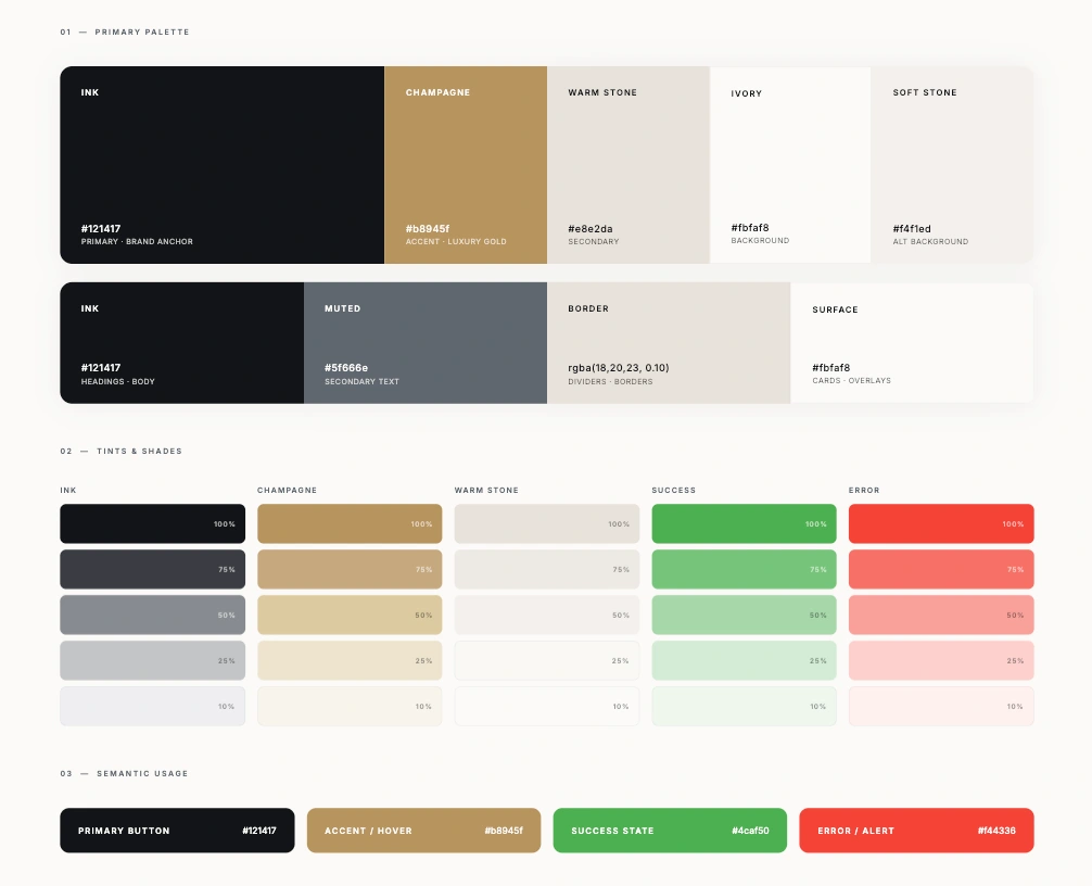
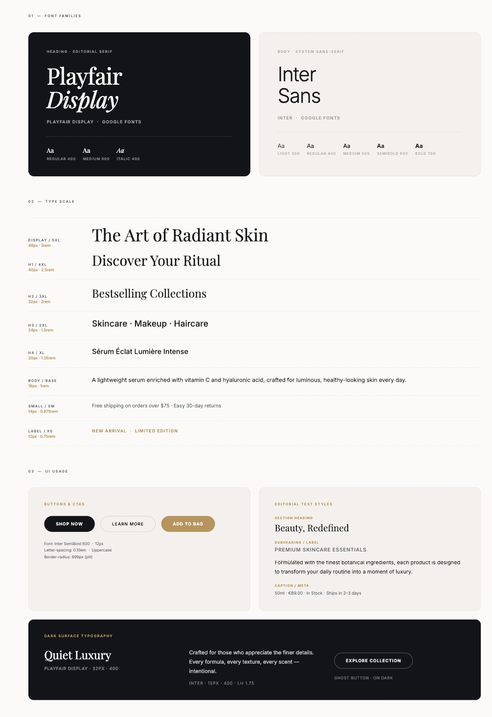
The design system I built for Lumière is anchored in restraint.
The primary palette pairs deep ink (
#121417) with champagne gold (#b8945f) against a warm ivory base colours that feel expensive without being cold. The champagne accent does a lot of work throughout the UI: it marks active states, highlights calls to action, and adds the playful warmth the client was after without breaking the premium feel.
Typography follows the same logic. Playfair Display carries the brand voice in all editorial moments, campaign headlines, product names, category introductions, while Inter handles every functional touchpoint: navigation, cart summaries, form labels, pricing.
The combination gives the store two distinct registers that work together seamlessly: one that whispers luxury, one that says this is easy to use.
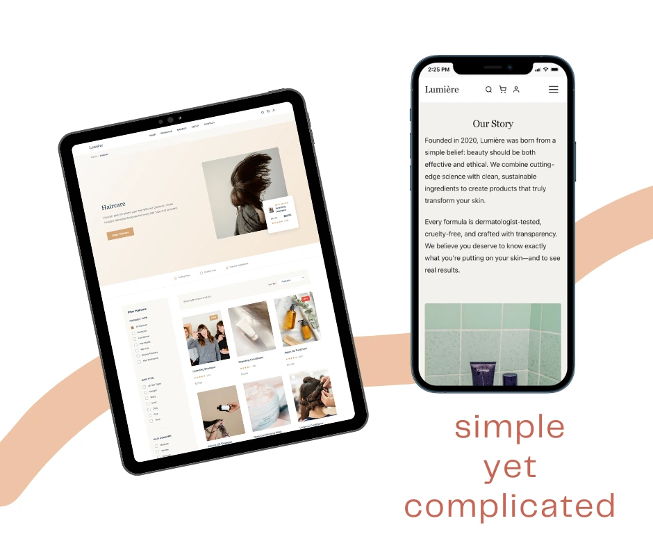
Navigation was one of the most considered parts of the project.
Beauty customers browse by category, by concern, and by product type often all three in the same session.
I designed a persistent top navigation with clear category groupings (Shop, Skincare, Makeup, About, Contact) alongside a search icon, cart, and account access that are always one tap away.
On mobile, a hamburger menu collapses the full navigation without sacrificing any of the hierarchy.
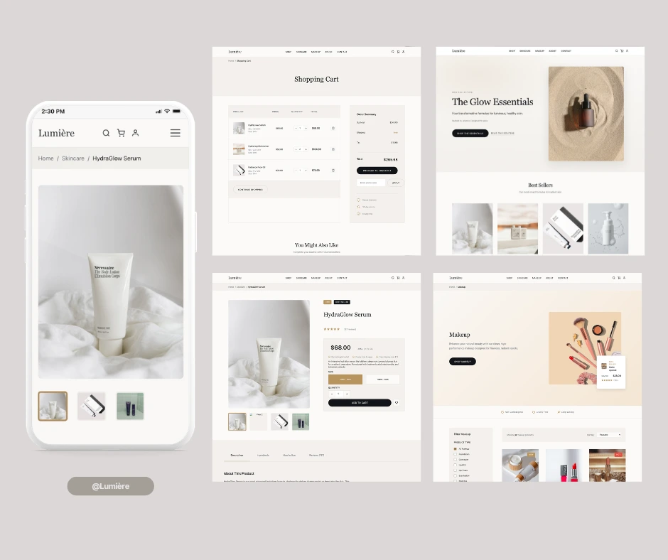
Product pages were built around imagery.
Large-format photography dominates above the fold, with the product name, price, and add-to-cart anchored below in a layout that works at any screen size.
Shade selectors, product descriptions, and related items follow a clear vertical flow; no hunting, no friction.
Every component was structured as a Shopify-compatible section, meaning the developer could map each element directly to theme settings without rebuilding anything.
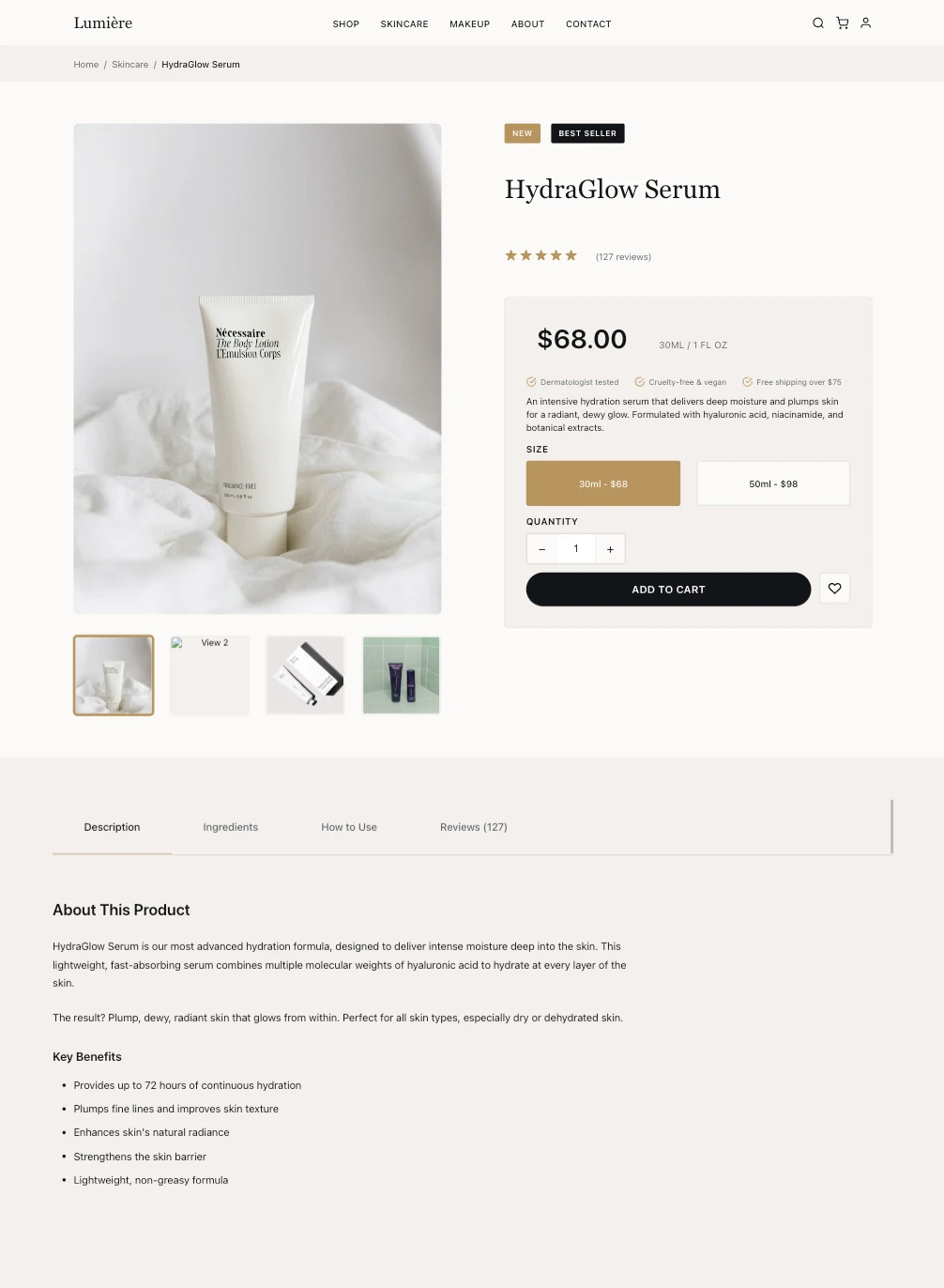
Product Page
The cart and checkout experience mirrors the same warm, minimal aesthetic, no jarring colour shifts, no design break when a customer is about to pay.
This kind of consistency across the full purchase journey is often where e-commerce designs fall apart, and it was something I paid particular attention to here.
The project delivered 15 fully designed screens; homepage, shop, product, cart, checkout, account, search, blog, and category pages, all component-mapped for Shopify.
The client reviewed all screens in a single round with minimal revisions. Within two weeks of handoff, the site was live.
What Lumière proves is that a beauty brand doesn't have to choose between looking beautiful and converting.
When the design system is built with both in mind from the start the colour logic, the type hierarchy, the component structure the two goals reinforce each other rather than compete.
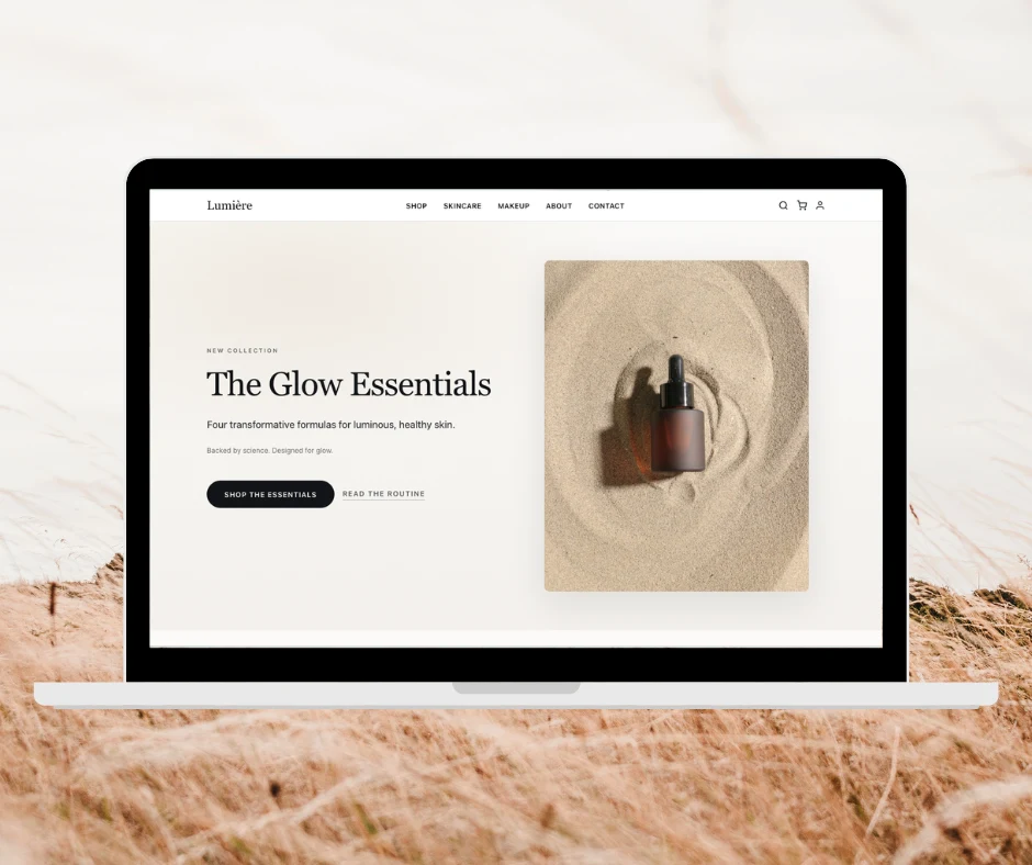
Hero Area
Key Features
- Clean, elegant product pages with large imagery
- Playful brand touches that reflect the makeup aesthetic
- Intuitive navigation and search functionality
- Fast-loading, optimized design system
- Fully Shopify-compatible structure
Responsive Screen
The Outcome
The design delivered exactly what the client needed: a brand experience that felt premium and trustworthy while remaining accessible. The playful elements made the store memorable and on-brand, while the technical structure meant zero friction in converting to Shopify. The result was a launch-ready design that could scale.
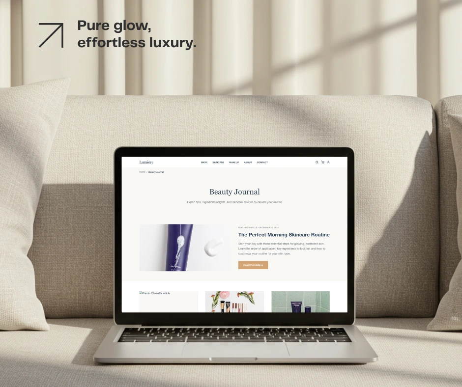
Beauty Journal
Like this project
Posted Mar 3, 2026
Designed a luxury, user-friendly Shopify e-commerce site for a makeup brand.
Likes
0
Views
7
Timeline
Feb 3, 2026 - Feb 10, 2026