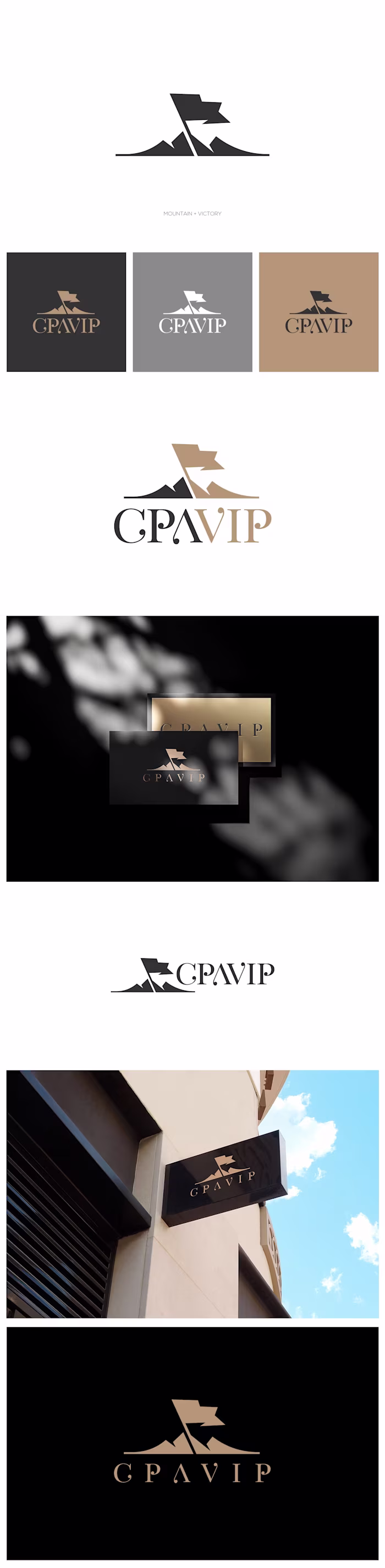
The logo is built around
Petar Kilibarda
The logo is built around the letter J (for Jungle), combined with an upward motion element that also reads as a stylized palm leaf, directly referencing the jungle/exotic theme. This fusion creates a distinctive, ownable symbol that communicates growth, movement, and premium experience—key values for an exotic car rental brand.
The geometric construction keeps the mark modern, streamlined, and bold, while the strong contrast between black and green reinforces luxury, energy, and freshness. The icon works equally well in horizontal and vertical layouts, and in both positive and negative versions, ensuring high flexibility across all applications.
Overall, the logo balances exotic character with contemporary minimalism, giving Jungle Exotics a confident, premium, and memorable visual identity. 🌴🚗
Like this project
Posted Feb 2, 2026
The logo is built around the letter J (for Jungle), combined with an upward motion element that also reads as a stylized palm leaf, directly referencing the ...