SeniorTix Redesign Case Study
✨ Purpose of the Project
I had the opportunity to join Bitesize UX's SeniorTix Redesign Accessibility Workshop!
I took on this project to:
1. Expand my learning
As a UX/UI Designer, it is my ethical responsibility to be able to learn and create products that can be used for everyone. There are no metrics present and this project is solely for personal UX/UI development 🌱.
2. Refine visual skills
I focused on refining my visual skills while keeping accessibility & inclusivity in mind 🤝.
3. Step out of my comfort zone
For a while, I have been designing for mobile applications. I wanted to take my designing skills to the next level by learning how to design websites 💻.
In a nutshell, this workshop was superr helpful and allowed me to connect and learn along with other designers from around the world 🌎.
👀 The Problem
How might we redesign the SeniorTix website to make it more accessible and usable for senior citizens?
👩🏻💻 My Role
As the Lead UX/UI Designer & Researcher, it is important for me to ensure that the SeniorTix website is successful and meets the needs of the users
My responsibilities include:
Creating lo-fi to hi-fi wireframes
Conduct usability tests
Learn by observing SeniorTix users to identify websites accessibility issues that have gone unnoticed
Ensure that the website is understandable and usable for seniors with visual or cognitive impairments
🔭 Exploring SeniorTix
SeniorTix is a website that offers discounted prices for senior citizens to enjoy a variety of events, tours, and group activities. It is a community platform that brings seniors together to socialize, learn, and stay active.
⭐️ Senior citizens who have visual / cognitive impairments may require additional design considerations to ensure that they can use the website comfortably
Pre-Existing Website
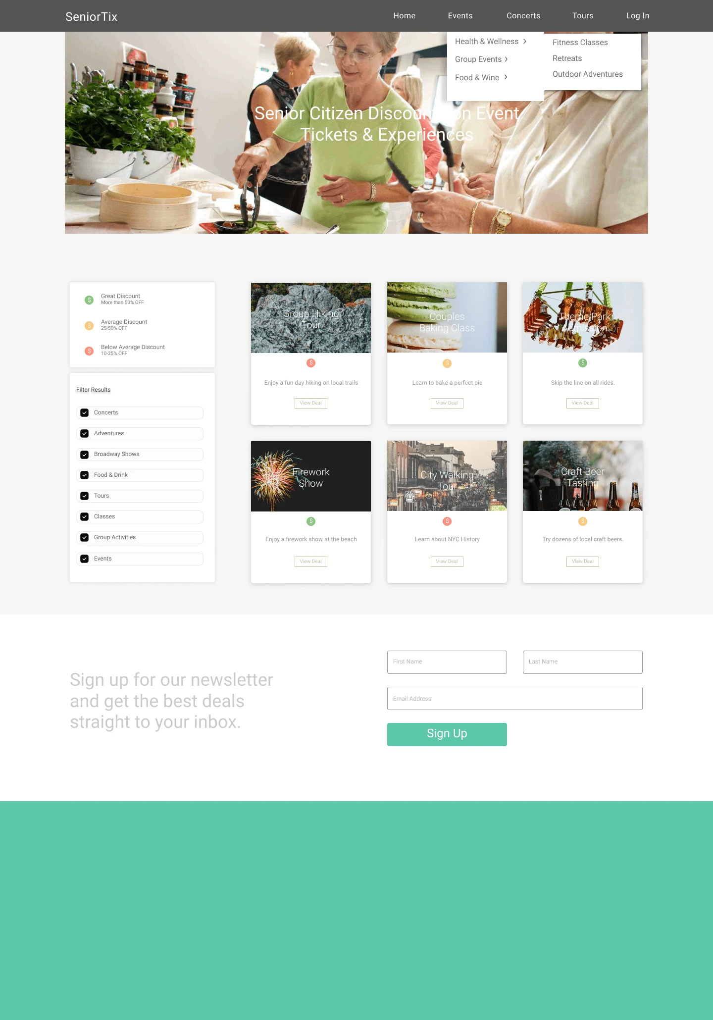
Before :(
Here is my redesign!
After :)
🍥 Now, how did I get there?
💞 Empathy
Accessible design is a design process in which the needs of people with disabilities or impairments are specifically considered.
Senior citizens may face a variety of barriers when using a website.
This may include:
Visual / cognitive impairments
Difficulty using a mouse or keyboard
Unfamiliarity with technology
To empathize with senior citizens using a website, it is important for me to:
Be patient and respectful
Listen to their feedback and observe how they use the website
Putting myself in their shoes in order to see the website through their perspective
🧪 Usability Testing
During the workshop, we collectively observed a pre-recorded usability test that showcased users navigating through the SeniorTix website.
As the video played, we actively engaged in an interactive discussion, building upon one another's ideas, and exploring ways to enhance the redesign process.
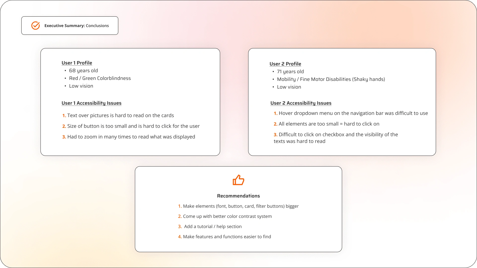
Usability Test Results for Old SeniorTix Website
🔍 Research Accessibility Guidelines
I wanted to take this project further by educating myself on accessibility.
In order to design a better and accessible website, I did research based on the Web Content Accessibility 2.1 Guidelines (WCAG 2.1) in order to implement accessible colors for the SeniorTix Redesign.
These are the colors that I chose that meet the requirement of Level AA conformance for web accessibility.
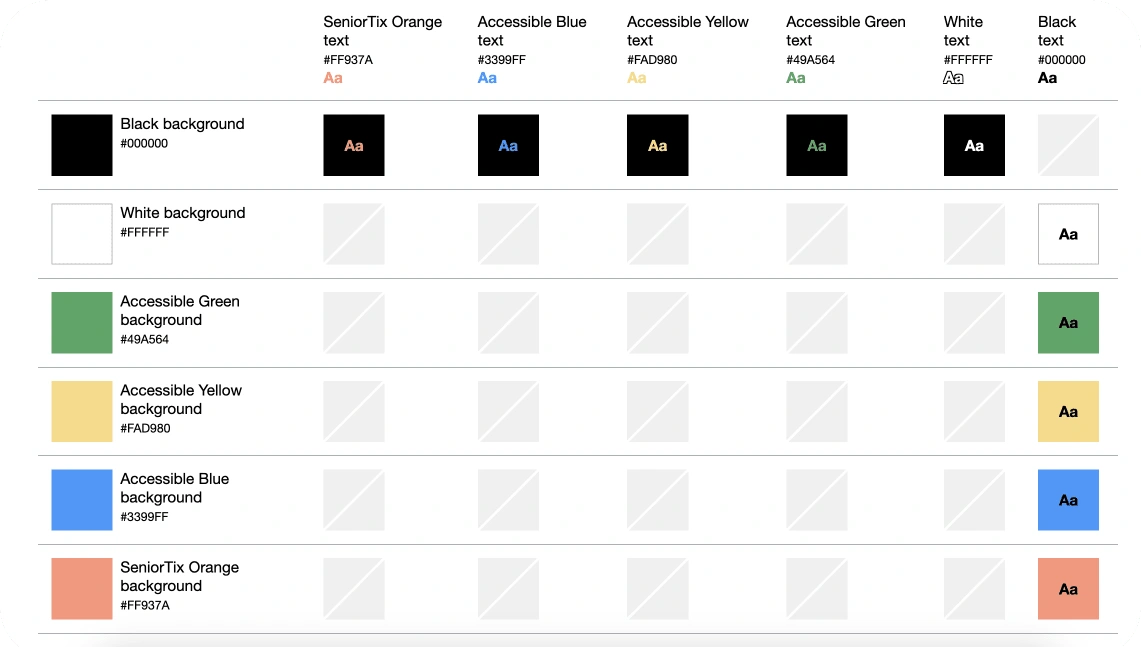
Accessible Colors
✏️ Crazy 4's
To generate new ideas for the redesign, we did the "Crazy 4's" exercise!
Building off of the usability test results, I decided to focus on these specific areas:
Activity Cards & Filter Buttons:
-> Increase the size of fonts, buttons, cards to improve their visibility and ease of use, especially for older users.
Navigation Menu:
-> Remove the navigation menu as there is a lot of redundant / repeated information that can easily be implemented onto the main screen itself.
Onboarding:
-> Adding a tutorial/help section to guide users through the website's features and functions, and to provide assistance for common tasks and issues.
Simplifying the User Experience:
-> Provide clear feedback such as confirmation / clickable elements to inform the user of what is going on while navigating through the SeniorTix website.
-> Reduce clutter / remove unecessary design elements
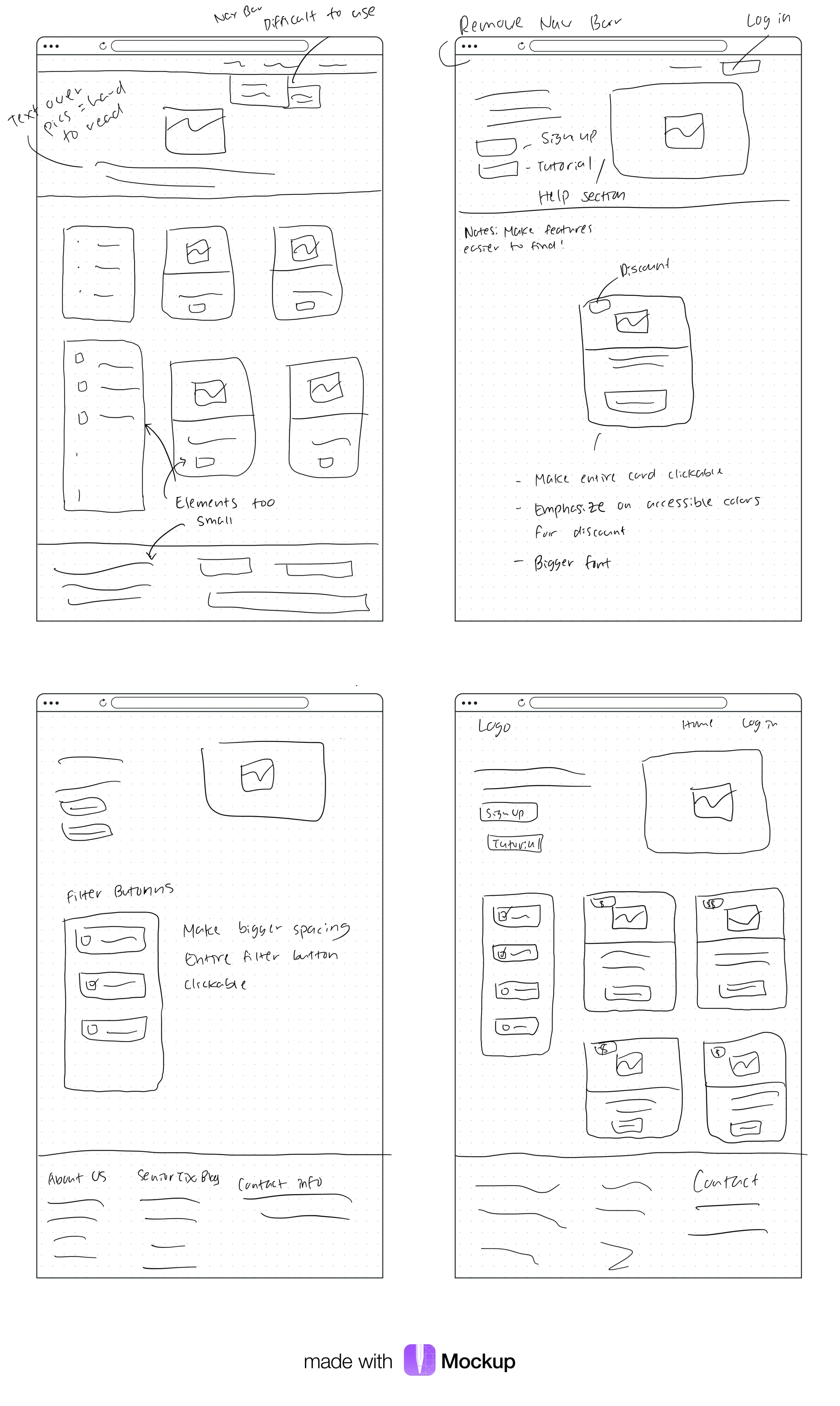
Crazy 4's exercise
🧩 Iterative Test & Redesign
In order for me to test my design repeatedly, I used the chrome extension called Funkify.
Funkify is a helpful chrome extension because it allows me to experience the web through the eyes of many users who have disabilities.
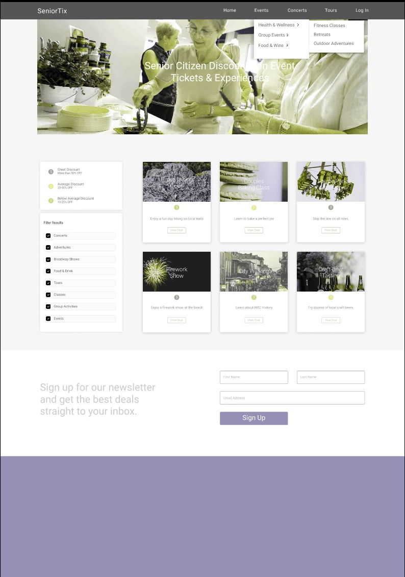
This is what the site would look like for someone who has Deuteranopia (Red/Green colorblindness) which is 1/100 Men & 1/300 Women.
Funkify really helped me re-design the website because it gave me continuous improvement to focus on the preferences and needs of the users.
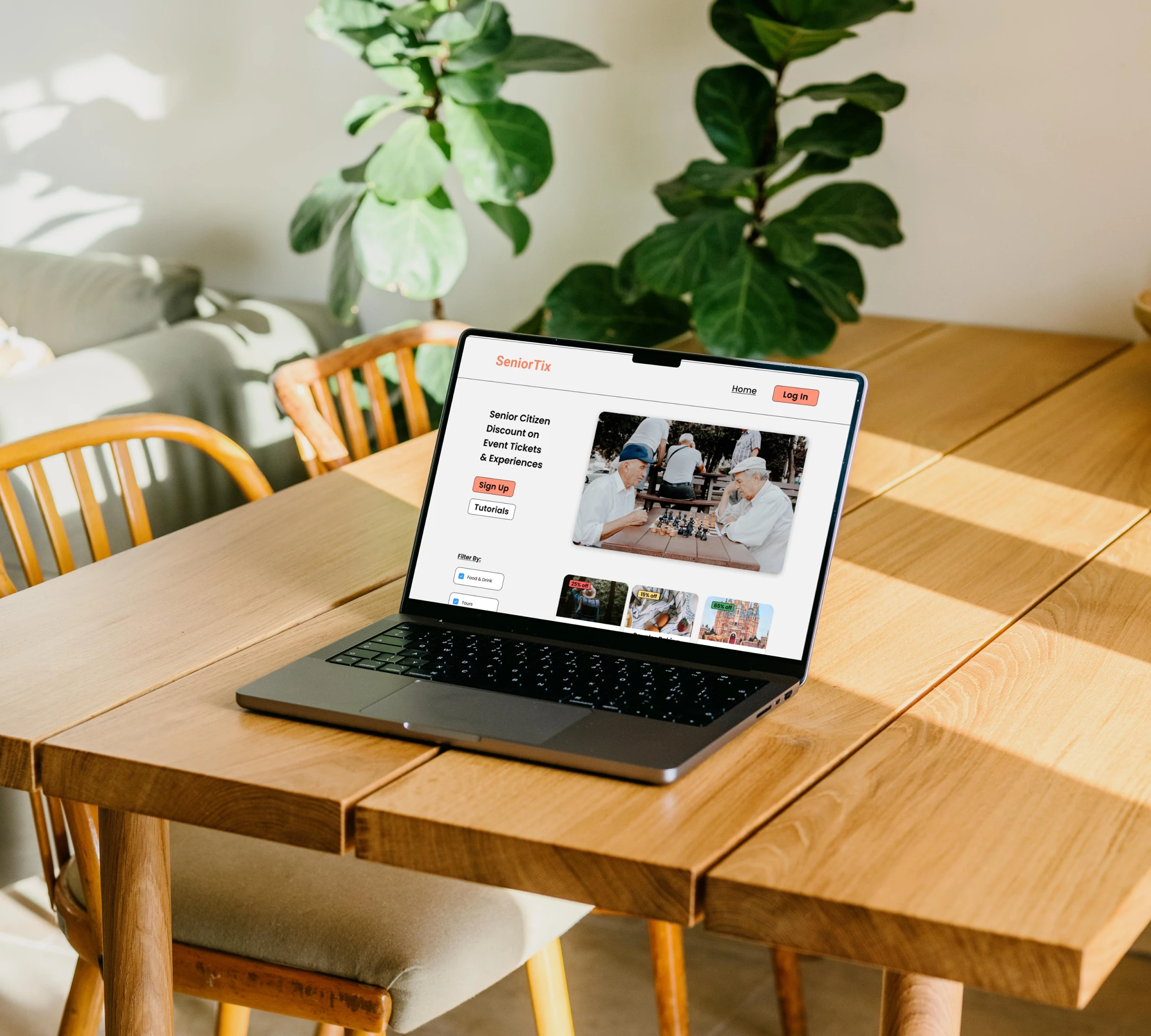
💻 Final Design
The Improvements
I created clear & concise labels that make it easier for the user to read and understand.
Increased font size & buttons for the event cards and filter buttons for users to click on easily
Made "Tutorials" accessible just in case the users needed additional assistance
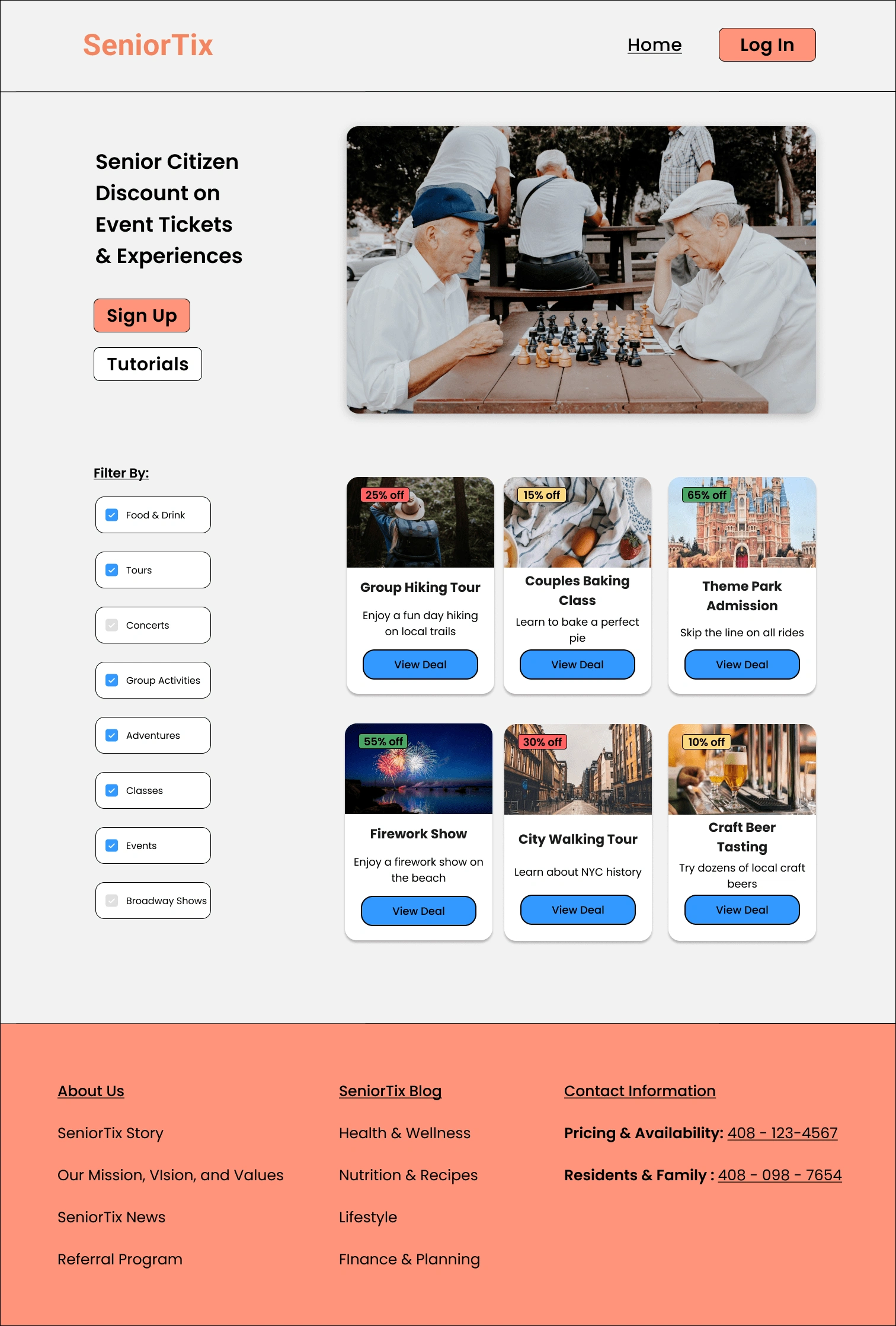
Final Redesign
🌌 Reflecting on the Project
This project allowed me to think outside of the traditional box and consider the needs of all users, regardless of their abilities.
🌱 I definetly struggled
To be transparent, it took me a while to come up with this design.
I learned that everyone has unique needs and preferences which can be difficult to incorporate into a single design. I had to consider a lot of factors such as neurological, visual, and motor abilities.
I would say, creating accessible designs definitely takes a lot more time, research and additional testing. Working on this project allowed me to invest more time and effort. However, it was all worth it in the end because I became a better designer that I was before.
Although this project had no metrics involved, I would measure its success by monitoring user feedback, engagement and overall satisfaction.
Despite these challenges, I enjoyed every single step of it. I loved taking this workshop project further and learning more about accessible and inclusive design.
🌿 Next Steps
If I were to do things differently, I would document different variations of my design. I'll never know that maybe the design I wasn't sure about might just end up working better than the other right?
Like this project
Posted Feb 25, 2023
Improving the usability of SeniorTix website through observation and accessibility evaluation
Likes
0
Views
88

