UX audit: Improving Clarity in a Reward-Based Digital Experience
Lera Kulikova
Improving Clarity in a Reward-Based Digital Experience
1. Overview
Project Type: Tourism & Rewards Platform
My Role: UX Auditor / UX Researcher
Duration: 3 weeks
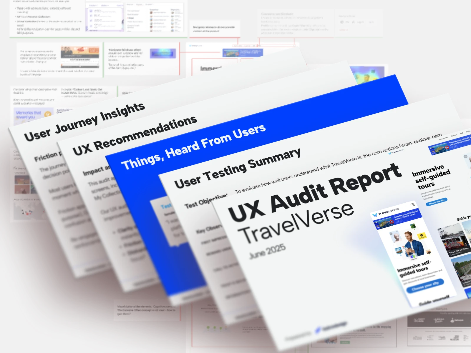
Deliverables:
UX Audit
Heuristic Evaluation
User Journey Maps
User Testing Summary
Content & Messaging Review
UX Recommendations
2. The Challenge
The product offered a unique experience built around exploration and rewards.
Because the concept was unfamiliar to most users, the main challenge wasn't functionality but understanding. Users needed to quickly grasp what the product offered, why it was valuable, and what to do next at each step.
The goal was to uncover points of confusion, friction, and uncertainty and identify opportunities to make the experience more intuitive and engaging.
3. My Approach
I used a combination of:
1. Heuristic Evaluation
Based on Nielsen's Usability Heuristics.
Focus areas: value communication, friction points, visual distractions, navigation, and accessibility.
2. User Journey Mapping
Created journeys for first-time visitors and returning users.
Goal:
Understand emotional states, expectations, and drop-off risks throughout the experience.
3. User Testing Review
Conducted a qualitative review of user interactions across key touchpoints to identify difficulties, comprehension gaps, and engagement opportunities throughout the experience lifecycle.
4. Content & Messaging Analysis
Reviewed: CTA labels, navigation terminology, reward-related language, explanatory content, and other.
4. Key Findings
Users struggled to understand the value proposition. Typical reactions: “What exactly is this platform?”, “What do I get from doing this?”.
Technical terminology created hesitation. Terms such as "NFT", "claim", and "wallet" caused confusion and reduced confidence.
Many actions lacked explanation. Users often did not understand what would happen next, where rewards were stored, or why account creation was needed.
The main engagement section lacked clear purpose. Users were unsure what rewards represented, what actions were available, and how to continue the journey.
Visual consistency and accessibility required improvement. Issues included inconsistent UI patterns, low-contrast areas, and readability concerns in outdoor mobile usage scenarios.
5. Artifacts
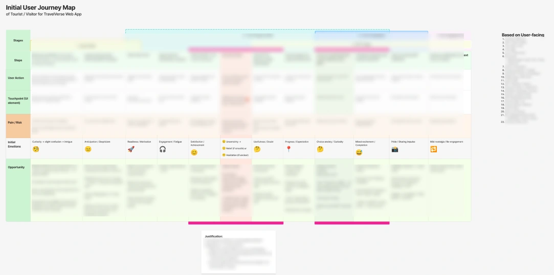
User Journey Map
This artifact provided a shared view of the user experience, helping connect user goals, moments of friction, and improvement opportunities across the journey.
UX Audit
The audit helped translate interface observations into actionable recommendations, focusing on clarity, flow, and decision points that affected user confidence and task completion.
6. Recommendations
The recommendations centered around three key areas: improving communication and user guidance, enhancing product usability and engagement, and creating a more consistent and accessible interface.
The goal was to make the experience easier to understand, more intuitive to navigate, and more rewarding for both first-time and returning users.
7. Outcome
The audit produced a prioritized roadmap covering:
UX improvements
Content strategy improvements
Accessibility enhancements
Navigation improvements
User onboarding opportunities
The findings helped align stakeholders around the most important usability risks before future product iterations.
8. Reflection
One of the most interesting aspects of this project was working with a product built around emerging technologies.
The biggest lesson was that users rarely struggle with the technology itself.
They struggle when the value, terminology, and next steps are unclear.
In products built on new concepts, communication often becomes the primary UX challenge.
Like this project
Posted Jun 1, 2026
A UX audit case study identifying how messaging, user flows, and interface consistency can help users engage with a new reward-based digital product.
Likes
1
Views
0