
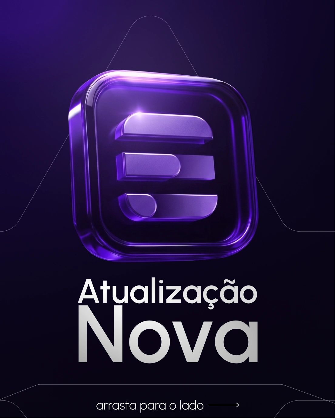
The first one was built around a product update announcement. Instead of a generic "new feature" post, we led with the brand asse, a 3D version of the logo rendered with a glassmorphism finish, purple neon depth, the kind of visual that makes people stop and think the company is bigger than it is. The "arrasta para o lado" mechanic turned a single post into a swipeable reveal, which keeps engagement higher without needing to explain anything.
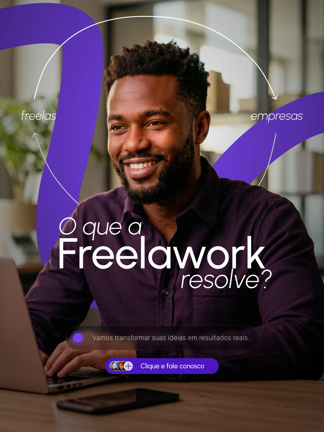
The second one answered the question most first-time visitors have but nobody asks out loud: okay, but what does this actually solve? We structured it around both sides of the marketplace, freelancers and companies, visible in the frame at the same time. The copy is direct, the CTA is low-friction, and the image does the work of showing the product is for real people, not a landing page concept.
Together they cover the two things any marketplace needs to communicate early: credibility and clarity. One tells you the platform is evolving. The other tells you why it exists.
0 likes · 0 views · Jun 17, 2026
The first one was built around a product update announcement. Instead of a generic "new feature" post, we led with the brand asse, a 3D version of the logo ...

