Visual Language Development for Landing - 2
Pablo Domrose

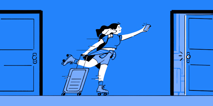
Landing is a US-based platform that lets people move between furnished apartments across the country with a single subscription. As the brand scaled, it needed a visual language that could feel warm, human, and consistent across every digital touchpoint.
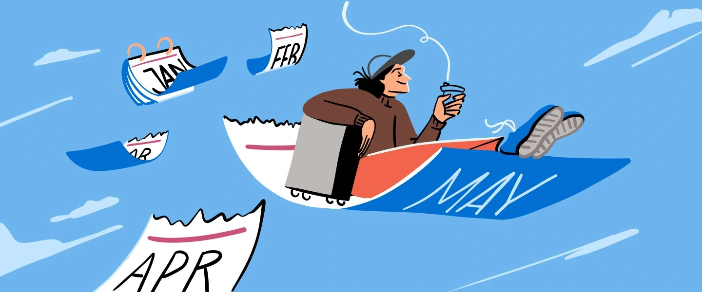
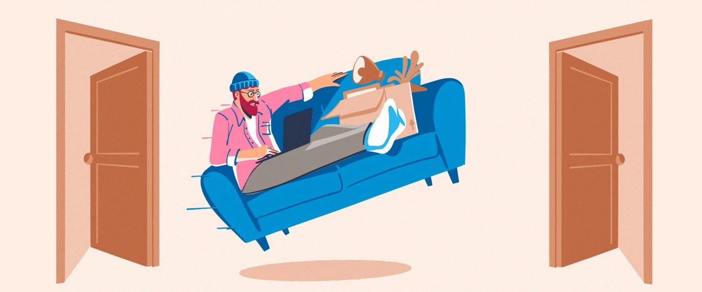
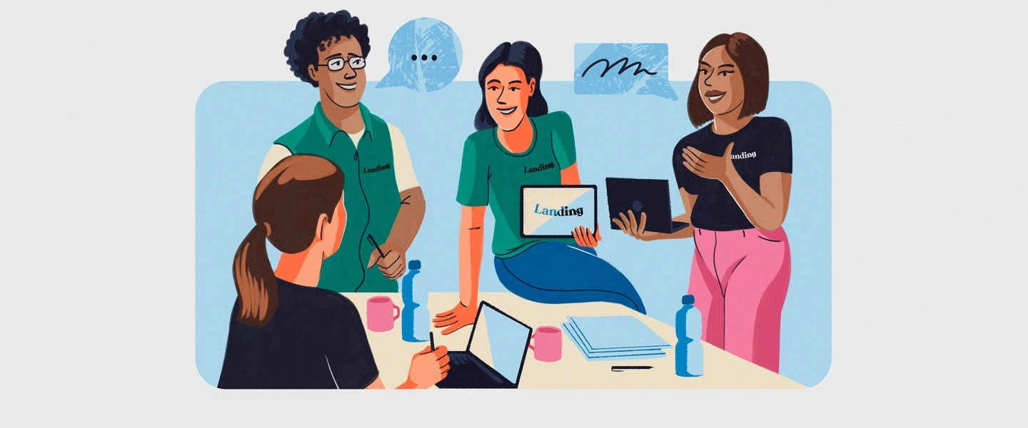
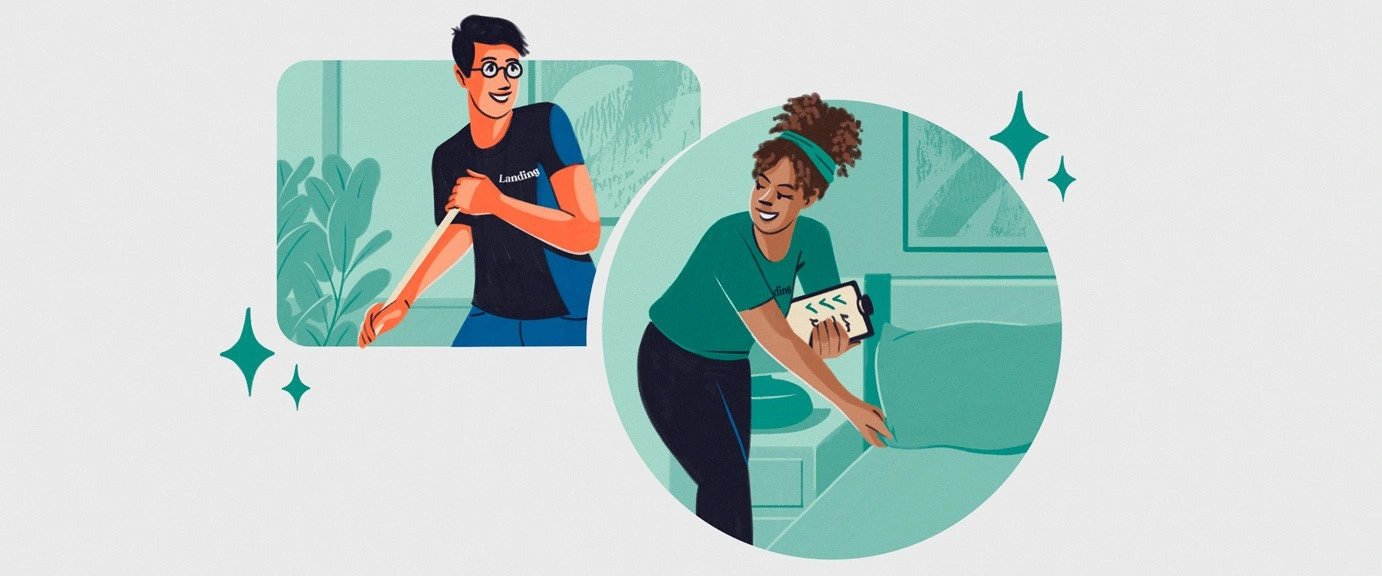
The work centered on replacing generic imagery with a cohesive illustration ecosystem built around the brand's core color palette. This included a three-step "How It Works" system using distinct colors to guide users through the product experience; a lifestyle illustration series inspired by French comic aesthetics, elegant lines, black and white with contrasting color, evoking comfort, community, and modern city living; and a set of ad campaign illustrations communicating the ease of flexible living.
The result is a scalable, emotionally resonant visual system that gives Landing a consistent, recognizable voice across every digital channel.


Like this project
Posted Jun 26, 2026
Developed a cohesive visual language for Landing's digital channels.