5 Features That Will Make Your Website Stand Out
Nowadays, a website is necessary for the success of a business.
Digital marketing has become such an important investment due to the growth and impact of e-commerce. This is because most businesses have found it efficient to sell their wares and services online as well as limiting the costs of a physical business location.
For many businesses, digital marketing provided a more direct approach to increasing reach. Being online meant that users could establish direct communication with the business at almost any time.
The problem now is that there is a great deal of competition online and it’s tough competing with all the rest. The best way through this challenge is to find a way to stand out.
The web design industry is very much alive. There are a lot of companies willing to pay for their services and for those with capital, outsourcing might be the right decision.
With outsourcing, you’re working with professionals and the question comes down to what kind of website works best for you. It’s all about what your site needs. You can find many WordPress website designs from web firms, worthy of note.
Alternatively, you could do the work yourself. It’s going to take a lot more time but in this way, you’ll have way more control. What you get will be what you’ll be able to learn.
In either case, you’re still facing the same question; “How do I stand out?” It’s pretty subjective but you’ll be able to find a few features that immediately pique your interest.
5 standout features
Immersive backgrounds
They’re interesting enough to keep you staring at the screen but not so distracting that you miss the actual content.
The more you think about it, they add to the content’s appeal. You know the kind. These backgrounds just grab your attention and add a bit of life to the whole page.
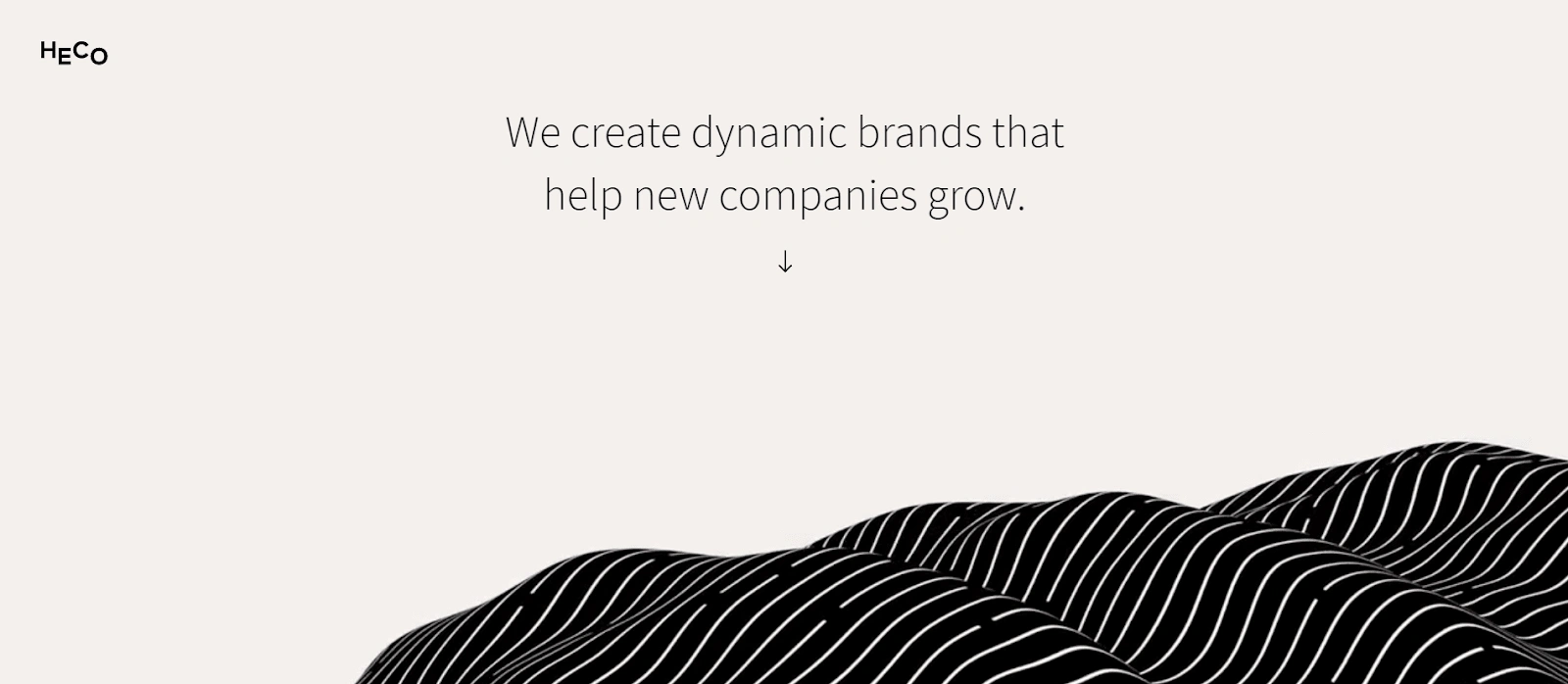
Take the above screenshot as an example. Heco Partners is a design agency from Chicago.
Immersive backgrounds are a sure way to stand out from the rest. Oftentimes, people take the background for granted. Paying extra attention to it will readily give you an advantage.
A form-and-function layout
The kind of layout raises eye-brows. It's aesthetic, it’s logical, and it adds flair.
With faster data speeds and better technologies, web designers have more to work with. Going for a functional layout can do your site wonders.
This is because with modern websites, optimizing your site’s performance is just as important as the content you have in it. This means that you’re going to have to pay more attention to how the site will work from the user’s perspective.
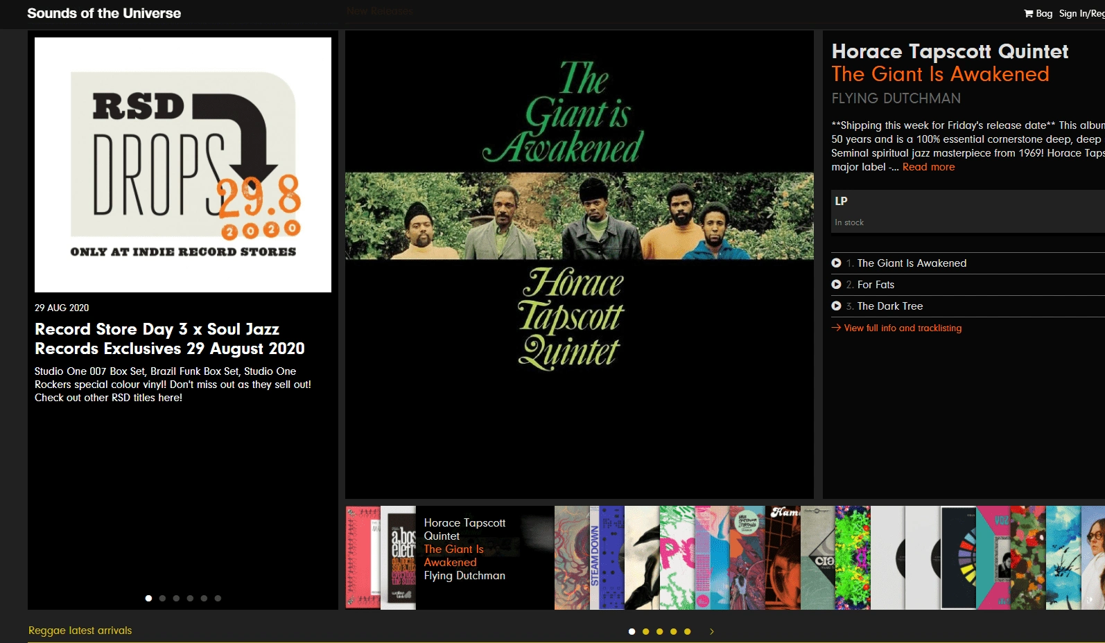
Take Sounds of the Universe above, for example. An online record store, they used the layout of a physical record store to organize this section. It’s functional and it adds to the charm of the website.
It doesn’t need to be overly complicated. Often it’s just about using a different angle on what you already have.
A Hero that counts
Page heroes, or the above-the-fold content, are the first things that your site visitors will see. You’ll find a lot of websites that don’t treat it with the importance it deserves.
With those sites, you’ll find something ordinary. Kind of like the top section of a newspaper.
But the thing is, these days we’re using computers and mobile devices to view these pages. Make the most out of your Page Hero and you’ll find yourself looking at better site traffic and interaction.
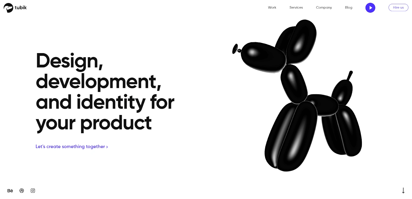
For this point, let’s look at Tubik. Tubik is another designing firm and they go with the phrase, “Let’s create something together” as their call-to-action on the front page.
Right there on the front page, you are presented with a 3D balloon animal. It’s even animated to “float” in place. Right beside it, in bold letters, Tubik declares, “Design, development, and identity for your product.”
It’s a simple approach that gets the message across. It’s not complex; it’s approachable but professional.
Engaging transitions
These days people pay more attention to the story of a brand. It’s not just about who has the brightest colors or the best promos. The narrative is just as important.
With that, websites are finding even more clever ways of telling their story. Transitions have played a big role in that with the use of scrollytelling.
Scrollytelling is when the webpage is designed to tell a story as the user scrolls down. It’s intuitive to do two things at once; tell a story, and immerse the user further.

One of the best examples of this is seen with the Dreamers and Makers website. Dreamers and Makers is a “creative ecosystem” and it shows in how they’ve developed their site.
Upon loading, users will find just the company name with some foreground elements. As the user scrolls, the background splits and reveals a new section.
With each scroll-down, the website feeds the user information the way they want you to read it. It’s immersive, it’s engaging, and it’s appealing and most users respond to this sort of work.
Rule-breakers
As with anything, web design has a few rules that people have to follow. The thing is, the rules aren’t always so applicable.
Take page symmetry for example. Yes, balance is important, but sometimes having that one discordant element on your page can increase retention. It’s like jazz, it doesn’t always have to make sense right away.
Another rule you might want to break is the serif font rule. In the past, technology made it hard for users to read serif fonts due to the displays we had available to us.
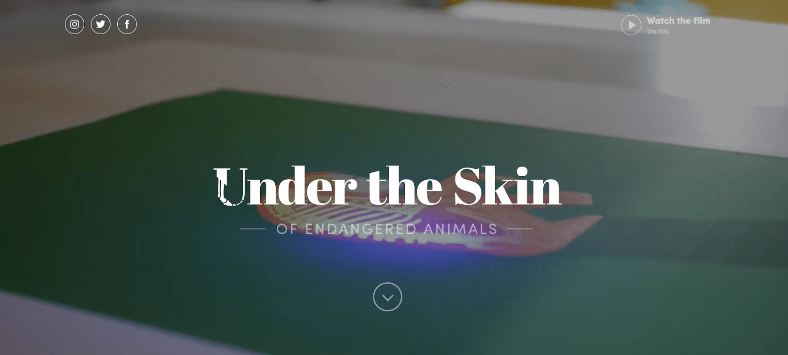
Looking at Under the Skin’s webpage, I’d say we’re past that. The webpage broke the sans serif rule but didn’t suffer for it. It adds to the appeal of the page since it’s not common practice.
Sometimes you have to break a few rules to stand out. That’s the beauty of it. With all the others following the rules, people will notice when you don’t.
Conclusion
Really, at the end of the day, it’s about getting to know your audience. That, and how you’re planning on communicating with them. Is the website there to establish that connection or is it meant for the communication itself? That’s up to you.
Keep up to date with the design trends in your industry as well. That way, you know what kind of competition to expect.
Figure out what your site is for. It’s important to have a unique and attractive site but it’s better to have a clear idea of what image or message you want to present.
After you figure that out, you’ll have a much better idea of the next steps ahead.
Like this project
Posted Jul 19, 2023
A short post describing features to make websites unique. A sample of listicle-type content.
Likes
0
Views
10


