Built with Framer
Wieldy AI Website Design
Approve request to show earnings
View
Chinonso Umeh
Verified
Project Overview
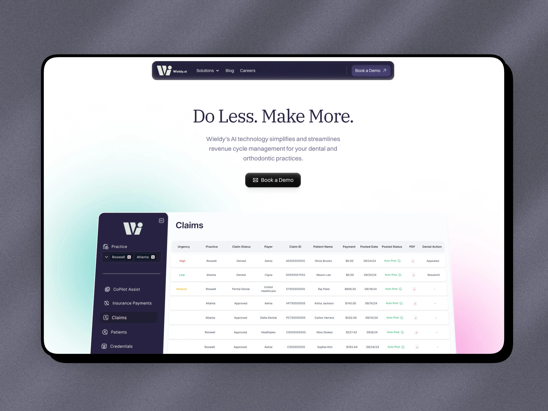
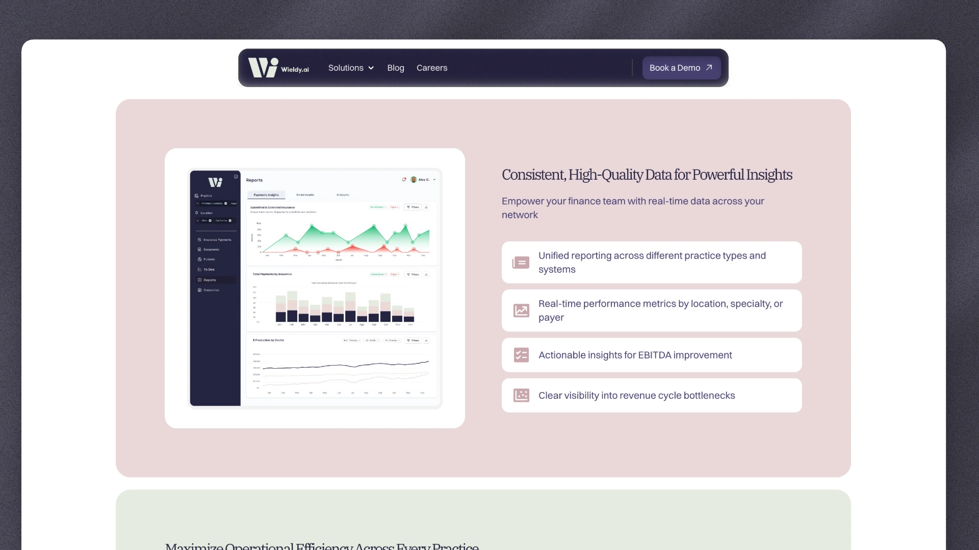
I redesigned and structured the website for Wieldy.ai, an AI-powered platform that streamlines revenue cycle management (RCM) for dental and orthodontic practices. The core goal was to clearly communicate how Wieldy’s technology reduces manual tasks, improves cash flow, and lets teams focus on what matters most, patient care.
Problem
Dental and orthodontic practices struggle with traditional revenue cycle processes because they are manual, time-consuming, and error‑prone. Tasks like insurance posting, denial management, and payment reconciliation take up high‑value hours that could be better spent on patient care and growth. Delays in processing also hurt cash flow and inflate operating costs.
Solution
I organized the site to clearly show how Wieldy’s AI automation solves these pain points by:
Highlighting how the platform eliminates manual admin work and saves significant time.
Showing measurable business value, such as faster collections and reduced accounts receivable aging.
Structuring key benefits so users instantly understand why Wieldy matters instead of what it does.
The end result is a landing experience that feels focused, strategic, and user‑centric, not just a list of features.
Key Features Communicated
I made sure the site covers the platform’s core strengths in a straightforward, readable way:
Automated Revenue Cycle Management - Wieldy uses AI to handle posting, denial tracking, and reconciliation with minimal human intervention.
Time Savings - Practices can save 80+ hours per month on administrative tasks, freeing up teams for higher‑value work.
Improved Cash Flow - Real‑time denial management and faster processing help increase collections and reduce aging on accounts receivable.
Better Satisfaction - Removing administrative burden improves staff satisfaction and patient experience.
User Outcome Highlights
Although exact metrics are from their platform messaging, the structure aims to reflect real impact:
Practices can cut manual work drastically
Teams spend more time on care instead of paperwork
Cash flow and financial visibility are meaningfully improved
This is all conveyed without jargon and in a way that resonates with practice owners and financial leaders alike.
Design & Copy Approach
Clear value language - I rewrote sections to focus on what matters most to the audience instead of internal features.
Benefit‑first structure - Each section answers a core question: Why does this matter?
Minimal distractions - Removed visual noise so the message speaks for itself.
Conclusion
The final version presents Wieldy as more than just software, it’s a solution that helps dental and orthodontic practices get time back, operate more efficiently, and improve financial outcomes. The case study reflects how I translated a complex product into a simple, compelling website narrative that feels authored by a real person rather than a template.
Like this project
Posted Feb 14, 2026
Launched a clear, conversion-focused SaaS site that simplified complex messaging, built trust with social proof, and drove more demo bookings.
Likes
0
Views
8
Timeline
Feb 10, 2025 - Ongoing
Clients
Nano Studios