Built with Framer
SaaS Landing Page Design for StatTracker
Gideon Cameron
SaaS Landing Page & Product Concept — StatTracker
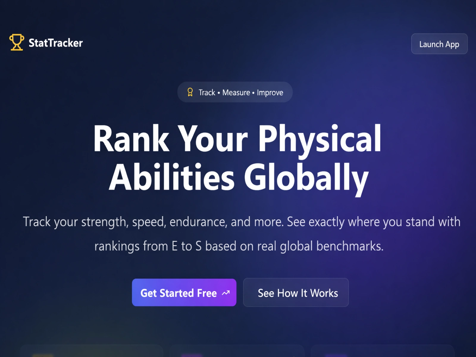
StatTracker is a SaaS concept designed to help users track, measure, and benchmark their physical abilities across multiple fitness categories. Users can input performance metrics — such as strength, speed, endurance, agility, and flexibility — and compare their results against global benchmarks, creating a more engaging and motivating experience than traditional fitness tracking tools.
The landing page was designed to clearly communicate this value from the first interaction. The hero section focuses on strong positioning, using clear messaging, structured hierarchy, and direct calls to action to guide users toward trying the product. Visually, the interface uses gradients, soft lighting, and modern typography to create a polished SaaS feel while keeping the experience lightweight and accessible—helping users quickly understand what the product does, who it's for, and why it matters.
Feature Highlights & Product Capabilities
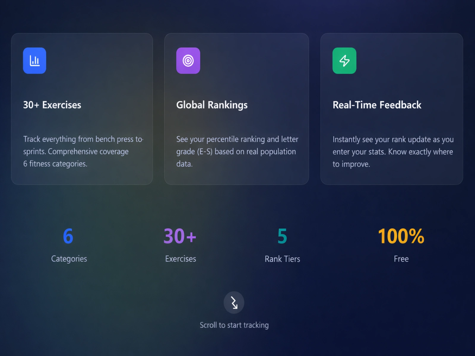
To further communicate the product's value, I created a feature section that highlights the core capabilities of StatTracker.
These include:
Tracking across 30+ exercises
Global ranking system
Real-time performance feedback
Each feature is presented in a clear, digestible card layout, making it easy for users to scan and understand the platform's capabilities.
The goal here was to balance visual appeal with clarity, ensuring the design supports the product messaging rather than distracting from it.
This section also helps position the product as scalable and feature-rich, which is important for SaaS-style landing pages.
Data Visualization & User Experience
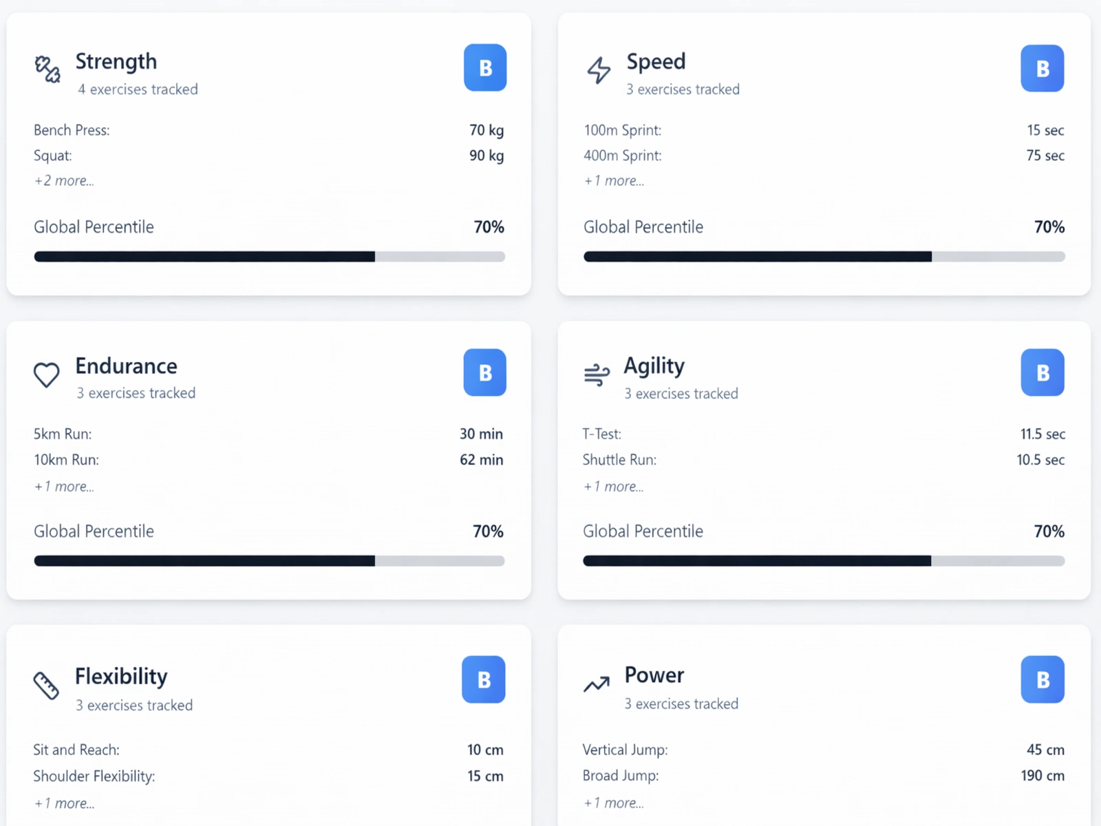
The final section focuses on showing how users interact with the platform.
Users can input their performance data across multiple fitness categories, including:
Strength
Speed
Endurance
Agility
Flexibility
Power
The interface presents results through percentile rankings, letter grades, and progress indicators, giving users immediate and meaningful feedback.
This approach transforms raw fitness data into something engaging and easy to understand, while reinforcing the core value of the product: helping users track improvement and understand their performance globally.
Project Goals
Create a modern SaaS landing page
Communicate product value clearly
Give users a test taste of the product
Gather data for improvements
Design scalable UI components
Focus on performance and usability
Build a polished, production-ready interface
This project was designed as a product-focused landing page that combines clean UI, strong messaging, and scalable frontend structure.
Like this project
Posted Mar 25, 2026
Modern SaaS landing page for a fitness stat tracker that benchmarks user performance across strength, speed and more with global rankings and real-time insights
Likes
1
Views
3
Timeline
Mar 17, 2026 - Mar 24, 2026