This project was built with:
Gyro - Podcast Website
0
Web Designer
Framer Developer
Framer Designer

Adobe Illustrator

Figma

Framer
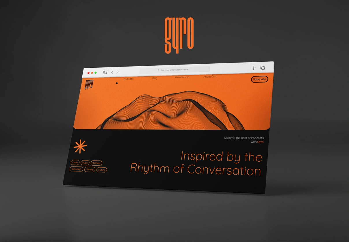
Framer Podcast Website
When designing the Gyro podcast website in Framer, I looked to Spotify for inspiration. Their approach to user-friendly interfaces and effective content organization influenced the design of Gyro, aiming for ease of use and accessibility.
The entire process of building Gyro, from the initial concept to the launch, spanned approximately three months. This period involved designing, prototyping, user testing, and applying the feedback to refine the website.
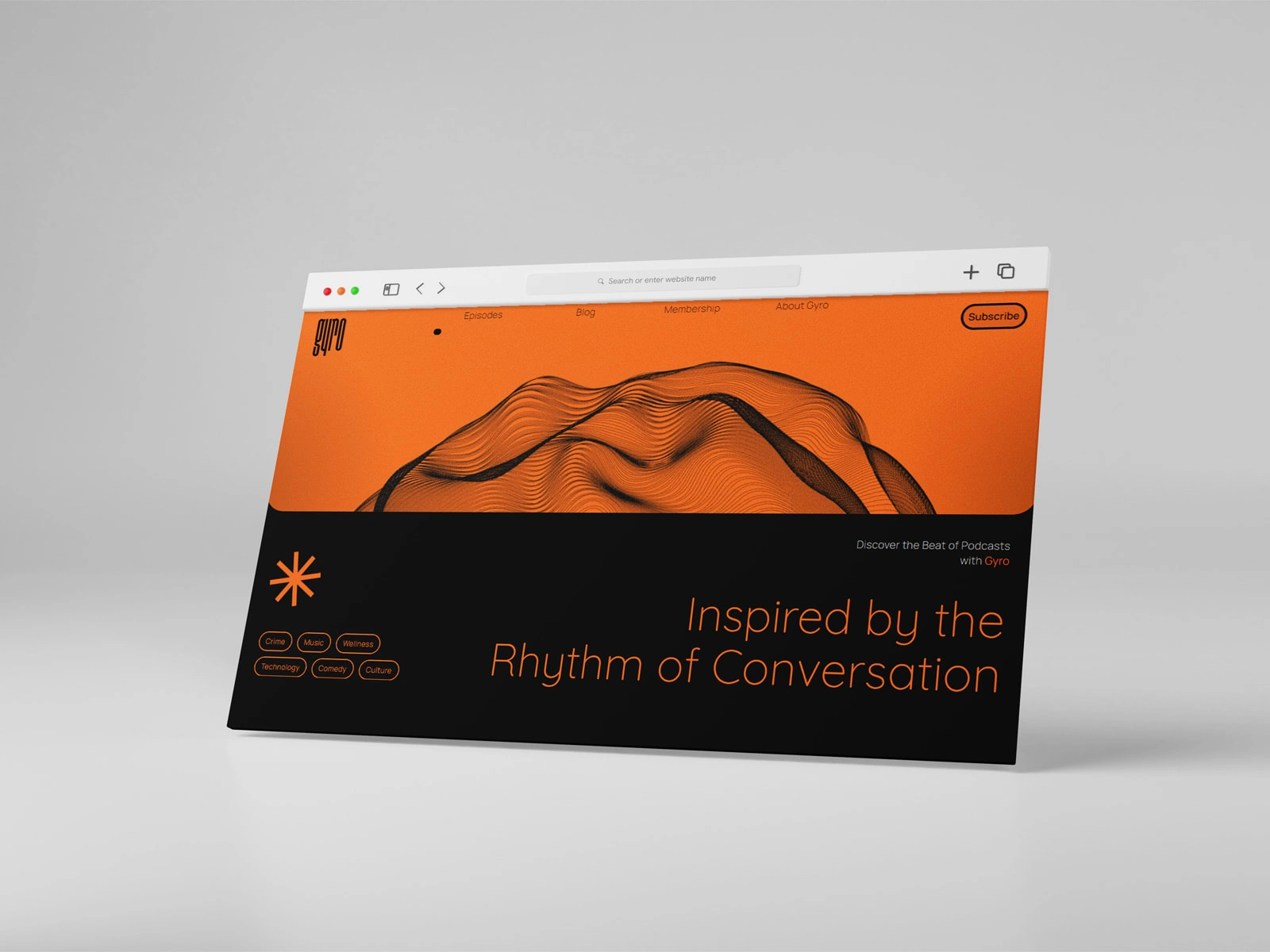
Framer Podcast Website
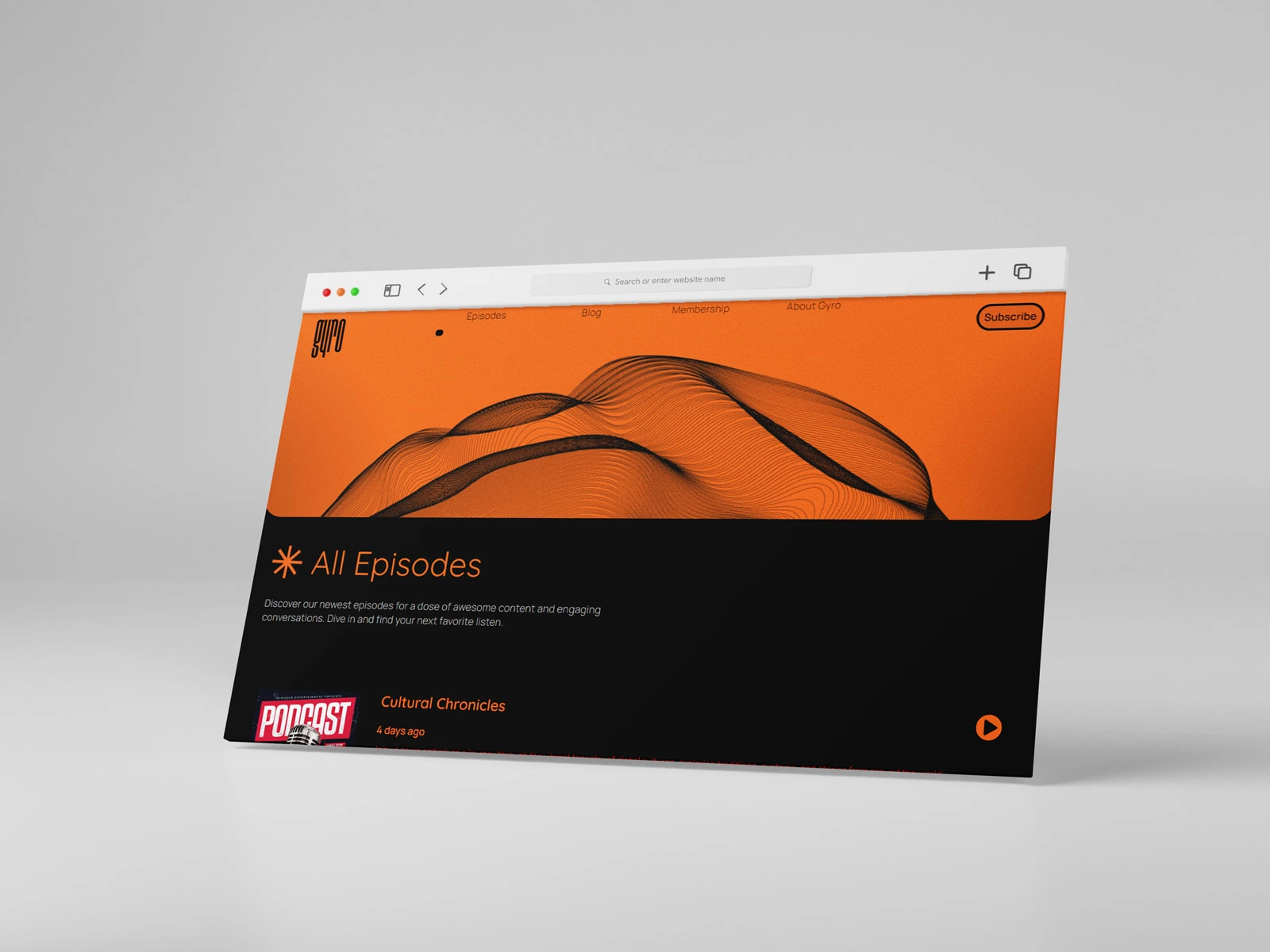
Framer Podcast Website
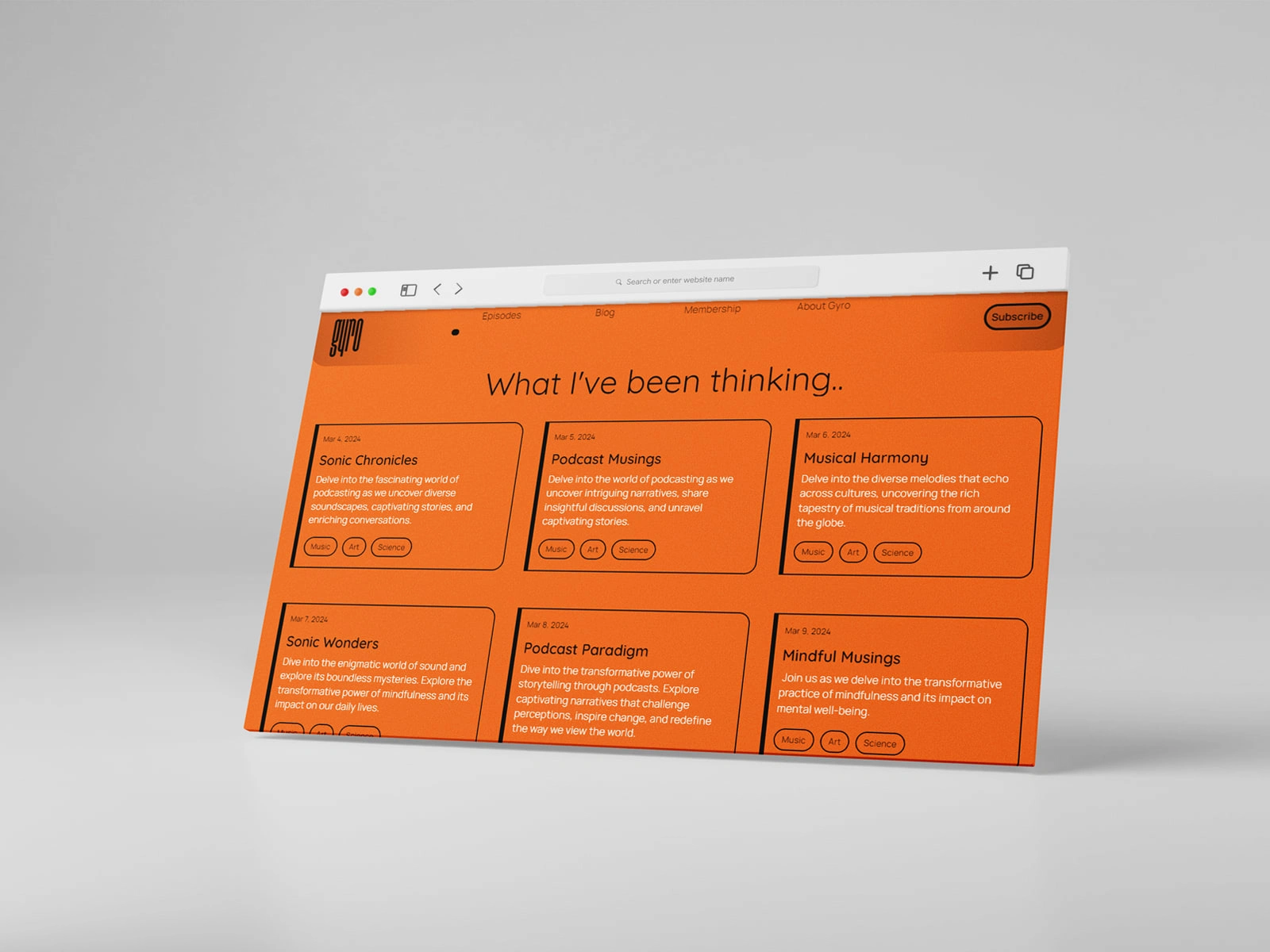
Framer Podcast Website
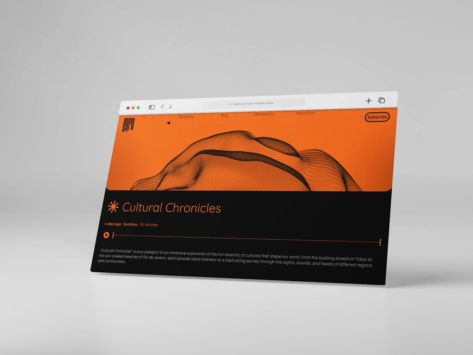
Framer Podcast Website
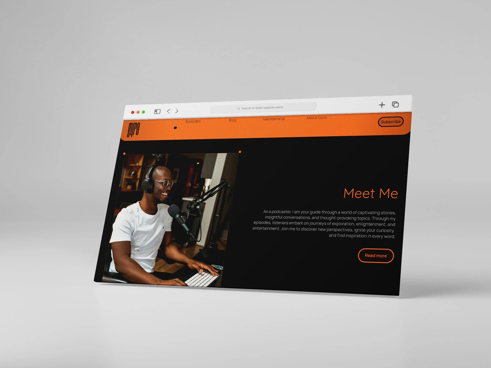
Framer Podcast Website
Like this project
0
Posted Apr 12, 2024
Discover a sleek, user-friendly podcast website template designed to showcase your content and engage your audience effortlessly.
Likes
0
Views
10
Tags


Web Designer
Framer Developer
Framer Designer

Adobe Illustrator

Figma

Framer

