Webflow Site for VC Company
Project overview
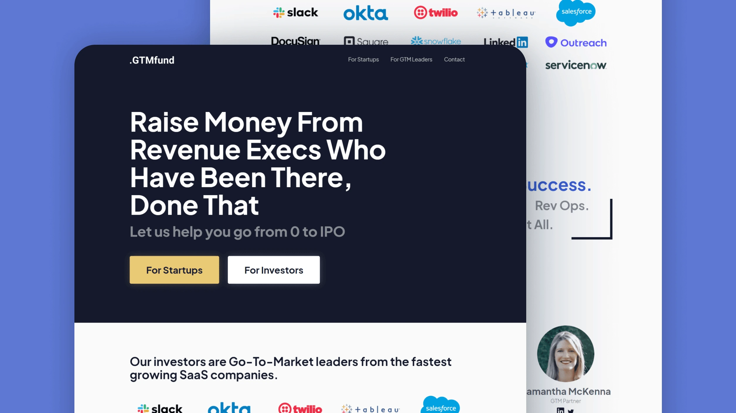
The client needed a minimalist website for a venture capital fund, GTMfund, and needed to launch by January 1st, 2021. The project goal was to encourage SaaS startups to apply for the fund via an online form.
Execution
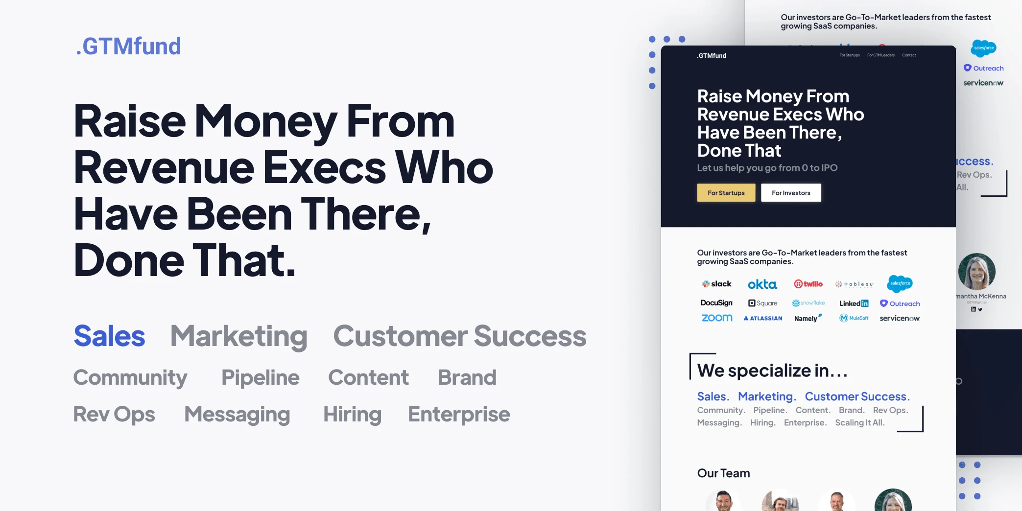
The client came with content prepared and produced a rough sketch of what he envisioned for the website. I referenced his sketch to determine the content layout and found design inspiration from other VC investor websites. I picked Plus Jakarta Display as the typeface to use across the website to instill professionalism, modernity, and trust. Dark blue and light gold were used as the primary colors to communicate integrity, professionalism, and premium-grade service.
The design and development process was highly collaborative, continuously going back and forth with the client while iterating each element of the design. Once the design was approved, the website was developed in Webflow. I chose to use grids for the list of logos as well as the team section to efficiently achieve a responsive design that could easily be edited by the client after delivery. The list of specialties uses inline blocks to allow for text wrapping and staggered intro animations. I considered the most likely pieces of content that would be changed or updated and created training videos that the client can reference when he wants to make his own changes to the website in the future.
Once development was complete and the website was approved, I transferred it to the client's Webflow account and delivered the training videos I had made
Post-launch Additions
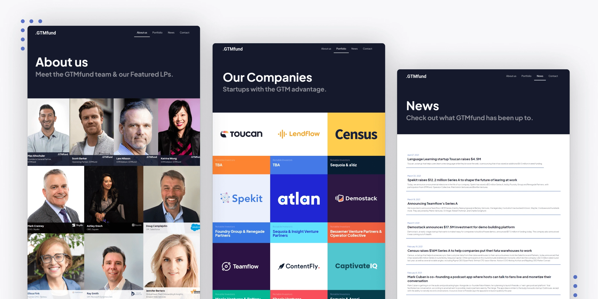
A few months passed and the website required 3 more pages to be created: About us, Portfolio, and News. We decided to upgrade the website hosting to Webflow's CMS plan to expand greater functionality and allow for more members of the GTMfund team to easily make updates to the website.
Media Launch
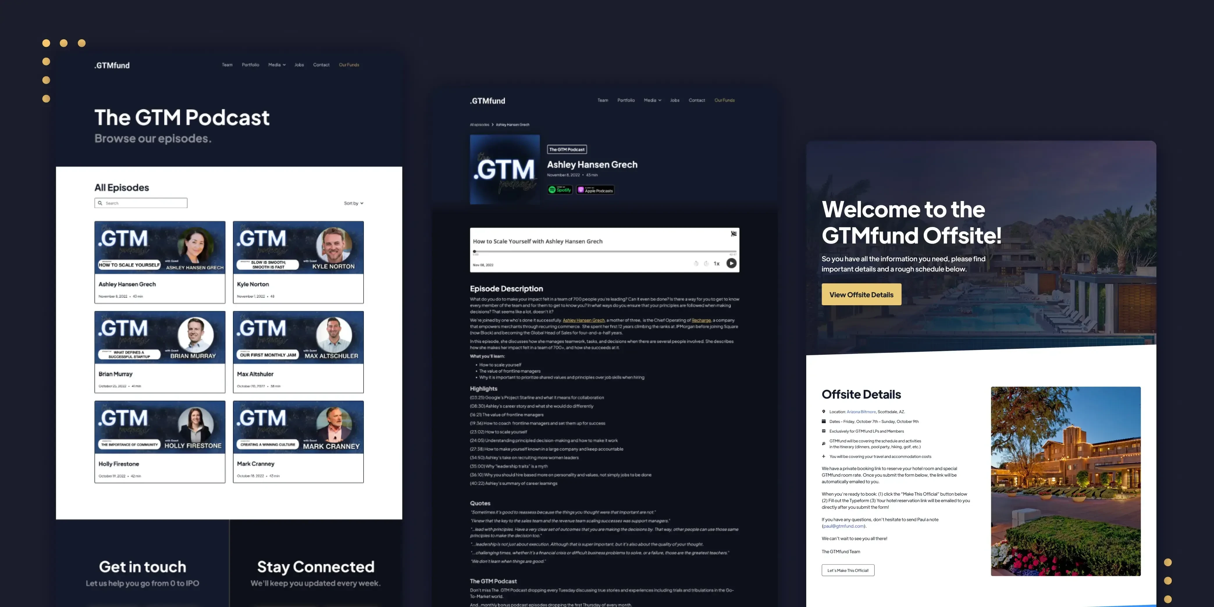
In October 2022, GTMfund launched their podcast and newsletter. This required new pages to be created that allow users to subscribe to the newsletter and listen to podcast episodes. The podcasts episodes were implemented using Webflow's CMS and Finsweet Attributes' CMS Filter for on-page search and filtering.
Results
The initial website was completed and delivered within 3 days, and GTMfund successfully launched before January 1st, 2021. Since launch, several investors have joined GTMfund, and dozens of startups have received funding.
Like this project
Posted Oct 7, 2023
This is a website design and build for GTMfund LLC – a VC investment firm that provides funding and resources to SaaS startups to help them go from 0 to IPO.
Likes
0
Views
4

