Built with Framer
Kaido Wellbeing & Sustainability —Framer Website Design

Can Girgin


Kaido Wellbeing & Sustainability — Responsive Website Redesign in Framer
People-first redesign for Kaido.org: parallax hero scenes, animated scroll-cue, heart/leaf vector motifs and a fresh Schibsted Grotesk + Inter system.
Overview
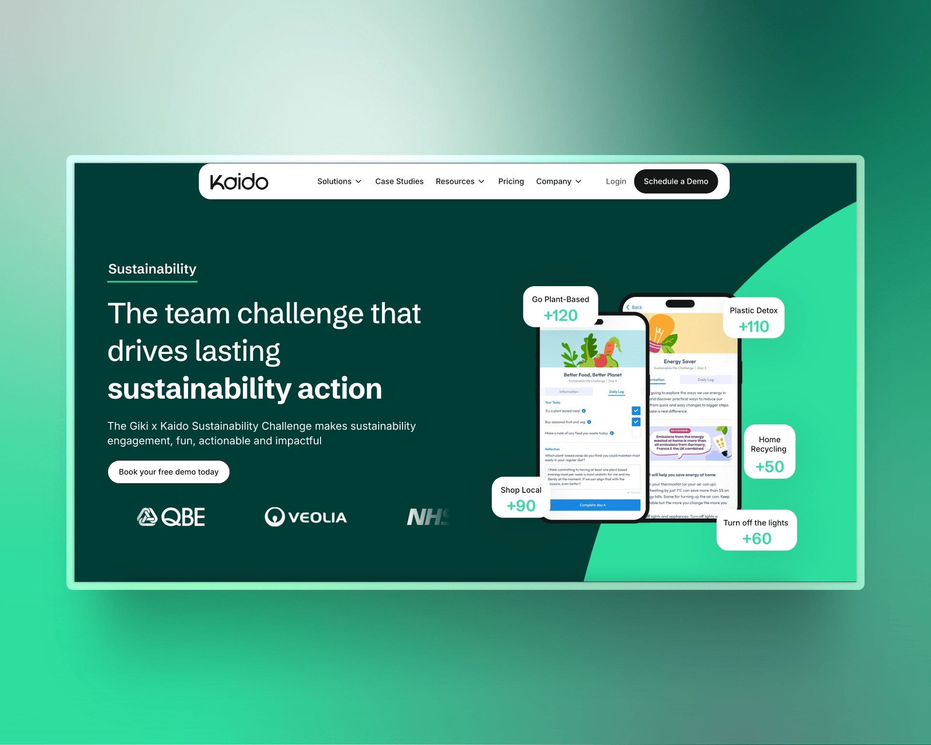
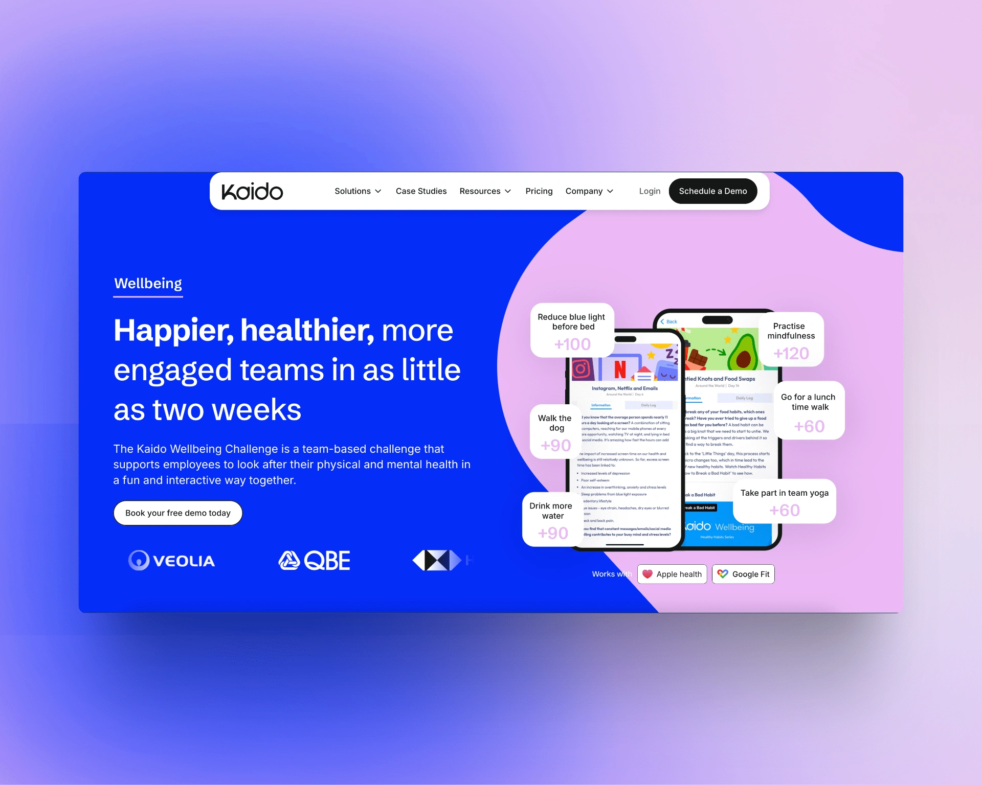
Kaido helps companies boost employee wellbeing and sustainability engagement. I rebuilt Kaido.org in Framer, crafting a calm yet vivid UI that lives in two colour stories: Wellbeing (💙 #052CF8 + 💗 #EBB9F6) and Sustainability (🌿 #023D36 + 💚 #2CDD9E).
Typography
• Schibsted Grotesk for headlines
• Inter for body text
Core Goals
• Deliver a lighter, more intuitive experience
• Separate Wellbeing & Sustainability journeys visually
• Boost conversions with clear CTAs and motion cues
• Build a reusable design-system inside Framer CMS
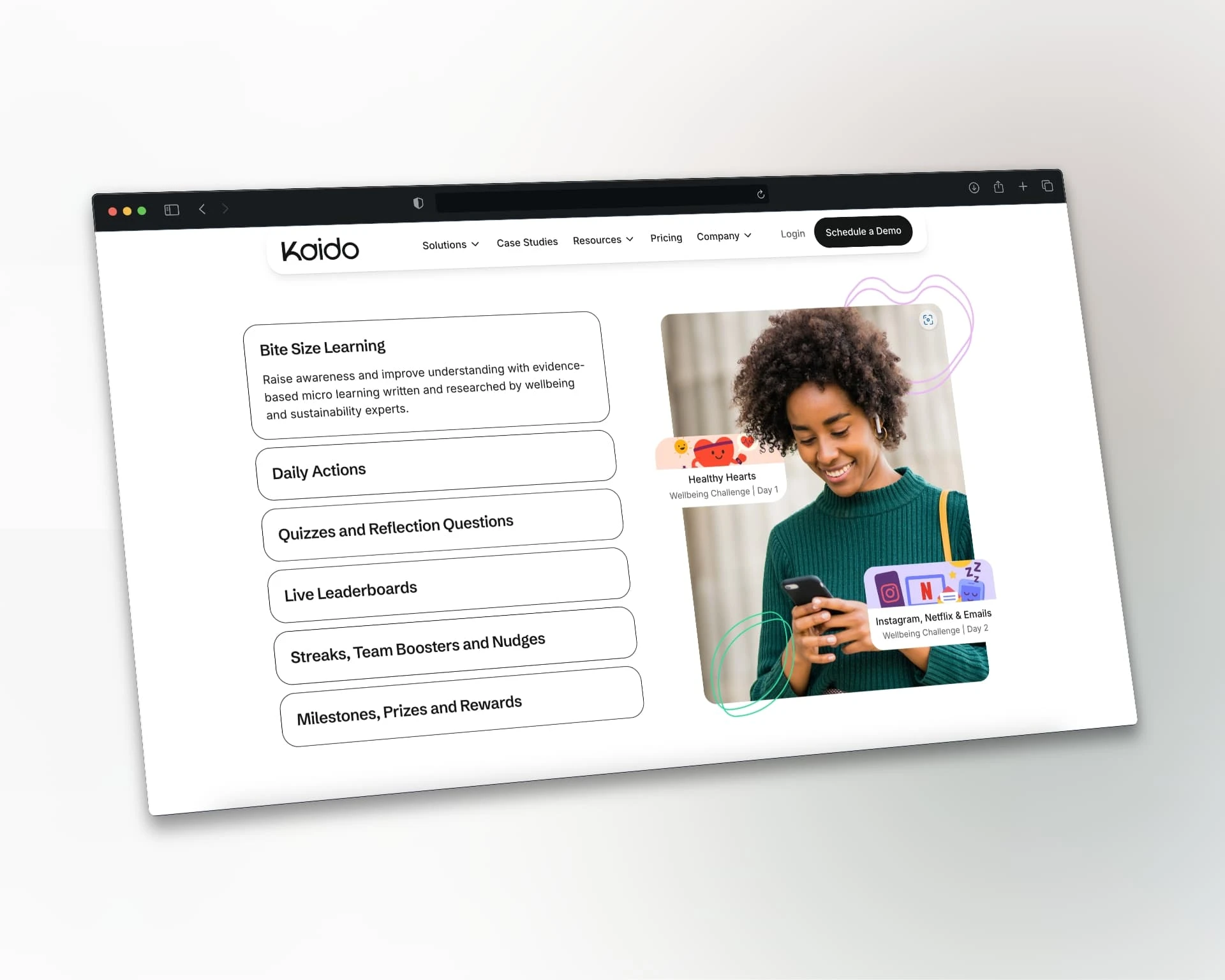
Key UI Features
• Parallax hero scenes for both pillar pages
• Animated scroll cue guiding the first fold
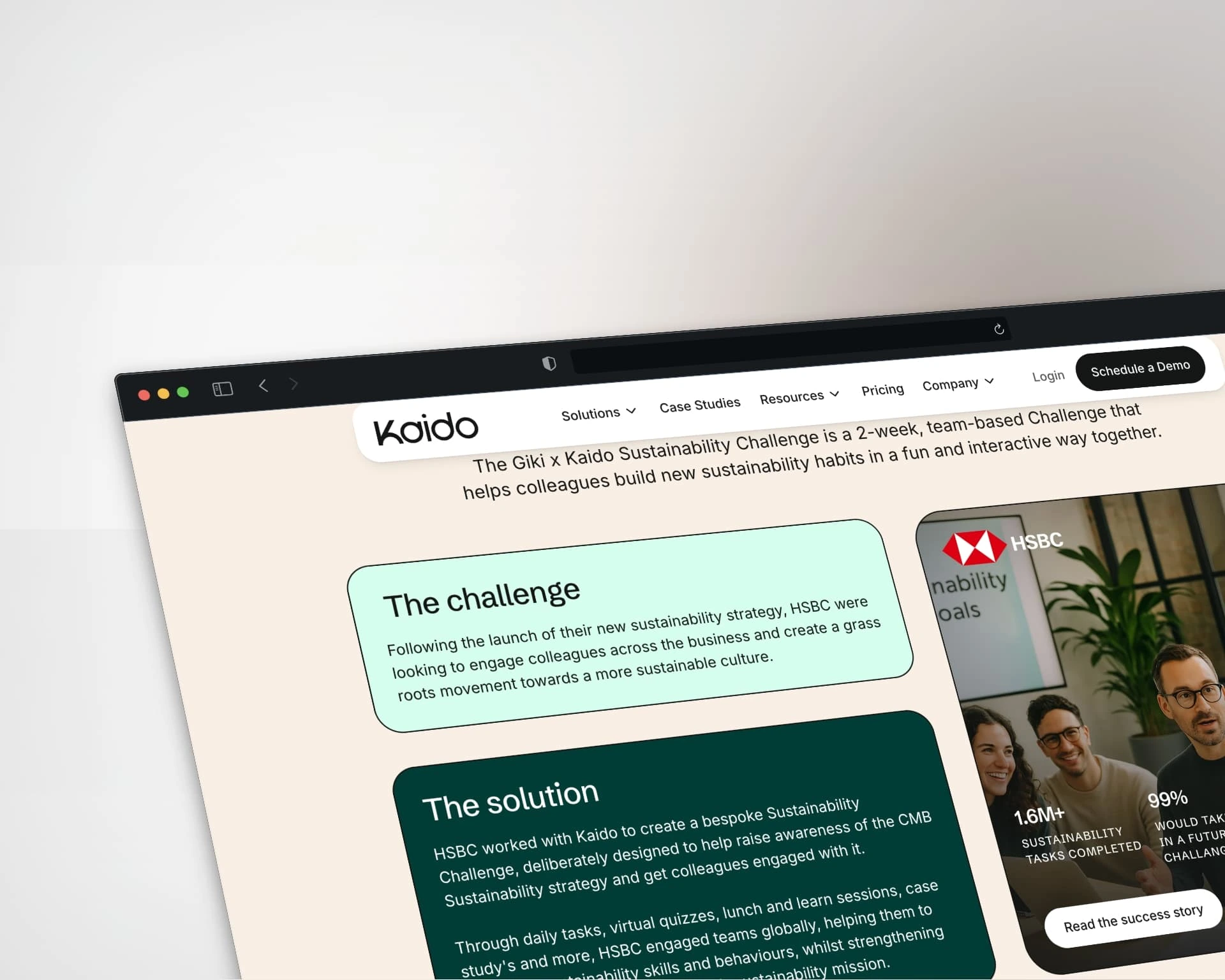
• Interactive case-study carousel — click a logo → the related mock-ups fade & slide in with a flawless Framer motion sequence (no external libraries)
• Custom heart ❤ and leaf 🌿 vector motifs integrated across components
• Subtle hover states and focus rings for accessibility
Process
1. Audit & UX strategy
2. Low-fi wireframes → hi-fi comps
3. Component-driven build in Framer
4. Performance + SEO pass (Lighthouse 90 +)
5. Cross-device QA & launch
Impact
• +38 % avg. session duration (30 days post-launch)
• +29 % demo-booking clicks
Tech Stack
Framer · Figma · Google Fonts · Hotjar · Lighthouse
Credits
Design & build — Can Girgin
Client — Kaido (kaido.org)
Live Site
kaido.org
---
Keywords: Framer web design, parallax hero, interactive case study, scroll animation, wellbeing website, sustainability website, Schibsted Grotesk, responsive UI, brand refresh, employee engagement platform
Like this project
Posted May 8, 2025
People-first redesign for Kaido.org featuring parallax hero scenes, an elegant scroll cue, and playful heart-and-leaf motifs—crafted in Framer.
Likes
0
Views
0
Timeline
Apr 1, 2025 - May 8, 2025


Esteticium Australia Cosmetic Health Tourism Website
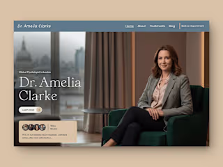
The Ultimate Framer Website for Psychologists
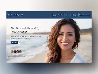
Dentiva – Best Framer Website for Dentists & Doctors

Architectural — Modern Framer Website for Architects & Designer