Built with Framer
Formes Fitness Landing Page Development
Divine Animasahun
Overview
Formes is a fitness program built by a solo coach focused on simple, sustainable movement. The brief was a brand-new landing page that could replace word-of-mouth as the primary sign-up channel and give the program a credible, premium online presence.
The problem
The coach was running a real program with real results, but no proper website to send people to. Without a clear digital front door, signups depended entirely on direct outreach and referrals. Anyone curious enough to look the program up online either landed on social profiles or hit a dead end.
The goal: a single landing page that clearly explains the program, quickly builds trust, and guides visitors to join without pressure.
Approach
I started in Figma to lock the structure and visual direction before touching Framer. That separation kept design decisions clean and made the build phase faster and more predictable.
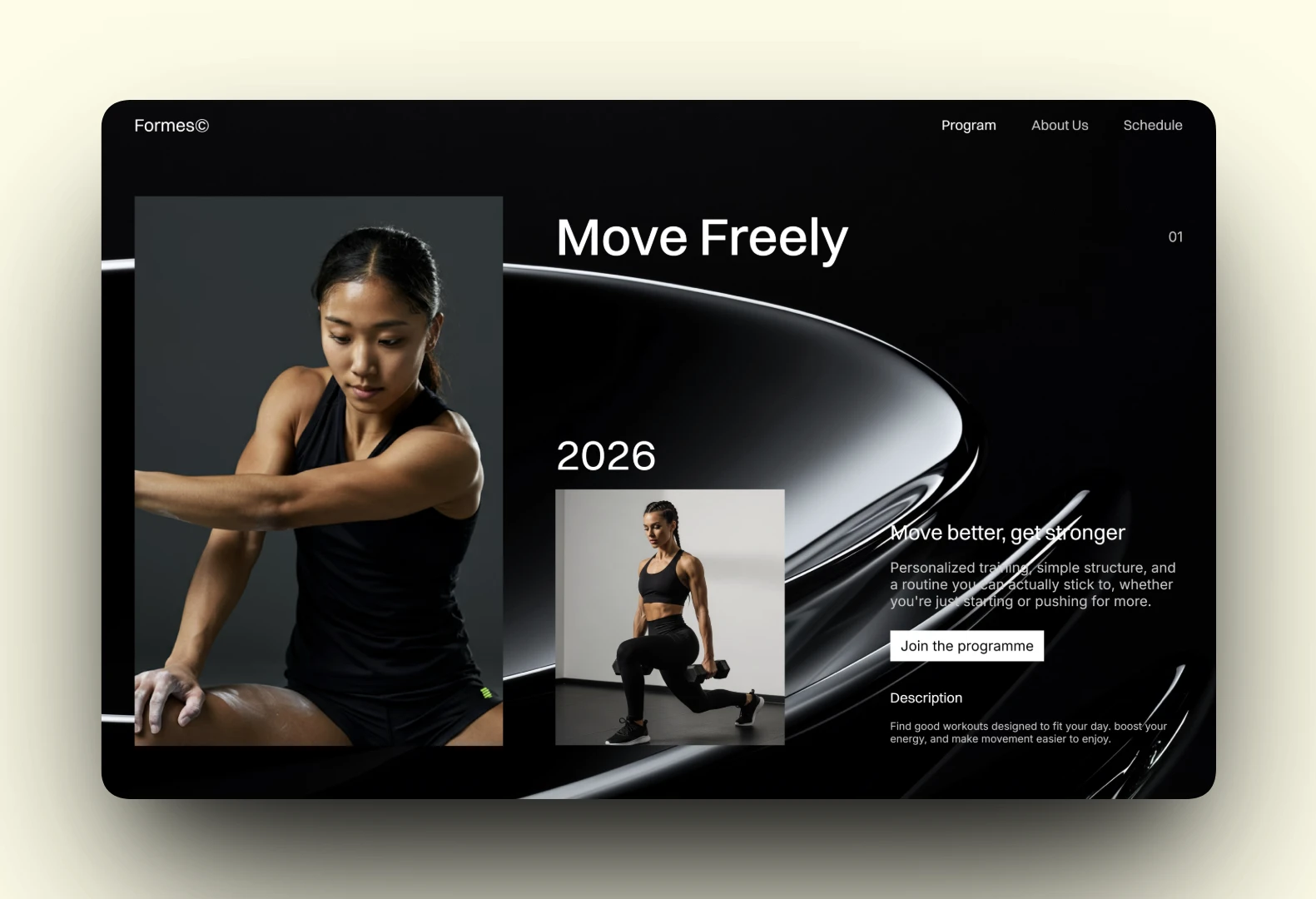
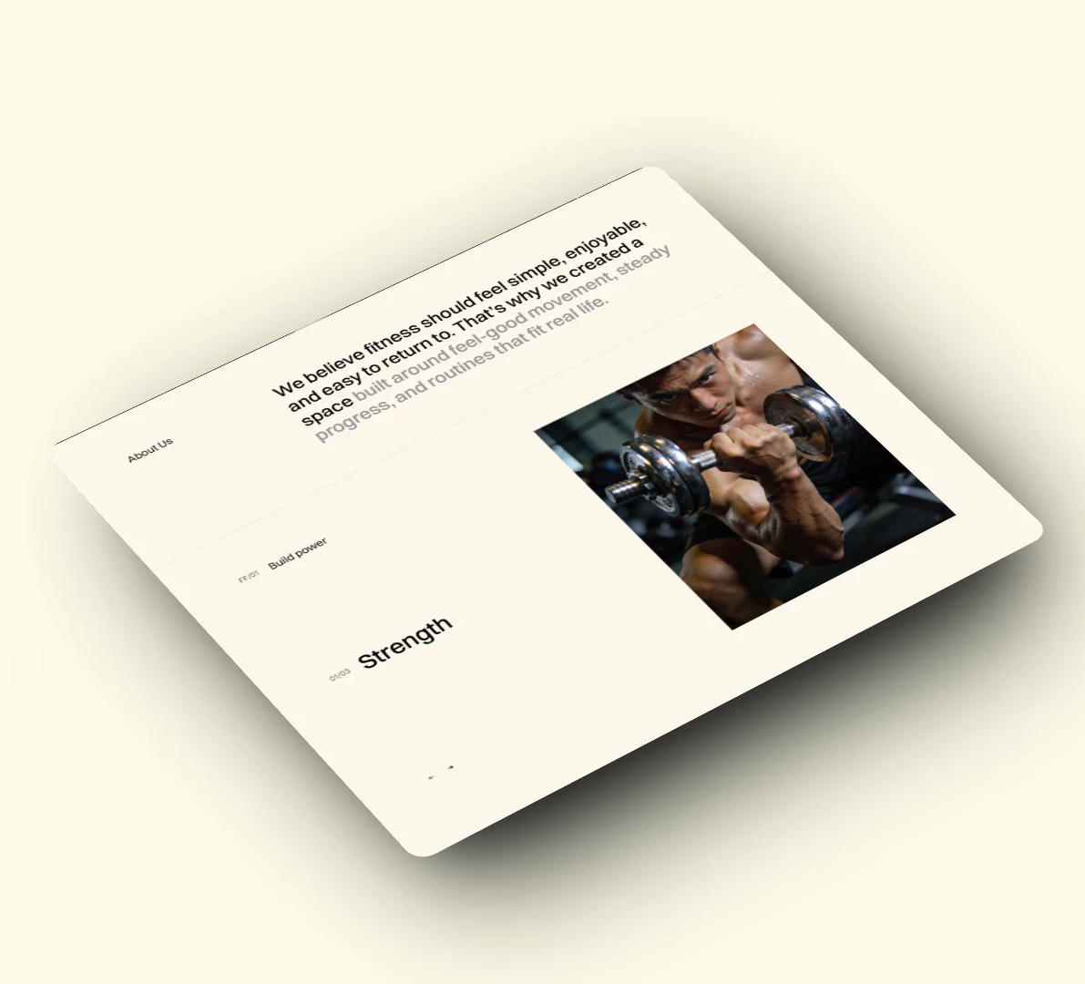
The site is built around the coach's actual philosophy: movement should feel approachable, not intimidating. So instead of leaning on the usual fitness tropes (transformation photos, aggressive copy, hard-sell CTAs), the design uses calm typography, editorial imagery, and a measured pace that mirrors how the program itself works.
What's on the page
Hero with program intro and primary CTA ("Join the program")
Three program pillars: Move Freely, Build Strength, Feel Better
About section explaining the philosophy behind the program
"How it works" three-step breakdown
Social proof from program members
FAQ section addressing common hesitations (beginner-friendly, equipment, pacing, frequency, results)
Final CTA with contact details
Design decisions
Slow, considered scroll rhythm instead of dense info-dumping
Mixed serif and sans typography to feel editorial rather than gym-brand
Real photography over stock fitness imagery
FAQ written to remove friction, not push the sale
Single primary action repeated throughout ("Join the program") so there's never any confusion about the next step
Tech notes
Designed in Figma, built in Framer
Fully responsive across mobile, tablet, and desktop
Lightweight, fast-loading, no CMS needed at this stage
Clean handoff so the coach can update copy without needing me
Outcome
Signups increased after launch. The page gave the coach a clear, credible link to share and removed the friction of explaining the program over DMs and calls. It now does the convincing on its own.
See it live
Like this project
Posted Apr 25, 2026
Formes is A fitness brand & the goal was to create a modern, website that communicates the program clearly, builds trust, and guides visitors toward joining.