:Problem Poor layout structure, weak
Rotimi Oluwadunsin
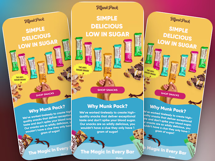
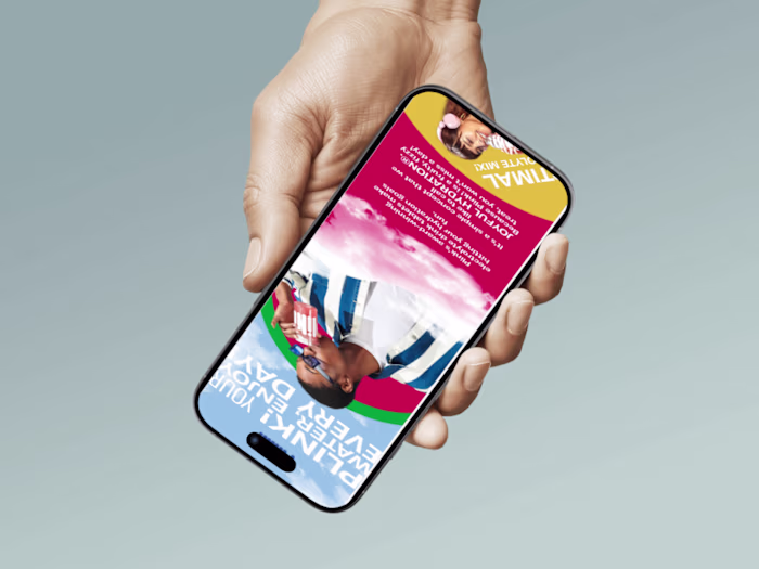
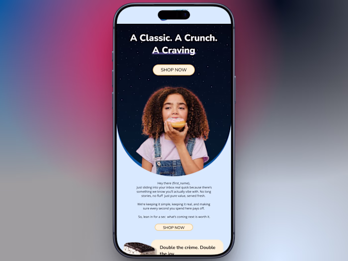
:Problem
Poor layout structure, weak call-to-action placement, and lack of visual hierarchy often make subscribers lose interest before reaching the main message.
Solution
To solve this, I designed a clean and conversion-focused email layout that guides the reader naturally through the content. The design uses strong visual hierarchy, clear sections, and strategically placed call-to-action buttons to make the message easy to understand and engaging.
Impact
The improved layout and clarity support higher engagement, better click-through potential, and a stronger connection between the brand and its audience.
Tools Used: Figma, Klaviyo
Focus: Email design, responsive layout, and conversion-driven structure.
Like this project
Posted Mar 6, 2026
:Problem Poor layout structure, weak call-to-action placement, and lack of visual hierarchy often make subscribers lose interest before reaching the main me...