Left Bank Barrel Aged Gin Label Design
Joanna Davis
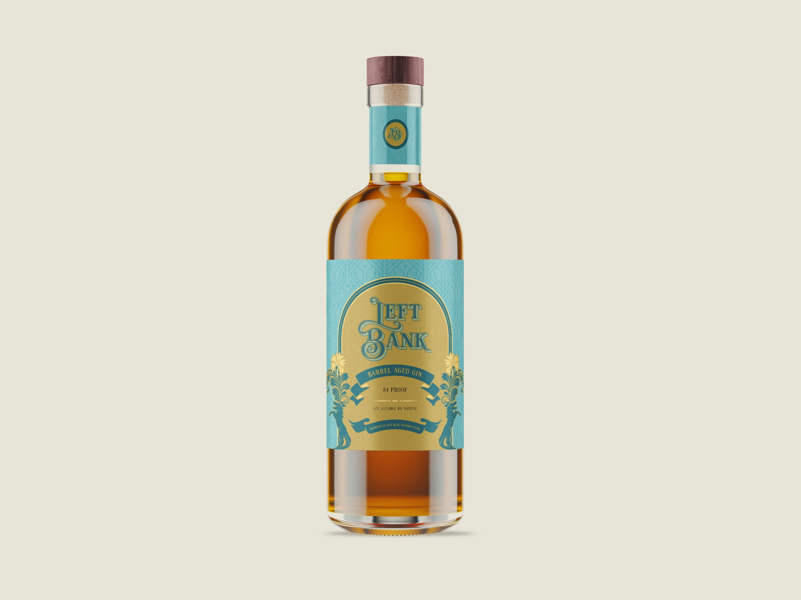
For Left Bank's Barrel Aged Gin, the goal was to create a label that felt as rich and layered as the spirit itself. This wasn't a traditional gin; it was aged in freshly emptied bourbon barrels, so the design needed to bridge two worlds: classic gin botanicals and the warmth and depth of bourbon heritage.
I created a visual system inspired by the vintage river trade and New Orleans culture. This design incorporates ornate typography, symmetrical flourishes, and decorative motifs that suggest movement and journey. The arch framing, ribbon elements, and detailed illustrations guide the viewer's eye while reinforcing the brand story of barrels traveling downriver. The color palette combines deep teal with warm gold, reflecting both botanical freshness and the complexity of oak aging.
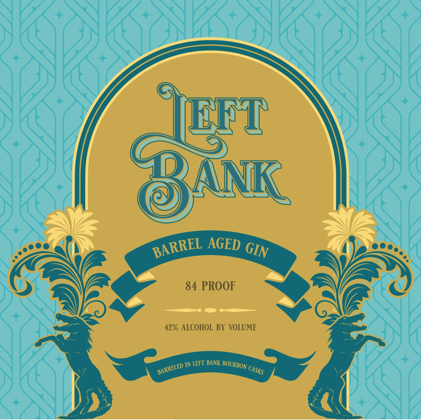
Left Bank Gin Label Front
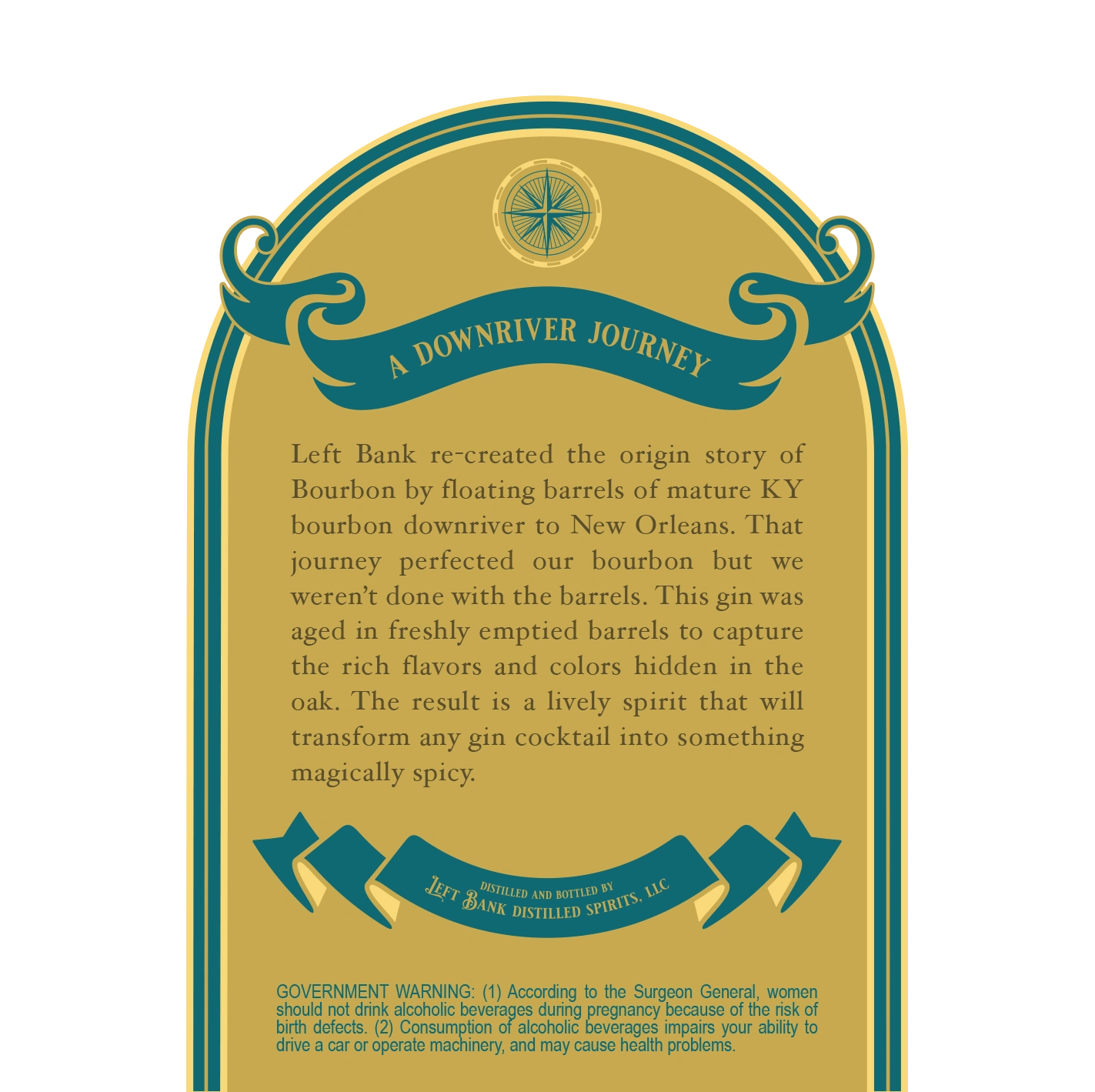
Left Bank Gin Label Back
The front label creates a strong shelf presence with its bold hierarchy and intricate details, while the back label focuses on storytelling, highlighting the brand's origin story and unique barrel-aging process. Every element was carefully designed to feel intentional, from the custom typography to the ornamental accents, offering a cohesive and premium experience from the first glance to the final pour.
The result is a label that not only stands out in a crowded spirits market but also honors craftsmanship, history, and the distinctive character of the product.
Like this project
Posted May 15, 2026
Designed a unique gin label that bridges traditional gin and bourbon aesthetics.
Likes
0
Views
1