FB Carousel | Social media | Carousel tiles

Niharika Singhal

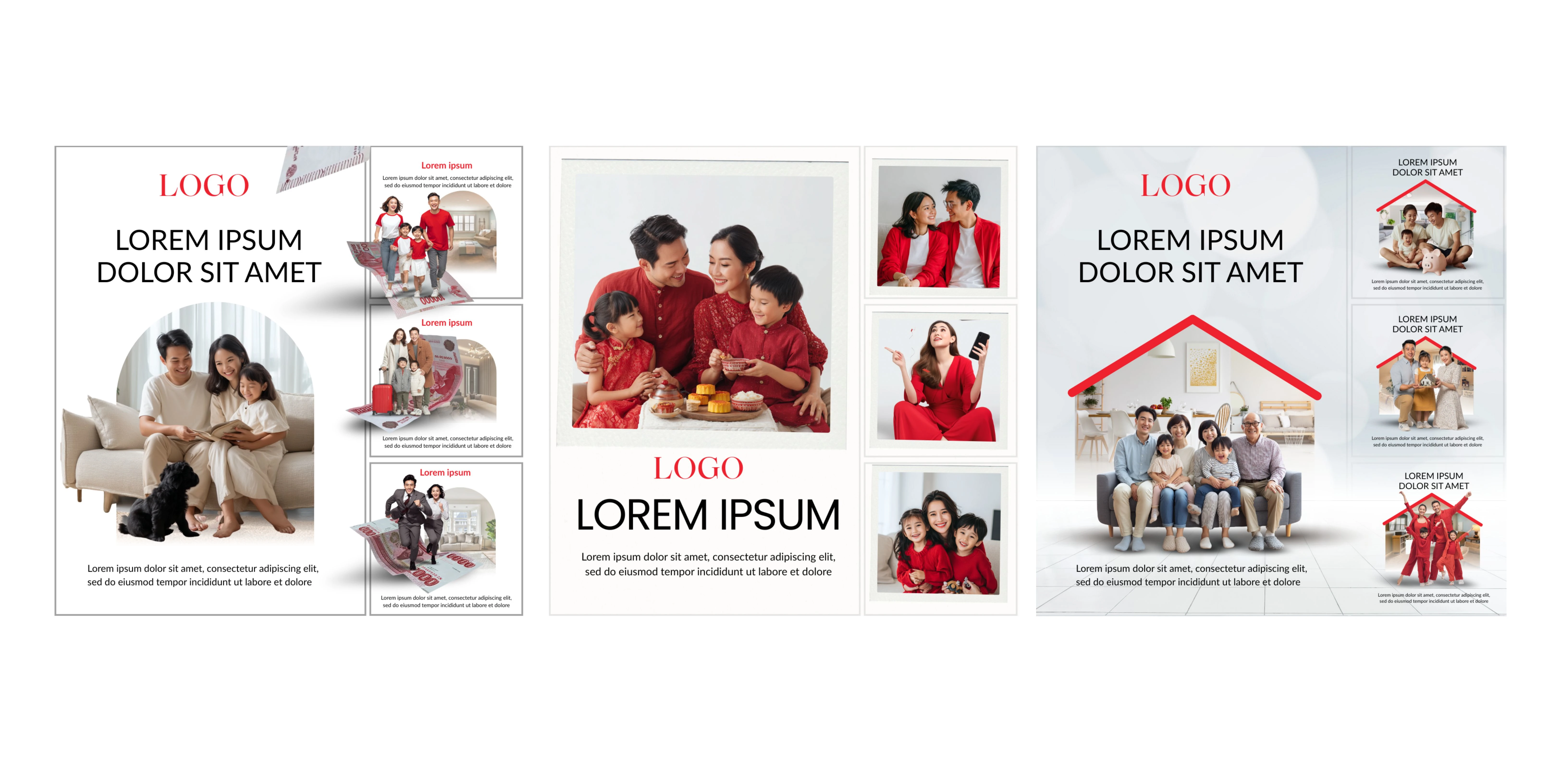
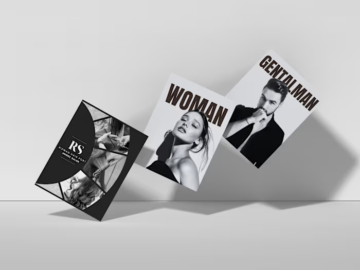
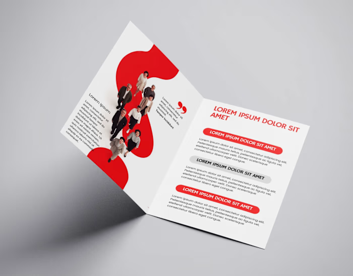
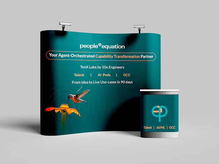
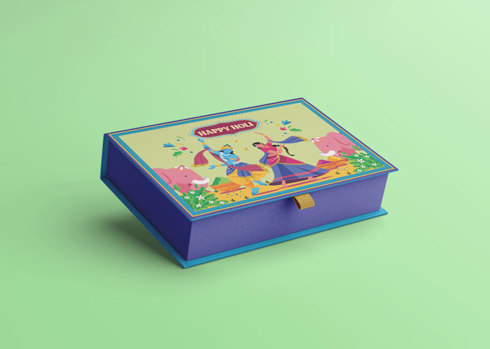
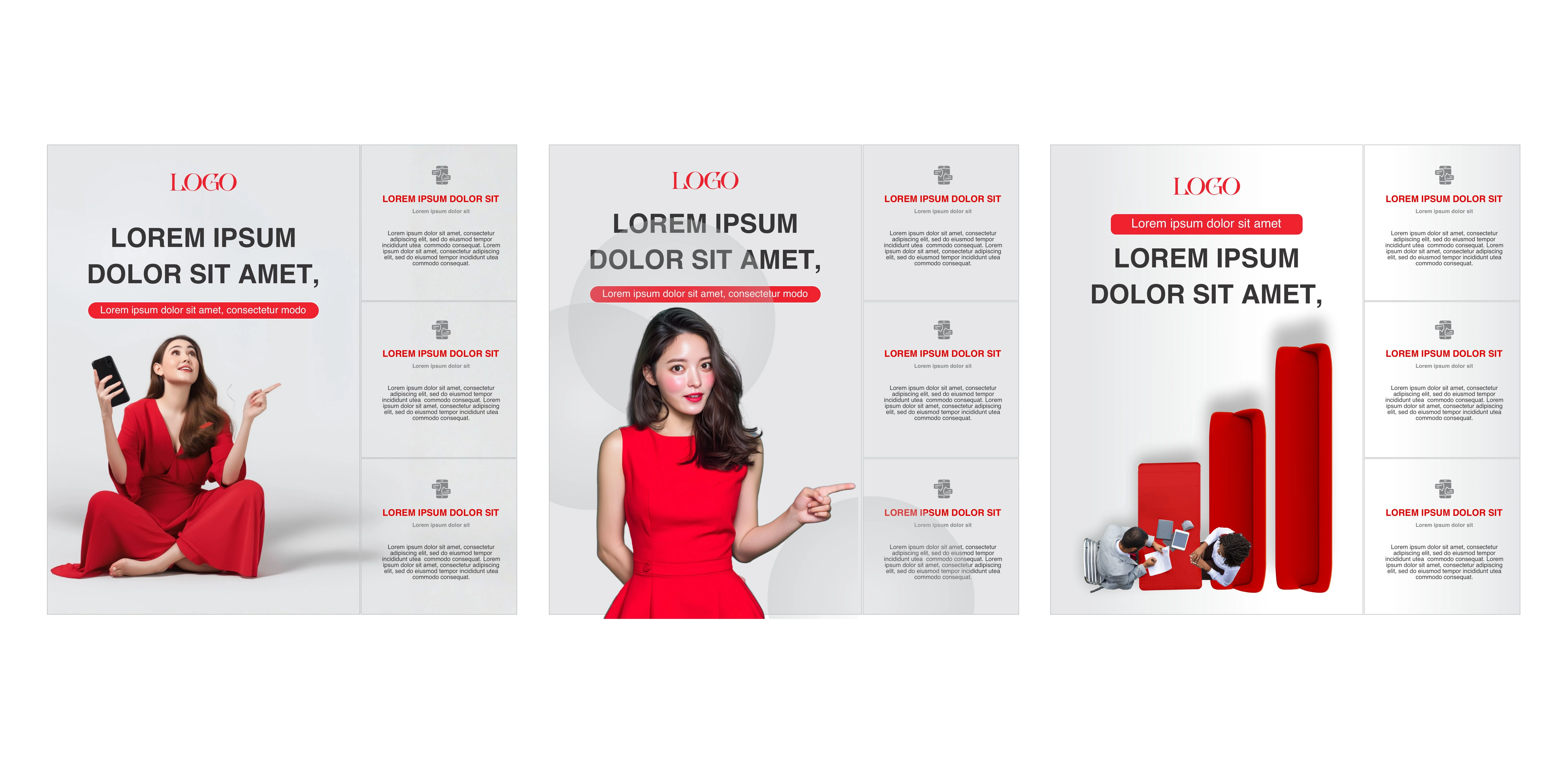
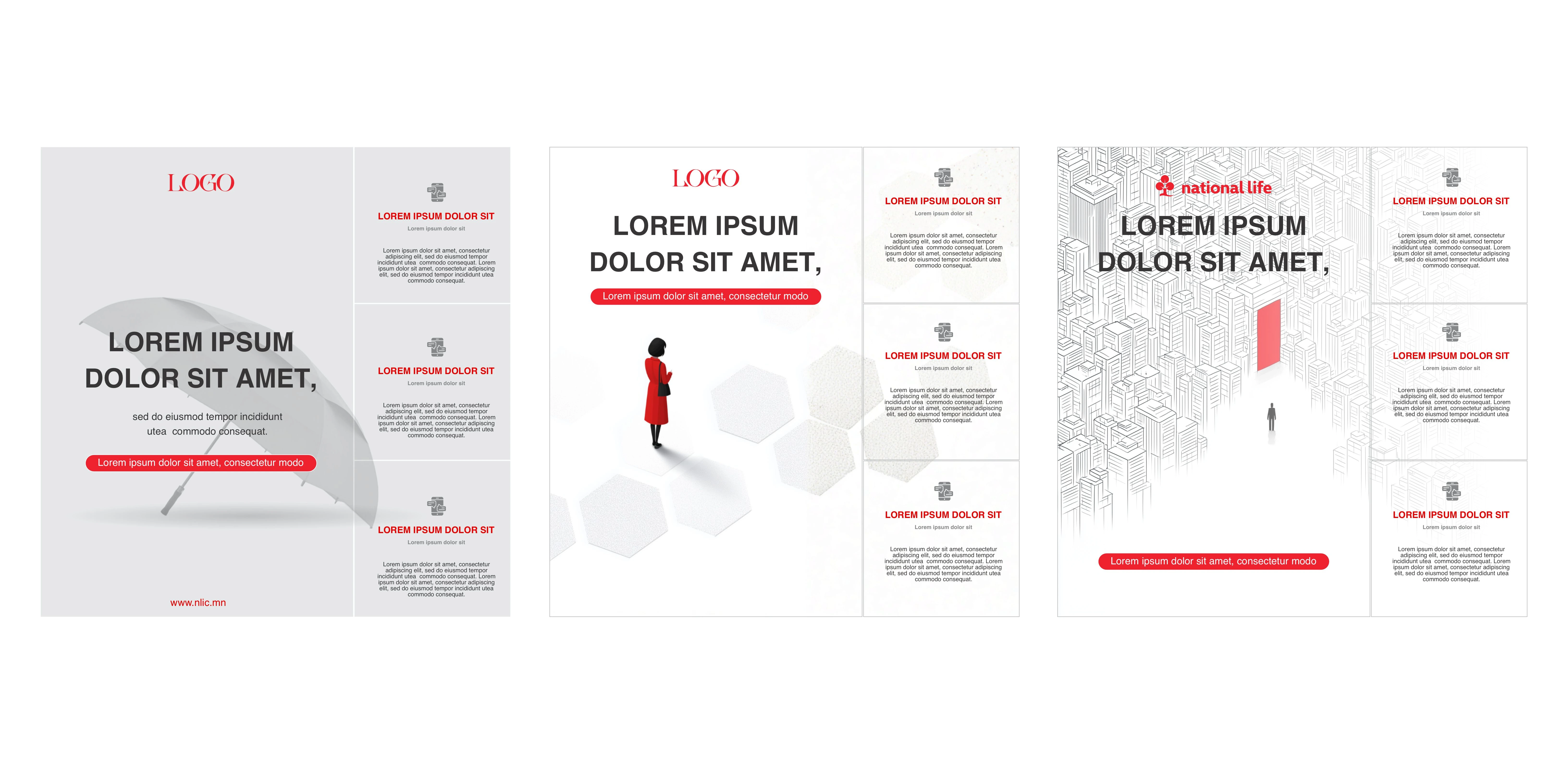
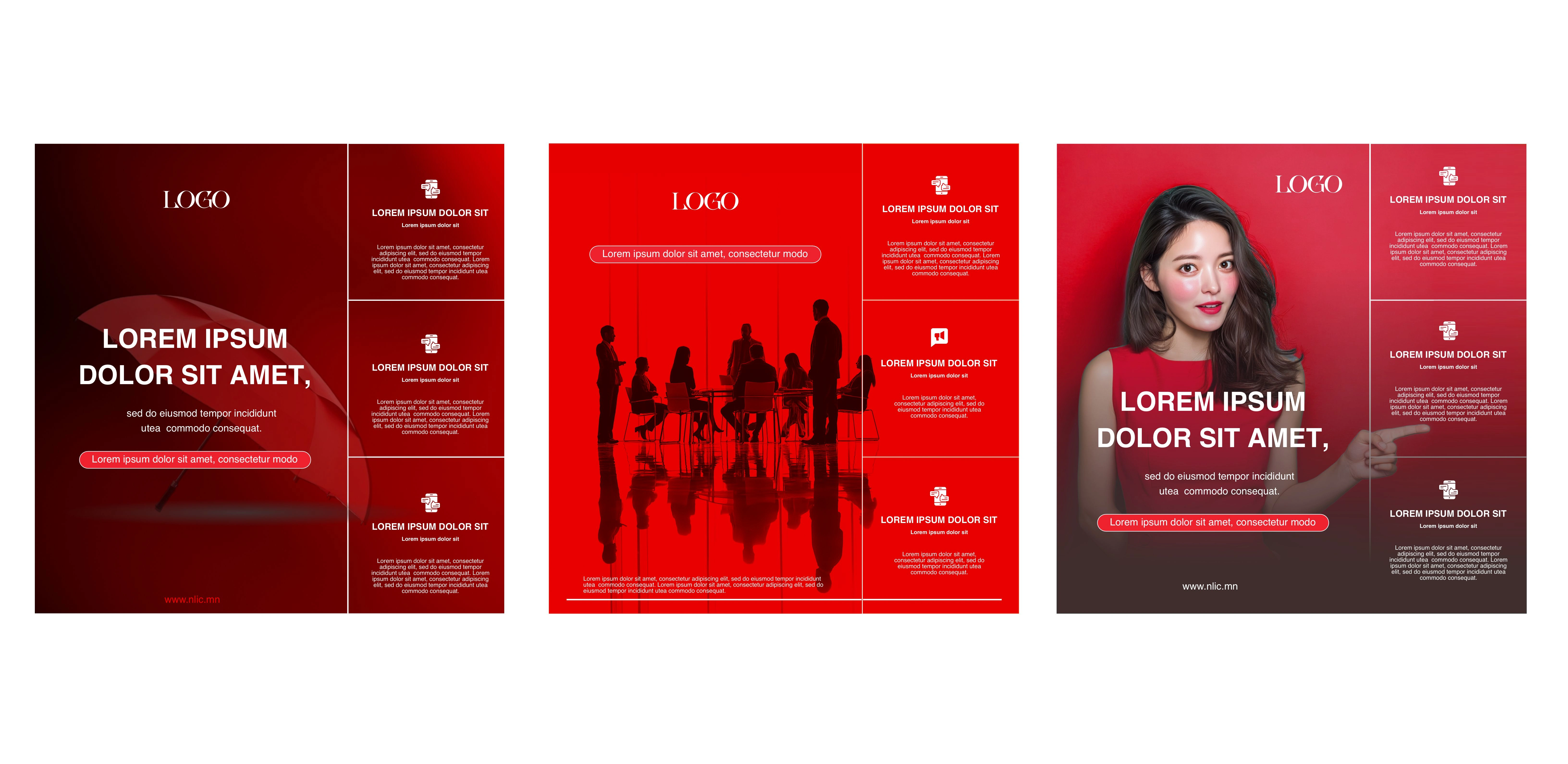
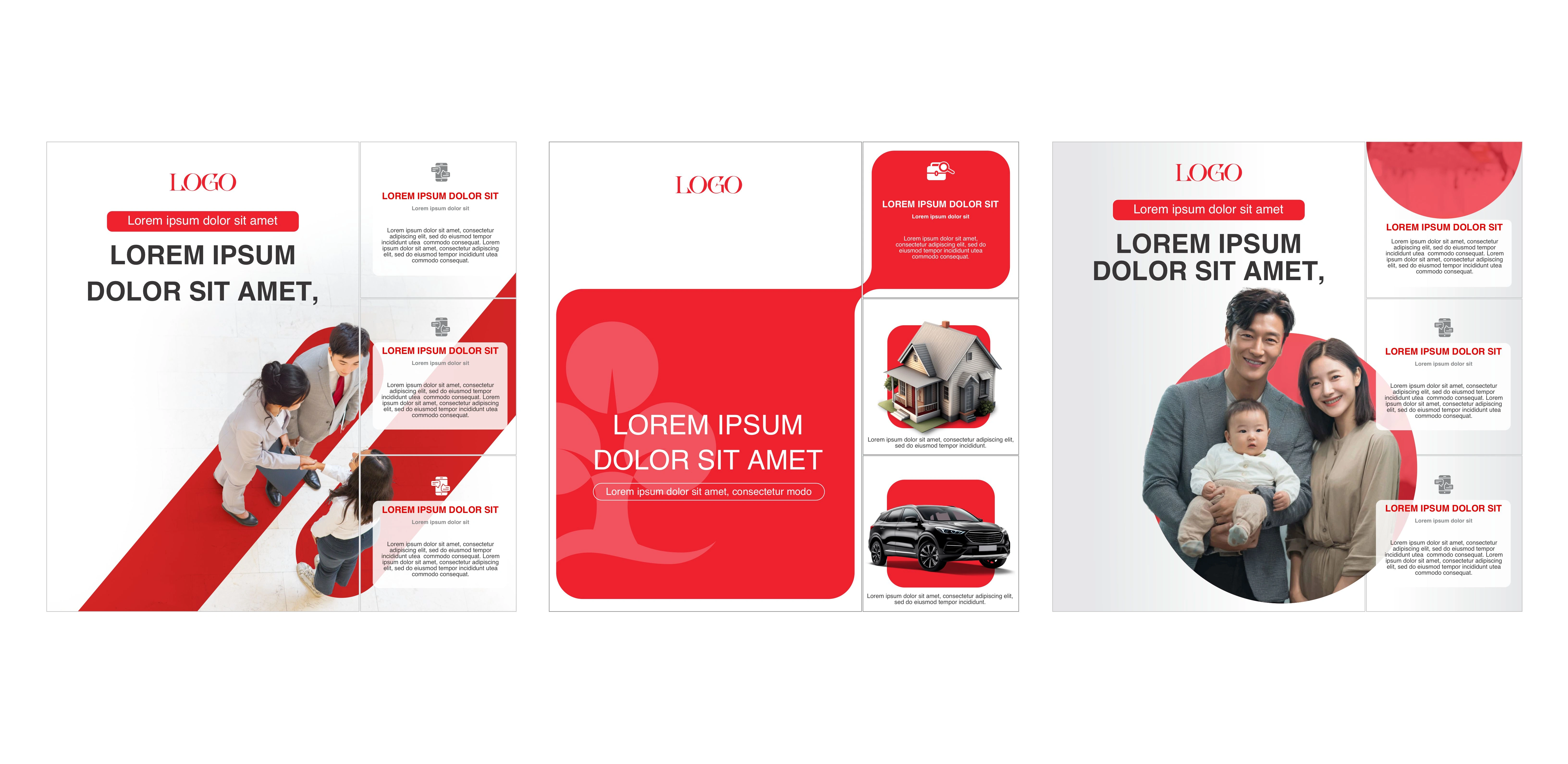
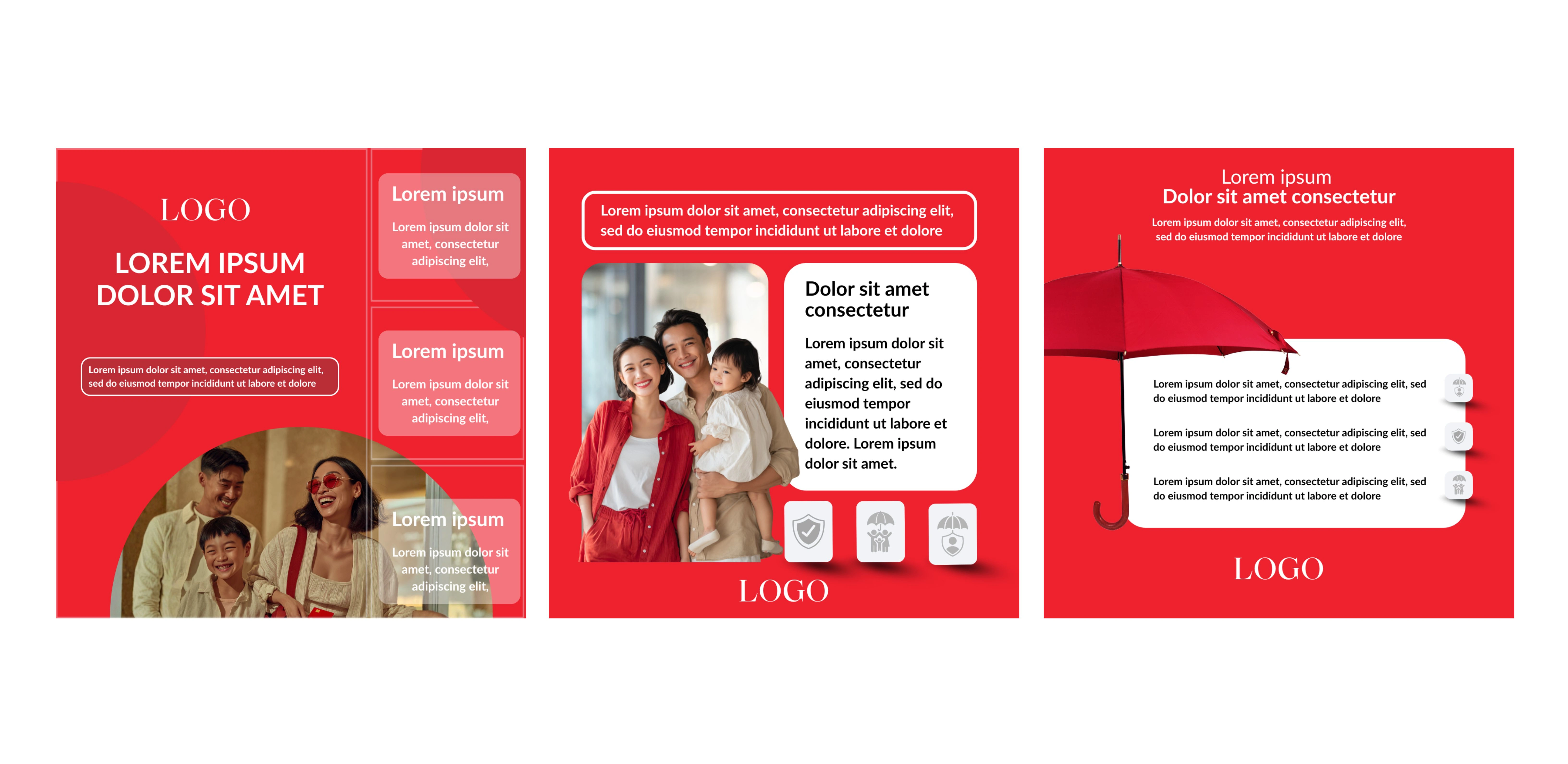
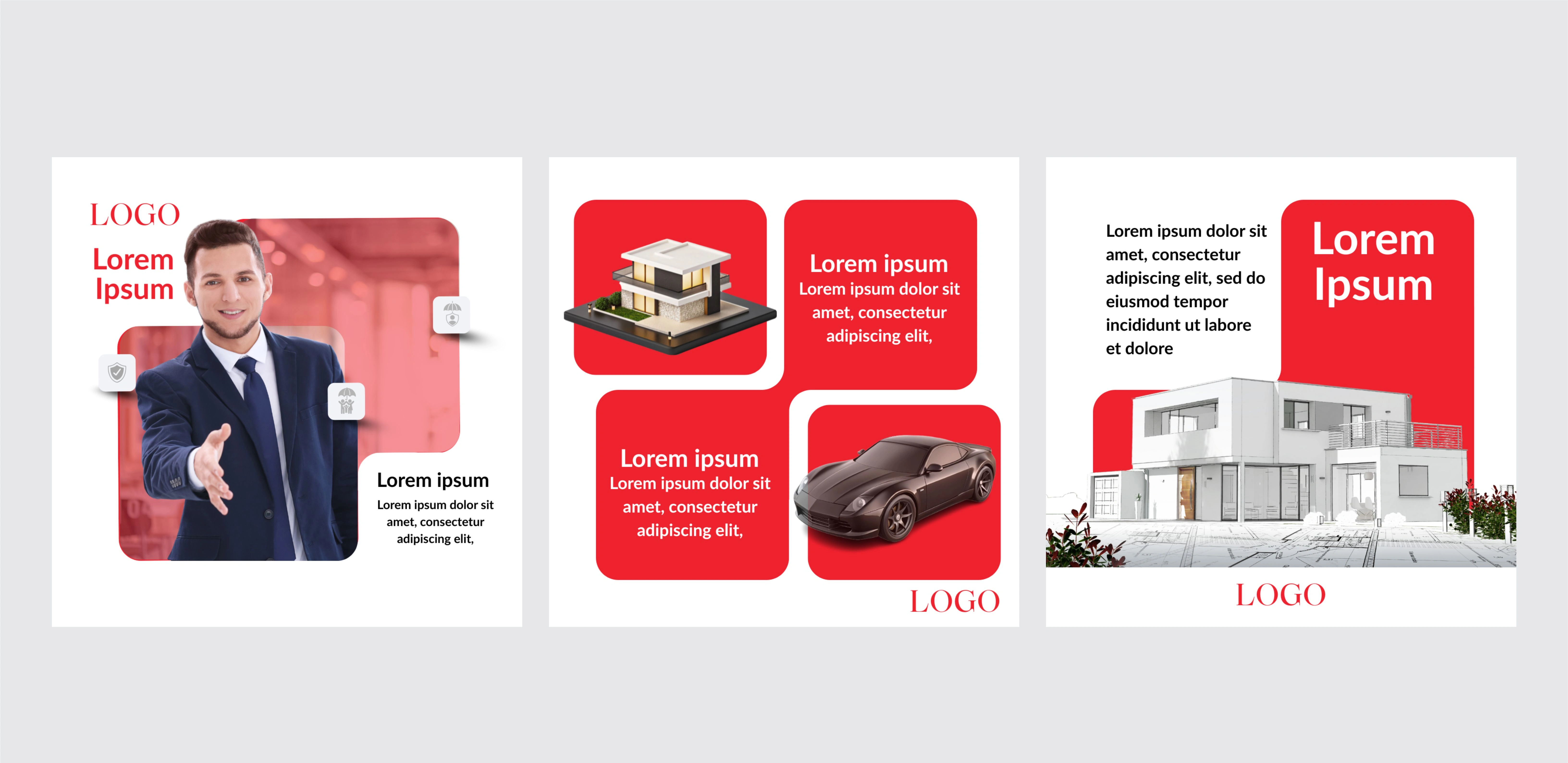
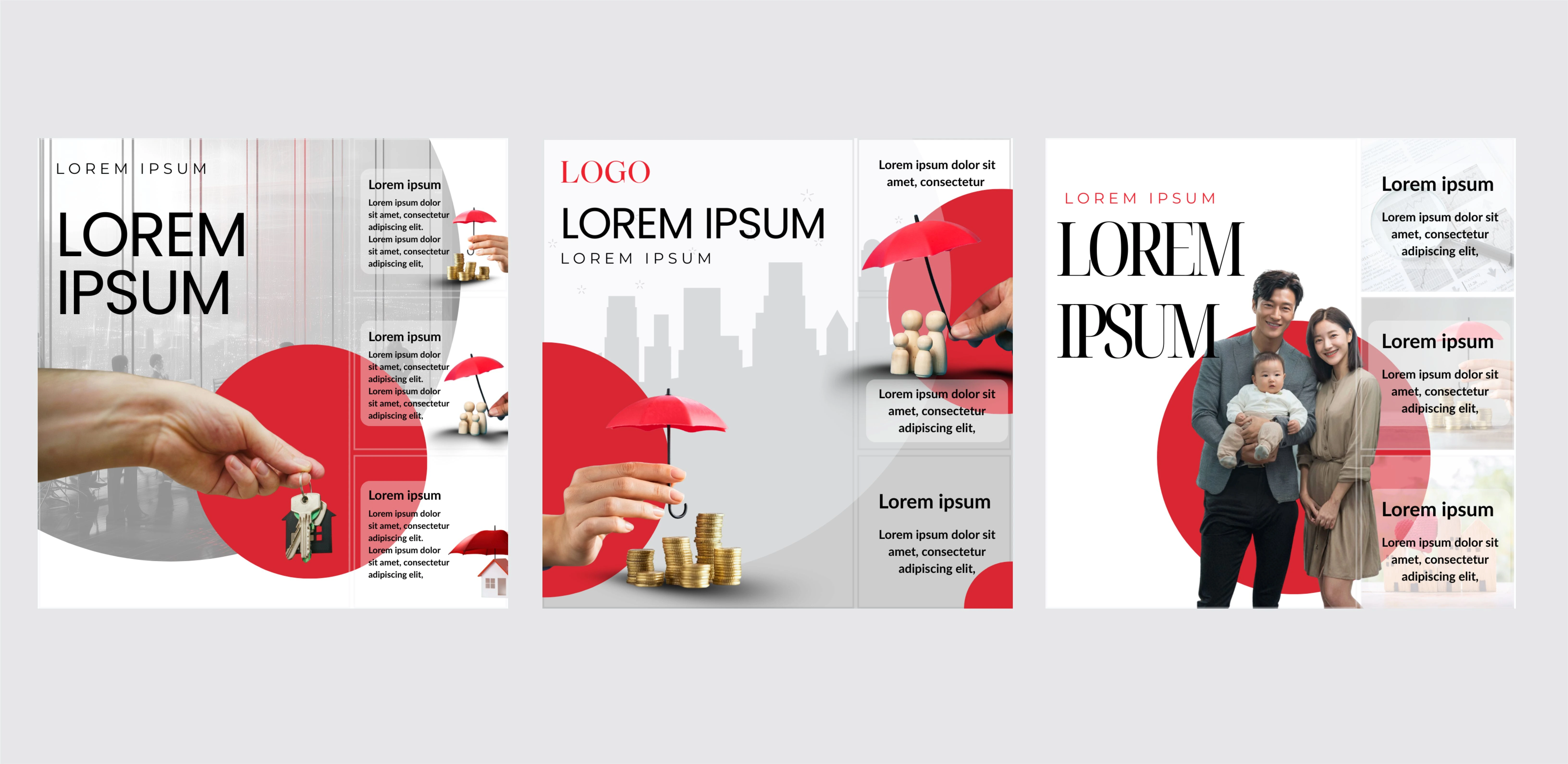
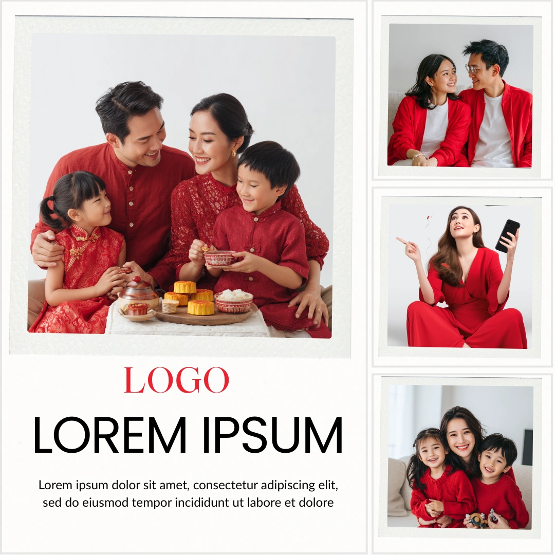
I designed a Facebook carousel post using an asymmetric 4-image layout. The composition features one dominant hero image on the left, paired with three smaller square images stacked vertically on the right. This structure helps establish a strong visual hierarchy, draws immediate attention to the primary message, and allows supporting visuals to complement the main content without clutter.



Like this project