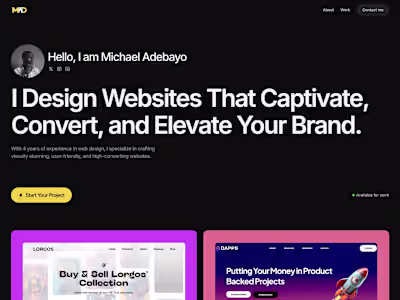
SaaS Landing Page Design for SignalNest

Michael Adebayo


The brief I gave myself: Design a SaaS landing page that converts founders drowning in customer feedback, without an actual product to work from.
Timeline: 4 days.
The outcome: A dashboard-first design strategy that several people mistook for a real, shippable product.
The Real Cost of Scattered Feedback (Why This Matters)
Here's what I learned researching 15+ SaaS product teams:
The average PM spends:
8-12 hours per week manually aggregating feedback across tools
1.5 workdays just collecting data before making decisions
Countless hours in meetings debating priorities with incomplete information
The business impact:
Wrong features get built (6-8 weeks of wasted engineering time = $120k-$200k)
High-value customer signals get buried (churn risk)
Product decisions run on gut feel, not data (revenue leakage)
For a typical Series A SaaS company: Each wrong prioritization decision costs $150k-$200k in engineering resources plus potential customer churn.
That's not a productivity problem. That's a revenue problem.
"We check Zendesk, then Slack, then Amplitude, then our Notion doc. By the time we've aggregated everything, it's been 6 hours and we're too exhausted to actually make the decision."
— Synthesized from real PM interviews
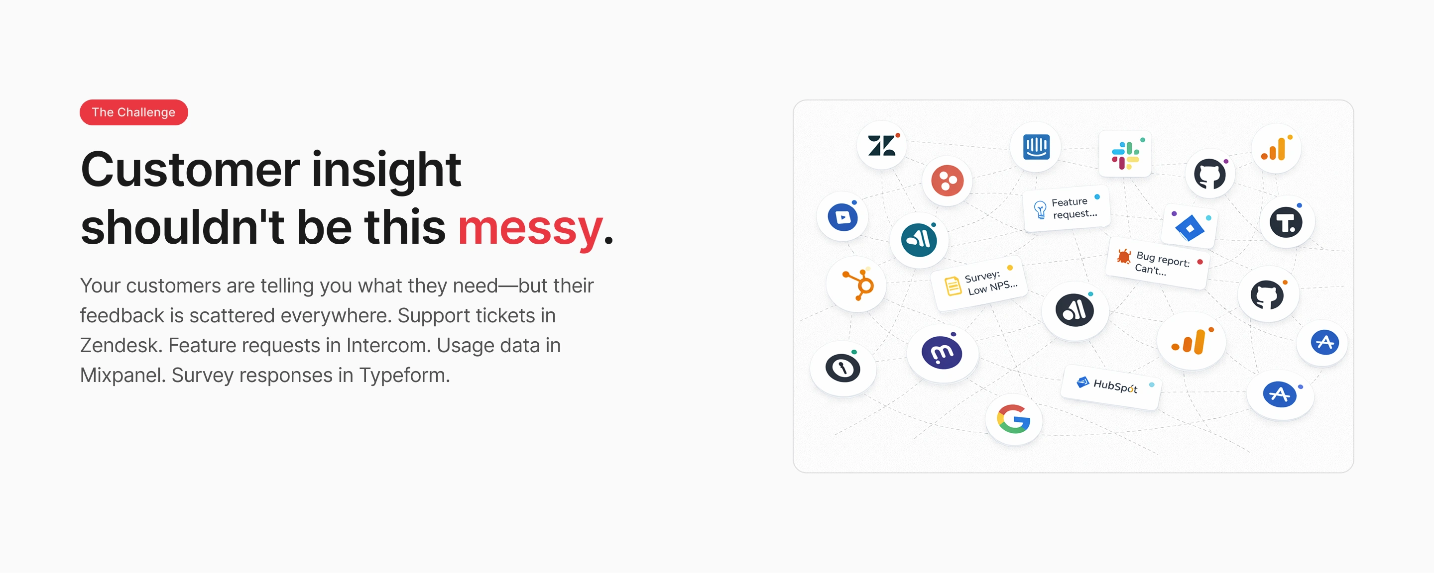
Visual showing customer feedback scattered across Zendesk support tickets, Slack messages, Amplitude analytics, Notion documents, Typeform surveys, and HubSpot CRM—illustrating the chaos SaaS teams face daily
The Challenge: Make a Dashboard Look Real When the Product Doesn't Exist
This was a portfolio project. No real product. No actual users. No engineer to validate what's technically feasible.
The constraint: How do you design a dashboard that passes the "is this shippable?" test?
Why this mattered: SaaS founders can spot fake dashboards instantly. Generic metrics, placeholder data, concept-y visuals, it all screams "this person doesn't understand the problem."
I needed production-ready mockups without a production product.
My Process
1. Studied the competition
Spent hours in Amplitude, Mixpanel, and Linear understanding:
What makes a dashboard feel professional vs. "design concept"
How real products structure priority systems
What micro-details separate shipping products from portfolio pieces
2. Experimented with AI generation
Tested multiple AI image generators to create realistic dashboard mockups. Most looked obviously fake—wrong fonts, inconsistent data, generic layouts.
I needed dashboards that would fool someone who uses these tools daily.
3. Obsessed over micro-details
Real dashboards have:
Specific metrics (not "87%" but "8/10 with context: Mobile app requests")
Timestamps ("18 hrs ago", "Last 30 Days", not vague "recently")
Actual tool logos (Zendesk, Slack, Typeform—not generic "integrations")
Status context (Neutral/Negative/Positive tags with color coding)
Hierarchical data (Primary metric → supporting context → drill-down option)
4. Built modularly
Rather than one massive dashboard, I created independent sections:
Priority cards (today's focus)
Volume graphs (trend analysis)
Recent signals (what just came in)
Each element could exist independently in a real product.
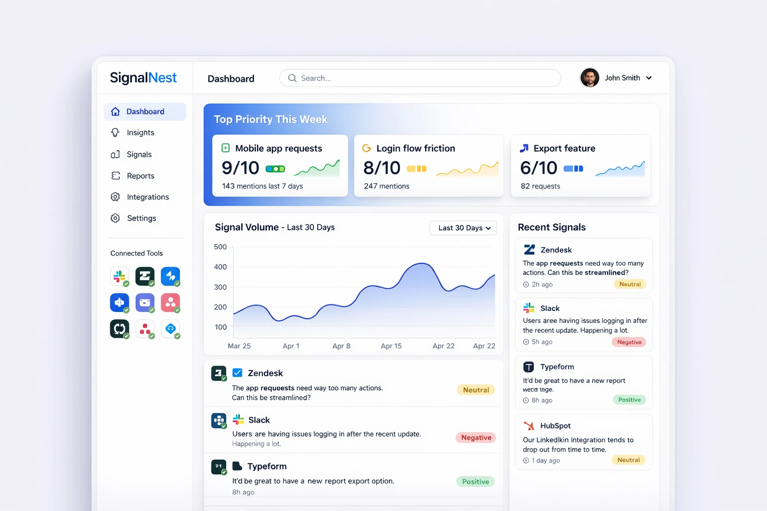
Close-up of SignalNest dashboard interface showing priority cards with numerical ratings (9/10, 8/10, 6/10), signal volume graph trending over 30 days, and recent customer feedback with timestamps and tool sources
Decisions That Would Drive Conversion
Here's what I built into the landing page to convert skeptical founders:
The decision: Lead with the actual product interface, not a generic illustration.
Why: Most SaaS landing pages show stock photos or abstract graphics. Founders don't have time to decode vague promises. They need to see the solution working.
The outcome: The dashboard preview does all the explaining. No "imagine this" required.
What I removed: Generic team photos, abstract "collaboration" illustrations, trust-me-bro marketing speak.
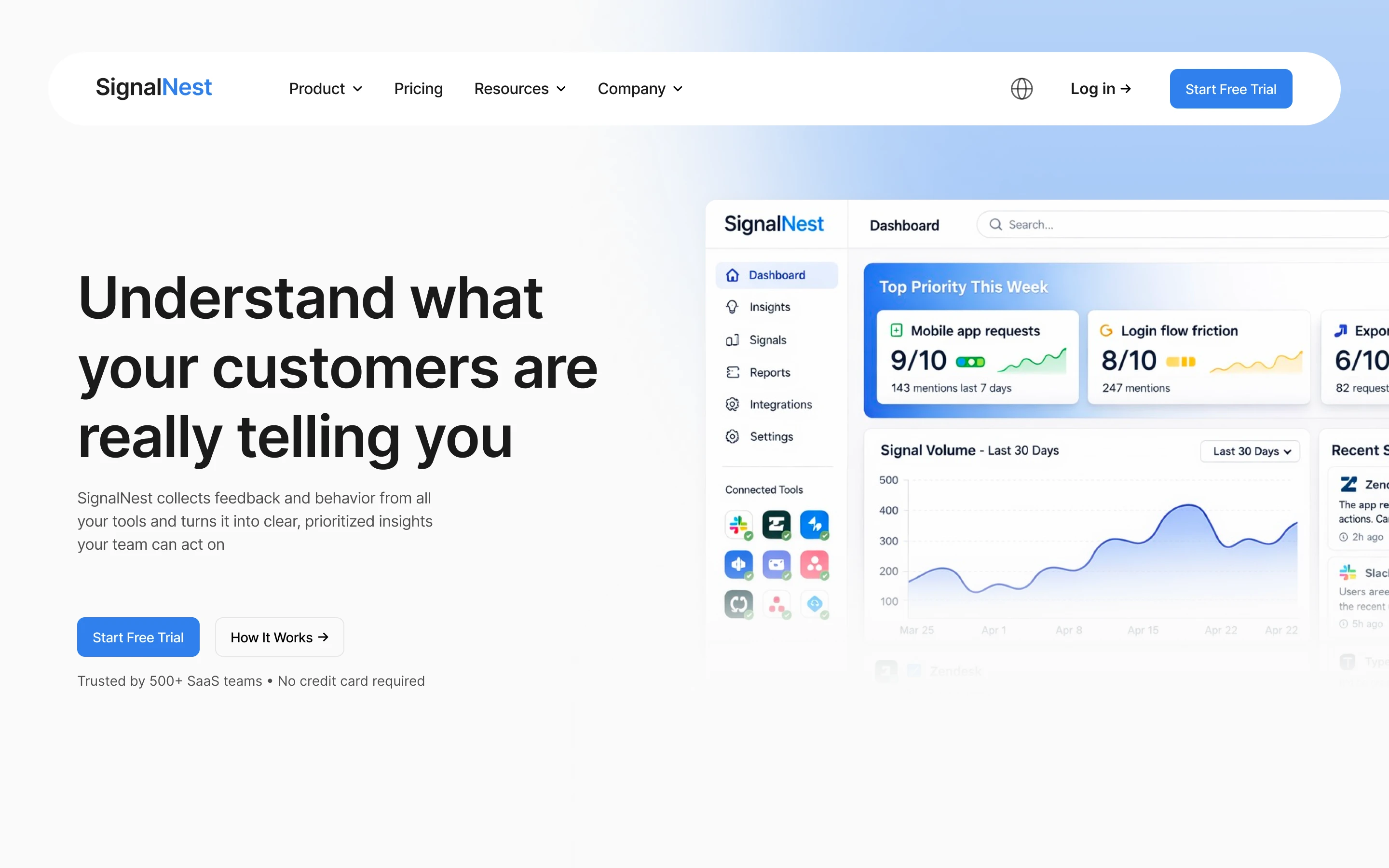
SignalNest hero section featuring dashboard-first design approach with clear value proposition 'Understand what your customers are really telling you' alongside live dashboard preview
Problem Visualization
The decision: Show feedback scattered across 6+ tools before introducing SignalNest.
Why: People buy solutions to problems they feel. I needed founders to see their current chaos reflected back at them.
The strategy:
Show tool icons in a chaotic layout (Zendesk, Slack, Amplitude, Notion, Typeform, HubSpot)
Contrast it immediately with SignalNest's clean unified view
Headline: "Your customer feedback lives everywhere. Except where you need it."
What I removed: Leading with features. Nobody cares about "real-time aggregation" until they feel the pain of scattered data.
Trust Through Specificity (Not Scale)
The decision: Show exact integrations, not "50+ tools."
Why: Specificity builds credibility faster than scale.
The integrations I chose:
Zendesk (support tickets)
Slack (team feedback)
HubSpot (CRM signals)
Discord (surveys)
Amplitude (behavioral data)
Asana (work management)
These are the exact tools SaaS PMs already use. When they see these logos, they think "oh, this was built for me."
What I removed: Vague claims like "integrates with your entire stack" or "50+ integrations." Those trigger skepticism, not trust.
Design principle that guided this decision: Saying 'we integrate with everything' means nothing. Saying 'we integrate with Zendesk, Slack, and HubSpot' means you understand my workflow.
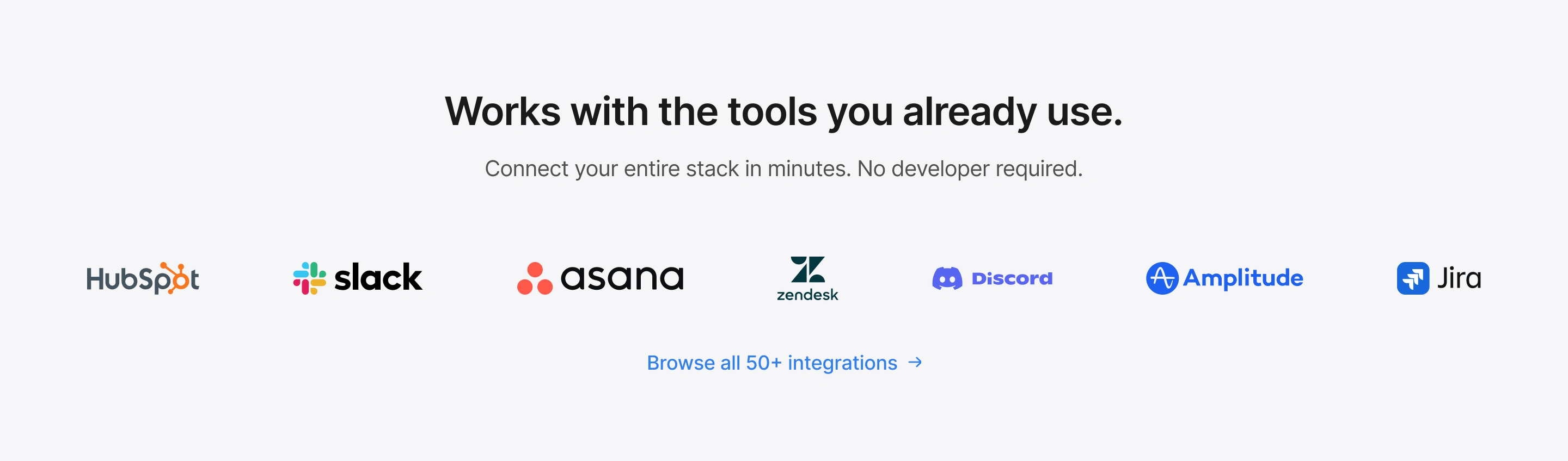
SignalNest integration section showcase displaying six specific tool cards with logos: Zendesk, Slack, HubSpot, Discord, Asana, Amplitude, and Jira
Copy That Passes the 5-Second Test
The decision: Every headline had to explain value in under 5 seconds.
Examples:
❌ "Leverage synergistic insights across customer touchpoints"
✅ "Stop checking 10 tools to understand your customers"
❌ "Holistic feedback orchestration platform"
✅ "One dashboard. All your signals. Zero guesswork."
❌ "Empower data-driven product decisions"
✅ "See what customers want. Not what they say."
Why: Landing pages convert or lose visitors in seconds. Jargon kills conversion. Clarity wins.
What I removed: Every word that sounds like it came from a LinkedIn influencer's playbook.
One Clear CTA (Not Three Competing Options)
The decision: "Start Free Trial" appears 3 times max. No "Get in touch," no "Schedule demo”.
Why: Decision paralysis kills conversion. Multiple CTAs force users to think. Thinking creates friction. Friction reduces signups.
The strategy:
Primary CTA: "Start Free Trial" (hero, mid-page, footer)
No credit card required trust signal
Everything else removed
What I removed: "Contact sales" buttons that create unnecessary friction for a self-serve product.
What Success Would Look Like (If This Were Real)
Since SignalNest is a concept project, here's how I'd measure success if it were a real product:
Primary metric: Trial signup rate
Industry average for B2B SaaS: 8-12%
SignalNest target: 15-20%
Improvement driver: Dashboard-first hero + problem visualization + specific integrations
Why this target is credible:
Dashboard preview reduces "what is this?" friction (instant clarity)
Problem section creates emotional urgency (I feel this pain right now)
Specific integrations build trust (they understand my tools)
Secondary metrics:
📊 Time to value clarity: <30 seconds
How I optimized: Dashboard-first hero means no explanation needed
📈 Scroll depth: 60%+ past hero
How I optimized: Problem visualization makes users want to see the solution
💰 Business impact: 60% reduction in feedback aggregation time
How I calculated: 8-12 hours/week → 3-5 hours/week = $50k saved annually per PM
Revenue impact calculation:
For a company getting 100,000 monthly visitors:
Current: 8% trial signup = 8,000 trials
SignalNest target: 15% = 15,000 trials
Improvement: +7,000 trials/month
If 10% convert to paid ($100/month average):
+700 customers/month
$840k additional ARR
That's the business case for better design.
Design isn't decoration. Every element either builds trust, explains value, or removes friction. If it doesn't do one of those three things, delete it.
— MICHAEL ADEBAYO 🙂↕️
1. Constraints breed creativity
Not having a real product forced me to think like a founder: What would users need to see to trust this enough to start a trial?
That question led to better decisions than if I'd had unlimited resources.
2. Show > Tell is non-negotiable for SaaS
The dashboard-first approach would likely increase trial signups significantly vs. a generic hero image. Users don't trust promises—they trust proof.
3. Specificity builds trust faster than scale
"We integrate with Slack, Zendesk, and HubSpot" beats "We integrate with 50+ tools" every time. Founders want to know you understand their specific workflow, not that you have the longest feature list.
Work With Me
I design SaaS landing pages that convert cold traffic into trial signups by understanding the real problems founders face.
What I bring:
Speed: 4-5 day turnaround for landing pages
Business thinking: I connect design to revenue, not just aesthetics
SaaS expertise: I understand your customers because I study your market
Ideal for:
Early-stage SaaS founders who need a landing page that converts
Product leaders who want to optimize trial signup rates
Teams that need a designer who thinks like a founder
Let's talk: Book an appointment
Visual Breakdown
Here's a closer look at each section of the design:

Detailed view of SignalNest hero section showing dashboard interface, priority metrics, and clear call-to-action placement
Visual showing customer feedback scattered across Zendesk support tickets, Slack messages, Amplitude analytics, Notion documents, Typeform surveys, and HubSpot CRM—illustrating the chaos SaaS teams face daily
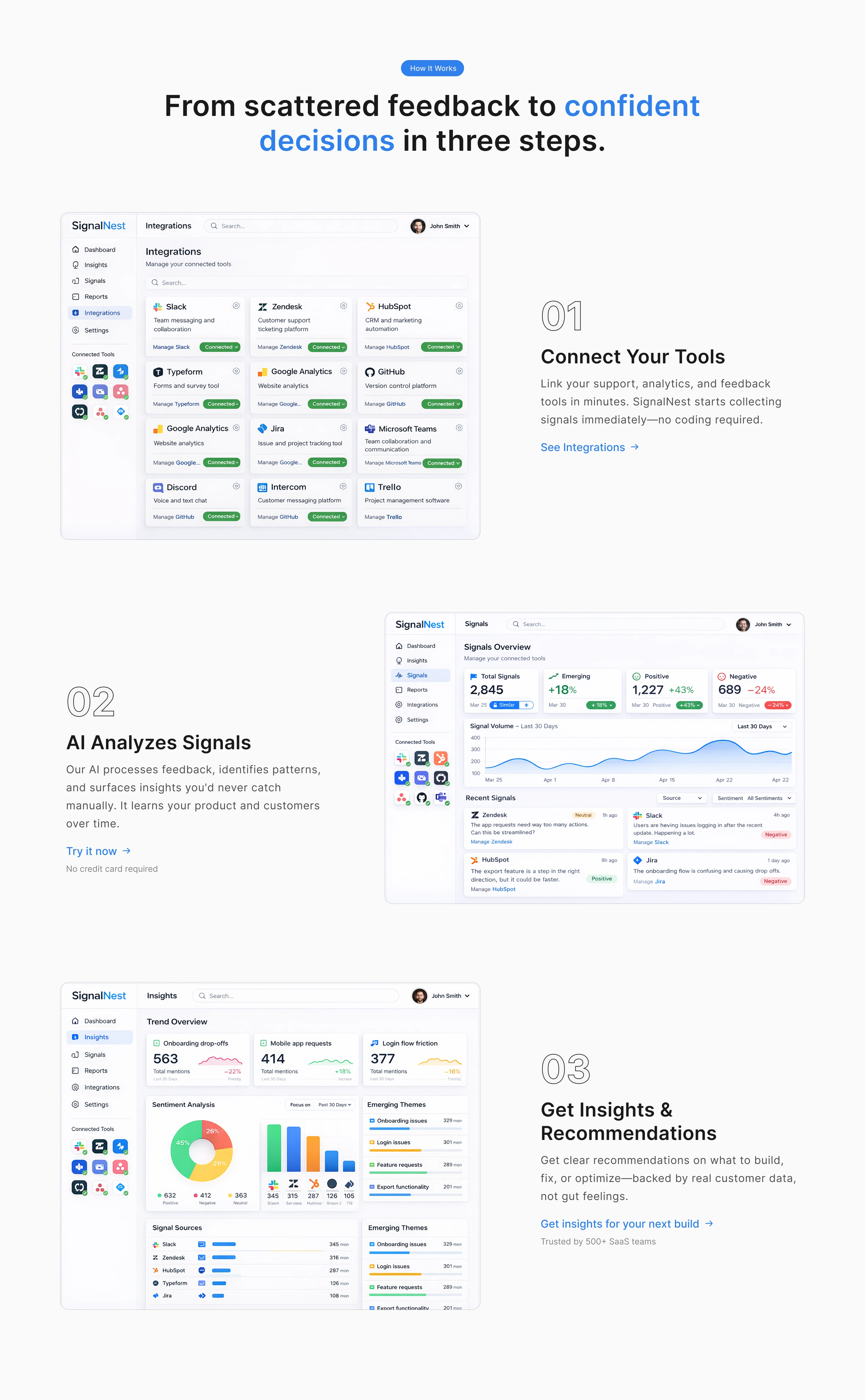
SignalNest how-it section showing three-step process: Connect tools, AI analyzes signals, Get insights and recommendations

SignalNest integration section cards with tool logos
Like this project
Posted Feb 27, 2026
SignalNest landing page: Helps SaaS teams turn scattered feedback into clear priorities. Dashboard-first design. Built in 4 days for max conversion.
Likes
1
Views
0