Haunted Places Book Design and Formatting
Hesham
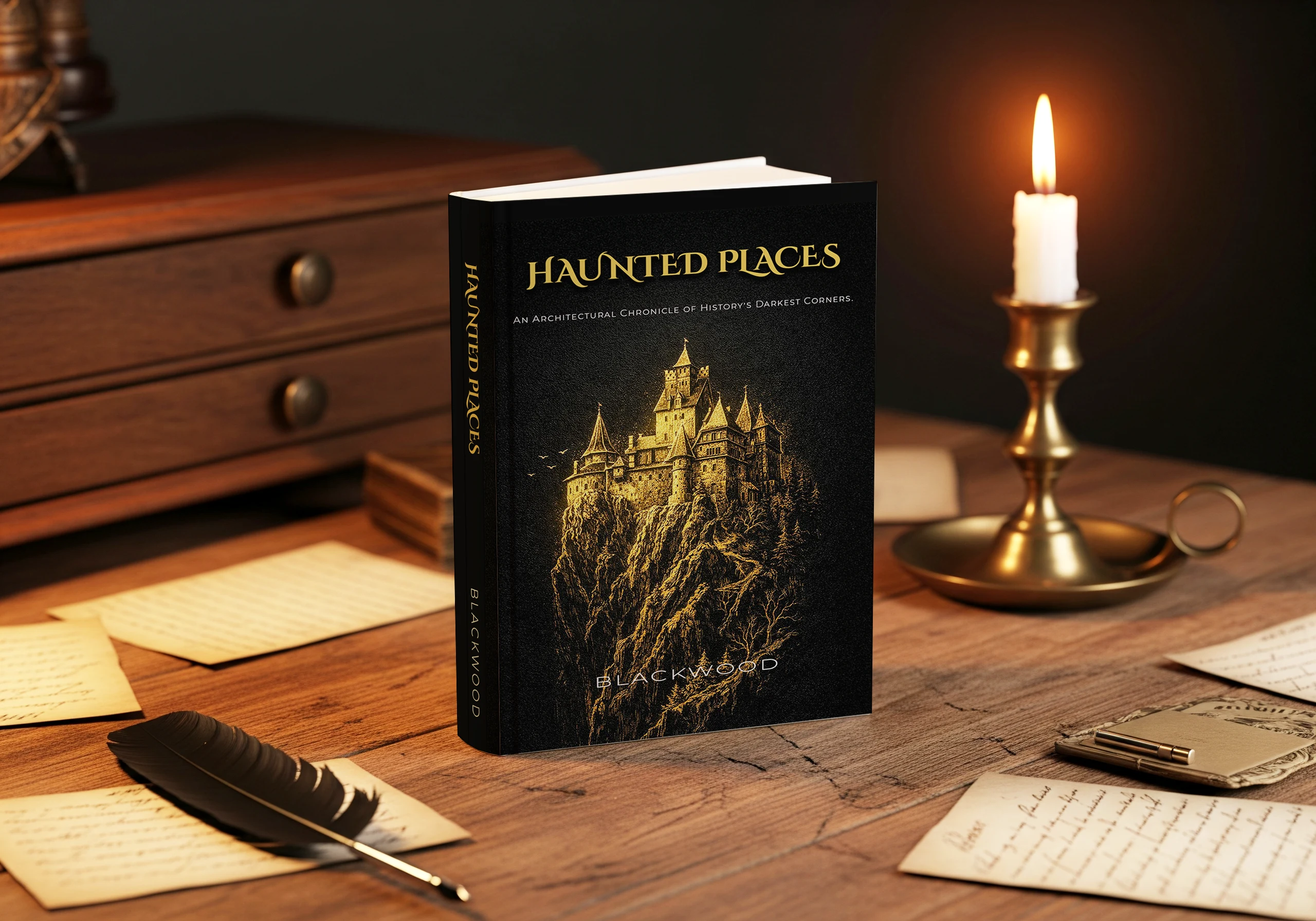
Haunted Places: Horror Novel Design
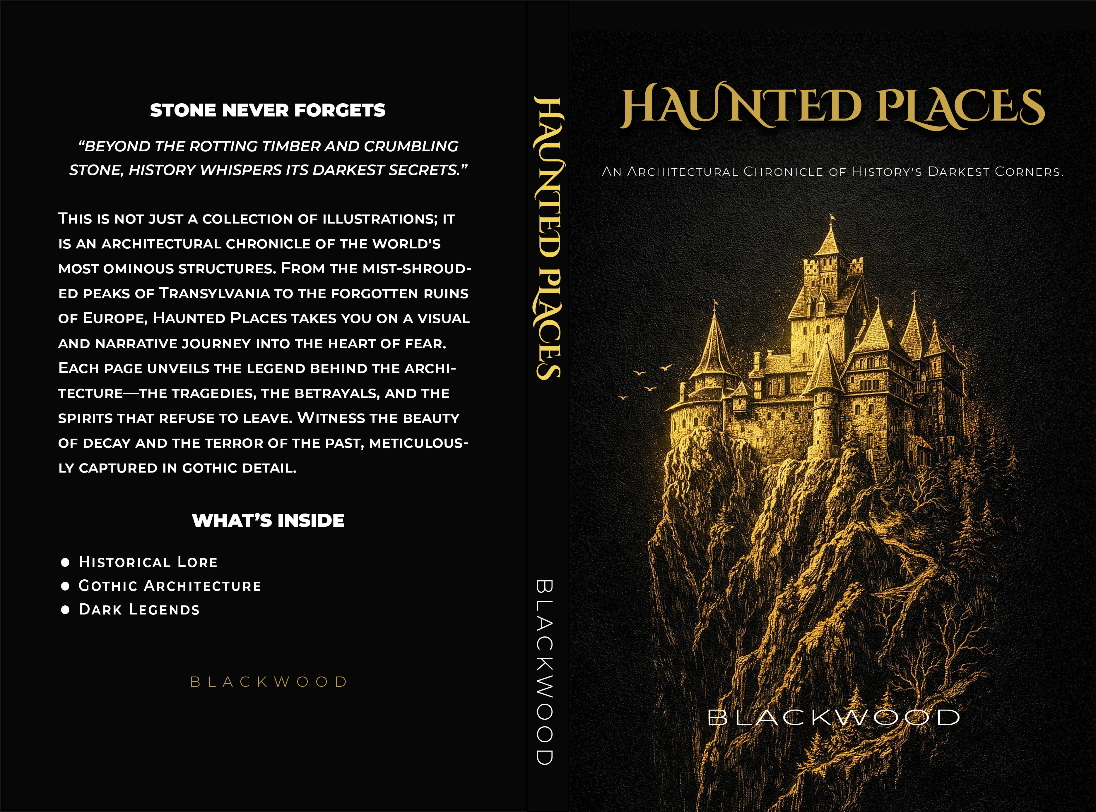
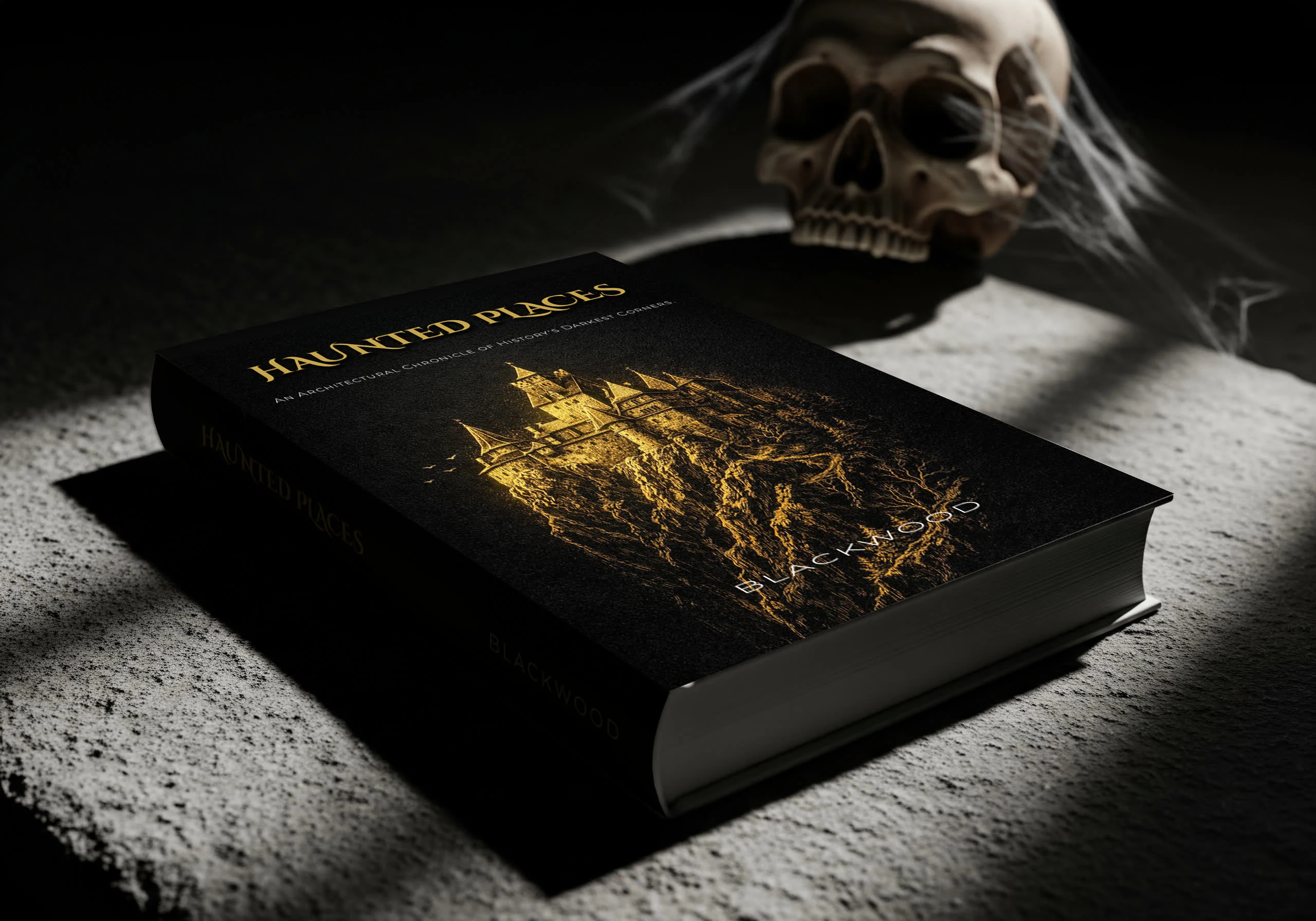
Final Paperback Cover Design featuring gold-texture typography.
Project: Haunted Places – Book Design & Formatting Client: Independent Author / KDP Role: Art Direction, Cover Design, Interior Typesetting
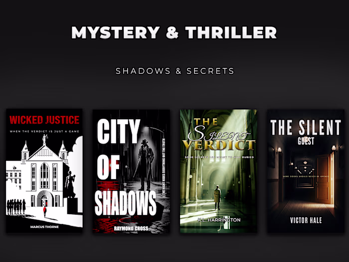
The Challenge: To design a "Bestseller Quality" book that stands out in the crowded Horror category on Amazon. The project required a dark, atmospheric cover that looks great as a thumbnail, paired with a clean, distraction-free interior layout for print.
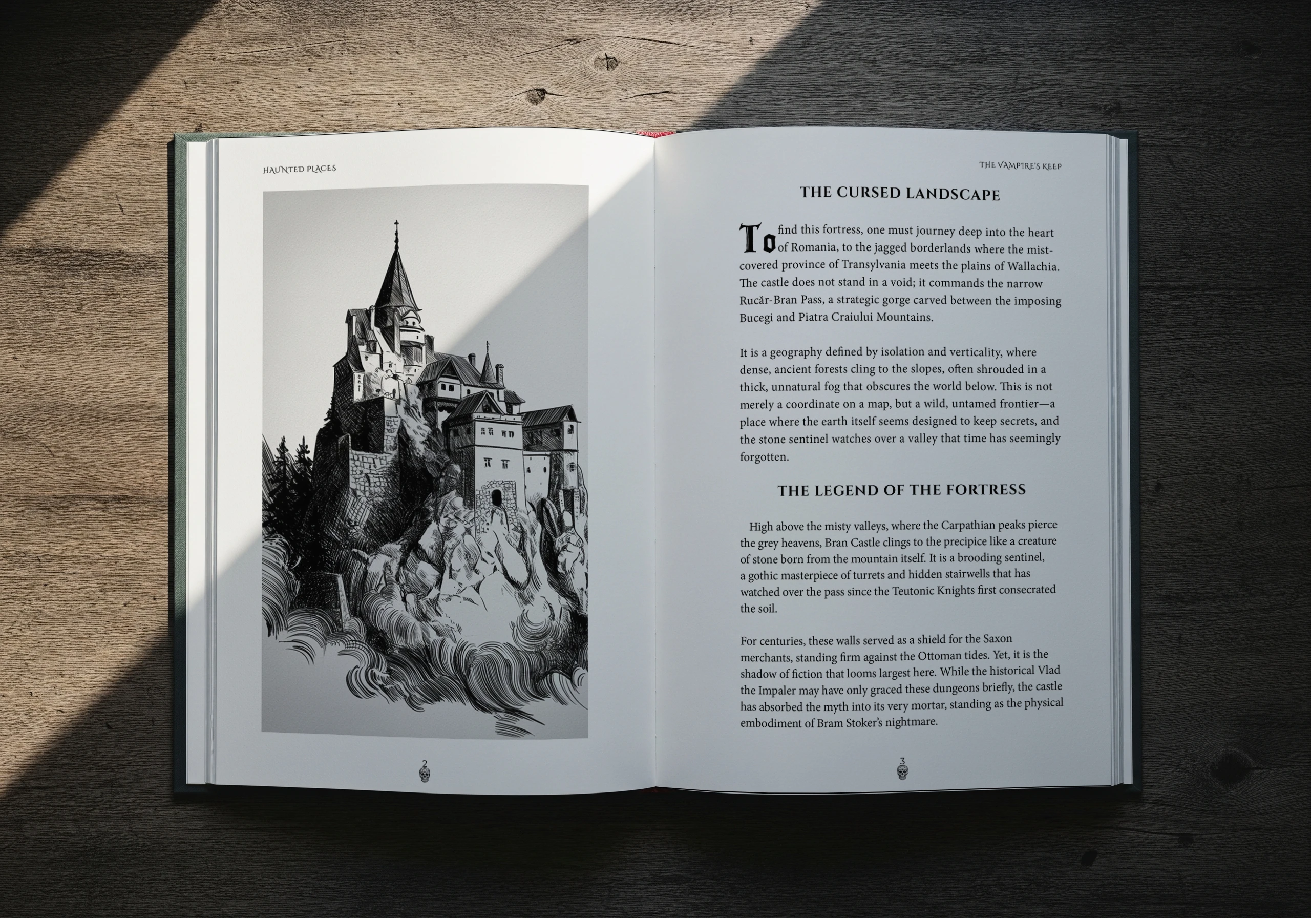
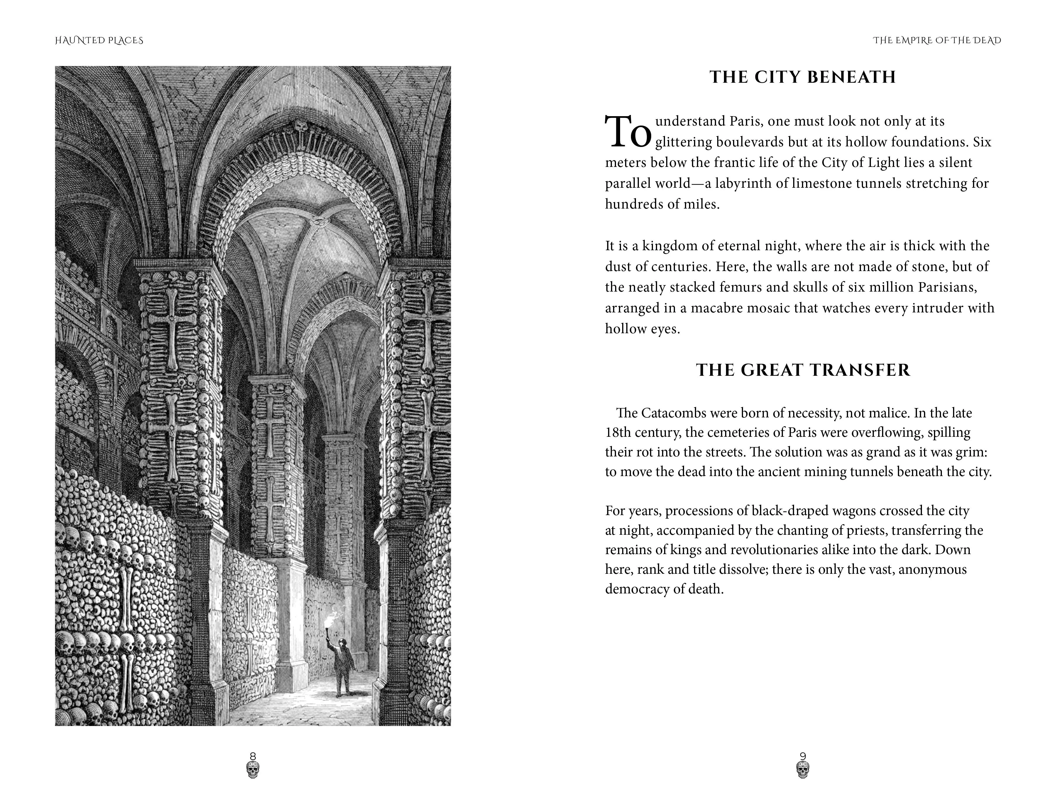
The Interior Layout: A great reading experience is invisible. For the interior, I focused on: • Typography: Using a classic serif font to ensure readability for long-form text. • Atmosphere: Incorporating custom Drop Caps and stylized chapter headers that match the horror theme without distracting the reader. • Technical Precision: Setting exact margins, gutters, and bleed areas for a flawless print run on KDP.
The Result
A cohesive, market-ready book delivered in print-ready PDF and eBook formats.
Like this project
Posted Dec 19, 2025
"Full cover design & InDesign formatting for a horror novel. Created atmospheric art and reader-friendly layout optimized for Amazon KDP print and digital."