Drip

Nilton Jr


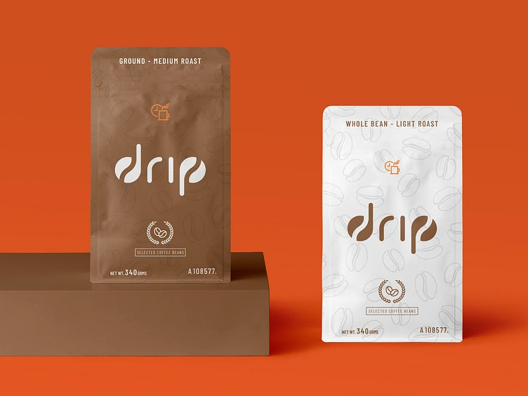
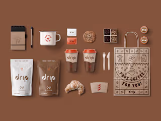
Both the brand and packaging design aim was to be clean and eye-catching. The solution was to create a rounded typeface that resembles coffee beans and a dripping effect that brings taste and sophistication for anyone who enjoys a good cup of coffee.
Like this project
Posted Apr 5, 2025
Both the brand and packaging design aim was to be clean and eye-catching.
Likes
0
Views
0


Drip

Cresol - Vem Junto Cooperar
Around Around
Cubism