I Redesigned Google Messages in Figma

Vikas Assudani
UX Designer
Product Designer
UI Designer
Figma
I challenged myself to redesign the homepage UI of Google Messages. It wasn’t supposed to be a Major UI Revamp; it had small parts and details that I felt could be improved.
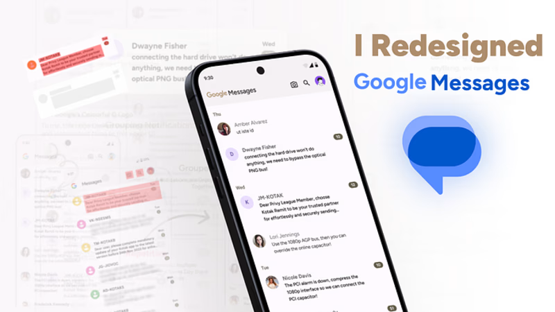
Introduction and The Need
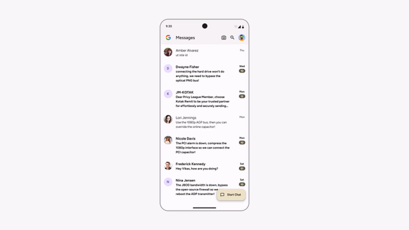
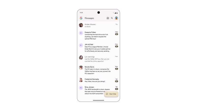
Exact Recreation of Google Messages UI in Figma
Have you ever wondered why your Messages app looked and felt so overwhelming and attention-grabbing whenever you opened it to check your essential messages, trying to ignore the bank/credit card/data recharge packages? Still, it couldn’t be ignored even if you wished to.
I used to use a Microsoft App called SMS Organiser as my Primary SMS App, but recently, I decided to try Google Messages (the default SMS app on the majority of phones), and I also wanted to use RCS (SMS Organiser didn’t support that).
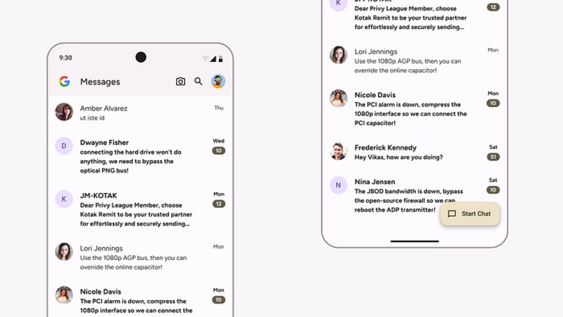
Closeup View of Google Messages Home UI
When I changed the Default SMS App from my Settings and Opened Google Messages, it felt overwhelming and attention-seeking. I didn’t know where to focus; everything just grabbed my eyes.
That day, I had an idea to redesign this app for practice and try out what I could improve.
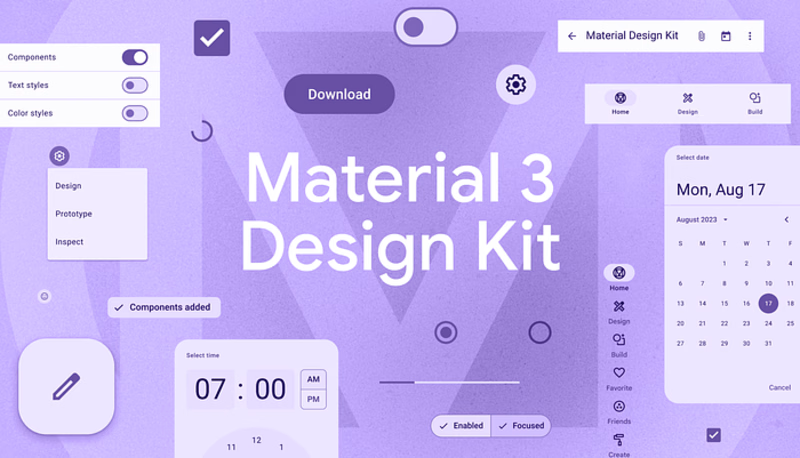
Material 3 Design Kit Cover
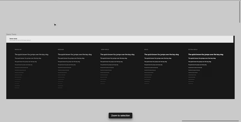
So I decided only to use Material 3 Design Components (not even a single line or text can be outside of material design components) except the Font (I didn’t use Roboto; instead, I used Figtree and referred to the Material Design Typography to recreate the Text Styles), obviously to make it look and feel as realistic as possible and a Google App.
It wasn’t supposed to be a significant UI Revamp, but Improvements in parts of UI where it could be improved.
Areas I Intended to Improve
Information Architecture
Visual Hierarchy & Maintaining Consistency
Typography & Color Theory
Redesign Goals
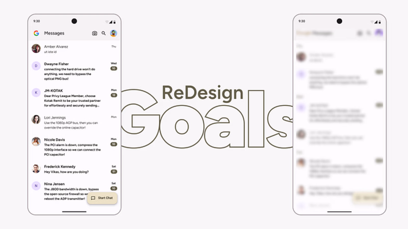
To Use & Maintain the Google Material 3 Color Scheme and Color Palettes
To keep the original Google Designed App Feel
Dont revamp the whole design rather fix a few things that I think could be improved and
Typography / Text Styles for this ReDesign
I didn’t entirely use the Material 3 Guidelines Typography System rather I took the Font Sizes from them and the UI ( the Screenshot of Google Message ) compared them and then created Text Styles.

Let’s Jump on to ReDesign
You may have been getting bored with all these and Now’s the interesting section of this Article
Element 1
Google’s Colorful G Logo
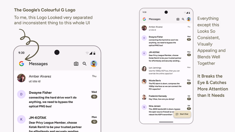
Have a look below
I do get the reason to keep the logo. I don’t have a problem with the Logo but with the logo choice and styling they went with.
I am on Android 14, so my System Apps have Material Wallpaper Color Theming. With that Color Scheme, I feel like there should be Material 3 Themed Google Logo too
And they do use some. For Example, I own a Pixel 7a and when it boots it shows the Google’s G logo but in a Material 3 Color Pallete
My Purposed Version
In this stage, I kept the Original UI Itself and only changed the Google logo to show how much the Whole UI can be uplifted with minor changes only
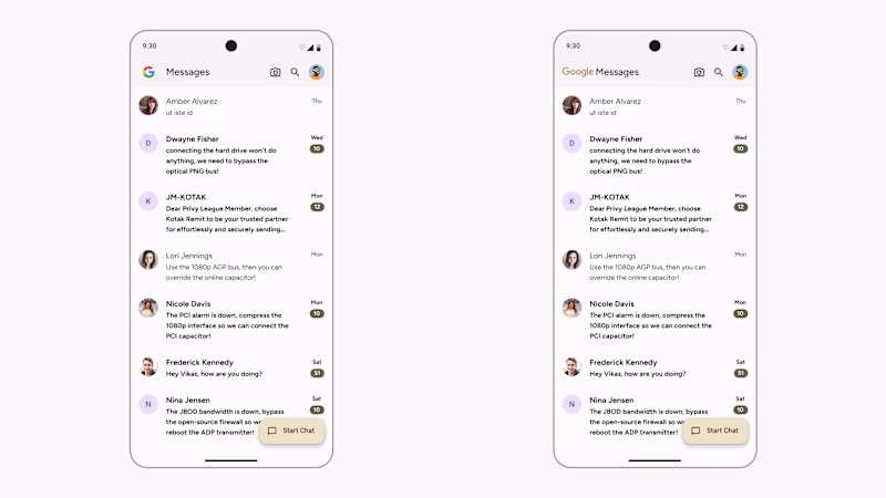
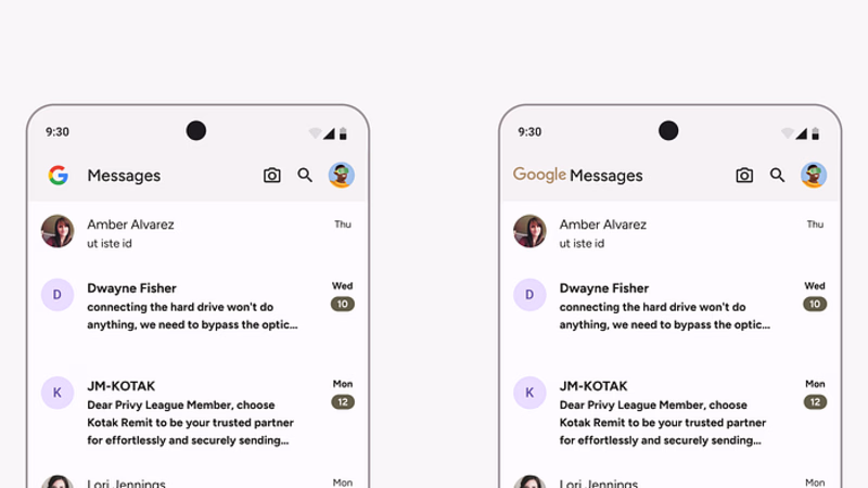
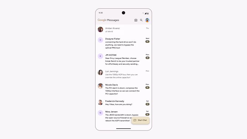
I used the Google Logo ( the word Google ) and it would also get adapted to the Material 3 Wallpaper Color Palletes same as other Apps’s Elements
From my perspective, the Logo Keeps its importance and at the same time doesn’t hinder or break the visual. I just loved the Color and Whole UI when I changed the logo to this. It feels a lot more visually appealing, consistent and adaptive.
Other Minor but Important Elements Changes
Now I will show you the Redesigned UI and Compare it with the Original and I will mainly use visuals ( images ) to Communicate you the Reason.
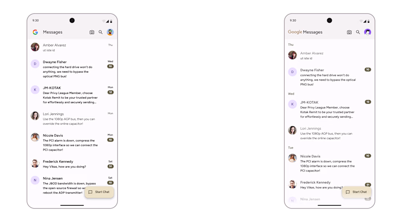
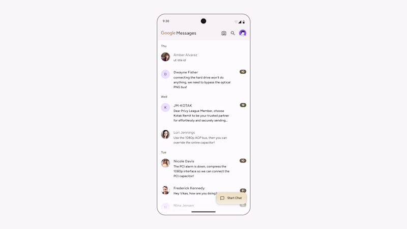
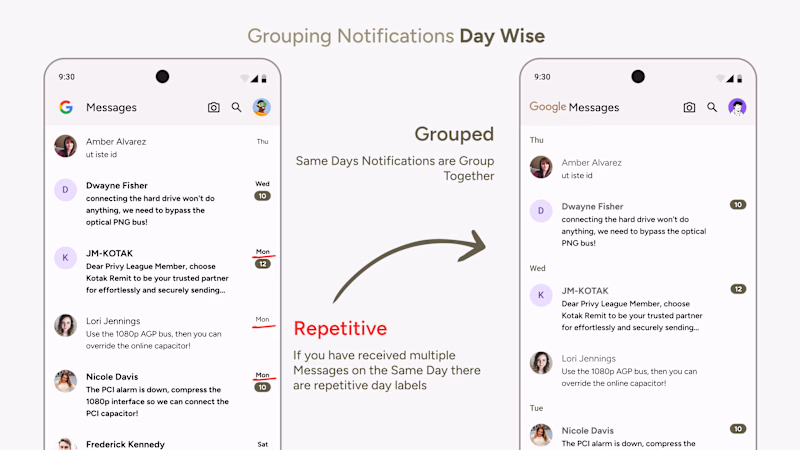
Notification Grouping
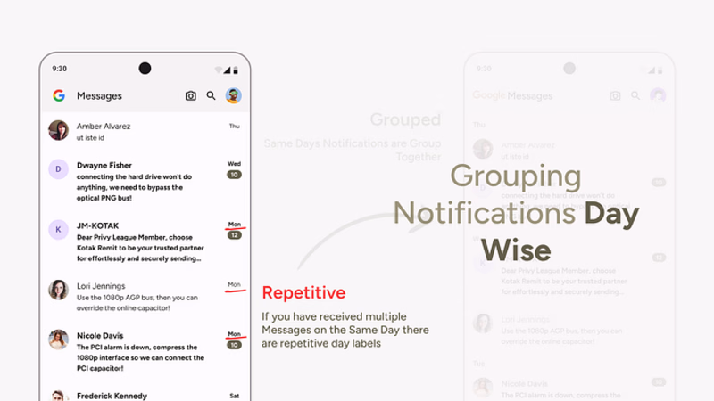
My Proposed Version
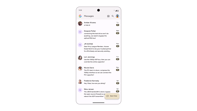
Bold & Black Texts All Over Fixed
When there are pending messages the Sender Name and The Whole Message Preview are Bold and Blacked which creates a lot of contrast and is harsh on the eyes.
When multiple messages are pending in the same view it gets uncomfortable and you don’t know where to focus.
Even the sender's name and the message both being black and bold you don’t know where should your eye focus next.
Here’s the visual context of what I am saying
My Proposed Version
Yes, the Sender's Name is important we can’t unsee its importance but the high contrast makes everything look cluttered and overwhelming
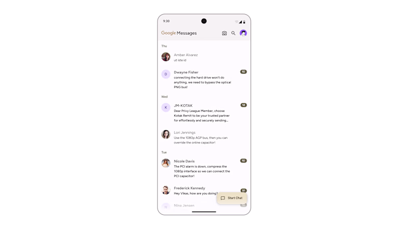
Quick Before After
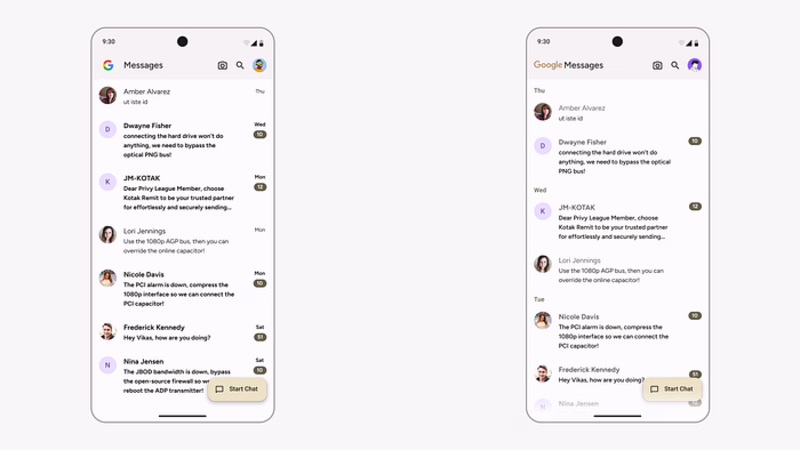
Here’s A Closeup View
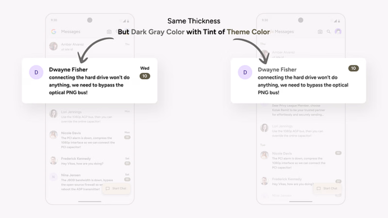
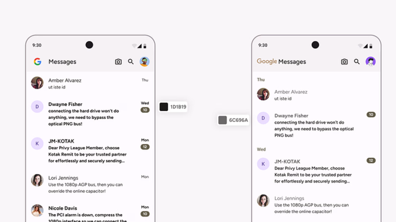
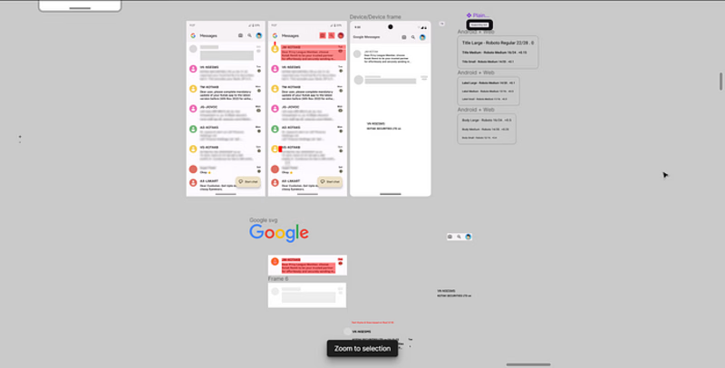
That’s all for this Article. This was my first post on Medium. I hope you will like my Redesign and the reasons and solutions proposed. I am open to suggestions, critics and Below are some screenshots of my Figma file and some figuring out stuff I did during the whole process of Redesigning
Disclaimer
This article is not intended to disrespect the Google brand, its designers, or the product. As a devoted Google fan, this serves as a personal practice and case study exploring potential improvements. Please note that these insights are subjective, based on my perspective, skill level, and individual thoughts. The intention is solely to contribute to the ongoing dialogue around design enhancements, and it’s not a guarantee that every suggestion is universally correct.

