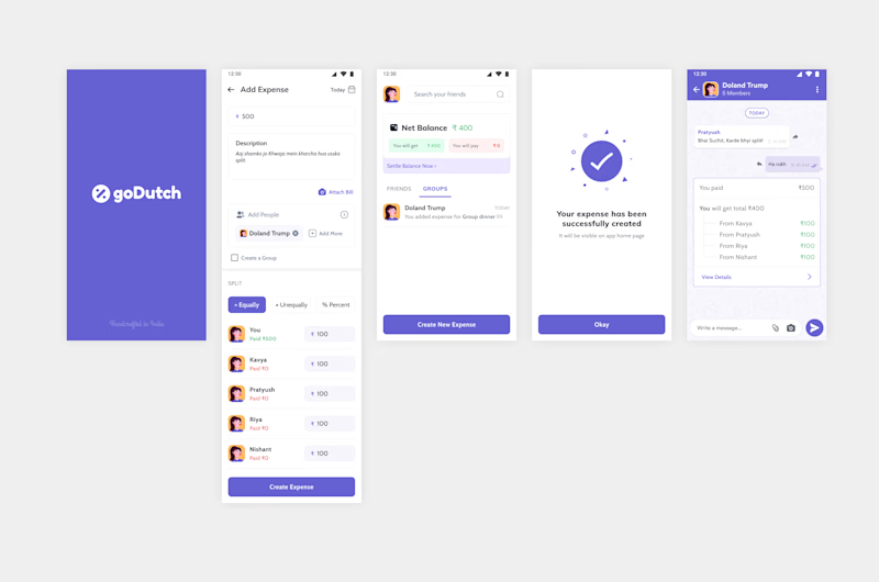
1. Problems I faced when creating expense was the flow mismatch. Usually, when you are splitting a bill among your friends the first thing that comes to your mind is the Total Amount. So I made the flow accordingly.
2. Date selection was placed at the wrong position, It should be to the top making it clear to the users that we are talking about the date of this expense that we are creating.
3. Info Icon on every page is not actually needed. The design is quite intuitive and also the targeted age group understands tech. Have you seen WhatsApp introducing each and every feature? [Read this article](https://medium.com/facebook-design/one-year-designing-at-whatsapp-c20b4c46bae6)
4. There was no option to make a group from the normal process of creating an expense midway. So I added it, not a big thing, but will surely come in handy and most users will not create a group in the first place.
5. Each transaction or expense created will be a chat screen. That way things will be easier for users as most of us talk about money with friends on chat.
6. Added percentage splitting option.
2021


