Redesigning filtering and sorting controls in a web app

Karol Stefanski
UX Designer
Product Designer
Abstract
Figma
Jira
Sketch
Recruitee
What’s the deal?
The tasks view in the product I’ve worked on looked dated and utilized suboptimal interaction patterns. I’ve decided to look further into how can I improve its design after receiving some feedback.
Let’s see a few quotes:
“Hello, how I as a manager can see colleagues planned tasks? I don't want to be spammed with their every task with me assign, just from time to time to see their tasks. Can't see tasks filter by user.”
“...especially if she is sick, she wants her colleague Jacqueline to know exactly what needs to be done.”
“Differentiating between own tasks and those assigned to others.”

These are valid points. There was no option to see the tasks of your particular teammate.
You can either see your tasks or everyone’s tasks. Switch between completed and incomplete tasks. Sort them in two ways. That’s it.
Also, controlling those filters was quite a hassle. Users had to figure out the heading was a dropdown menu trigger. Then there was a segmented button and two radio buttons. Pretty weird, right?
Right. But at first there was no intention to fix that view, just add an option to filter out your teammate’s tasks. I tried doing that by simply adding a select component, which allowed you to pick a person. Then I’ve tested it!
It didn’t go well
To say the least. People were struggling to find filtering options, confused them with sorting, and more. This is when I’ve decided to completely rethink how these controls should look and work.
The problem was much bigger because other pages were utilising this interaction pattern. Also, there were issues with translating concatenated strings. “My requested evaluations” could be changed to “All completed evaluations” and it wasn’t so easy to handle in all of the supported languages. And I’m not even mentioning minor visual issues with the current design.

Calendar view with previous design
Let’s fix it
First of all, I’ve done some research on what’s more important for the users: switching between incomplete and completed tasks, or switching between my and team’s tasks. The former answer won.

Updated design for tasks view
I’ve incorporated the segmented button with counters for switching between incomplete and completed tasks. It became clear what’s currently being shown. Also, there are two buttons on the right side of the list: “My tasks” and “Due date” – both with icons.
They are used to filter and sort the tasks. It’s much more clearer which one is doing what, because of the icons. I’ve reduced friction and cognitive load as people don’t have to read and process a long string to know what are they looking at.
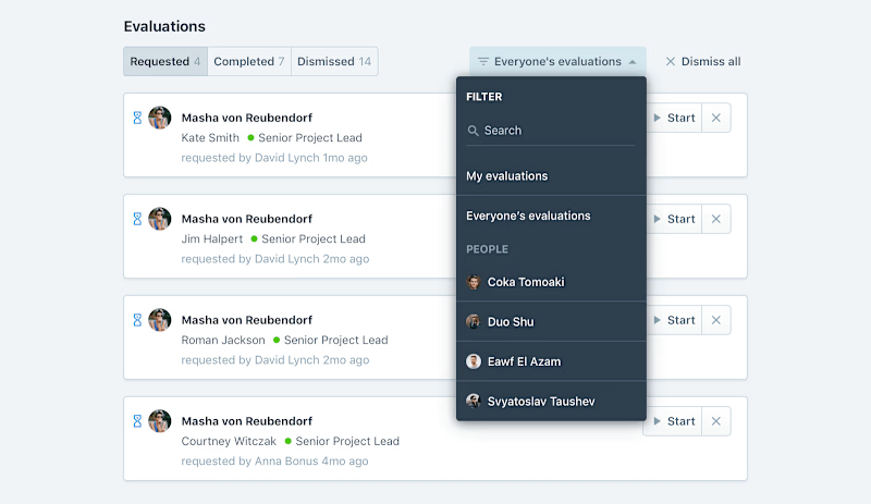
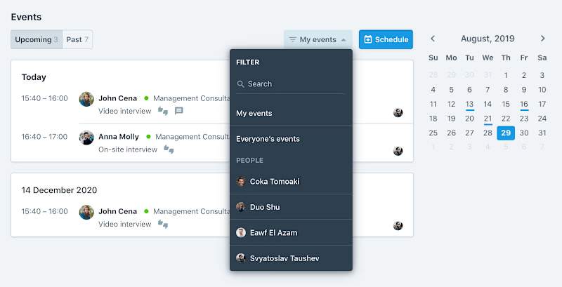
There’s a filters dropdown with a search field for finding the right people in your company, and the three universal filters. You can easily see your tasks, everyone’s tasks, and also tasks with no assignees (which can be useful).
Now we’re talking
Another user testing session made it clear to me: it is a really good solution.
Users had no trouble finding their tasks, their colleagues' tasks, or anything else. Then I knew I can adapt the same pattern to other pages mentioned before.


Conclusion
It’s always worth testing your assumptions. Most UX people would agree with me on that. It’s also good to challenge the status quo once in a while. Most of the team thought there’s nothing wrong with those interactions unless I’ve asked them to show me how they use it.


