Built with Framer
Flowsync AI Website Design

Vee Maji


FLOWSYNC AI WEBSITE
Flowsync is an AI-powered automation platform designed to enhance teams' productivity and streamline workflows in a matter of minutes.
View Live Website
Features
AI Features Overview
Animations & Interactivity
Clean Navigation
Bento Visual Style
Fully Responsive Design
Made in Framer with Zero Code
Hero Section
My goal for the hero was to create an impactful first impression while maintaining clear and functional content. I used strong typography for the headline to immediately communicate the value of Flowsync AI. At the same time, the subtext explains how it combines project management, communication, and workflow automation into one platform.
I built the hero as a reusable component with interactive states, ensuring smooth transitions between CTAs and the integration icons. The floating icons animate in sync to visually show Flowsync AI’s ability to connect multiple tools into one flow. I also designed the “Request Demo” and “See how it works” buttons with clear hierarchy, guiding the user toward action right from the start.

Core Features
For this section, I had to ensure that the interactions supported the storytelling without distracting from the content. I built it as a component with interactive variants, just like the hero. Each card was designed with on-appear animations so that elements came into view one by one as the user scrolled.
This approach made the section more engaging, creating a sense of discovery while highlighting each feature individually.

3-Step Process Section
For this section, I focused on keeping the flow simple and easy to understand by turning the three steps into individual interactive cards. Each card was designed with on-appear animations, so they reveal themselves as the user scrolls, creating a smooth and progressive experience.
I also built the layout as a component, making the “Request Demo” and “Pricing” buttons reusable across the site, while the supporting image on the right balances the content visually and reinforces the approachable tone of the brand.

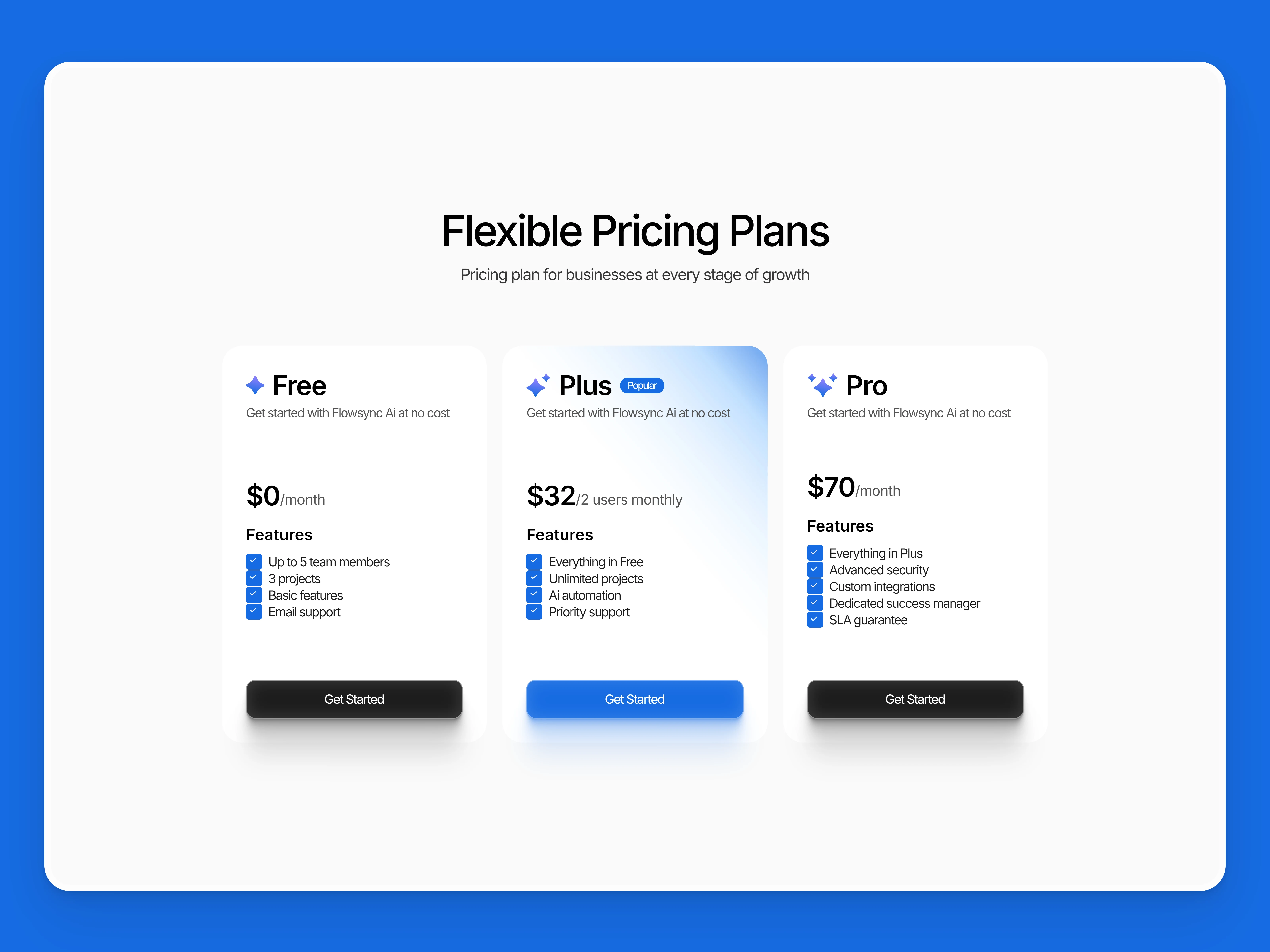
Pricing Section
For the pricing section, I aimed to make the plans clear, simple, and easy to compare. I structured the layout as a component so that each pricing card could be managed with variants, allowing flexibility if plans change in the future.
I used a clean hierarchy to highlight the recommended plan while keeping the others accessible. This approach ensures that users can quickly understand the value of each option and take action without friction.
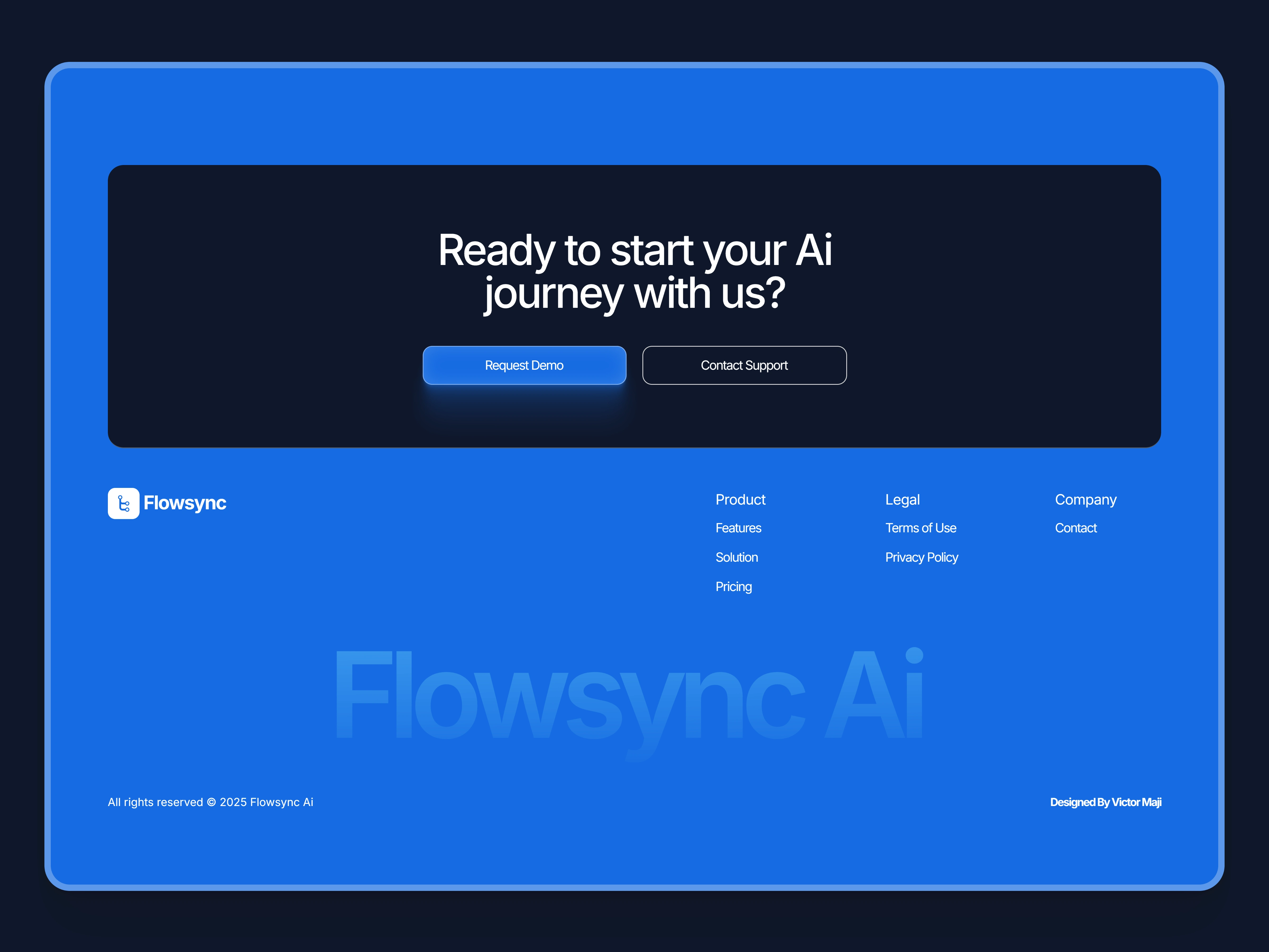
CTA & Footer Section
Like this project
Posted Sep 22, 2025
Designed and launched an interactive website for Flowsync AI using Framer.
Likes
3
Views
25
Timeline
Sep 5, 2025 - Sep 12, 2025


Creative Agency Website Design
NG Kash Fintech Website Design
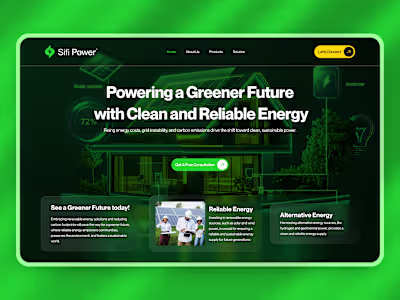
Brand + UI + Web Design for Sifi Power