Logo and Brand Identity Design: Magenta
Giada Marotta
Mgenta - an academic project
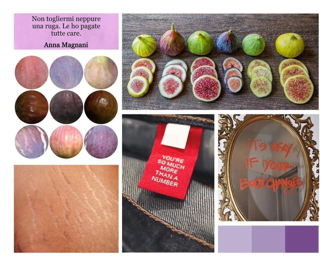
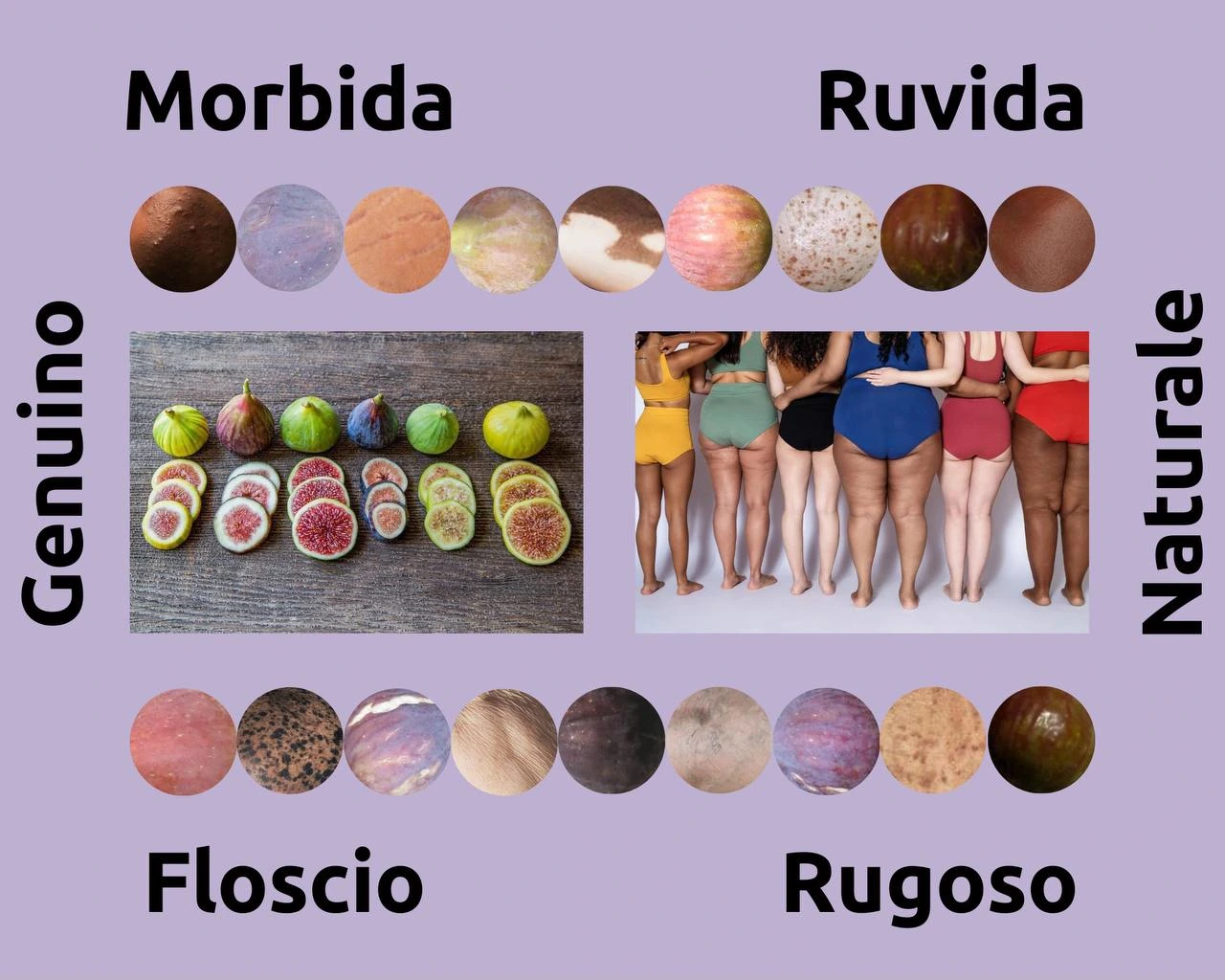
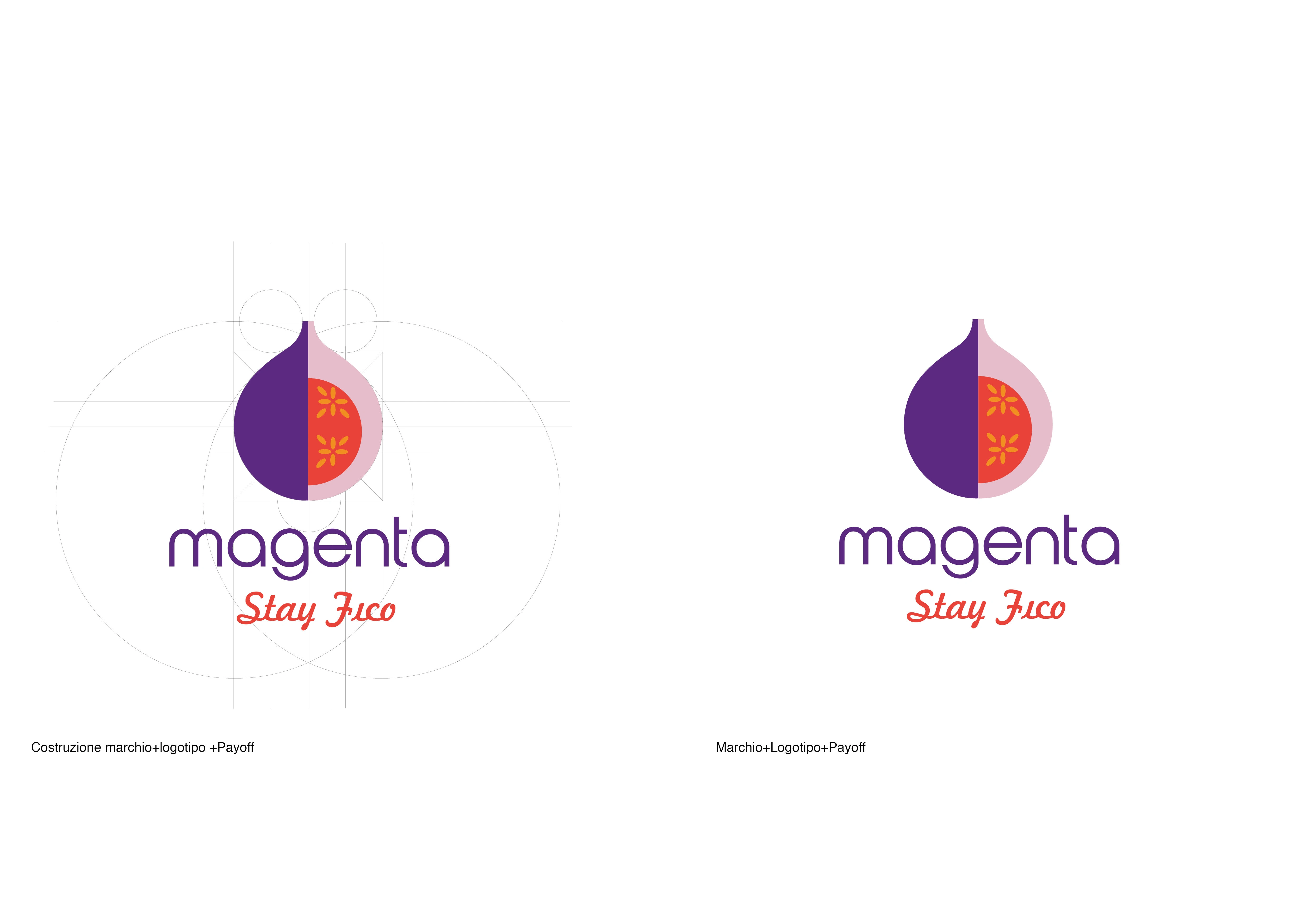
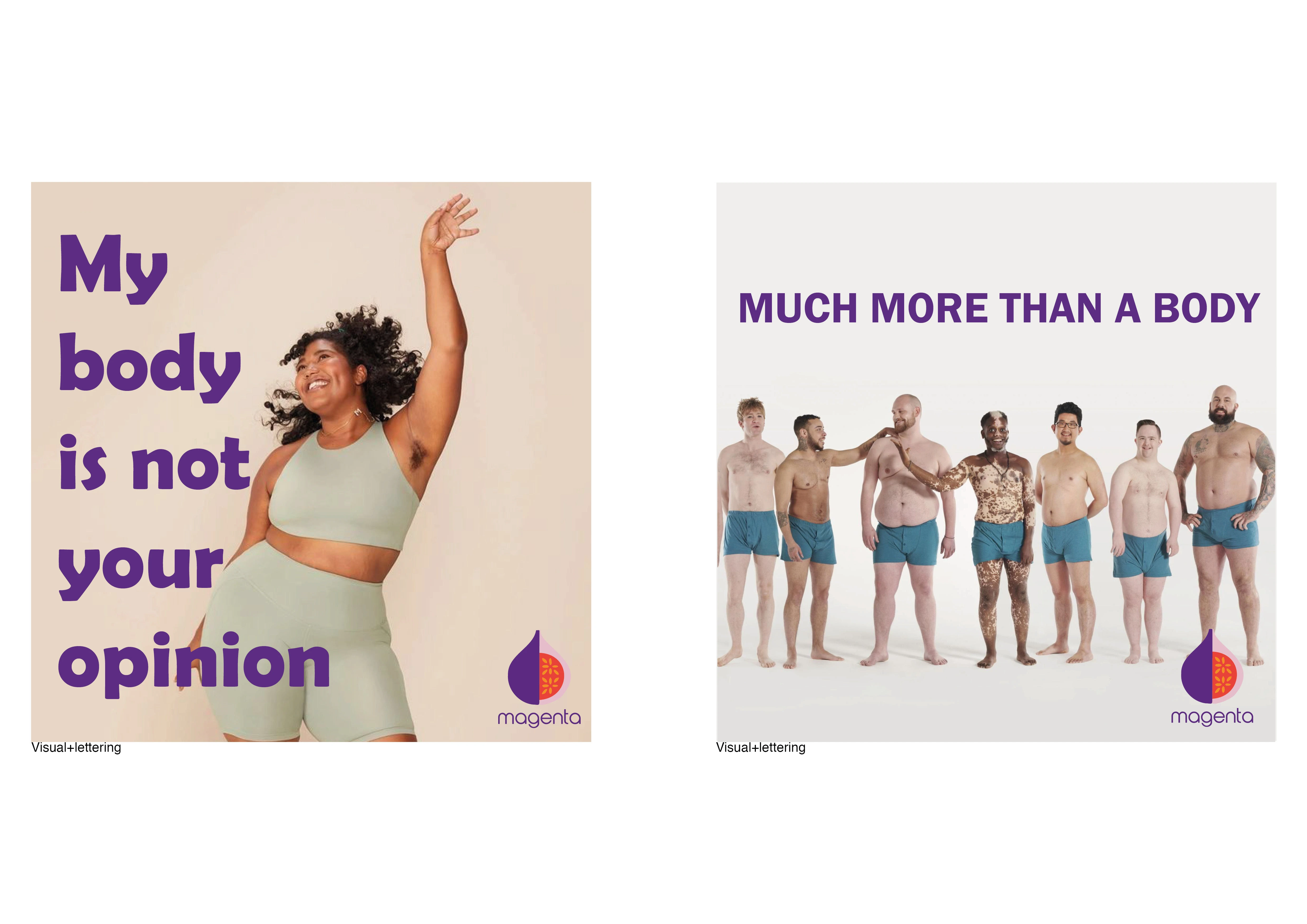
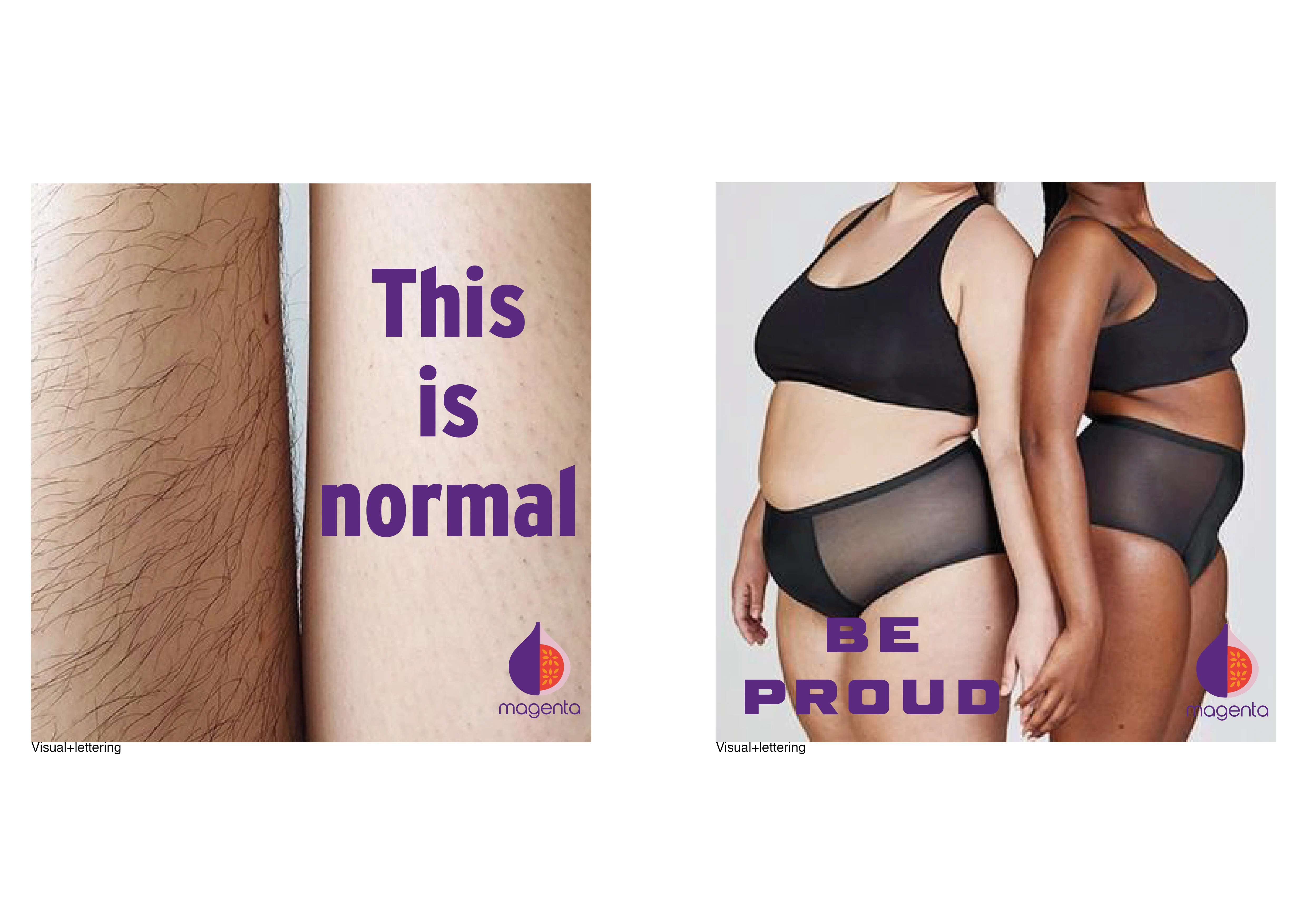
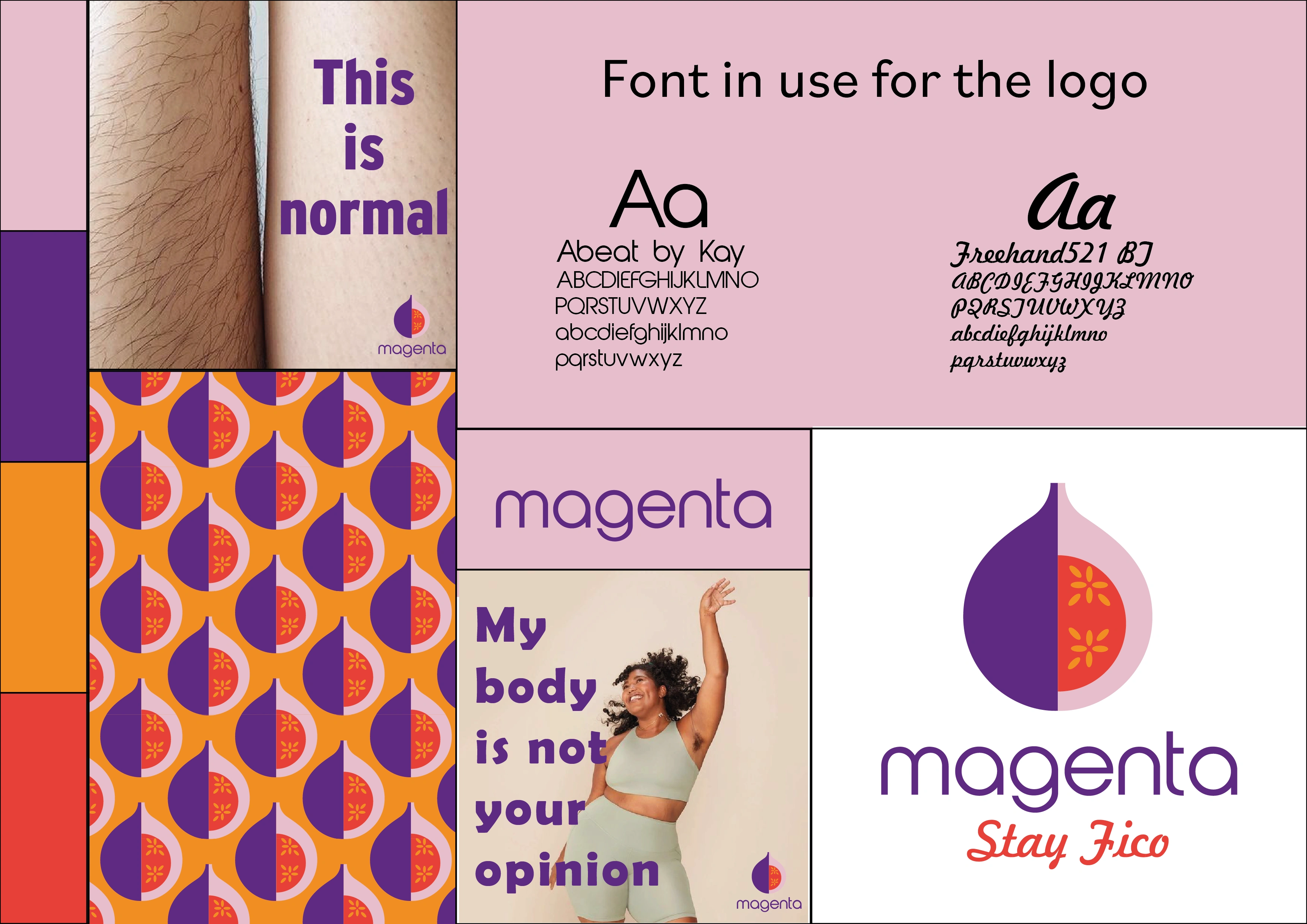
The branding project for the "Magenta" association, dedicated to the promotion of body positivity, aims to convey the message that every individual has the right to express their physicality in the way they deem most appropriate, without being judged by beauty stereotypes. to illustrate this concept, I used the comparison with figs, emphasizing that, despite the external variations, in the end they are always figs.
The purpose of branding is to celebrate diversity and promote an inclusive and respectful environment. Through the brand identity, which includes an evocative fig logo and vibrant colours, it aims to raise awareness, engage the community and generate a positive impact on people, encouraging them to develop a more loving relationship with their own bodies and with of others.
Moodboard
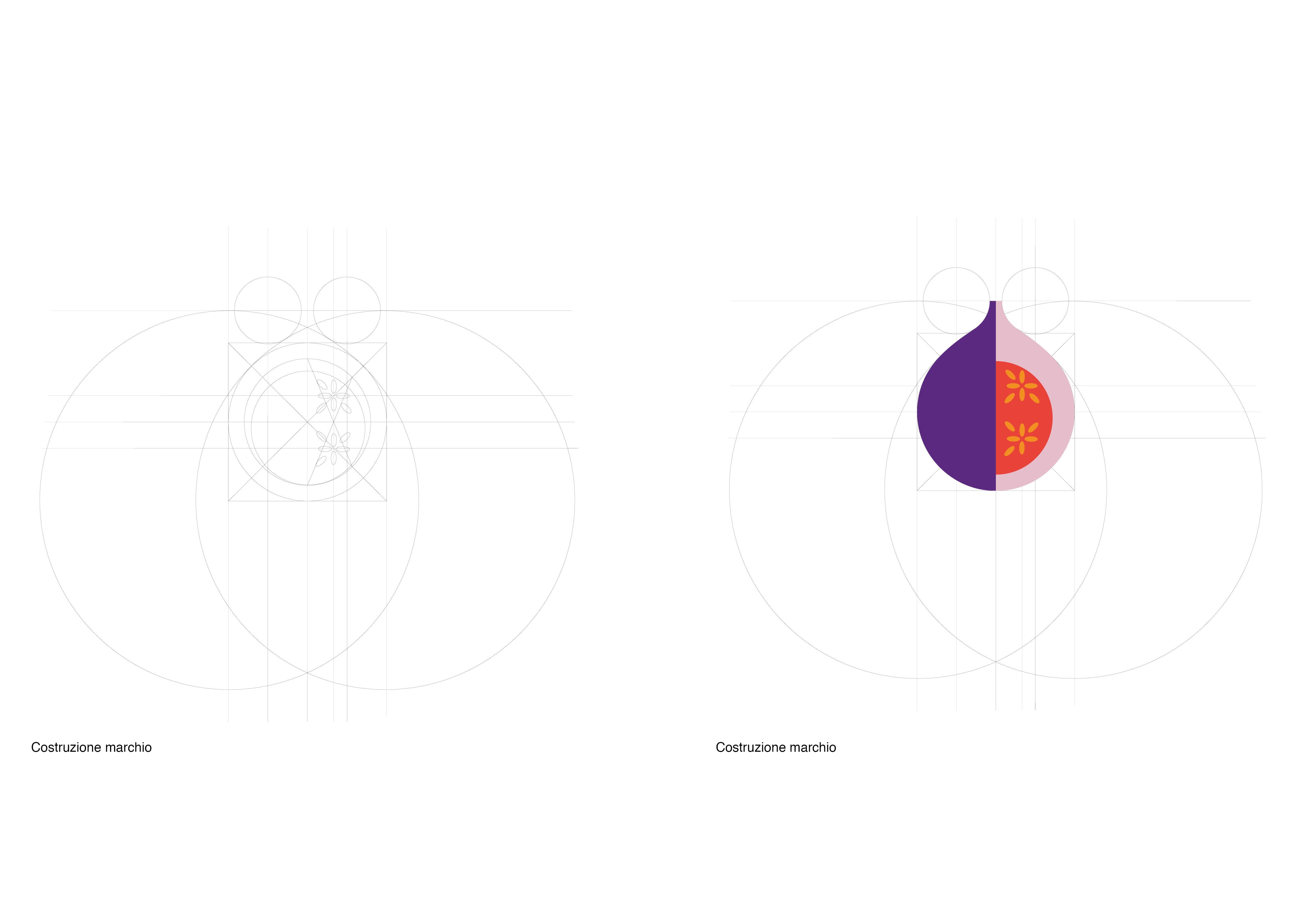
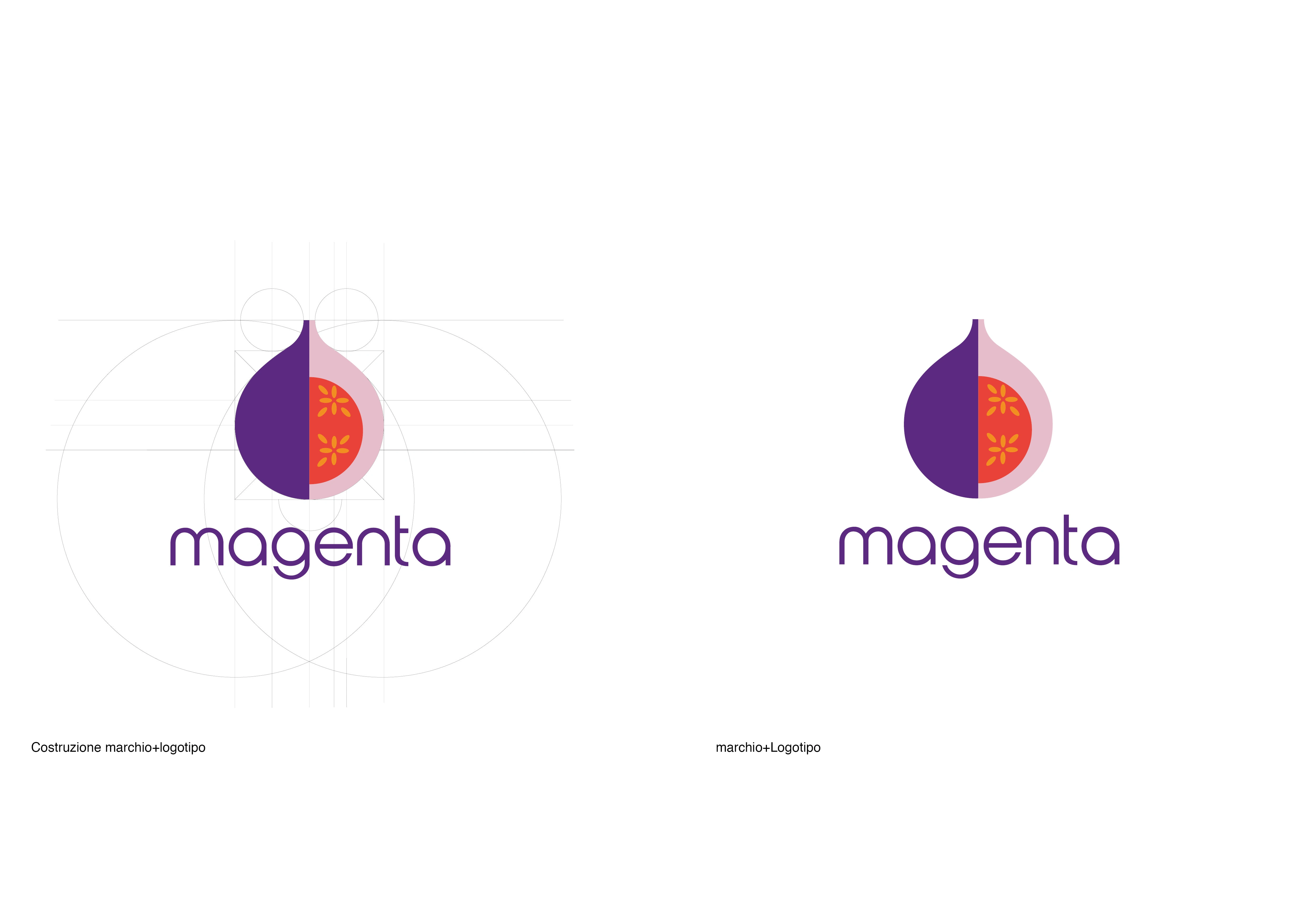
Logo and payoff
For the payoff I did a search within the target language social media, noting that English terms are often used mixed together to Italian, I decided by connecting to the concept expressed earlier on the fruit taken consider using “stay fico” as a payoff so as to express the concept of being yourself.
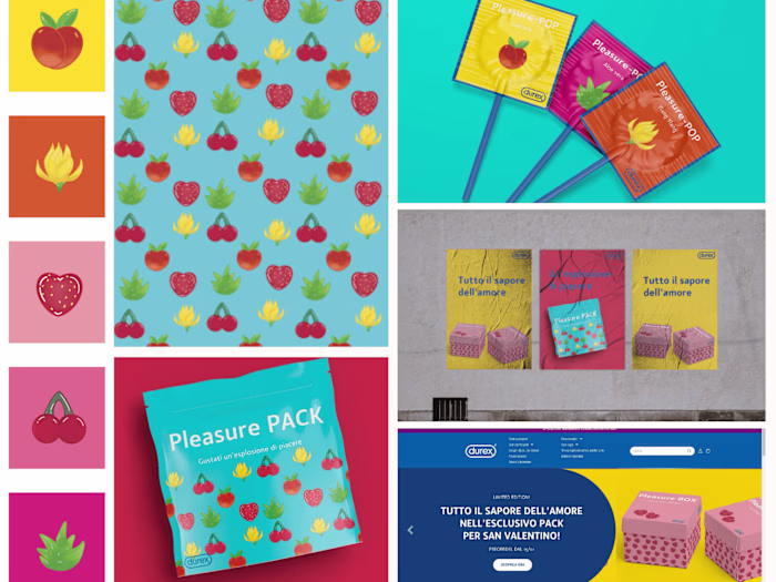
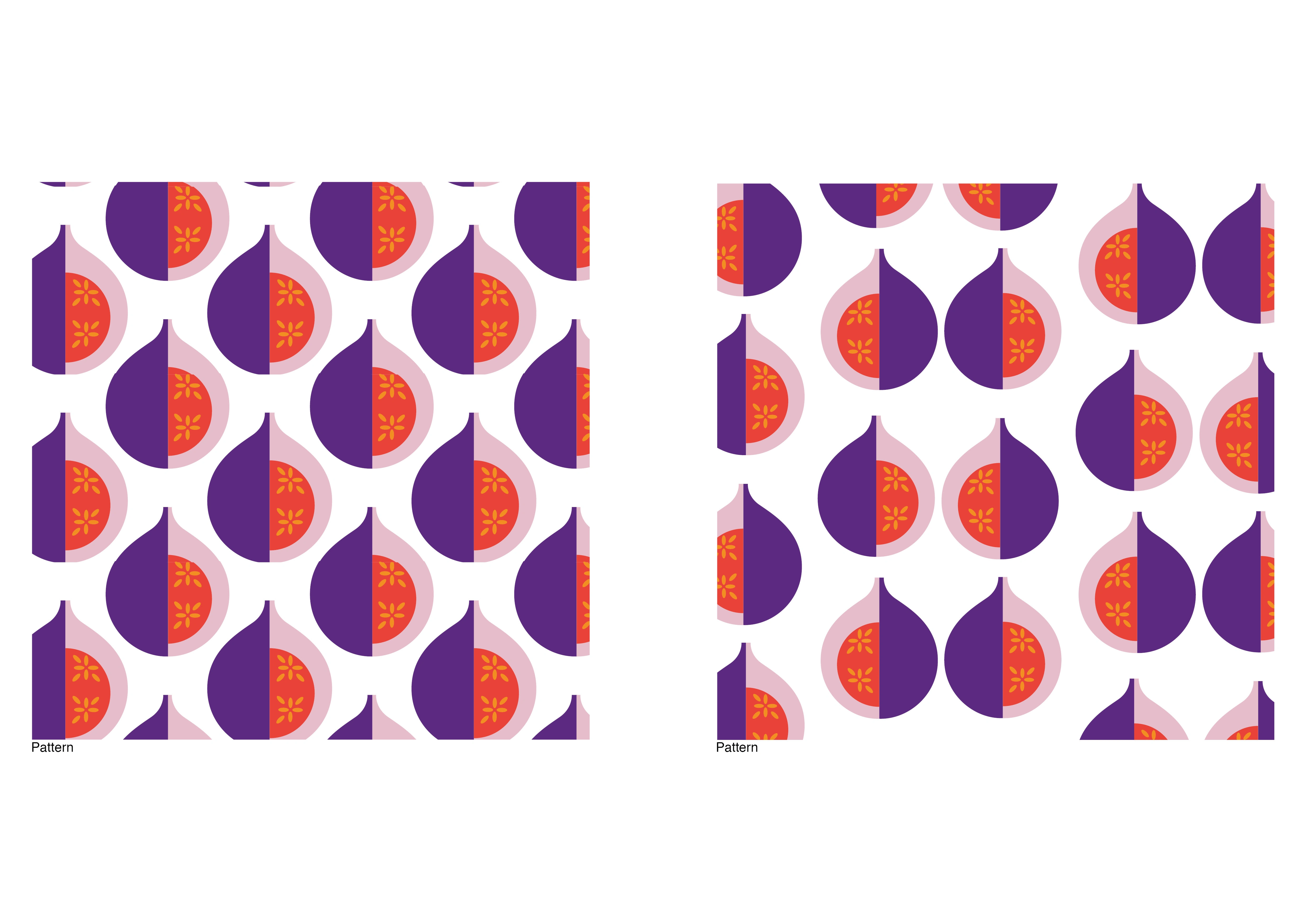
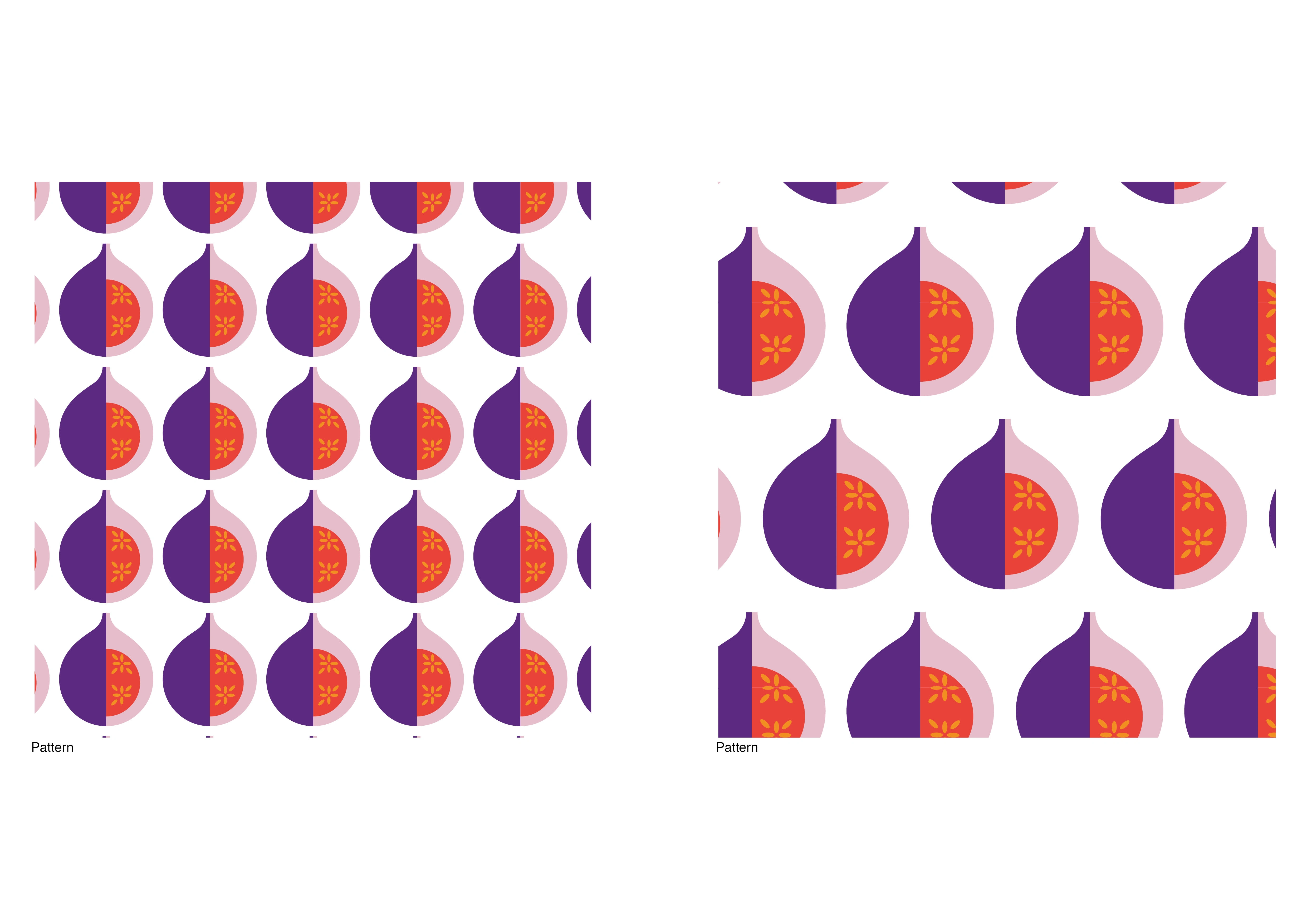
Pattern
Visual


Visual summary
Like this project
Posted Mar 29, 2024
Let's explore diversity with Magenta: a body positivity association that celebrates individual authenticity, like figs, always unique.