Built with Framer
DizWiz Studio: Web Design Agency Landing Page
Trushar Radadiya
DizWiz Studio: Web Design Agency Landing Page
👉 Project Overview
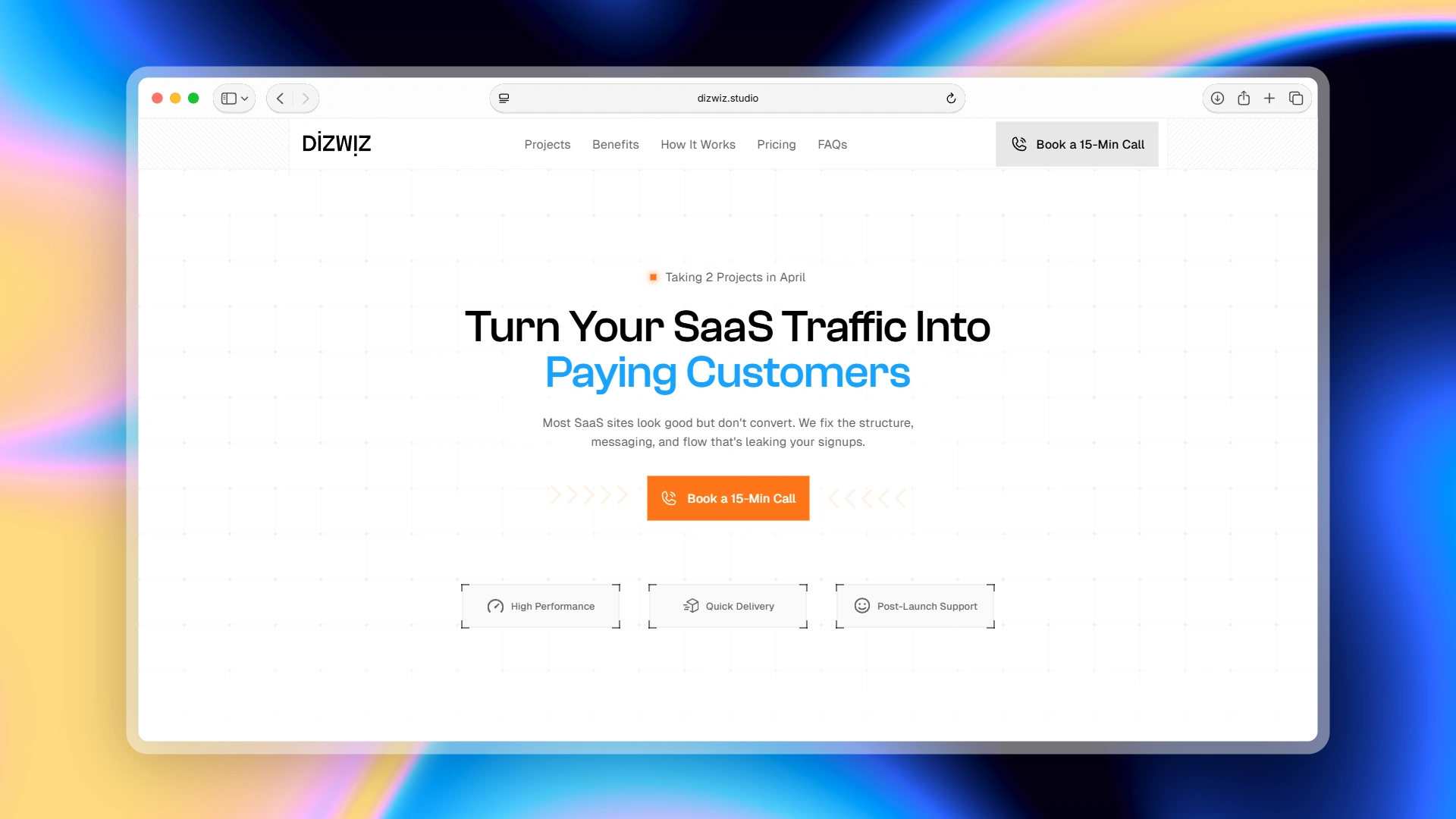
DizWiz Studio is a Framer web design agency that specialises in building high-performance landing pages and multi-page websites for early-stage SaaS startups. The challenge with designing the studio's own site was a familiar one: a new agency with no published client case studies needs to earn trust immediately. The brief was to design a website that leads with a sharp value proposition ('Turn Your SaaS Traffic Into Paying Customers'), communicates a clear and disciplined design process, and drives a single conversion action, booking a 15-minute discovery call at every scroll depth.
👉 Design Objectives
One CTA, Everywhere - Every section, hero, projects, benefits, process, pricing, FAQ, and footer funnels to the same action: 'Book a 15-Min Call'. The entire site is engineered to remove distractions and drive that single conversion.
Positioning Over Portfolio - With no client work published yet, the site needed to establish credibility through positioning, process transparency, and honest messaging, not fabricated social proof. The 'Why Trust Us?' FAQ answer openly addresses this.
Conversion-First Messaging - Every headline and benefit statement is written around the visitor's problem (traffic that doesn't convert, slow sites losing 40% of visitors) rather than around the studio's credentials.
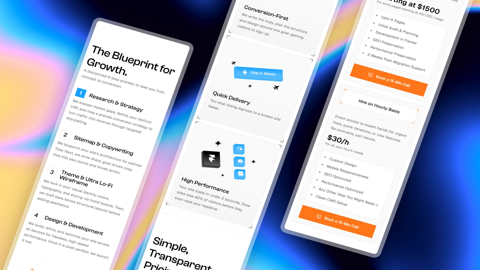
Process as Trust Signal - A detailed 4-step process section (Research, Sitemap & Copy, Wireframe, Design & Build) replaces the usual 'about us' fluff with something more useful: showing exactly how the work gets done.
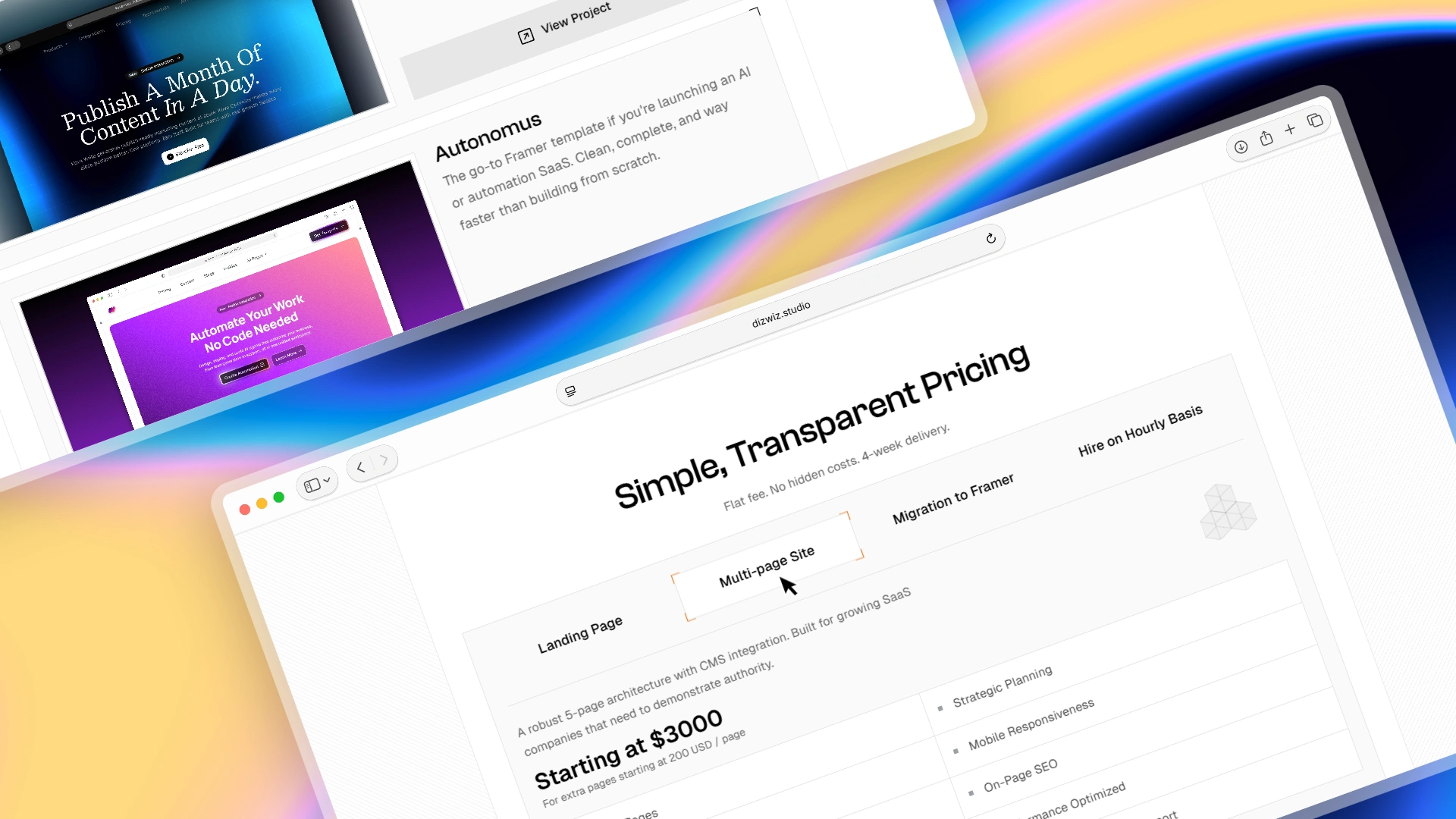
Transparent Pricing - All four service tiers (Landing Page, Multi-page Site, Framer Migration, Hourly) are listed with flat fees, deliverables, and timelines, removing the friction of a 'get a quote' black box that loses leads.
Mobile-First Execution - All sections are optimised for mobile, including the pricing tables, project cards, and FAQ accordion, ensuring no drop in conversion quality for founders browsing on their phones.
👉 Key Features of the Landing Page
Hero with Urgency Signal - Opens with 'Taking 2 Projects', a scarcity nudge paired with a direct headline and a primary CTA button. Immediately communicates availability, focus, and intent.
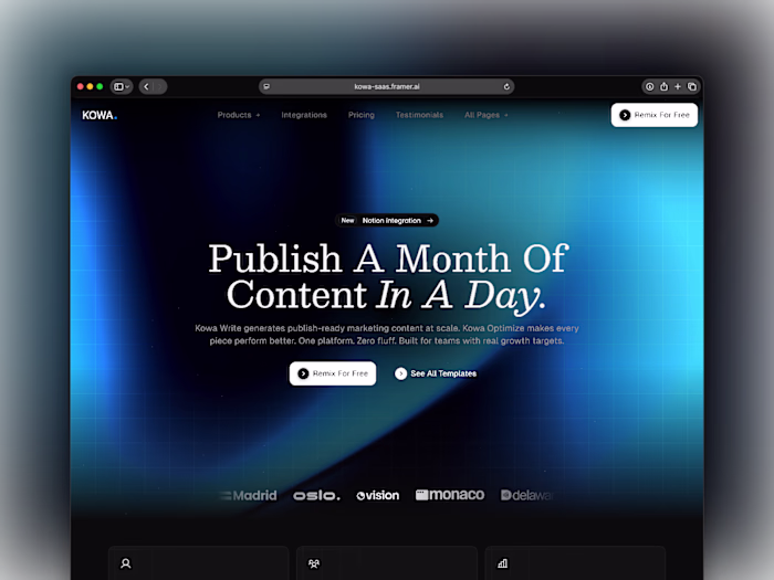
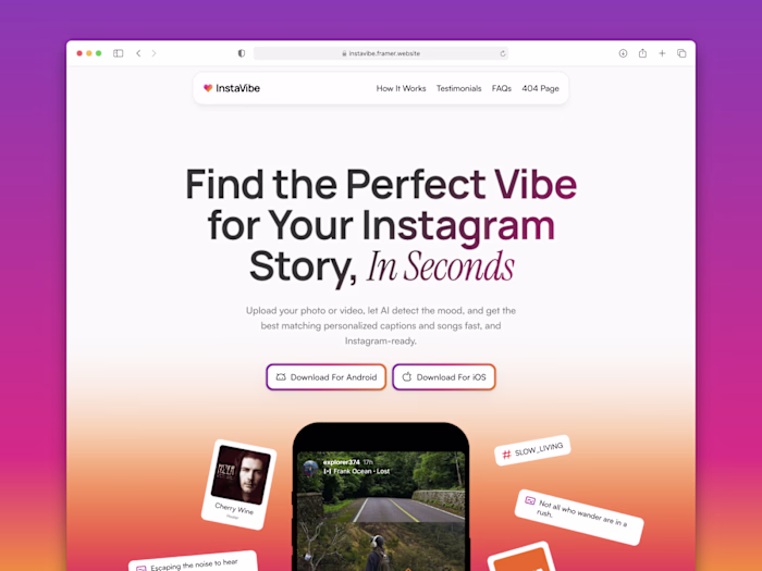
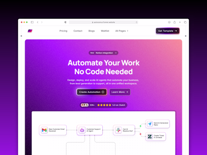
Projects Section - Showcases three Framer builds (Autonomus, InstaVibe, and Kova, the latter marked 'Coming Soon'), each with a preview image, one-line description, and a live project link. Let the work speak before any claims are made.
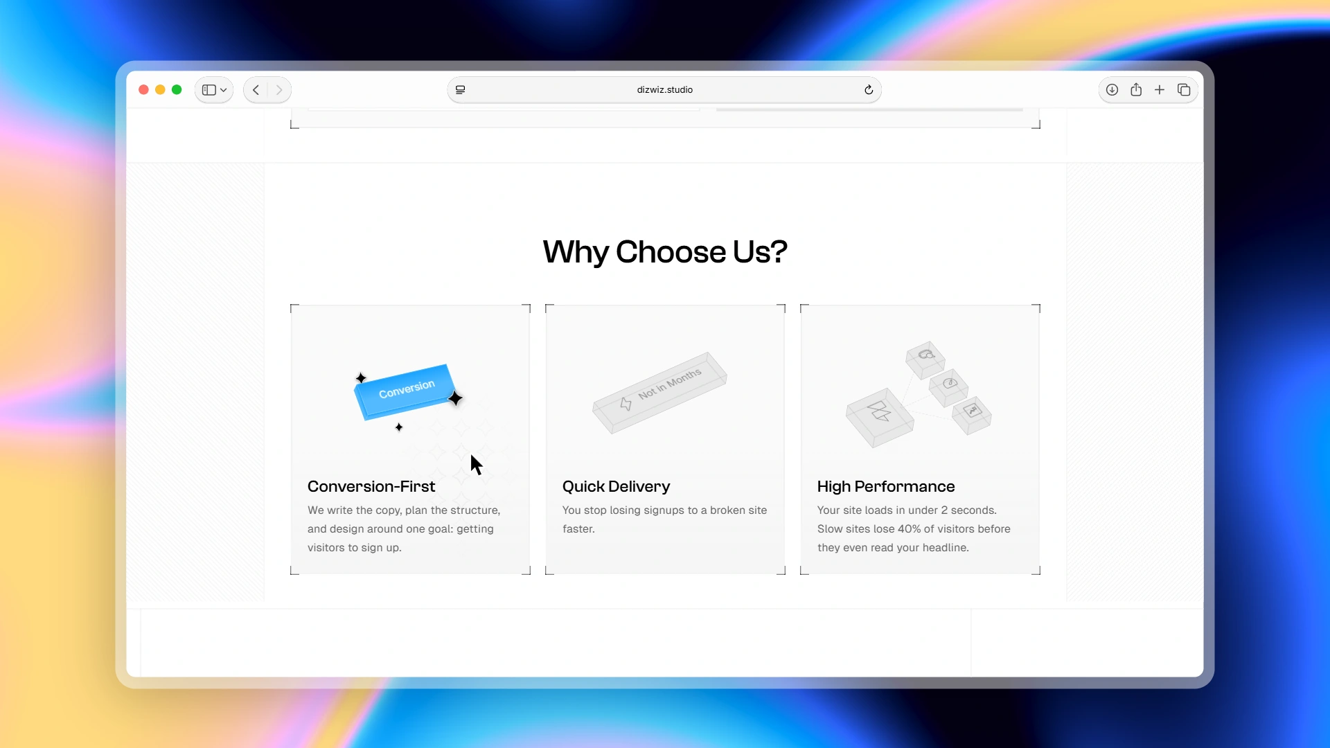
Benefits Section ('Why Choose Us?') - Three benefit pillars: Conversion-First, Quick Delivery, and High Performance, each written around a measurable outcome rather than a vague promise (e.g., 'Slow sites lose 40% of visitors before they read your headline').
4-Step Process Section - Numbered, sequential breakdown of the studio's workflow: Research & Strategy → Sitemap & Copywriting → Theme & Lo-Fi Wireframe → Design & Development. Removes the mystery of the process and sets clear expectations.
Transparent Pricing Table - Four service options with visible pricing ($2,000 for landing page, starting at $3,000 for multi-page, starting at $1,500 for Framer migration, $30/h for hourly) and full feature lists, no 'contact for pricing' friction.
FAQ Section - Seven questions that address the real objections of the target buyer: trust without case studies, difference from templates, revision limits, payment structure, and post-launch support. Written in plain, direct language.
Single Repeating CTA - The discovery call link appears in the nav, hero, pricing cards, FAQ section, and footer, ensuring that no matter where a founder decides to take action, the next step is always one click away.
Minimal, Fast-Loading Design - Clean typographic hierarchy, monochrome palette, and optimized assets result in a site that loads under 2 seconds, consistent with the performance standard the studio promises to its own clients.
This project demonstrates my expertise in:
The ability to solve the hardest design brief in agency work: selling design services without an established portfolio.
The site uses positioning, copywriting, process transparency, and conversion architecture to do the job that case studies would normally do.
Every design decision from the scarcity badge in the hero to the flat-fee pricing and single repeating CTA was made deliberately to build trust fast and reduce the steps between a first-time visitor and a booked discovery call.
Built entirely in Framer with full mobile responsiveness and sub-2-second load performance.
Want a high-converting landing page for your digital product or want to convert visitors into customers, then you are just one step away from it.
Like this project
Posted Apr 24, 2026
A conversion-first agency website designed to turn SaaS founders' traffic into booked discovery calls, built end-to-end in Framer.
Likes
0
Views
3