Knwn Local Business Launch Video Editing
Video editing: Clean and professional business launch video.
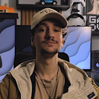
In August 2025, I was assigned one of the most important projects of the team that I work with: Edit a business launch video. Andrew Bayon and Clayton Mclemore recently merged their agencies to grow together, and rebranded to one single agency called Knwn Local, and the responsible for editing their launch video was me. My mission was to transform this simple 1:30 minute video visually stunning, high-impact video that could sound and look as professional as possible.
🎯 The Challenge
My biggest challenge was, by far, creating something professional, original, and at the same time, clean and smooth. On top of that, I had a really short delivery time, so I had to make sure to be precise and agile.
To reach my goal, I spent hours researching references, styles, and other similar videos to come up with something new. After that, though it wasn’t exactly quick to do, it was still a piece of cake to handle all the motion graphics.
🛠️ The Process
I started with a thorough structural edit of the footage: cutting out filler moments, sharpening the dialogue, and refining the pacing so that every second served a clear purpose.
My next step was to decide which moments should have the motion graphics I mentioned before. This was extremely important, because if I used too many, it could compromise the professionalism, momentum, and cleanliness of the video. So I decided to go with 4–5 different moments to illustrate and used markers to remember these specific points.
After thorough research, I decided to go with the Apple style, with a little bit of my own touch for all of the motion graphics. I also combined the whole style with the marine blue color of the video. This turned out to be a great decision. The contrast between these two colors worked so well.
With the creative tone established, I moved into full post-production, working in Adobe Premiere Pro for pacing, transitions, and sound dynamics.
Each motion element was hand-built — from environmental overlays to animated callouts — carefully balanced to enhance clarity without overwhelming the viewer. Techniques like 3D camera projection, parallax layering, and micro-motion detailing added depth and fluidity to the visuals.
📈 Results
Although I'm unaware of the results, this was by far a big milestone for me. After that day, I started to use many of the skills and techniques I learned while doing this much more frequently. I discovered a whole new horizon of styling and skills that I had been unaware of until then. My creative thought process became clearer, and my agility improved along with my techniques.
🏁 Closing Thoughts
This project set a new goal for my future and career while opening my eyes to new ideas, visuals, and design.
What began as raw, unpolished footage evolved into a meticulously crafted narrative.
📞✉ Want to grow your business throught youtube, organic ads and the power of video editing? Get in touch! I'll be the one to help you generate millions with the power of visual storytelling.
Like this project
Posted Oct 31, 2025
Edited a professional business launch video for Knwn Local with the use of motion graphics and video editing techniques and sound design.
Likes
0
Views
9
Timeline
Jul 31, 2025 - Ongoing
