Full-stack Developer for Tradytics Website
Marco Wong
Verified
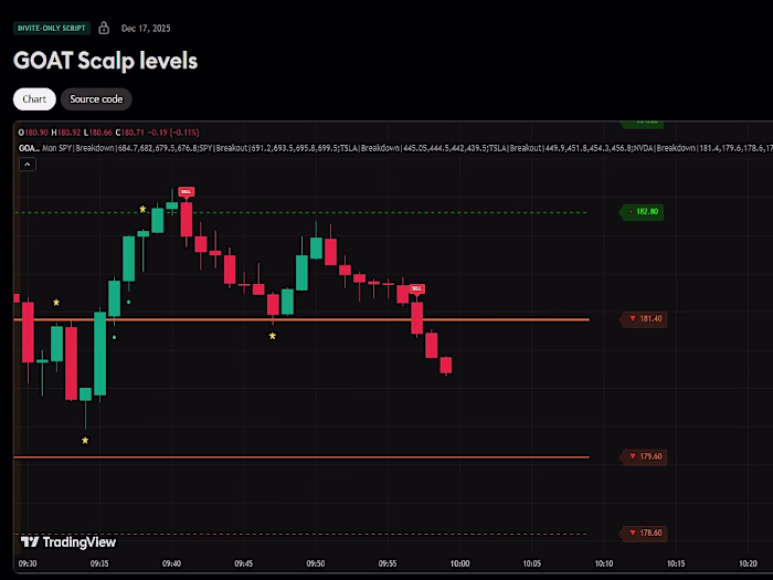
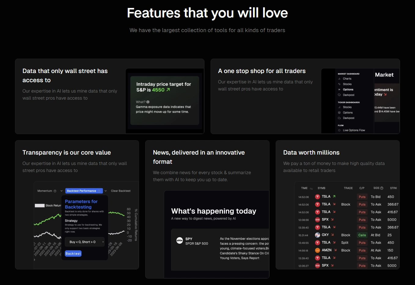
Full-stack development project focused on building an intuitive trading analytics platform with clear data visualization and scalable membership management. The goal was to simplify complex market data into actionable insights while maintaining a fast and responsive user experience.

The process involved structuring data-heavy interfaces into modular, easy-to-understand components, enabling users to quickly interpret signals, trends, and analytics. I focused on UX enhancements such as clear hierarchy, real-time data rendering, and responsive layouts to ensure seamless usage across desktop and mobile devices.
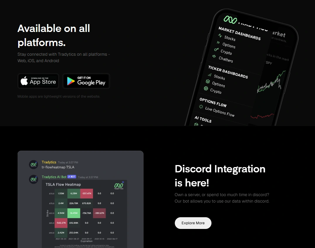
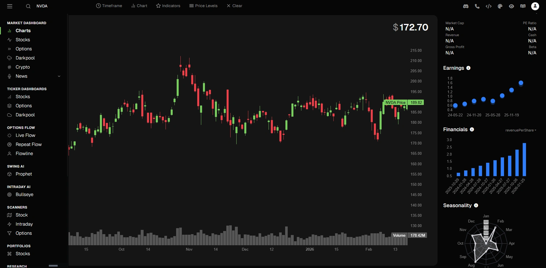
Using React and Next.js, I developed dynamic frontend components and optimized performance for data-intensive views. I integrated external APIs for real-time market data and implemented Stripe-based membership systems supporting multiple pricing tiers, subscriptions, and access control.
My aim was to deliver a scalable, high-performance platform that balances advanced analytics with intuitive UX, making complex trading data accessible and actionable for users.
Like this project
Posted Feb 2, 2026
Delivered a scalable, high-performance platform that balances advanced analytics with intuitive UX, making complex trading data accessible & actionable 4 users
Likes
2
Views
17
Timeline
Jan 6, 2026 - Feb 14, 2026
Clients
NALA Financial