
Near Health — website redesign, motion & rebuild
Web design · Motion · Front-end development · 2026 · 3–4 weeks
Live site: near.health
Near Health website
Overview
Near Health is building AI-native infrastructure for what happens after someone enrolls in a health plan, a stage of the journey nobody really owns. Members struggle to use their coverage, brokers lose sight of their clients once the plan is sold, and providers meet patients halfway through a broken journey.
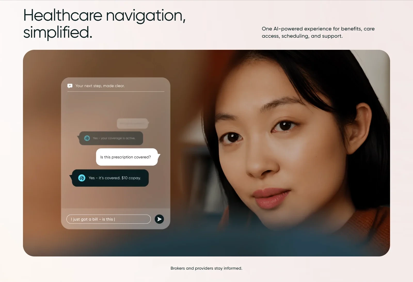
Near connects all three in one AI-powered layer for benefits, care access, scheduling and support, delivered through text and voice.
Their website had one job: make this invisible problem obvious in a single scroll, and turn the right visitors into early-access conversations.
The challenge
When Near came to us, they already had a website. It just didn't work.
It had been built by another team, and you could tell. Pages were slow to load, animations stuttered, and the layout fell apart on tablets and phones, which is where many brokers and providers would first see it. For a company selling reliable healthcare infrastructure, a site that broke on mobile was hurting their credibility.
We audited the build and logged more than 80 critical issues, grouped into four areas:
Responsive layout: fixed pixel values everywhere, so sections overflowed, overlapped or collapsed below desktop width.
Performance: heavy, uncompressed video and imagery, and JavaScript shipped for content that never needed it.
Motion: scroll animations that caused layout shift and dropped frames.
Code, structure and SEO: non-semantic markup, duplicated logic and missing metadata.
Mobile Lighthouse scores were sitting in the 60–75 range across categories.
Patching wouldn't fix this. The site needed rebuilding from the ground up, both the design and the code.
Our approach
1. Rebuilding the design in Figma
Before writing any code, we rebuilt the whole design in Figma so we had one source of truth to build from:
A component-based design system: reusable cards, section headers, CTAs and type styles, so every section follows the same rules.
Dedicated Desktop, Tablet and Mobile layouts: responsive behavior is designed up front rather than left to guesswork in CSS.
A consistent grid and spacing rhythm, so the page reads as one calm, continuous story.
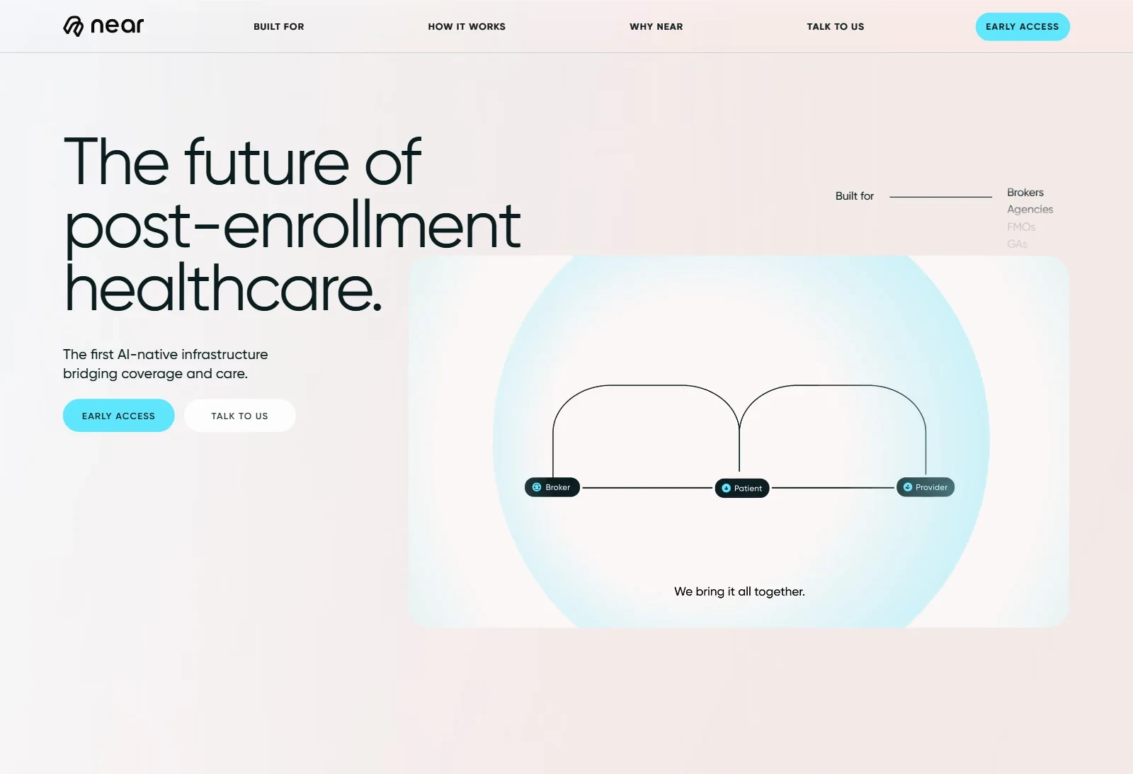
The visual language stayed calm on purpose: warm blush gradients, a light-weight Gilroy typeface, deep teal text, and a single cyan reserved for every action. In healthcare, calm builds trust.
2. Telling the story through scroll
The page is built so the problem shows up before the product is named.
A scroll-driven hero: a patient navigates the system alone, then the same journey plays again with every piece connected.
Reveal typography: headlines and the "Shaped by real-world use" manifesto appear line by line and word by word as you scroll, so visitors read at the pace of the story.
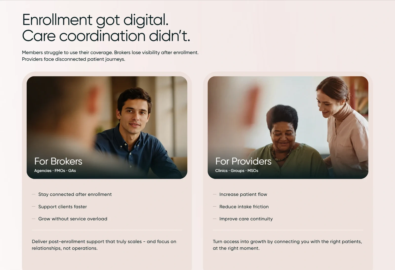
Audience entry points: separate cards for Brokers (Agencies · FMOs · GAs) and Providers (Clinics · Groups · MSOs), each listing plain-language benefits.
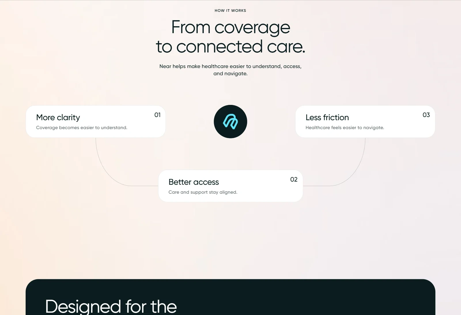
A three-step product explanation: More clarity → Better access → Less friction.
Coverage lines as a moving strip: Vision · Dental · Medicare · Individual · Employer, shown as a continuous marquee alongside the "Built for" audience ticker.
We also tightened the information hierarchy and added anchor navigation (Built for / How it works / Why Near) so visitors can jump straight to the part that matters to them.
Care cards
Ai Chat Video
Infographics
3. A contact flow that routes itself
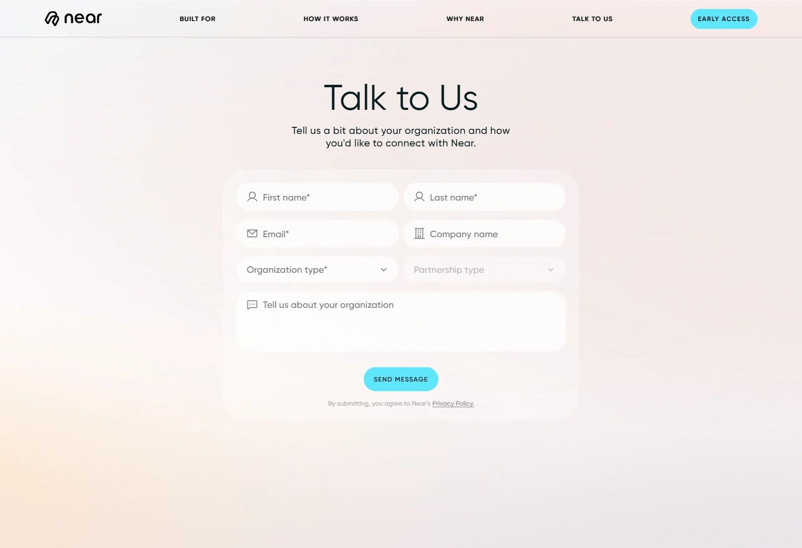
Every CTA leads to one contact form, and the form starts by asking who the visitor is. Requests are routed by organization type and intent (Early access or Talk to us), so the Near team knows who they're talking to before the first reply.
4. Engineering for speed: Astro + React islands
We rebuilt the site on Astro, with React used only where interaction is needed.
Static by default: almost the whole page ships as plain HTML and CSS, which is fast to load and easy for search engines to index.
Islands architecture: React and Motion hydrate only the interactive pieces, so the rest of the page carries no JavaScript cost.
Smooth scrolling with Lenis, plus IntersectionObserver-based reveals that use only
transform and opacity, which removed layout shift and dropped frames.Fluid layouts replaced the hard-coded pixel values, and were tested across Desktop, Tablet and Mobile.
Semantic markup, clean metadata and accessible structure throughout.
The hardest part: video on mobile
The hero story and the AI chat demo both use video, and video is usually what kills mobile performance. Keeping the motion while getting a perfect Performance score was the hardest problem on the project.
Here's how we solved it:
Separate mobile videos: each video has its own mobile cut, with framing and resolution chosen for a vertical screen.
Aggressive compression and re-encoding, to keep visual quality while cutting file size substantially.
Poster first, video later: a lightweight poster frame renders immediately, and the video lazy-loads after the main content, so it never blocks Largest Contentful Paint.
iOS autoplay fixes:
muted and playsinline handling so videos play inline in Safari without user taps or fullscreen takeovers.The result is a full-motion story on mobile that still loads instantly.
Results
Mobile Lighthouse, before → after:
Category | Before | After
Performance | 60–75 | 100
Accessibility | 60–75 | 96
Best Practices | 60–75 | 96
SEO | 60–75 | 100

80+ critical issues resolved
Rebuilt in 3–4 weeks: design, motion and development
4 pages shipped: Home, Contact, Terms, Privacy
A site that holds together on every screen size and finally matches the quality of the product it represents
Near now has a one-page story that takes visitors from "Enrollment got digital. Care coordination didn't." to an early-access request, without breaking on any device along the way.
Client testimonial
"The team took a website that was falling apart on mobile and turned it into something we're genuinely proud to send to partners. They didn't just fix the code. They rebuilt the design, reworked every animation, and found and solved more than 80 issues we didn't even know we had. What stood out was how well they understood our business: they knew the site had to build trust with brokers and providers, and every decision reflected that. Fast, detail-oriented, proactive, and great to work with. Highly recommended." Adrian Thistle, Founder, Near Health
Credits & stack
Scope: UX design · Figma design system · Motion design · Front-end development
Stack: Astro · React · Motion (Framer Motion) · Lenis · CSS animations · IntersectionObserver
Timeline: 3–4 weeks
Live: near.health
0 likes · 1 view · Nov 17, 2026
We rebuilt the Near Health website from the ground up, turning a slow site that broke on mobile into a scroll-driven story about post-enrollment healthcare.


