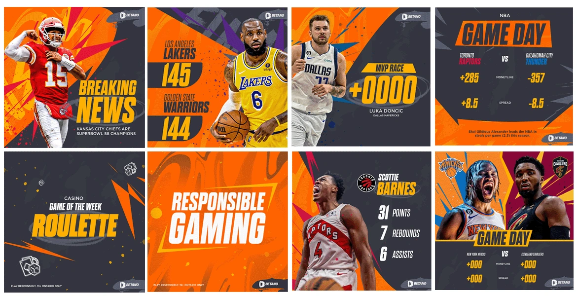
Betano Canada
Craig Visser

STYLE DIRECTION
Embracing a distinctive and unique visual style, the design seamlessly flows with the brand's colour palette, incorporating shades of oranges and dark greys. Team-specific colours are integrated, resulting in a captivating and unique appearance tailored to the dynamic landscape of social media.
The font is a bold, powerful and modern style to capture attention, featuring larger text for headings to prioritise essential information. This font choice serves to connect the digital and sporting worlds. The incorporation of bold and sharp elements contributes to a unique style that not only attracts social media users but also maintains the relationship between the digital and sports spheres.
Ultimately, this approach elevates Betano Canada's social presence, leaving a lasting impact on users and drawing attention through a memorable and distinctive style.
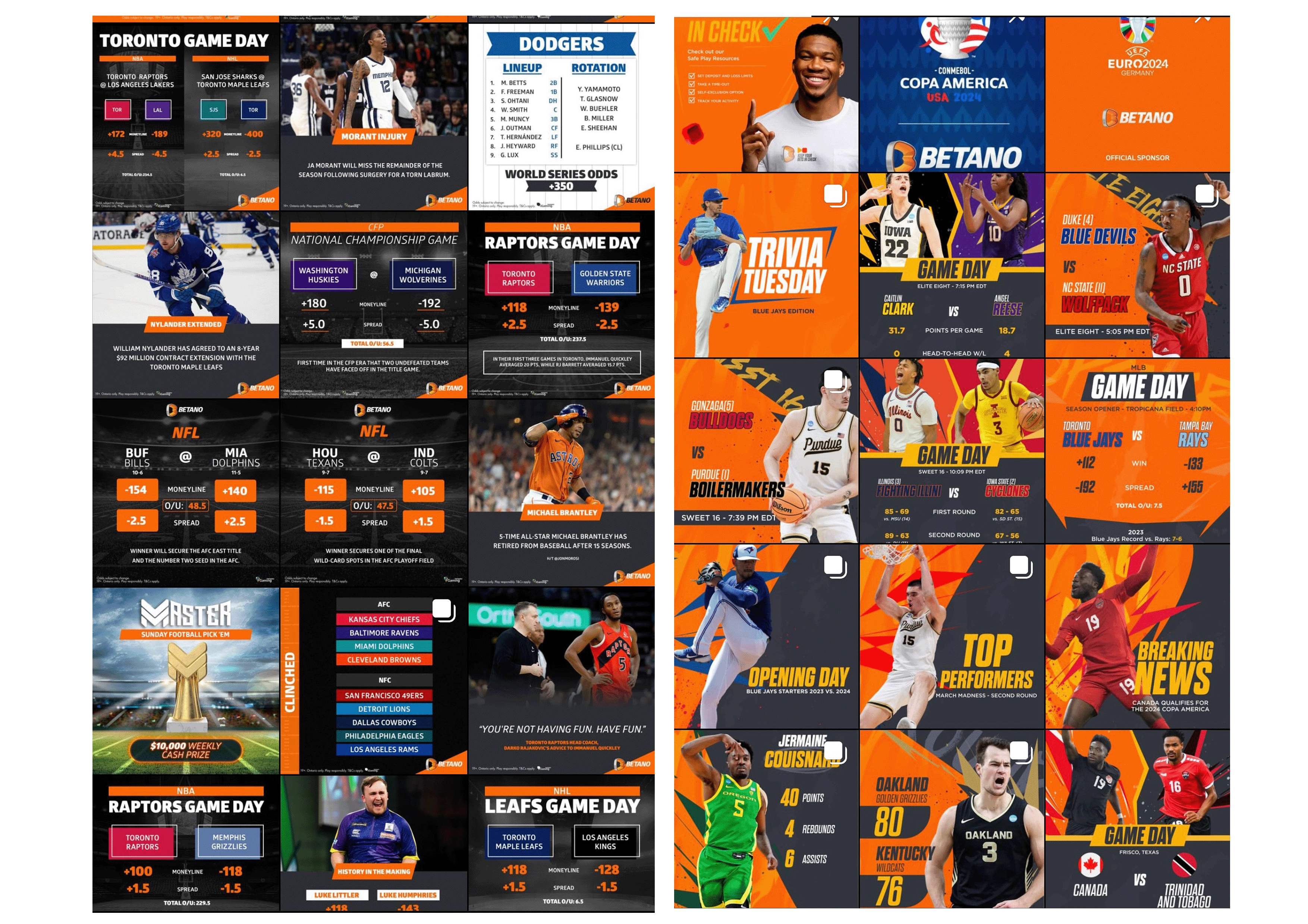
INSTAGRAM POSTS
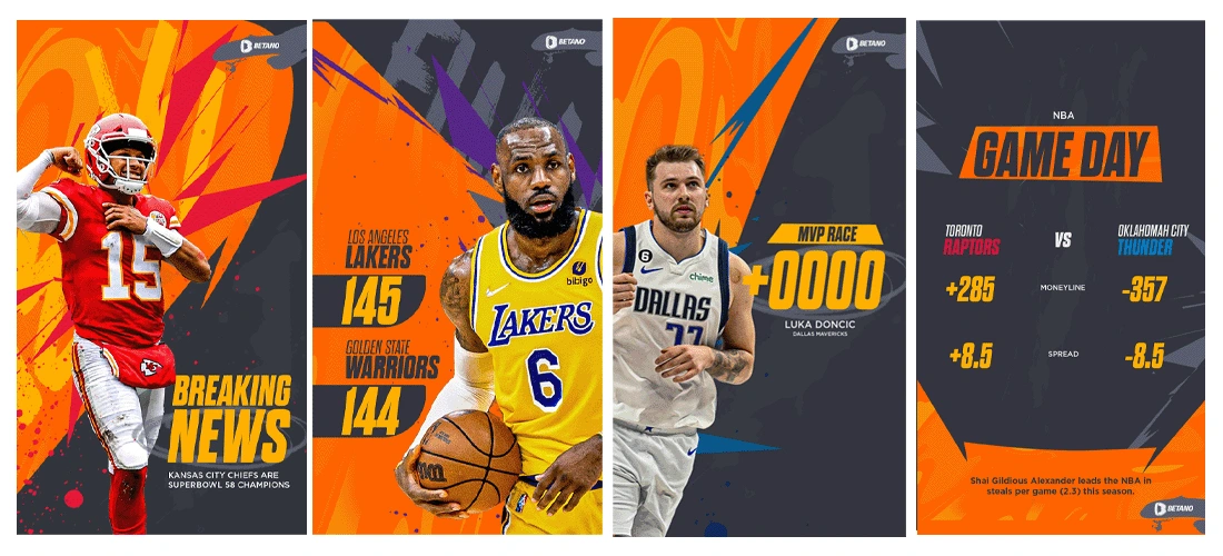
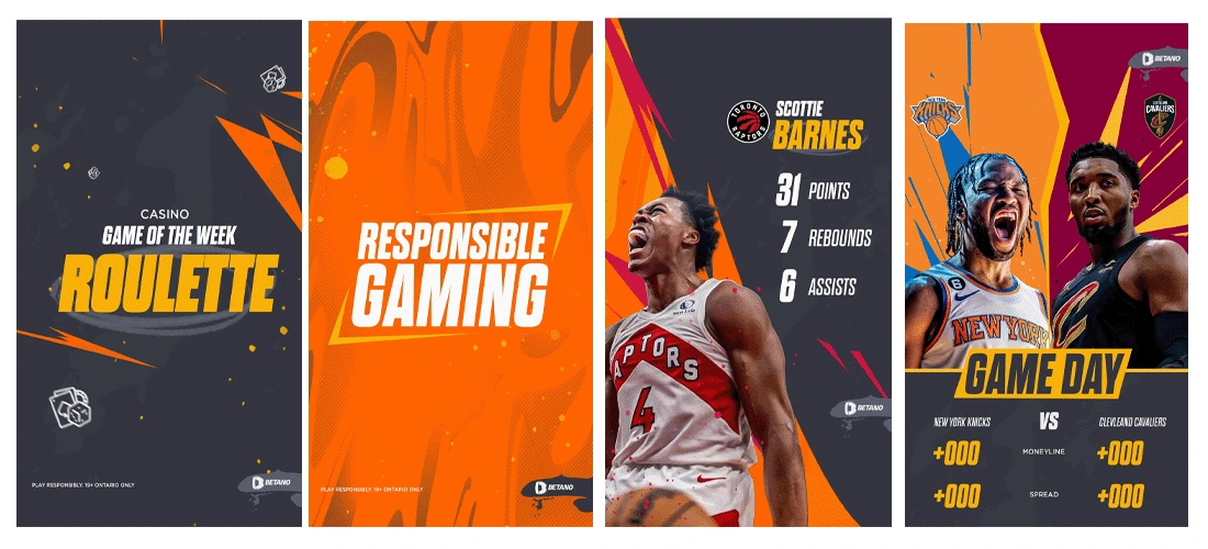
INSTAGRAM STORIES
BEFORE → AFTER
Like this project
Posted Apr 5, 2024
Social Media Content Creation
Likes
0
Views
27
Tags