Built with Framer
Sitekick Framer Website
Chris Nutbeen
Overview
As a Partner at Sitekick, it was time to redesign our own website to better reflect the direction of the studio.
Issac, Alexa and myself were tasked with building a fresh, clean site to highlight the great work produced by the team. I was to advise on the web development specifics and build the Figma design into a pixel perfect Framer website, with all the joys that come with micro-interactions to bring the amazing design to life!
The Challenge
Sitekick is moving quickly, hitting 1M ARR in just over a year and has been consistently iterating on the brand look and direction. Now had come the time where we needed to build on this initial brand development to lock in the direction to make it easier to offer our services. Keeping the logo, Issac and Alexa set to work on exploring their design ideas, mood-boards and motion in Figma.

Sitekick Homepage
The Solution
A Figma design masterclass using all our design system best practices to produce a website design that was the perfect blend of fun, intrigue and good clean UI.
From a reletaively small website, the user was instantly introduced to the team and a statement of who we are and what we do. The pre-load, hero animation and interactive team banner sets the tone for the rest of the user experience, all with one clear call to action.
Each section of the website was built using components, mostly native, some custom to achieve the results we wanted. With added Lottie animations to add more pop to the content.
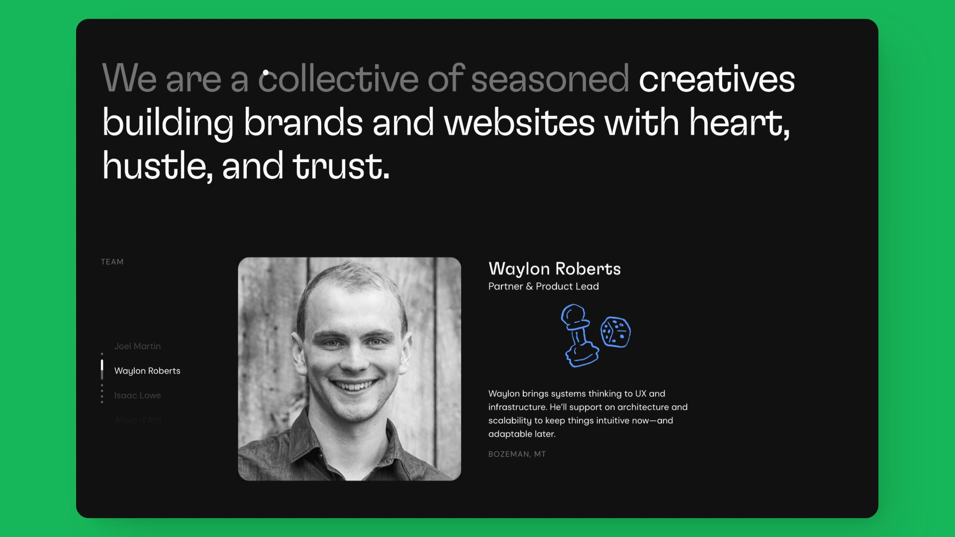
Team Slider
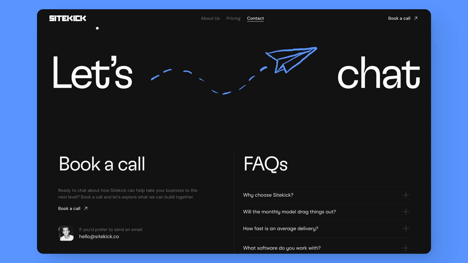
Contact Page
Final Thoughts
A very happy team with a very cool website.
Like this project
Posted Jun 26, 2025
The all new Sitekick Framer website - Figma to Framer development and enhancing the UI with Lottie animations and motion to create a great website experience.
Likes
3
Views
108
Timeline
Jun 12, 2025 - Jun 24, 2025
Clients
Sitekick