Notifications System
Problem Overview
Sprout Social had never had a team or specific initiative dedicated to thinking through (and building for) users’ Notifications experiences, despite key personas being heavily reliant Sprout Social for real-time information regarding activity on or with their business’s social media pages.
Sprout Social’s Notifications problem was two-fold:
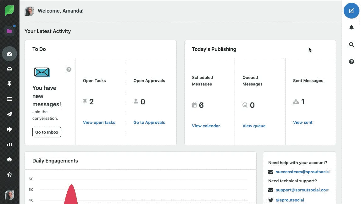
1. User Experience: Without a centralized Notification Center, users didn’t have a dedicated space to find, review, and act on pertinent information resulting in frustration. Additionally, users did not have the ability to manage delivery preferences for opting in/out of notifications. In the ‘Before’ screenshot you can see three icons in the upper left hand corner of the old interface, each containing counts for notifications from a specific area of the application. Those icons’ notifications all had different styles and varying levels of actionability (ie click into, read-only, etc). While these icons + notifications were all at least at the top of the navigation, there were several more instances of notifications not accounted for here hidden throughout the various pages of the web application.
2. Technical: Over the years, various development teams had created dozens of scrappy one-off service solutions for delivering notifications to users within their siloed product areas. This culminated in a tangled system of disparate notifications services which became increasingly difficult to understand, maintain, measure, and support.
Discovery Methods
Existing Product & Tech Audits
Multi-team + Cross-Functional Brainstorms
Large-Scale Requirements Gathering Tour
Internal User & Customer Interviews
Adjacent Product Space Research
Beta Release Programs + User Surveys

Like this project
Posted Mar 18, 2021

