Built with Framer
Designed a SaaS landing page to optimize user conversion
Gabriel kayode
Designing a saas landing page Template for conversions
The process began with research into established SaaS websites to understand common user expectations around layout, content hierarchy, and conversion patterns. These insights informed the overall website structure, ensuring a clear and logical flow from discovery to feature understanding and finally to action. The emphasis at this stage was on clarity, scannability, and reducing cognitive load.
With the structure defined, wireframes were created using Relume to explore layout options and refine content hierarchy. This allowed for rapid iteration while focusing purely on usability and flow, without the distraction of visual styling. The wireframes helped validate section order, spacing, and content priority before moving into high-fidelity design.
Outcome and Key takeaways
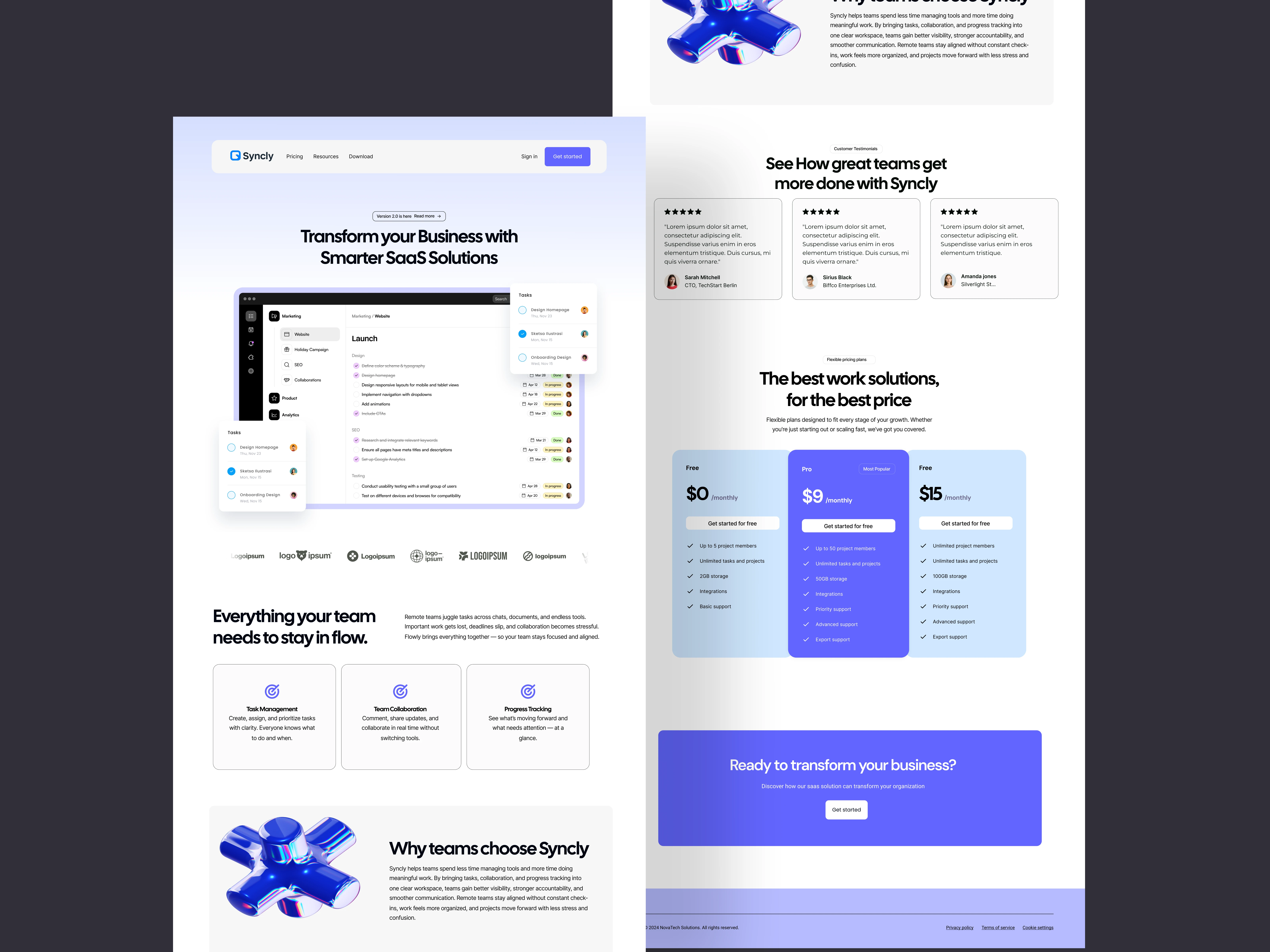
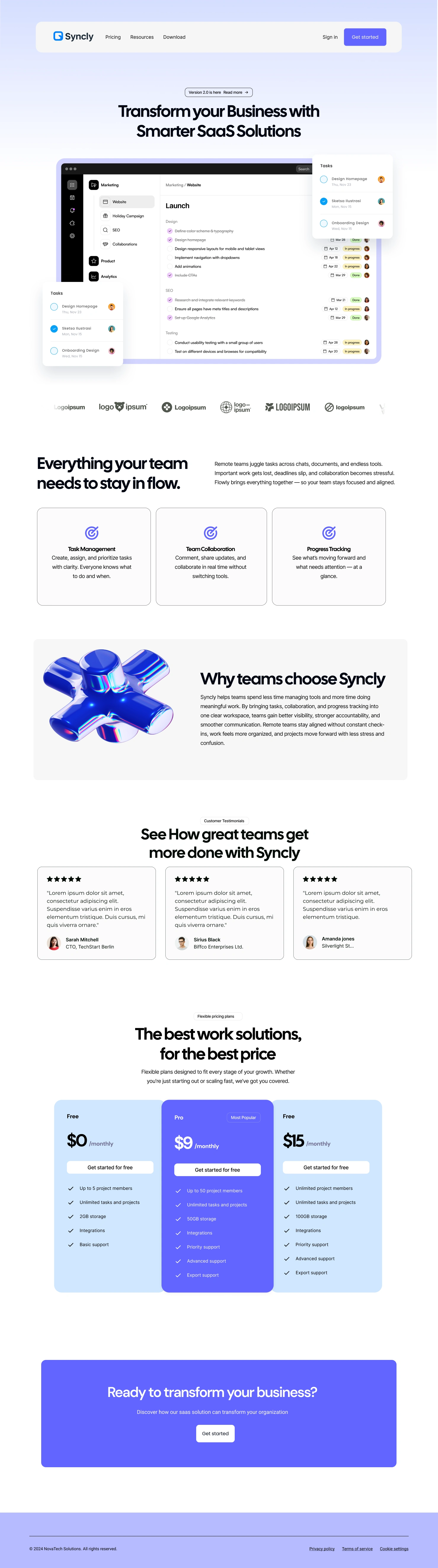
The final website design presents Syncly as a professional, modern, and approachable project management solution. The structure allows users to quickly understand the product’s value, while the visual system reinforces clarity and trust throughout the experience. The responsive layouts ensure consistency across devices and support smooth user navigation from entry point to conversion.
This project reinforced the importance of strong structure and hierarchy in SaaS website design. Focusing on layout and flow early in the process made visual decisions more intentional and effective. Establishing a clear design system also proved essential in maintaining consistency, scalability, and clarity across the entire website.
Like this project
Posted Mar 25, 2026
Designed a SaaS landing page to optimize user conversion for Syncly.
Likes
1
Views
4