Purple Mattres
🗓 Feb 2021. This was a discovery project spanning one week
👥 Customer-facing
📱 Mobile web
🎨 Me (UX Designer), Product Manager, Site Merchandiser
🔧 Made a recommendation to the business but nothing was built
😑 Problem: Customers are unaware that Purple sells kids products.
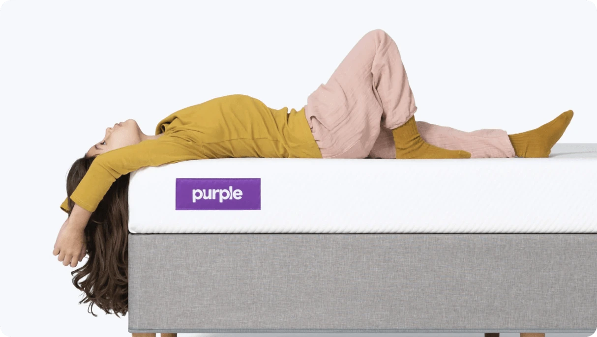
Purple is an American comfort technology company. It specializes in the direct-to-consumer sale of mattresses, seat cushions, back cushions, pillows, and platform bases. Purple also offers kids mattresses and accessories such as: kids sheets, pillows, and mattress protectors.
Testing
To test our assumption that customers do not know that Purple sells kid’s accessories, we used usertesting.com and performed 7 unmoderated tests. All participants had recently purchased a mattress for a child online. We wanted to know:
What’s their general awareness of the kid’s accessories?
Can they organically discover the kid’s accessories?
How do they interact with kid’s accessories?
After the sessions were complete, I went through and synthesized the interviews and uncovered some common themes.
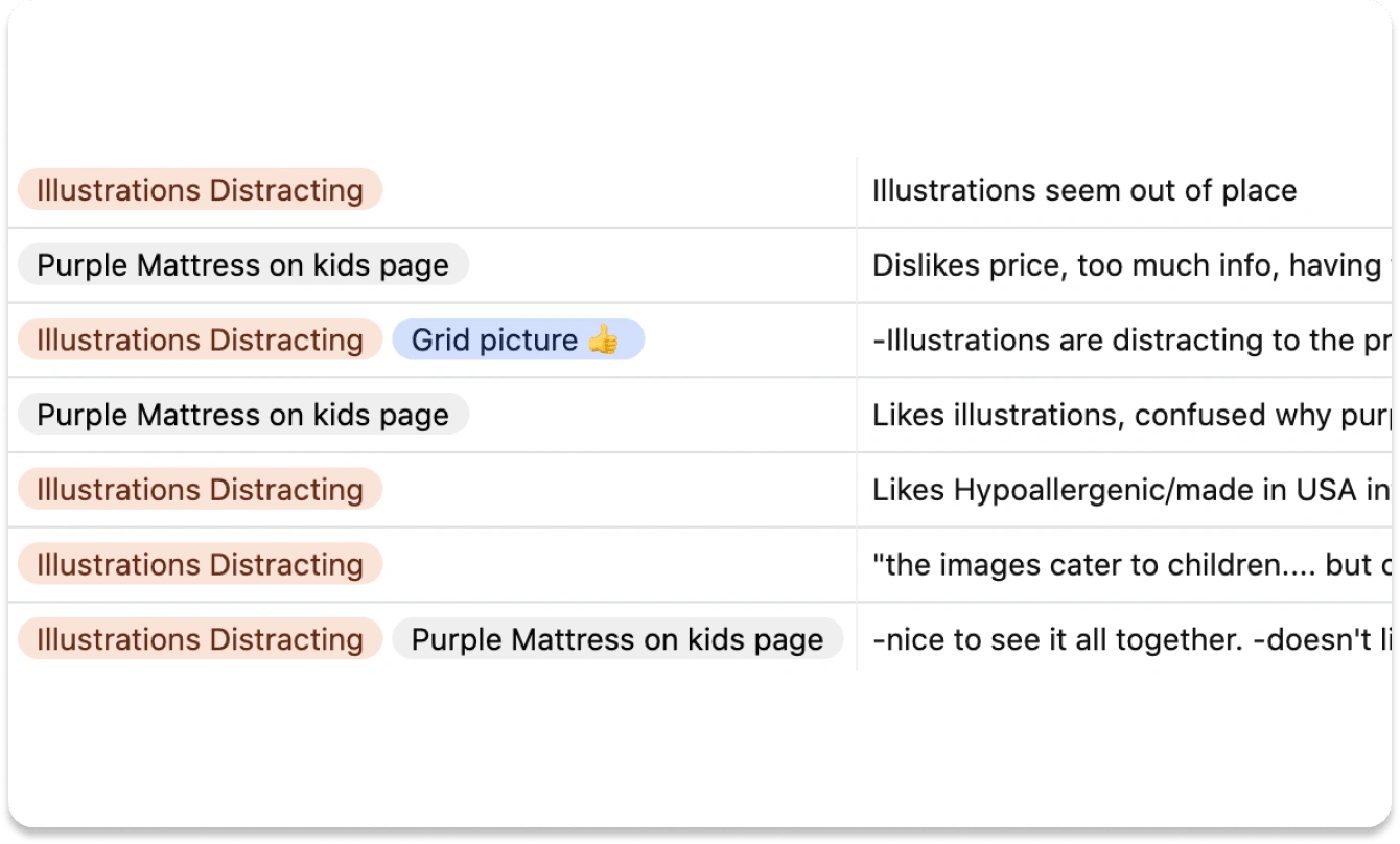
Synthesized user interviews in Airtable
The illustrations were distracting participants from other content on the page. Participants made comments such as:
“…the illustrations are distracting...”
“the images cater to children.... but children won’t be buying these online.”
“I can’t see any detail of the product because of the creepy monsters...”
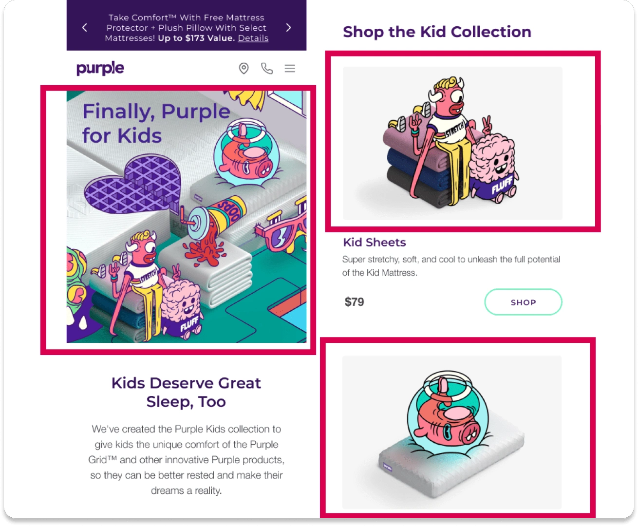
Some screenshots of Purple’s kid collection page with red boxes highlighting product imagery and illustrations.The unique illustrations seem to do more harm than good through my research.
2. Most participants had confusion with the different types of mattress on this page.
3. Many participants were searching for “full/twin” mattress, not “kids mattress”.
4. Few participants noticed “Shop the Kid Collection” section upon scrolling through the page.
5. Most participants mentioned the importance of pillows, even for kids.
6. Almost no one said they would pay more than $60 for kids sheets.
Audit and recommendations
I performed an audit of other products to see what comparable patterns already existed. One that I found and liked was Patagonia Kids.
After exploring some other product experiences, as well as identifying some key pain points, we began exploring some small changes that we could test, as well as some long-term solutions-
Recommendations
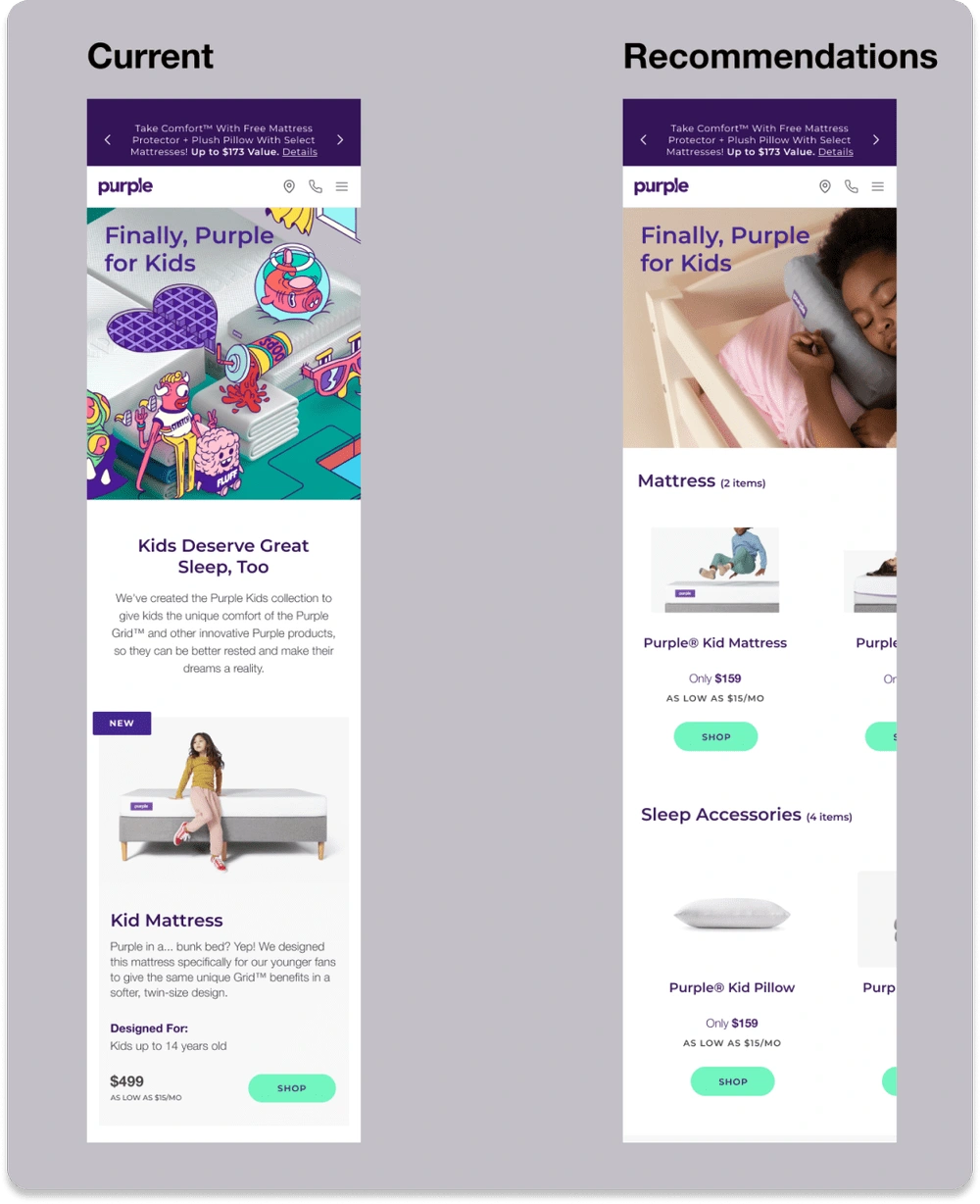
Page recommendations after conducting research
Remove illustrations
Rework copy so there is less text
Explore naming other than “kids mattress”. Some ideas:
Explore Information architecture + Horizontal Scroll for each category
List pillows before sheets wherever the kids accessories are being listed
Next steps
A/B test illustrations
A/B test switching positions of “Shop Kid Collection”
Additional research: What are adults looking for in kids accessories? Are there key terms we should be using?
Like this project
Posted Aug 26, 2024
Design recommendations after user research.

