Built with Framer
Website UX Redesign for Ashoka School of Business
Om Adhavan

Problem Statement
The current website experience makes it difficult for prospective students to understand the institution’s value, find key information, and confidently complete an enquiry or application. Navigation is unclear, CTAs lack visibility, and important trust signals—such as placement results, program benefits, and success stories—are not emphasized. This leads to confusion, hesitation, and drop-off, especially during exploration and enquiry stages.
To improve conversions and user confidence, the experience needs clearer messaging, intuitive navigation, stronger visual hierarchy, optimized mobile usability, and a simplified enquiry-to-application flow.
Design Process Summary
The redesign followed a structured approach to identify issues, understand user needs, and translate insights into actionable improvements:
UX Audit
A detailed audit highlighted key usability gaps including weak CTAs, poor hierarchy, inconsistent UI, and mobile-related friction. Recommendations focused on clarity, trust-building, and streamlined interaction paths.
User Journey Mapping
A 5-stage journey was defined (Discovery → Exploration → Consideration → Enquiry → Application) to understand how first-time visitors move toward conversion. Pain points, motivations, and behavior patterns informed design decisions to create a more guided and intuitive flow.
Wireframing & Experience Redesign
Low-fidelity wireframes were created for the homepage, program page, and enquiry flow. The updated structure emphasizes:
Clear value propositions and strong CTAs
Logical content hierarchy
Trust signals like testimonials, stats, and partner logos
A simplified multi-step application with progress tracking and support
UX Audit
Critical Issues: Navigation confusion, weak CTAs, poor information hierarchy, mobile issues
UI Problems: Inconsistent design, excessive text, weak visual hierarchy, outdated patterns
Key Recommendations: Clear value propositions, simplified user journeys, prominent trust signals
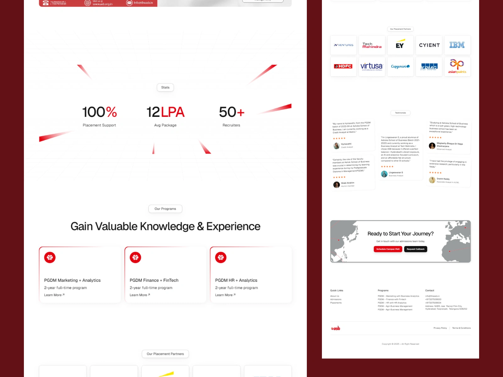
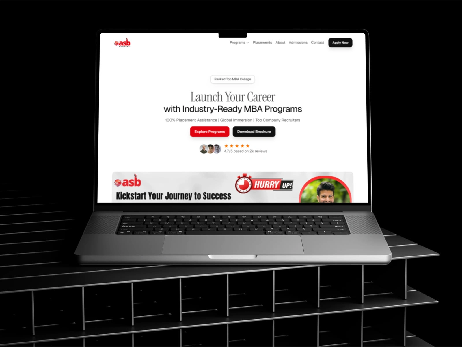
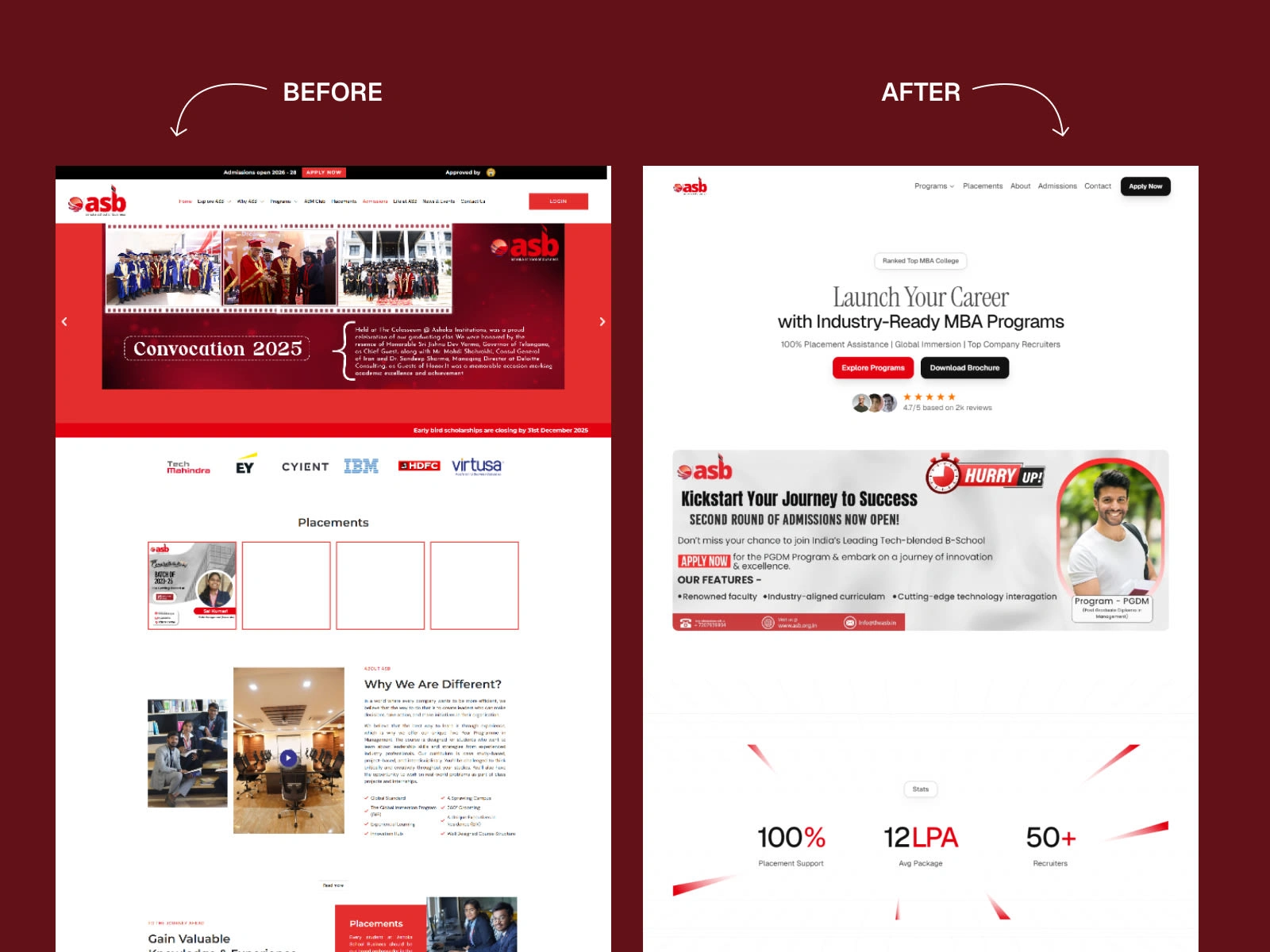
Solution
Clear Value Proposition - Leading with placement stats and unique differentiators
Simplified Navigation - Logical program discovery path
Prominent CTAs - Multiple conversion opportunities throughout
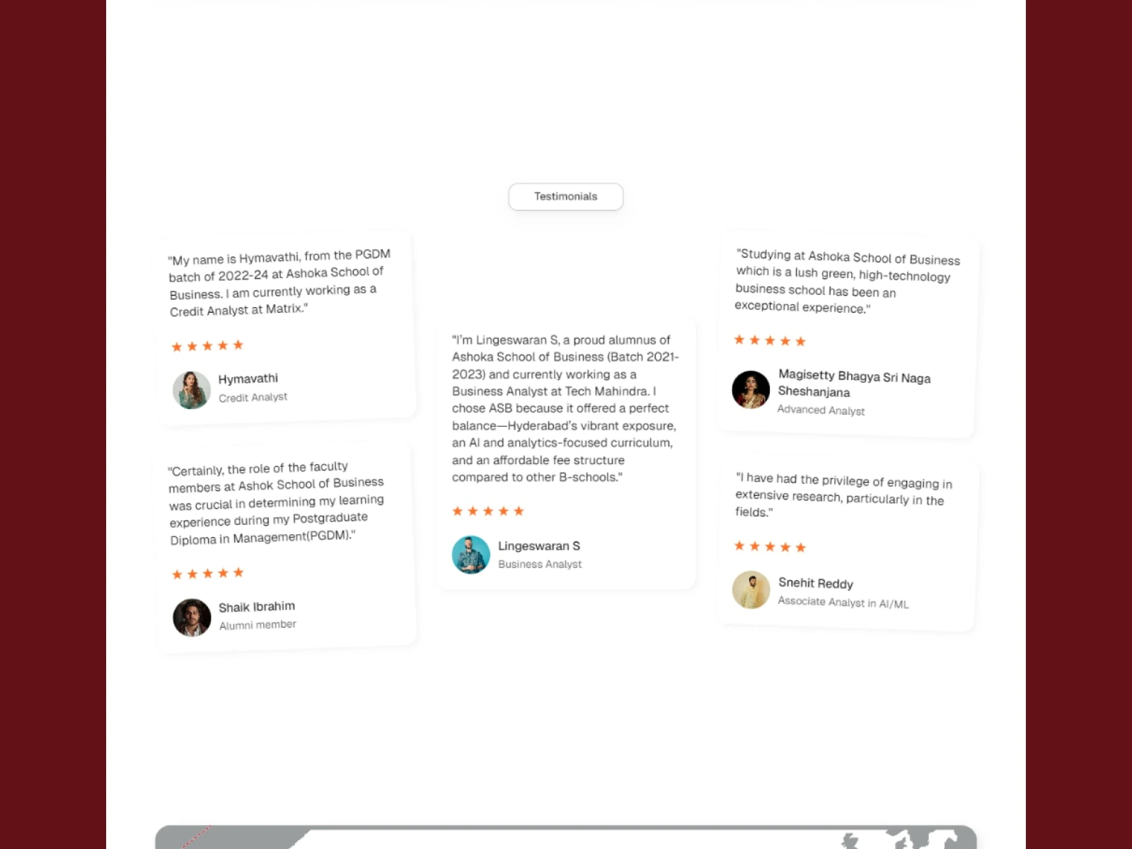
Trust Signals - Placements, testimonials, and success stories front and center
Mobile-Friendly - Responsive design considerations
Reduced Friction - Streamlined application process with progress indicators
Book your call
Like this project
Posted Dec 9, 2025
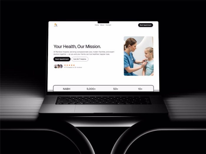
Redesigned website for improved conversion and user confidence in student application process. Complete website development is made in Framer.