Retainr - SaaS Dashboard Redesign
Dashboard UI | Redesign
🤔 Before :
The boxy look of the side-nav does not go with the overall curved UI elements.
Simplifying the styling, getting rid of that box shadow under the buttons.
Adding an icon for Sidenav Menus to help distinguish between individual menus.
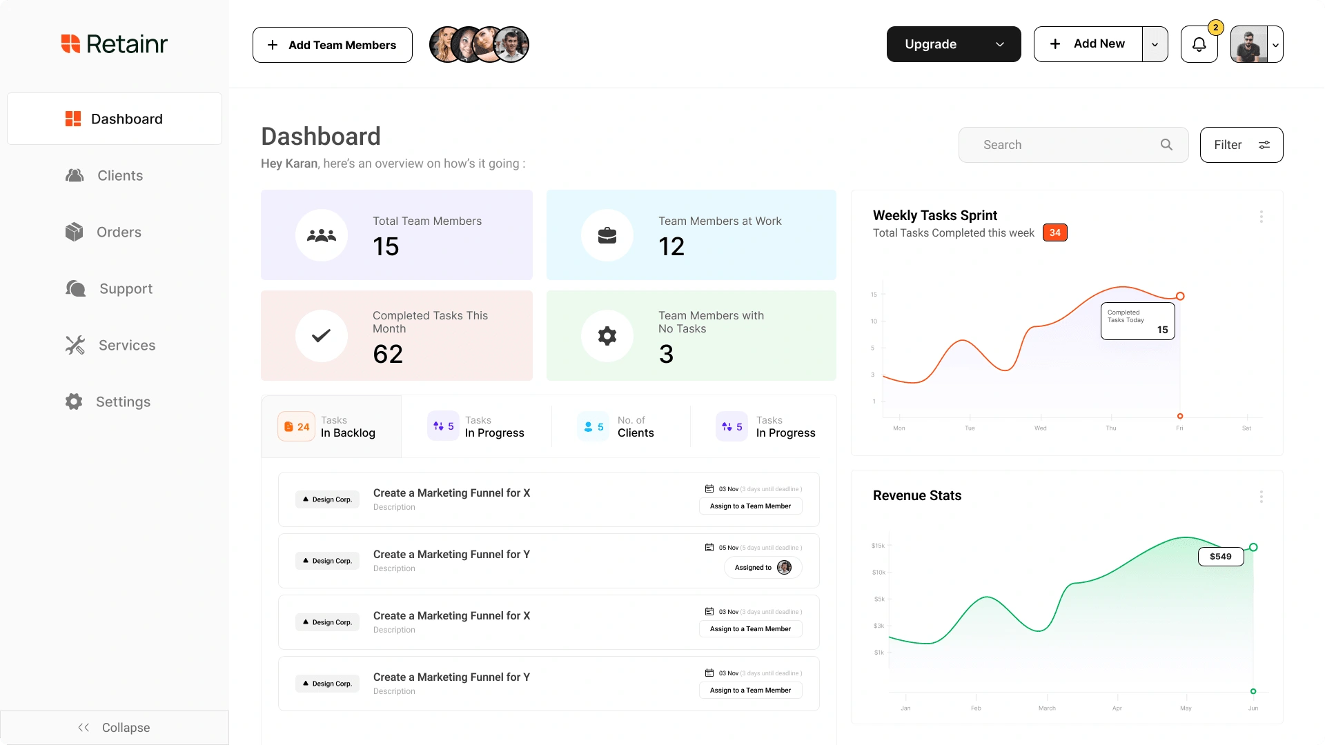
Adding new UI elements for easier conversion to paid user
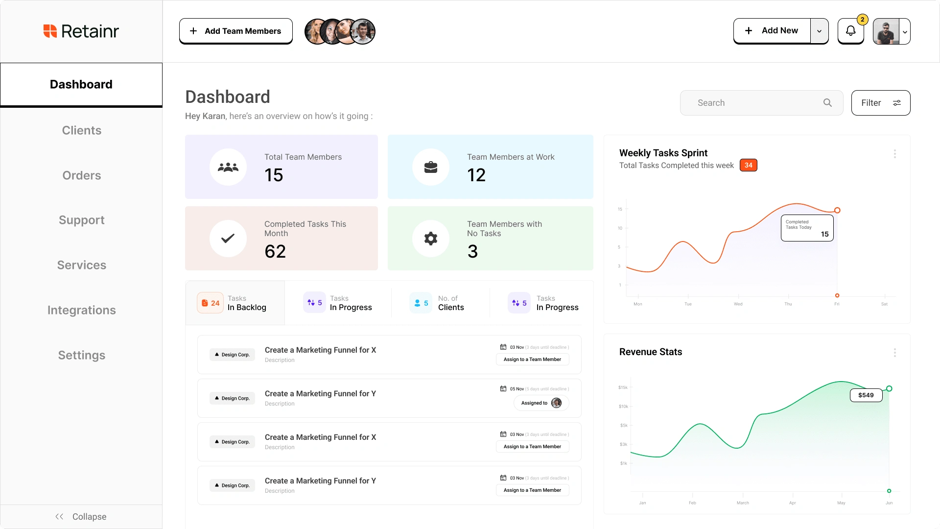
This dashboard was created by me for a Statup called "Retainr"
👉 Why Redesign ?
I personally thought - since the design was done in a super short time span of couple of days. I could improve the visuals to give a more polished look to the end user.
🤯 After :
Fixed all the visual errors i mentioned above 👆
After the redesign, the dashboard proved to increase user engagement by 17%.
Like this project
Posted Oct 27, 2024
Dashboard Redesign for a SaaS Startup - helping agencies and freelancers to manage all of their clients and projects in one place.
Likes
0
Views
13


