Building a Premium AI & Web3 Product Experience for Solana
Bob Vasic
Building a Premium AI & Web3 Product Experience for Solana Intelligence
Website Design · Frontend Development · AI-Assisted Build · Web3 Product Concept
IntelliChance is a self-initiated AI/Web3 product concept built as a premium frontend prototype for a Solana intelligence explorer.
The goal was to take a complex on-chain analytics idea and turn it into a polished, readable, and visually distinctive website experience — one that could communicate technical depth without feeling like a cold trading dashboard or generic crypto landing page.
The final result is a live, responsive website that positions IntelliChance as “a living canvas for on-chain intelligence.” It combines a dark editorial interface, amber-gold visual system, soft geometric motion, Solana-inspired product language, and a clear conversion path for users interested in exploring blockchain activity through a more intuitive intelligence layer.
Live Website:
https://v0-lana-ai-website.vercel.app
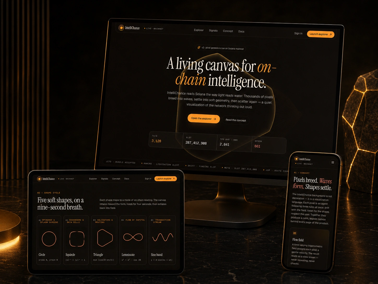
Premium homepage mockup showing the IntelliChance hero, navigation, live-mainnet badge, on-chain metrics, and amber-black visual system.
The Challenge
Most blockchain analytics products are difficult to understand at first glance.
They often rely on dense tables, technical terminology, aggressive charts, or generic crypto visuals that make the product feel either too complex for new users or too familiar for experienced Web3 teams.
For IntelliChance, the challenge was different:
How do you present a sophisticated Solana intelligence product in a way that feels premium, accessible, and credible within the first few seconds?
The website needed to:
Communicate the product vision immediately.
Make on-chain intelligence feel understandable and valuable.
Avoid the overused blue, purple, neon, and glassmorphism-heavy crypto aesthetic.
Use motion and geometry as part of the product story, not just decoration.
Feel polished enough for founders, traders, analysts, Web3 teams, and technical buyers.
Present the concept as a real product direction, not just a visual experiment.
This was not designed as a generic template. It was built as a product-facing website concept with a clear brand system, narrative structure, and buyer-ready presentation.
My Role
I handled the complete concept-to-live execution.
Product Positioning
I defined IntelliChance as an AI-powered Solana intelligence explorer rather than a standard blockchain dashboard. The positioning focused on intelligence, signal discovery, natural-language exploration, flow mapping, and risk visibility.
Visual Direction
I created a dark, premium interface system using near-black backgrounds, amber-gold accents, thin borders, serif headlines, muted panels, and soft geometric visuals. The direction intentionally avoids the usual crypto aesthetic and gives the product a more serious intelligence-platform feel.
Landing Page Strategy
I structured the page around a clear narrative flow: hero, concept explanation, visual system, explorer features, and final call to action. Each section introduces the product with progressively deeper context.
Frontend Build
I used v0.app to accelerate the frontend generation process, then refined the interface, responsive behavior, visual hierarchy, layout, and copy before deploying the final site live on Vercel.
Copy and Storytelling
I wrote product-focused copy that explains on-chain intelligence through accessible metaphors: pixels, waves, shapes, signals, density, and flow. The goal was to make abstract blockchain activity feel more legible.
The Solution
The final website uses calm, premium product language instead of aggressive trading-terminal visuals.
The central idea is that the interface background is not decorative. It behaves like a visualization system: pixels move, form shapes, respond to the user, and represent different ways of reading on-chain activity.
The website introduces this through four main product sections.
1. Hero
The hero section creates immediate product context with the headline:
“A living canvas for on-chain intelligence.”
It includes clear CTA buttons, a live-mainnet style badge, Solana-inspired metrics, and a signal ticker that makes the product feel active from the first screen.
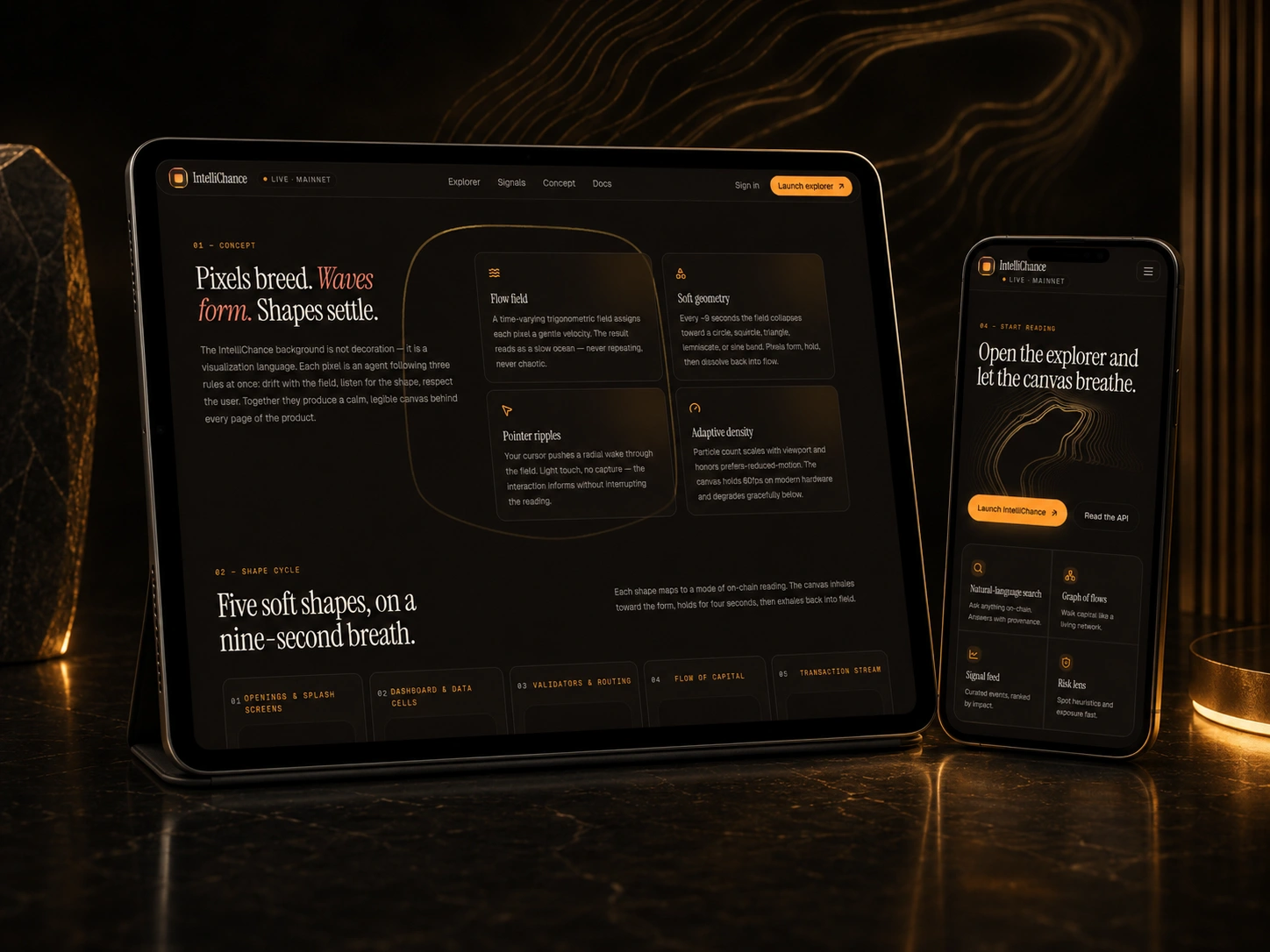
2. Concept
The concept section explains how IntelliChance turns blockchain activity into a visual intelligence layer. It introduces the flow field, soft geometry, pointer ripples, and adaptive density as part of the product’s core experience.
3. Shape Cycle
The shape-cycle system gives the product a distinctive visual language. It uses five forms — circle, squircle, triangle, lemniscate, and sine band — with each shape representing a different mode of interpreting on-chain data.
4. Explorer Features
The explorer section presents the product’s potential capabilities through a clean feature grid, including natural-language search, graph of flows, signal feed, risk lens, saved agents, and composable API access.
Responsive product showcase: desktop hero, tablet shape-cycle section, and mobile concept section using the same black, amber, and ivory design language.
Visual Direction
The visual system was built around restraint, contrast, and credibility.
Instead of using common Web3 tropes like floating coins, neon gradients, excessive glassmorphism, and overloaded dashboard panels, IntelliChance uses a darker editorial design language.
The result feels closer to a premium intelligence product than a typical crypto website.
Key design decisions included:
Warm Black and Amber Palette
The black-and-amber system gives the product a serious, high-value tone while still feeling distinctive in the Web3 category.
Serif Headline Typography
The serif headline treatment creates contrast against the technical subject matter and gives the product a stronger editorial identity.
Soft Geometry System
The geometric motion system turns abstract blockchain activity into a recognizable visual language.
Minimal Feature Cards
The feature grid keeps the page readable while still communicating technical depth and future product potential.
Strong CTA Hierarchy
The orange CTA buttons — including “Launch explorer” and “Open the explorer” — create a clear conversion path through the page.
AI-Assisted Development Workflow
AI was used as an execution accelerator, not as a replacement for product thinking.
The workflow combined AI-assisted frontend generation with manual product direction, visual refinement, responsive testing, copywriting, and design judgment.
The build process included:
Defining the product category and positioning.
Creating the first landing page structure in v0.app.
Refining the black-and-amber visual system.
Improving the layout, spacing, hierarchy, and responsiveness.
Adding sections for the product concept, shape-cycle system, and explorer feature grid.
Writing product-focused copy around Solana intelligence and on-chain signal discovery.
Testing the website across desktop, tablet, and mobile views.
Publishing the final version live on Vercel.
This workflow compressed the path from concept to deployed frontend while still preserving a premium visual standard.
Tablet and mobile views showing the concept section, shape-cycle system, explorer CTA, and responsive presentation.
Technical Stack
v0.app — AI-assisted frontend generation and rapid UI iteration
Vercel — Deployment and live hosting
React / Next.js-style frontend — Component-based interface structure
Tailwind-style styling — Fast visual iteration and responsive layout
Responsive Web Design — Desktop, tablet, and mobile presentation
AI-Assisted Product Development — Used to accelerate the idea-to-live-site execution cycle
Outcome
The result is a polished, deployed AI/Web3 product website that demonstrates how quickly a complex product concept can move from abstract idea to live frontend.
The project shows execution across several important areas:
Product Thinking
The concept was positioned as an AI-powered Solana intelligence explorer, not just another crypto dashboard.
Brand Differentiation
The black-and-amber visual identity separates IntelliChance from common Web3 design patterns.
Frontend Execution
The work resulted in a real deployed website, not just a static mockup.
Responsive Design
The page maintains its visual system and product narrative across desktop, tablet, and mobile.
Conversion Structure
The page includes a clear journey from product vision to features to CTA.
AI-Assisted Speed
The project demonstrates how modern AI tools can accelerate frontend production when paired with strong product direction and design refinement.
Why This Matters for Clients
This project is a proof of how I approach early-stage product execution.
Many founders, SaaS teams, and Web3 builders have strong technical ideas but struggle to turn them into a clear, premium, buyer-ready digital experience. IntelliChance shows how an abstract product concept can be translated into a live website that communicates value, builds trust, and creates a strong first impression.
This type of work is especially relevant for:
AI startups
SaaS products
Web3 platforms
developer tools
cybersecurity products
blockchain analytics tools
fintech products
data intelligence platforms
MVPs that need to look credible before the full backend is complete
The value is not only in the design. It is in the ability to combine product positioning, visual identity, technical structure, AI-assisted development, and frontend execution into one coherent result.
What I Would Build Next
The next version of IntelliChance would connect the interface to real Solana data sources and turn the concept into a functional MVP.
Planned product extensions would include:
Wallet and Program Search
Search any Solana wallet, program, or token.
Graph of Flows
Visualize movement between wallets, protocols, liquidity pools, and entities.
Signal Feed
Rank on-chain activity by significance instead of only showing raw transaction volume.
Risk Lens
Add exposure scoring, entity clustering, anomaly detection, and suspicious-pattern visibility.
Saved Agents
Allow users to create monitoring prompts that watch the chain and notify them when important activity occurs.
Composable API
Expose the intelligence layer through endpoints for teams building their own tools.
Final Result
IntelliChance demonstrates how a sophisticated AI/Web3 product idea can be transformed into a premium frontend experience quickly, clearly, and with strong visual differentiation.
It is a live example of product strategy, UI direction, AI-assisted frontend development, responsive design, and conversion-focused storytelling working together in one deployed product concept.
Live Website:
https://v0-lana-ai-website.vercel.app

Premium homepage mockup showing the IntelliChance hero, navigation, live-mainnet badge, on-chain metrics, and amber-black visual system.
The Challenge
Most blockchain analytics products are either too technical, too visually generic, or too dependent on dashboard density. The challenge was to create a landing page that could communicate a sophisticated Solana intelligence product without becoming another cold crypto dashboard.
The page needed to do four things:
Communicate the product vision in seconds.
Make Solana intelligence feel premium and accessible.
Use motion and visual systems as part of the product story.
Be polished enough to sell the concept to founders, traders, analysts, and Web3 teams.
This was not built as a generic template. It was built as a product-facing website concept with a clear brand, narrative, and conversion path.
My Role
I handled the full execution:
Product positioning — Defined the product as an AI-powered Solana intelligence explorer, not just a blockchain dashboard.
Visual direction — Created a warm black-and-amber interface system that avoids the usual blue/purple crypto aesthetic.
Landing page structure — Built the page around a clear narrative: hero → concept → shape cycle → explorer features → CTA.
Frontend build — Used v0.app to rapidly generate and refine the interface, then deployed the site live through Vercel.
Copy and storytelling — Wrote product-focused website copy that explains on-chain intelligence through simple metaphors: pixels, waves, shapes, signals, and flow.
The Solution
The final site uses a calm, premium product language instead of aggressive trading-terminal visuals.
The core idea is that the background is not decorative. It behaves like a visualization system: pixels move, form shapes, respond to the user, and represent different ways of reading the chain.
The website introduces this through four main sections:
Hero
A high-impact introduction with the headline “A living canvas for on-chain intelligence,” CTA buttons, Solana-style metrics, and a live signal ticker.
Concept
A breakdown of the visual system: flow field, soft geometry, pointer ripples, and adaptive density.
Shape Cycle
A five-shape visual language: circle, squircle, triangle, lemniscate, and sine band. Each shape maps to a specific mode of on-chain reading.
Explorer
A feature grid explaining natural-language search, graph of flows, signal feed, risk lens, agents, and composable API.
Responsive product showcase: desktop hero, tablet shape-cycle section, and mobile concept section using the same black, amber, and ivory design language.
Visual Direction
The visual system was intentionally built around restraint.
Instead of using common Web3 tropes like neon gradients, floating coins, and overbuilt glassmorphism, the site uses a darker editorial style: near-black backgrounds, thin borders, serif headlines, warm orange CTAs, muted panels, and golden line geometry.
The result feels closer to a premium intelligence product than a typical crypto landing page.
Key design choices:
Warm black and amber palette
Gives the site a more serious, high-value tone.
Serif headline typography
Creates contrast against the technical subject matter and gives the product a stronger editorial identity.
Soft geometry system
Turns abstract blockchain activity into a recognizable visual language.
Minimal feature cards
Keeps the page readable while still communicating technical depth.
Strong CTA hierarchy
The orange “Launch explorer” and “Open the explorer” buttons create a clear conversion path.
Execution
The build process was optimized for speed without sacrificing visual quality.
I used v0.app to generate the initial interface structure, then refined the layout, copy, hierarchy, responsive behavior, and product narrative. The website was then deployed live on Vercel.
The workflow:
Defined the product category and positioning.
Built the first landing page structure in v0.app.
Refined the visual system around the actual black/amber brand direction.
Added product sections for concept, shape cycle, and explorer features.
Tested the live page across desktop and mobile.
Published the final site on Vercel.
Tablet and mobile views showing the concept section, shape-cycle system, explorer CTA, and responsive presentation.
Technical Stack
v0.app — AI-assisted frontend generation and rapid UI iteration
Vercel — Deployment and live hosting
React / Next.js-style frontend — Component-based interface structure
Tailwind-style styling — Fast visual iteration and responsive layout
Responsive web design — Desktop and mobile presentation
AI-assisted product development — Used to compress idea-to-live-site execution time
Outcome
The result is a live, polished AI/Web3 product website that demonstrates how quickly a serious product concept can move from idea to deployed frontend.
The project shows:
Product thinking — Clear positioning for an AI-powered Solana intelligence product.
Visual identity — A distinctive black-and-amber brand system that separates the site from generic crypto UI.
Frontend execution — A working deployed website, not just a static mockup.
Responsive presentation — Layout and narrative that work across desktop and mobile.
Conversion structure — Clear CTAs for launching the explorer and reading the API.
This case study demonstrates my ability to turn an abstract Web3 product idea into a premium frontend experience quickly, using modern AI-assisted development tools.
What I Would Build Next
The next version would connect the interface to real Solana data sources and turn the concept into a functional MVP.
Planned product extensions:
Wallet and program search
Search any Solana wallet, program, or token.
Graph of flows
Visualize movement between wallets, protocols, and liquidity pools.
Signal feed
Rank on-chain activity by impact, not just volume.
Risk lens
Add exposure scoring, entity clustering, and suspicious-pattern detection.
Saved agents
Let users create prompts that monitor the chain and notify them when something important happens.
Composable API
Expose the same intelligence layer through endpoints for teams building their own tools.
Final Link
Live website:
https://v0-lana-ai-website.vercel.app
Like this project
Posted May 7, 2026
A live AI-assisted frontend prototype for IntelliChance, a premium Solana intelligence explorer making on-chain data visual and easy to understand.
Likes
14
Views
17
Timeline
May 5, 2026 - May 6, 2026