Responsive Portfolio Website

0
Graphic Designer
Web Designer
Web Developer

Bootstrap

CSS3

HTML5
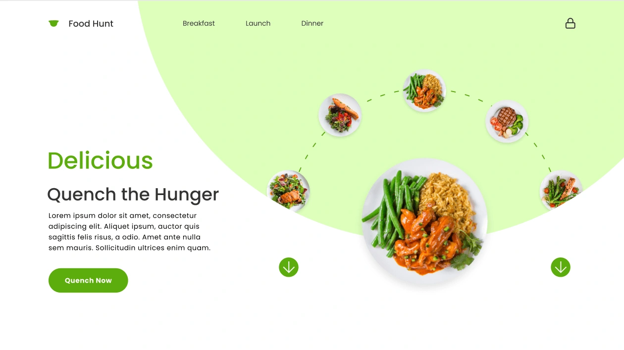
Food Hunt - A Responsive Website
Introduction
Welcome to Food Hunt, your go-to platform for satisfying culinary cravings at any time of the day. Our responsive website ensures a seamless and delightful user experience across all devices, from desktops to smartphones. Whether you’re searching for breakfast, lunch, or dinner options, Food Hunt makes it easy to discover delicious meals and quench your hunger.
Design and Functionality
Food Hunt boasts a clean, modern design that emphasizes both aesthetics and usability. The website features a harmonious color palette and engaging visuals that draw users into a culinary journey. Key features include:
Responsive Layout: Our site adapts effortlessly to different screen sizes and orientations, providing a consistent and intuitive browsing experience on any device.
Interactive Navigation: Easily browse through meal options with our interactive menu. The navigation bar at the top offers quick access to breakfast, lunch, and dinner categories, ensuring you find exactly what you’re looking for without hassle.
Visual Appeal: High-quality images of mouth-watering dishes are strategically placed to entice users and enhance the overall visual appeal. The circular layout of images guides the user’s eye, creating a dynamic and engaging flow.
Compelling Call to Action: The prominent “Quench Now” button invites users to take action, seamlessly leading them towards exploring meal options or placing an order.
Informative Content: Below the headline “Quench the Hunger,” users are greeted with engaging and informative content that highlights the essence of Food Hunt, ensuring they understand the value and quality we offer.
User Experience
At Food Hunt, we prioritize user experience by providing:
Fast Load Times: Our website is optimized to load quickly, ensuring users have immediate access to content without frustrating delays.
Easy Navigation: Simple and intuitive navigation helps users find their desired meals quickly and efficiently.
Accessibility: Designed with all users in mind, Food Hunt is accessible and user-friendly, catering to a diverse audience.
Conclusion
Food Hunt is more than just a website; it’s a culinary destination designed to delight your senses and satisfy your hunger. Explore our responsive website today and discover a world of delicious possibilities at your fingertips. Whether you’re craving breakfast, lunch, or dinner, Food Hunt has you covered.
Like this project
0
Posted Jul 24, 2024
Food Hunt is a responsive website designed for easy access to breakfast, lunch, and dinner options on any device. With a modern design, high-quality images, etc
Likes
0
Views
0
Tags
Graphic Designer
Web Designer
Web Developer
Bootstrap
CSS3
HTML5


Brand Identity Design

E-Commerce Website Development