UX Case Study : NIFT CMS Re-design
About CMS
The NIFT CMS website serves as a comprehensive information source for students and faculty members of the institute, but there is a significant gap between merely fulfilling its purpose and doing so efficiently
Main Problem
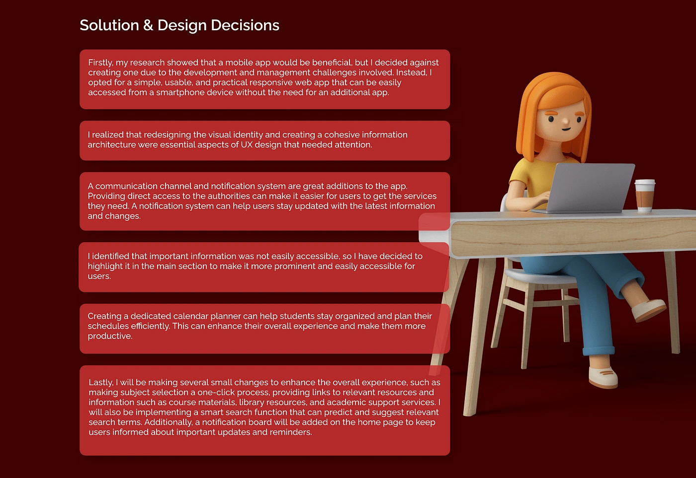
Main problem is the design of information architecture which makes it really hard to access alot of features. Plus through thorough research I was able to find out what features are needed and wanted by the users and what are felt secondary. how I reached to my problem ? the entire process is below.
Main Goal
The primary objective is to transform the website into a unified piece of digital architecture that efficiently and conveniently organizes all necessary functions, information, and actions into their designated room, making it user-friendly and efficient
DEFINE PROBLEM :
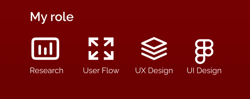
As a component of my Integrated Design Project curriculum, this project necessitated researching and defining the problem. My initial assignment was to undertake two primary research efforts. First, I created a questionnaire and distributed it among college students to gather data. Second, I personally met with a diverse group of students from various departments and years and conducted interviews with them to learn about their views on CMS.
Below are some of the data collected from my questionnaire survey:
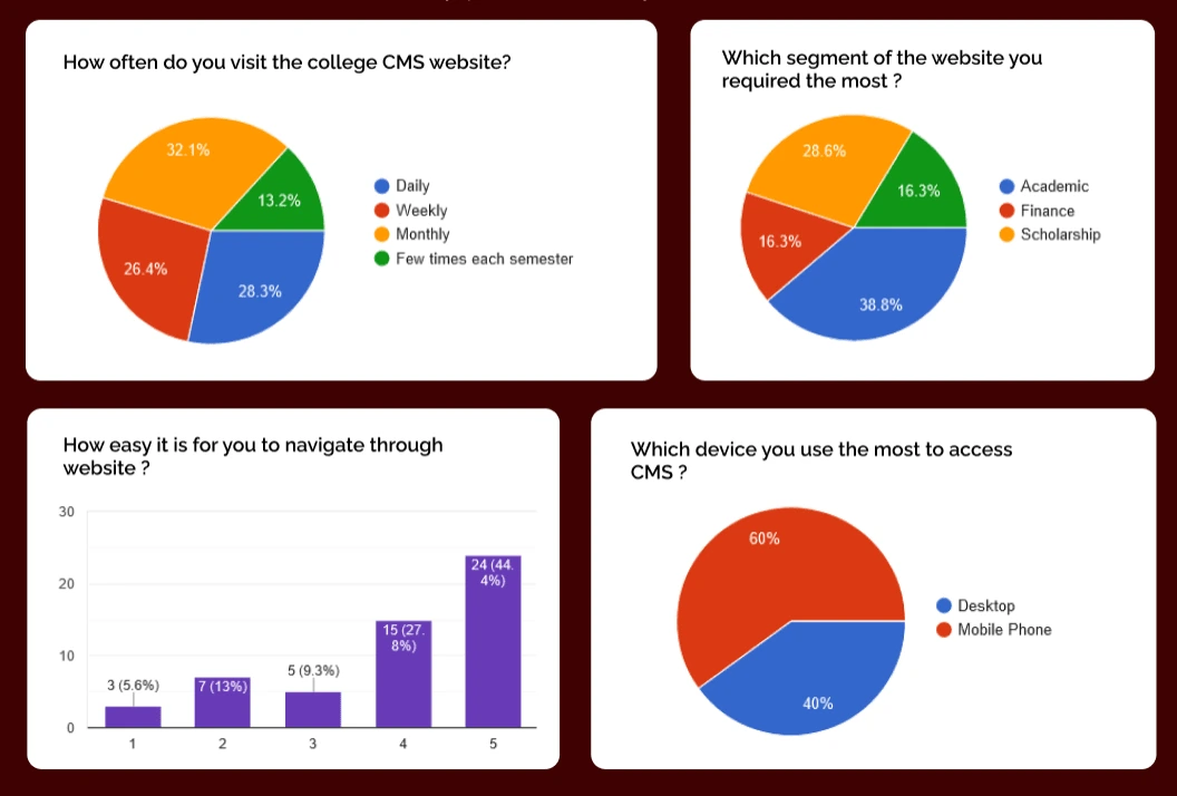
After conducting personal interviews, I gathered key insights by asking open-ended questions from the participants. Here are some of the main findings from the interviews that I gathered:
Students found it difficult to navigate the website, especially when searching for specific information.
The design and layout of the website were often criticized for being cluttered and confusing.
Students were frustrated with the website’s slow loading times and occasional technical issues.
The search function was often deemed ineffective and unreliable by students.
Mobile-friendliness was deemed highly important by students, with many citing the need to access the website on-the-go.
Students desired a more visually appealing and modern design for the website.
The organization of information on the website was often confusing and not intuitive, leading to frustration among students.
Empathy Map
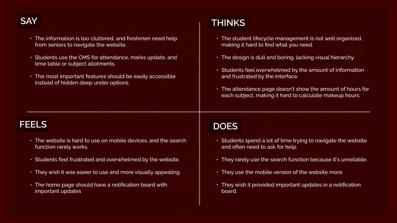
Creating a user empathy map helped me to better understand the needs, goals, and pain points of your target users. This was useful in the design process as it helped me to develop a deeper understanding of users and create solutions that are tailored to their specific needs.
Initial Ideas and Brainstorming
So from my design research I could summaries the pain points and problems as follows, Students find the college CMS website difficult to use and overwhelming due to cluttered and confusing information. Important features, such as attendance, marks updates, and timetables, are hard to find, while the design is dull and lacks visual hierarchy.
The website is not mobile-friendly, and the search function is unreliable. Students wish for a notification board with important updates and feel frustrated with the overall interface.
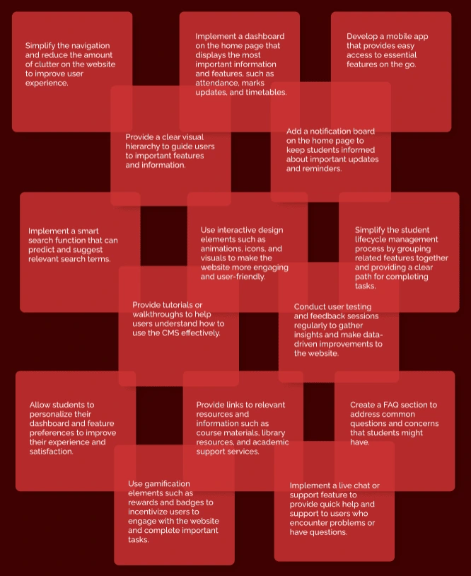
My next action is to initiate the process of ideation and brainstorming to come up with potential solutions for the problems identified in the empathy map. Additionally, I conducted secondary research by studying other college’s CMS websites and browsing the internet to explore various approaches that can be taken to address the user issues.
DESIGN SOLUTION

User Testing, Feedbacks & Re-Designing Process
Once I finished my initial prototype, I approached some of the users who had participated in the interview and survey process. I presented them with the design and asked them to test it out. This was done with the intention of gaining a deeper understanding of what areas still required attention, what design decisions were effective and what could have been improved. It was also an opportunity to identify any additional modifications that could be made.
Feedback from testing:
One user felt that while the notice board was a good addition, it was still not providing enough information as the admins rarely updated the CMS for new information.
Another user suggested that the attendance feature should not only show the total sessions completed but also the number of hours left, so that students can manage their attendance accordingly.
Users generally liked the redesign, finding it cleaner and easier to navigate.
I tested out with some freshers and even users who were new to CMS websites found the redesign easy to use and organized.
Some users suggested using icons to differentiate between different topics such as marks and subjects.
Most users particularly liked the student calendar feature, stating that it would help them stay up-to-date with their academics and college activities.
New Design Decisions & Screens
I came up with a solution to address the problem with the notice board by deciding to integrate the common email ID content with the CMS site of every user. The reason behind this decision is that the common email ID used by 30–40 students is a major issue since it is not designed to be used by multiple people. As a result, many students are not able to log in, and this has led to missed opportunities for internships. To validate my assumption and theory,
I discussed this issue with my college mates, and the majority of them agreed that the common mail ID is indeed a significant problem. Therefore, integrating the email content with the notice board would help students stay up to date without the hassle of using a single ID for multiple users. This solution would ultimately benefit students by ensuring that they have access to all necessary information without any inconvenience.
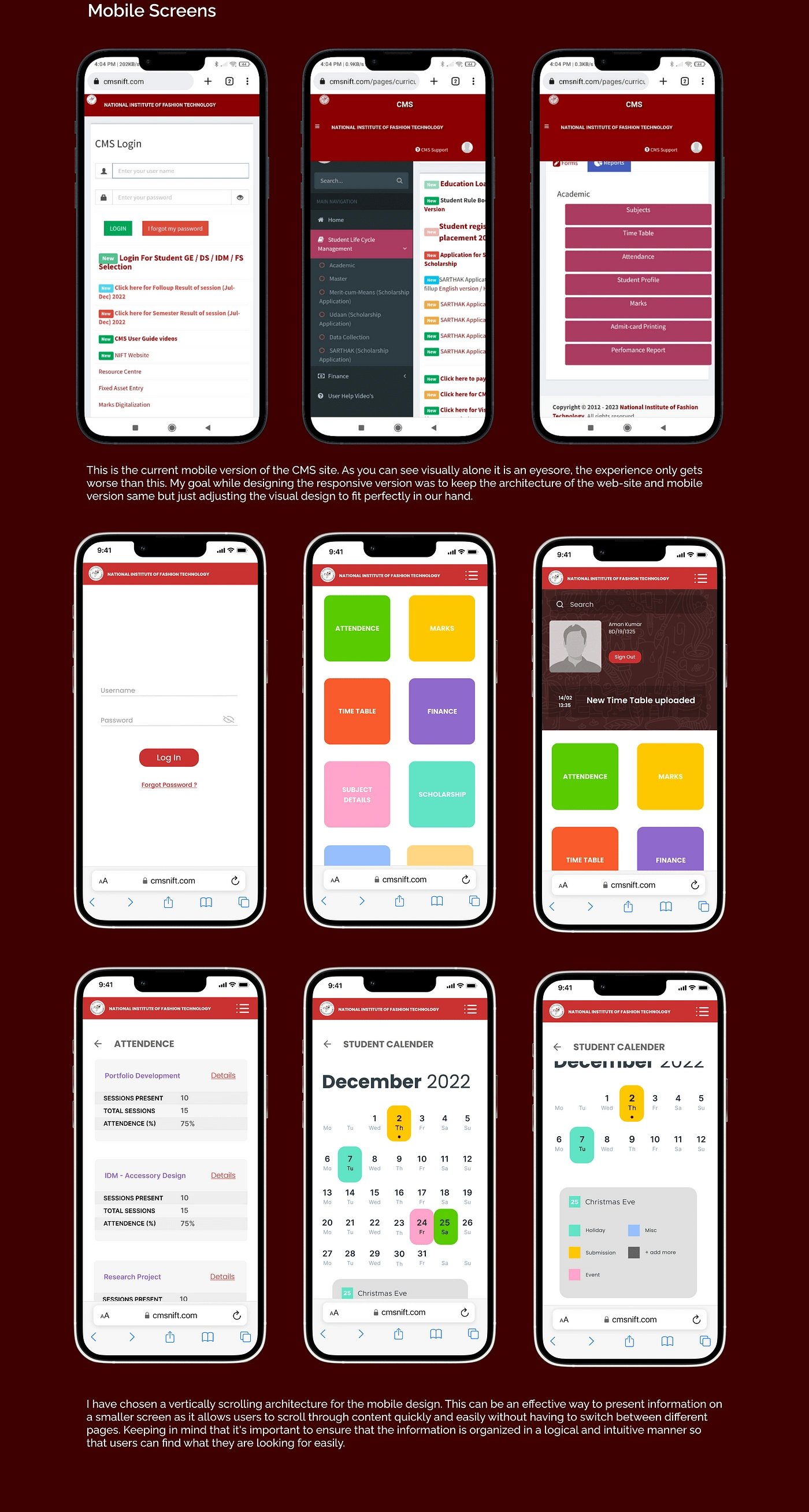
The decision to add the total hours available and left in the detail section of the attendance was made to help students keep track of their attendance progress more effectively. The current system only displays the total number of sessions completed, which doesn’t give students an accurate picture of their attendance status. By adding the total hours available and left, students will be able to see how many hours they need to complete in order to meet the required attendance criteria.
This will help them plan their attendance better and avoid any penalties for low attendance. This decision was made based on feedback from the user testing sessions, where one of the participants suggested that it would be helpful to see how many hours were left in addition to the total number of sessions completed.
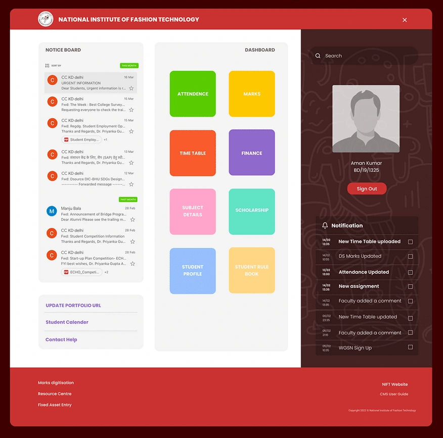
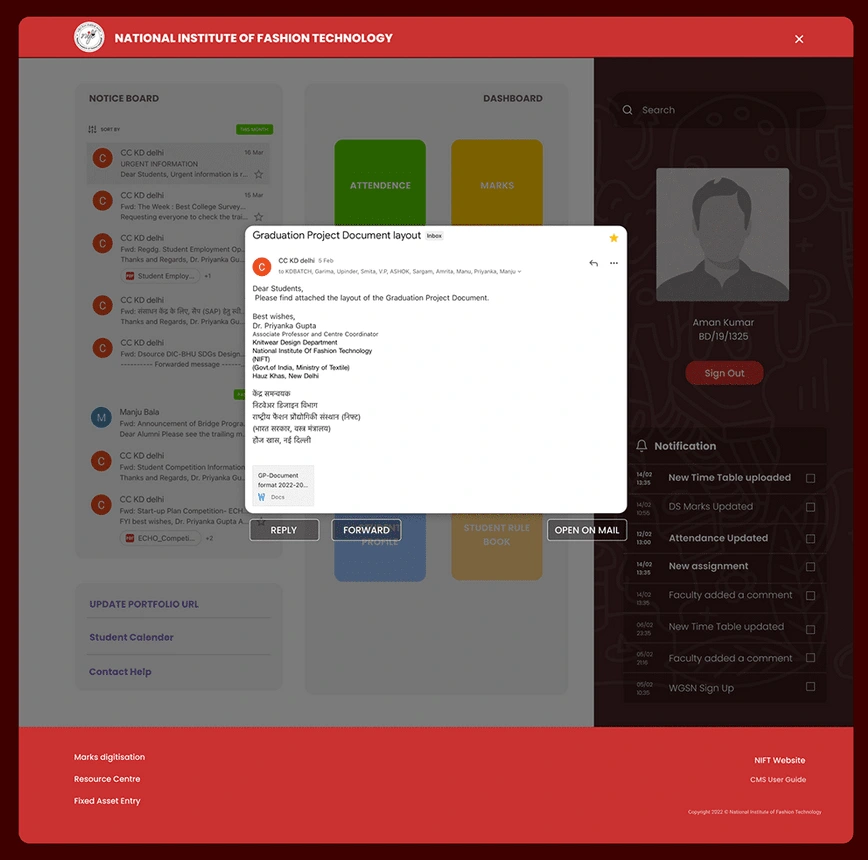
In order to solve the issue of the common mail ID, I integrated the email content with the notice board on the CMS site. Users can simply click on the notice board to open up the email within the CMS platform. From there, they can choose to reply or forward the email, or opt to have more options by opening it in the Gmail app.
MY LEARNINGS
Iterative design: The value of creating prototypes and testing them with users, then using feedback to refine the design and repeat the process.
Technical skills: The need for proficiency in relevant design tools and technologies, such as prototyping software, programming languages, and user interface design principles.
Communication skills: The ability to effectively communicate design ideas and decisions to both technical and non-technical stakeholders.
Flexibility and adaptability: The ability to adjust design plans and processes in response to unexpected challenges or changes in project requirements.
WHAT I CAN IMPROVE ON MY NEXT PROJECT
There is still room for improvement in my next UX project as this project was completed by me alone. Further design changes and adjustments can be made after conducting more research and testing. Some of my design decisions were based on assumptions which is not always the best approach, but given the importance of this project, I accepted that for now.
Like this project
Posted Mar 24, 2024
Transform the website into a unified piece of digital architecture that efficiently organizes all necessary functions, information, and actions.

