Built with Framer
ConceptCore: 500 Visitors & 200 Signups Before Official Launch
Virgil Caffier
ConceptCore: From Zero to Community in Weeks
The founder reached out with something rare: no existing site, just a bold vision.
They wanted to launch ConceptCore — an online concept art school — but needed to validate the idea first and build momentum before the official launch.
The challenge? Create a pre-launch experience that felt like a real school, proved demand, and started building a community from day one.
No safety net. No existing audience. Just a vision, a neon-yellow brand identity, and a tight timeline.
The Spark
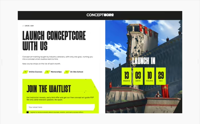
The founder knew exactly what they wanted: something that screamed "next-generation concept art school" — bold, dark, edgy, with punches of electric yellow.
We mapped out the strategy: hero section that hooks artists immediately, instructor profiles to build credibility, social proof sections, course teasers, FAQ to answer objections, and clear CTAs driving people to the waitlist and Discord.
I started designing in Figma to lock in the aggressive, modern aesthetic, then built everything in Framer with animations that made the page feel alive.
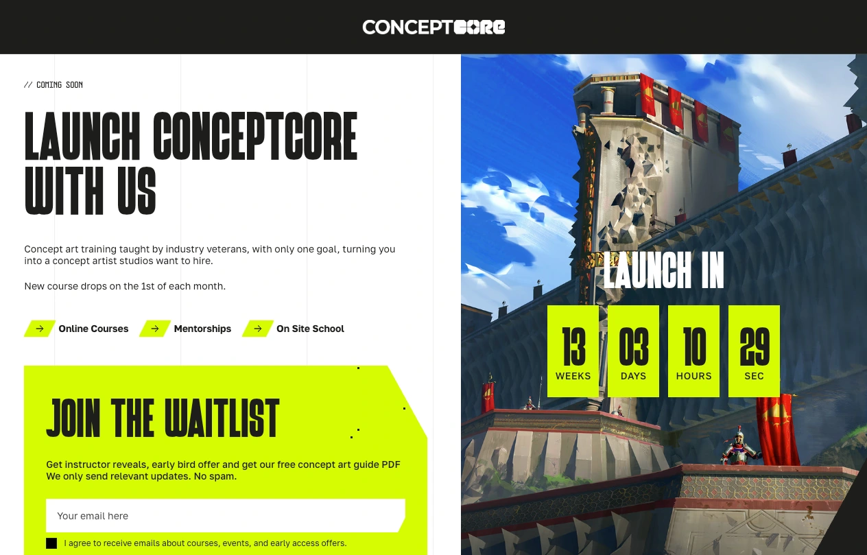
Hero section
The Game Plan
Design that reflects the craft — Dark, cinematic, premium. This had to look like a concept art school that serious artists would want to join, not a generic course platform.
Build for validation — Before investing in the full platform, we needed proof: Will people sign up? Will they join the community?
Tease what's coming — Sections highlighting instructors, course drops, and the "500 seats before launch" urgency to create FOMO and drive conversions.
Track everything — Implemented Clarity and analytics to see exactly how visitors interact, what they click on, and where they get stuck.
This wasn't just a waitlist page. It was a proof-of-concept and community launcher.
Bringing It to Life
I designed the page to feel like walking into an elite studio — dark, focused, with flashes of neon yellow pulling your attention exactly where it needs to go.
Instructor cards with that signature yellow accent. Social proof from real artists. Course previews that tease without overwhelming. A persistent "Join the Waitlist" CTA that follows you down the page.
Every interaction was intentional: smooth scrolls, strategic reveals, and animations that add energy without slowing things down.
Mobile-first, fast-loading, and built to convert curiosity into commitment.
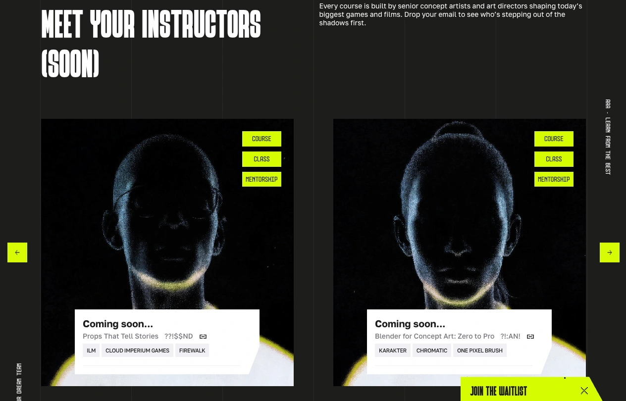
Mentors section
The Results (Pre-Launch)
The site went live as a pre-launch waitlist. The response?
Way above expectations:
Nearly 500 visitors in the first few weeks
200 people on the waitlist before any courses were live
200 members in Discord — a real community forming before launch
7+ minutes average time on site (massive for a waitlist page — people were reading, exploring, engaging)
20% of traffic from Google within days — organic discovery kicking in immediately
The feedback was overwhelmingly positive: visually, people loved the bold aesthetic. UX-wise, navigation was smooth and intuitive.
Clarity heatmaps revealed that some visitors tried clicking on "On-site," "Mentorship," and "Online Courses" — confirming strong interest in those offerings and giving clear direction for the full launch.
The founder's reaction:
"The stats are really good — 7+ minutes average on a waiting page is huge. This has taught us so much for the real launch. The response has been beyond what we expected."
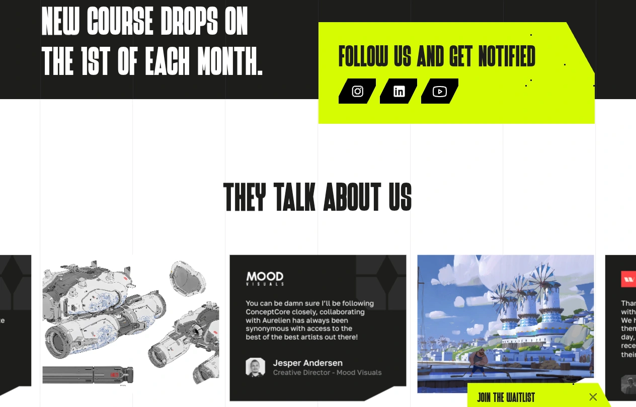
testimonials section
The Shift
What started as "just an idea" became a validated concept with a growing, engaged community — before the school even officially launched.
The waitlist page didn't just collect emails. It proved demand, built momentum, and gave the founder real data to shape the roadmap, prioritize features, and launch with confidence.
Now they're not guessing. They know what artists want, where to focus, and how to launch strong.
Sometimes the best way to build something big is to start small, launch fast, and let real people show you the way forward.
And honestly? I can't wait to see what happens when ConceptCore fully opens its doors.
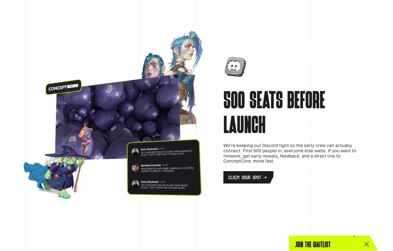
Discord section
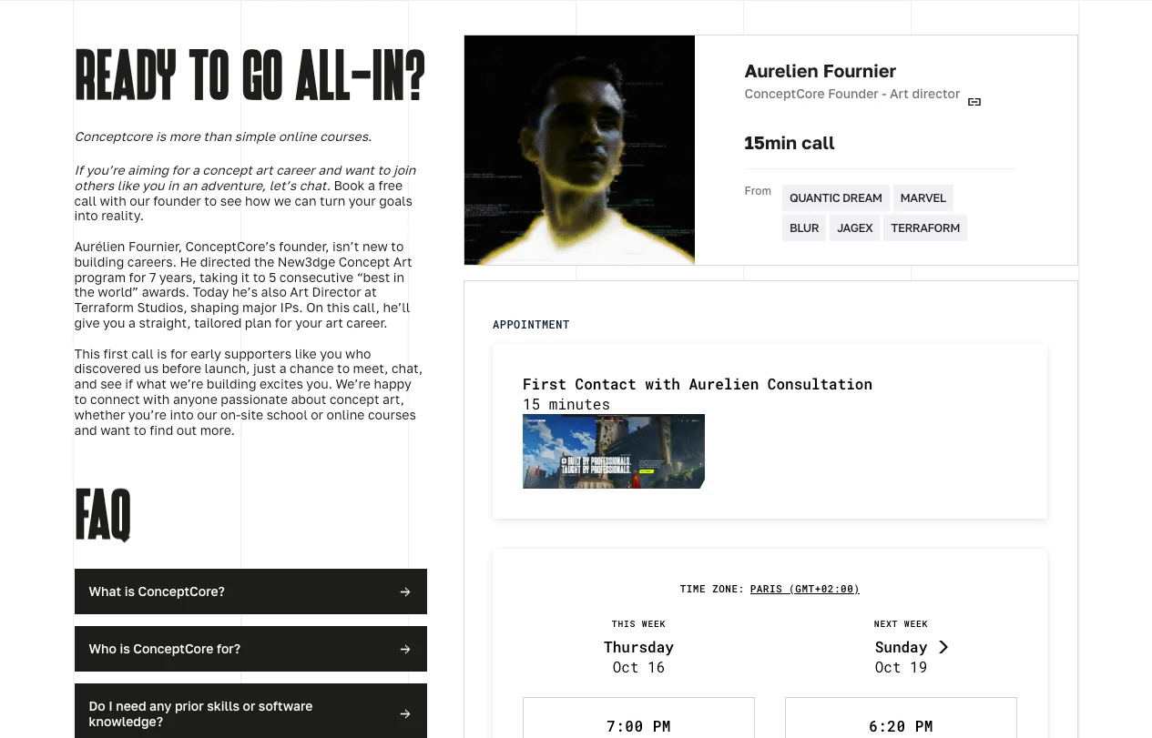
Appointement section
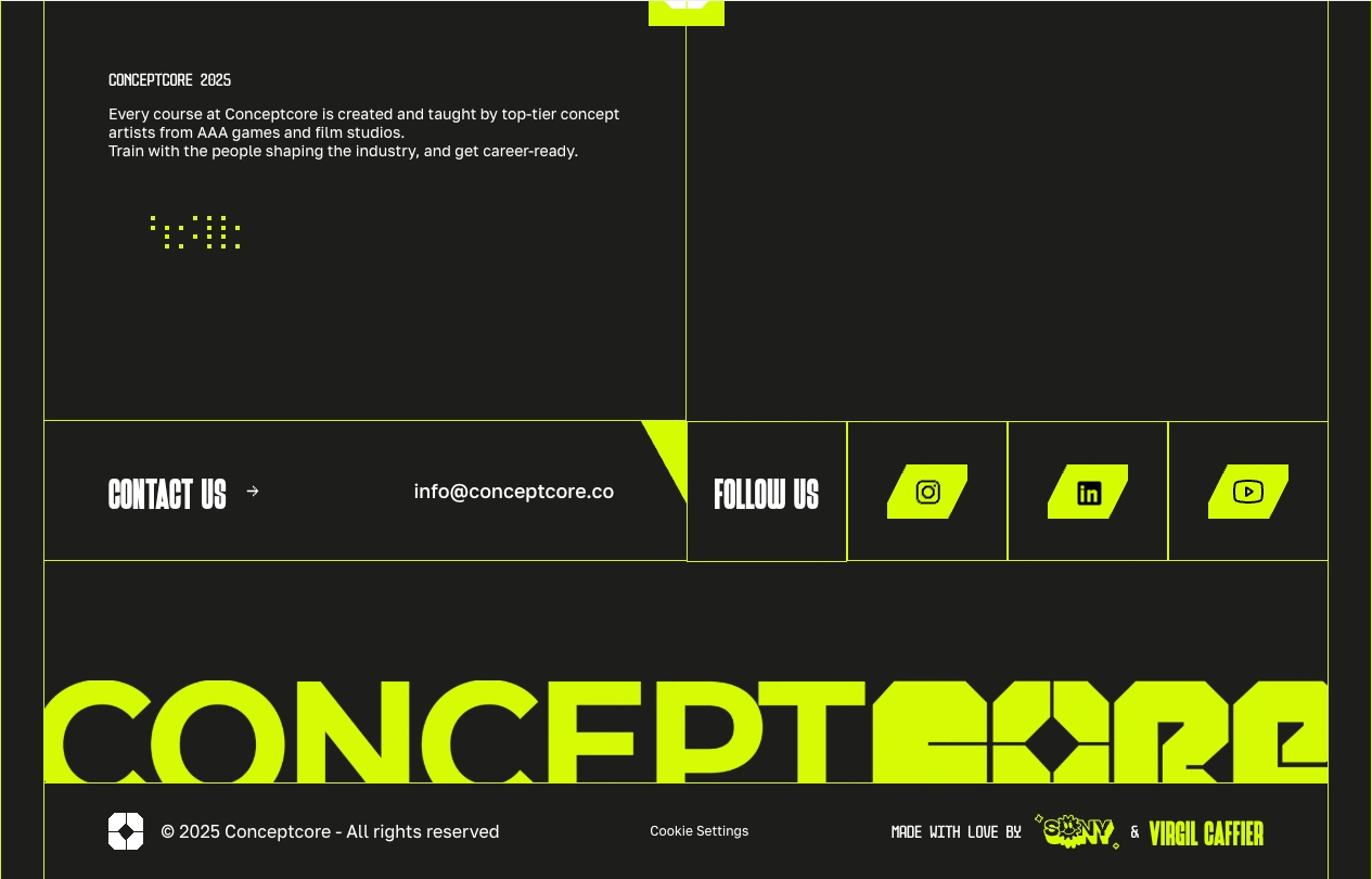
Footer section
Like this project
Posted Oct 12, 2025
Pre-launch site for concept art school: 500 visitors, 200 waitlist signups, 7+ min avg time on site. Bold design on Framer that validated the vision.
Likes
1
Views
9
Timeline
Jul 1, 2025 - Oct 10, 2025