Eagle Glass Premium Landing Page Development
Vasily One
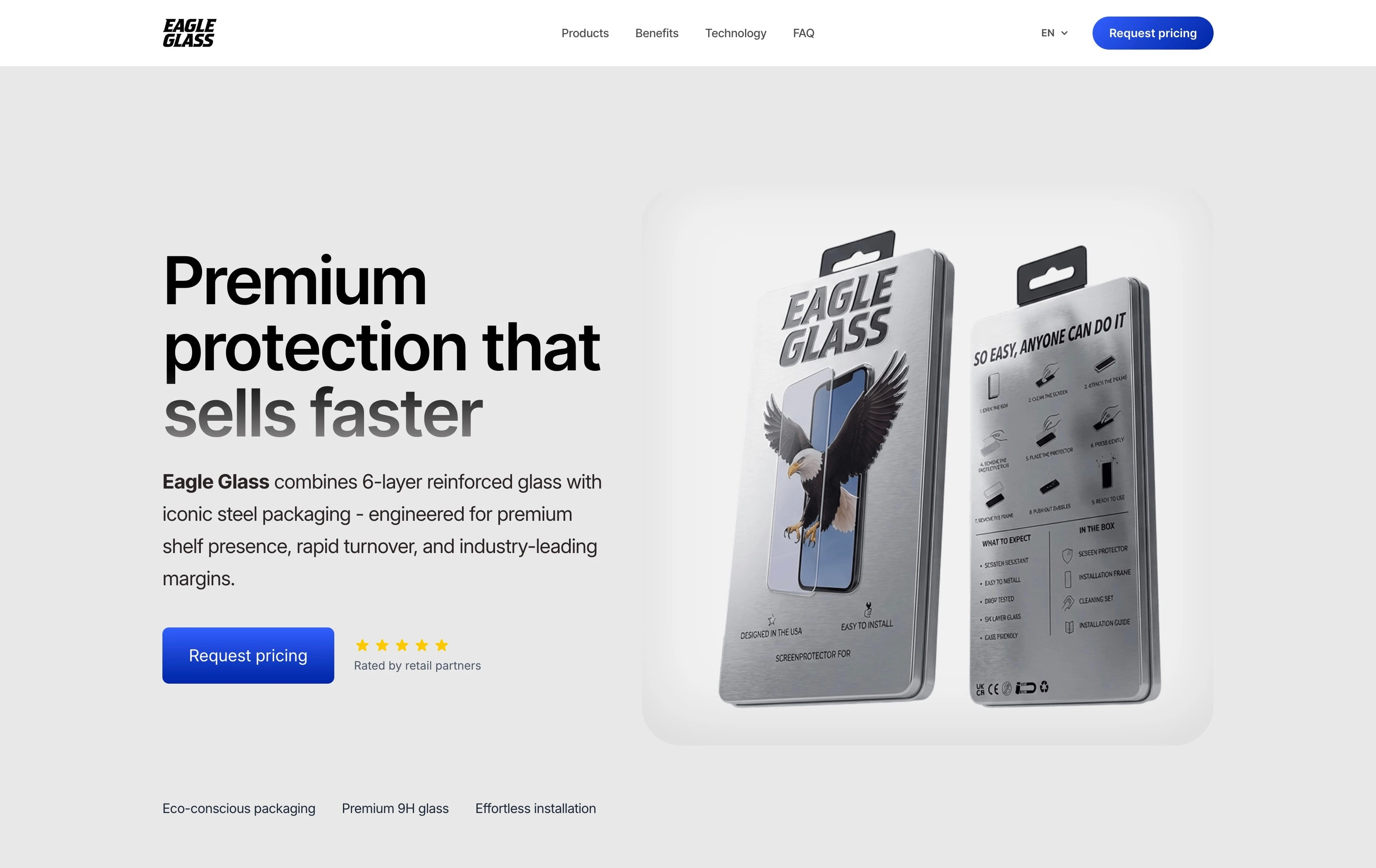
Eagle Glass website hero section
Eagle glass - premium screen protection glass landing page - Astro.js / Three.js / i18n
Table of Contents
About the Client
The Challenge
Strategy & Approach
Design Process
3D & Three.js Integration
Multilingual Architecture (i18n)
Tech Stack & Development
Outcome
Key Takeaways for Founders
Conclusion
About the Client
Eagle Glass is a premium screen protection brand focused on delivering high-quality products with strong positioning in both direct-to-consumer and retail environments.
The brand needed a website that would not just “present information,” but visually communicate product quality, precision, and trust within seconds. In competitive hardware and accessories markets, perception is often shaped instantly - which makes design and performance critical business assets, not just aesthetic choices.
The Challenge
At the start of the project, the client did not need just another landing page — they needed a clear digital representation of a premium product.
Most competitor websites in the niche rely heavily on templated layouts, stock visuals, and generic messaging. This creates a problem: even strong products end up looking indistinguishable.
The key challenges were:
Translating physical product quality into digital perception
Avoiding generic “eCommerce template” look
Supporting multiple languages for EU expansion
Maintaining fast load speed despite visual richness
Delivering everything within a strict 3-week timeline
This required balancing visual sophistication with technical discipline.
Strategy & Approach
Instead of starting from layout blocks or inspiration galleries, the project began with a simple question:
“What makes this product feel premium - and how do we translate that into the web experience?”
From there, the strategy focused on three pillars:
1. Visual restraint over complexity
Rather than adding more sections, animations, or content, the goal was to reduce noise and increase clarity. Premium brands rarely compete on volume — they compete on precision.
2. Product-first storytelling
Every section of the page was designed to support the product itself, not distract from it. This meant prioritizing visuals, spacing, and flow over marketing-heavy copy.
3. Performance as part of UX
A slow website immediately breaks the illusion of quality. Therefore, performance was treated as a core design constraint from the beginning — not an afterthought.
This strategic foundation guided both design and development decisions throughout the project.
Design Process
The design process focused on building a cohesive visual system, not just a page layout.
Instead of designing isolated sections, the approach was to define:
Typography scale and rhythm
Spacing system
Contrast rules
Visual hierarchy patterns
This ensured consistency across the entire experience.
The minimalistic direction was intentional. By removing unnecessary elements, the design creates space for the product to stand out. This also improves scanning behavior, allowing users to quickly understand what the product is and why it matters.
As a combined designer-developer workflow, decisions could be tested and adjusted in real time, reducing friction between concept and implementation.
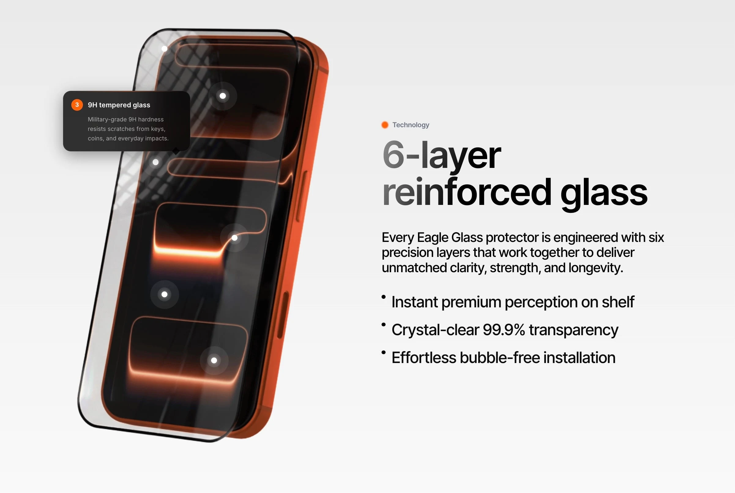
3D Website Development with Three.js
One of the defining features of this project was the use of custom 3D models integrated via Three.js.
Instead of relying on static product images, 3D allowed the product to be presented in a more tactile and realistic way. This is especially important for physical products where texture, thickness, and finish influence buying decisions.
However, 3D introduces trade-offs.
Heavy animations and large assets can easily degrade performance. To avoid this, the implementation focused on controlled use of 3D, rather than visual overload.
Implementation highlights:
Custom-built 3D product models
Lightweight Three.js integration
Selective interactivity (not constant animation)
Performance-aware asset handling
The goal was not to impress with technology, but to enhance product perception without compromising speed.
Multilingual Website Development (i18n)
From the beginning, the website was designed as a multilingual system, not a single-language site with later translations.
This is a critical distinction.
Retrofitting internationalization often leads to inconsistent structure, SEO issues, and technical debt. Instead, the architecture was built with scalability in mind.
The site supports four languages, including English and Dutch, with a structure that allows easy expansion.
Key considerations included:
Clean and predictable URL structure per language
Separation of content and layout logic
Maintainability for future updates
This ensures that the website can grow alongside the business without requiring a rebuild.
Tech Stack & Development
The project was built using a performance-first modern stack, with Astro as the foundation.
Astro’s architecture allows developers to ship minimal JavaScript by default, which results in faster load times and improved user experience — especially important for content-driven landing pages.
Core technologies:
Astro (static-first framework)
Three.js (3D rendering)
Custom CSS (lightweight and tailored)
Minimal JavaScript
Choosing not to rely on heavy frameworks or UI libraries was a deliberate decision. It allowed full control over performance, styling, and output quality.
This approach aligns with the needs of premium product websites, where speed and polish directly affect perception.
Outcome
Within a 3-week timeframe, the project was delivered as a fully functional custom Astro landing page.
The final result includes:
A clean, premium visual identity
Integrated 3D product presentation
Multilingual support across 4 languages
Fast, responsive performance
Scalable structure for future growth
Most importantly, the website now provides a clear and consistent representation of the product’s positioning.
While no artificial performance metrics are presented, the outcome can be evaluated directly through the live experience and client satisfaction.
Key Takeaways for Founders
Building a high-quality landing page is not about adding more — it’s about making better decisions.
1. Premium design comes from clarity
Users associate simplicity with confidence and quality.
2. Performance shapes perception
A fast site feels more trustworthy and professional.
3. 3D is powerful - but must be intentional
It should support the product, not dominate the experience.
4. Think about scale early
Multilingual and structural decisions are hard to fix later.
5. Custom builds create differentiation
Templates are efficient, but rarely memorable.
Conclusion
This case study demonstrates how a focused approach to design, performance, and structure can produce a high-quality result within a short timeline.
By combining Astro, Three.js, and a clear design strategy, the project delivers both visual impact and technical efficiency — two elements that are often treated separately, but work best together.
Need a Fast Astro Website?
If you're looking to build a premium, fast, and scalable landing page with Astro, this is exactly the type of work I specialize in.
👉 Need a fast and functional Astro website? Drop me a message!
Like this project
Posted Apr 7, 2026
Developed a premium Astro landing page for Eagle Glass with 3D features and multilingual support.